
"Photography is not about the thing photographed. It is about how that thing looks photographed."
A guide to fine art printing and archival techniques
A photograph reaches its final form when it is printed, handled and displayed with the same care that shaped its creation. The choice of paper, ink, tonal scale and presentation can alter how an image is read, from the soft depth of a black-and-white portrait to the saturated colour of a conceptual series. Fine art printing turns a digital or analogue negative into a physical object with a defined visual character and a planned lifespan.
Archival practice adds another layer of responsibility. It considers the stability of the image, the surface on which it is printed, the materials used for mounting and framing, and the conditions in which the work will be stored or exhibited. For Australian collectors, galleries and photographers, climate, intense sunlight and long-distance transport are practical factors that belong in the decision-making process from the beginning.
Choosing a suitable printing process
The printing method should serve the character of the photograph rather than follow a fixed formula. Archival pigment printing, often called giclée printing, uses a high-resolution inkjet system with carefully profiled inks and fine art papers. It is well suited to detailed colour work, subtle gradients and black-and-white images requiring a broad range of greys. With a well-managed workflow, pigment prints can offer excellent permanence and consistency across an edition.
Traditional darkroom printing remains distinctive because the image is formed through chemistry and light rather than deposited ink. A silver gelatin print has a tactile presence, rich blacks and a particular relationship between highlights and paper surface. Fibre-based papers are often selected for exhibition prints because they provide depth and tonal refinement, although they require careful washing, drying and flattening. The darkroom process also introduces small variations that can make each print feel materially connected to the photographer’s hand.
Other processes may be appropriate for specific projects. Contact printing, platinum-palladium, cyanotype and photogravure each produce different densities, textures and colour responses. Platinum-palladium prints are valued for their delicate tonal transitions and long-term stability, while photogravure brings an etched, tactile quality that suits limited-edition books and conceptual series. The process should be assessed alongside the intended scale, budget, edition size and viewing distance.
A photographer working between medium-format film and digital capture may produce test prints from both sources before deciding on a final method. Film grain, lens rendering and negative density influence how an image responds to paper. A digital file can be adjusted for the chosen process, but it should not be treated as a neutral source that will look identical on every surface.
Paper, inks and the physical character of an image
Fine art paper is part of the image’s visual language. Cotton rag papers are popular for their clean fibres, soft surface and absence of optical brightening agents. Smooth matte papers can support quiet portraits and finely controlled monochrome work, while textured papers may add a sense of atmosphere to landscapes, fashion images or abstract compositions. The surface affects apparent sharpness, shadow depth and the way viewers perceive distance within the frame.
Gloss and baryta-style papers produce stronger apparent contrast and can reveal fine detail, but they also reflect light and may show fingerprints or glare under unsuitable illumination. Semi-gloss surfaces offer a compromise between tonal density and easier viewing. For a black-and-white photograph, a warm paper may create a subtle sense of age, whereas a neutral or bright white base can make the image feel more contemporary and precise.
Pigment inks are generally preferred for archival inkjet work because of their resistance to fading and their ability to produce stable, nuanced colour. Dye-based inks can be vivid and economical, but they are less commonly selected for museum-quality editions intended for extended display. The paper and ink must be tested together; a highly stable ink can still produce an unsatisfactory print if the paper profile is inaccurate or the surface does not suit the image.
Australian conditions make paper selection especially practical. A print displayed in a sun-filled Sydney apartment or a bright coastal home may receive more ultraviolet exposure than the same work installed in a dim gallery. In Brisbane and other humid areas, cotton papers and mounted works need protection from moisture and fluctuations in relative humidity. A reputable printer should provide handling guidance and recommend materials based on the final location, not just the appearance of a sample under studio lighting.
Colour management and proofing
A reliable archival workflow begins with a calibrated monitor. Screen brightness, white point and colour profile affect every editing decision, so a display that is too bright can lead to prints that appear muddy or underexposed. Calibration should be repeated at regular intervals, particularly in professional studios where monitors are used frequently. The editing environment also benefits from controlled, neutral lighting that does not introduce a strong warm or cool cast.
Colour management connects the camera file, editing software, printer, ink and paper. An ICC profile describes how a particular combination of printer and media reproduces colour. Soft proofing allows the photographer to preview likely changes before making a physical print, including compressed shadow detail, altered saturation or out-of-gamut colours. It is an aid to judgement rather than an automatic guarantee of a perfect result.
A test strip or small proof is essential for important work. It can reveal blocked shadows, weak highlights, excessive sharpening and subtle shifts in skin tone. Black-and-white prints deserve particular attention because a neutral monochrome image may acquire a green, magenta or warm cast depending on the ink set and paper. Some photographers deliberately choose a cool or selenium-like tone, but that decision should be controlled rather than caused by an unmanaged workflow.
Proofing is also important when producing a limited edition. The approved reference print becomes a standard for subsequent copies, while the photographer records the paper, ink set, printer settings and file version. Edition numbers, signatures and certificates of authenticity should be handled consistently. A signed print is more credible when its production history is clear and the edition size is fixed before sales begin.
Archival mounting, framing and storage
The print itself is only one component of long-term preservation. Acid-free, lignin-free mount board helps reduce chemical deterioration, while archival corners or hinges allow the work to be supported without permanently bonding it to a backing sheet. Hinging is generally preferred to full-surface dry mounting because the print can be removed or conserved later. Adhesive choice matters, particularly for valuable works or prints intended for institutional collections.
A window mount creates space between the image and glazing, reducing the risk of the surface sticking to the glass in humid conditions. Museum or conservation glazing can filter a significant proportion of ultraviolet radiation and reduce reflections, although no glazing eliminates the need to control direct sunlight. Acrylic glazing is lighter and safer for large works, but it can attract dust and develop static, which may be relevant when framing delicate surfaces.
Frame construction should allow modest movement as materials respond to environmental change. Timber, backing boards and paper can expand or contract at different rates, so a frame that is tightly sealed without appropriate spacing may place pressure on the print. Professional framers in Melbourne, Sydney and other Australian cities commonly advise on glazing, spacers and backing systems for local conditions. The correct solution will vary between a climate-controlled gallery and a private home near the coast.
Unframed prints should be stored flat where possible, separated by unbuffered archival tissue or suitable interleaving. They should remain away from garages, sheds, kitchens and exterior walls exposed to damp. Rolled storage is less desirable for long periods because repeated curling can stress the paper. For collectors in Perth or regional Australia, transport packaging should include rigid protection, moisture-resistant outer wrapping and enough cushioning to prevent corner damage during courier handling.
Display, conservation and the life of an edition
Light is usually the greatest threat to a displayed photograph. Even stable pigment prints and well-made silver gelatin prints can fade gradually under strong illumination. Direct sunlight should be avoided, and gallery lighting should be kept at a moderate level with ultraviolet protection. Rotating works on paper can reduce cumulative exposure, a practice often used by museums and private collectors who wish to preserve sensitive editions.
Relative humidity and temperature should remain reasonably stable. Rapid changes are frequently more damaging than a stable reading that is slightly outside an ideal range. Air conditioning can create dry conditions, while damp coastal weather or a humid Brisbane summer may affect paper, frames and mounts. A home collection does not need to replicate a museum store, but it benefits from good ventilation, sensible placement and distance from heaters, cooling vents and damp surfaces.
Conservation records add value to the physical work. The photographer or collector can document the title, date, process, paper, dimensions, edition number, framing materials and any later treatment. Notes about display history, shipping and visible changes are useful if the piece is sold, loaned to a gallery or insured. In the Australian market, where a work may travel between Adelaide, Melbourne, Sydney or interstate exhibitions, accurate records support responsible handling and professional valuation.
Archival quality does not mean that a print must appear sterile or untouched. A carefully made darkroom print may carry slight process marks, while a contemporary pigment print can have a precise, exceptionally clean surface. The essential point is that each characteristic is intentional and that the materials support the photographer’s visual purpose. When printing, framing and conservation are considered together, the photograph can retain its tonal character and physical integrity for many years.
Selected Series
A cross-section of commissioned and personal projects spanning fine art, commercial, and conceptual work.
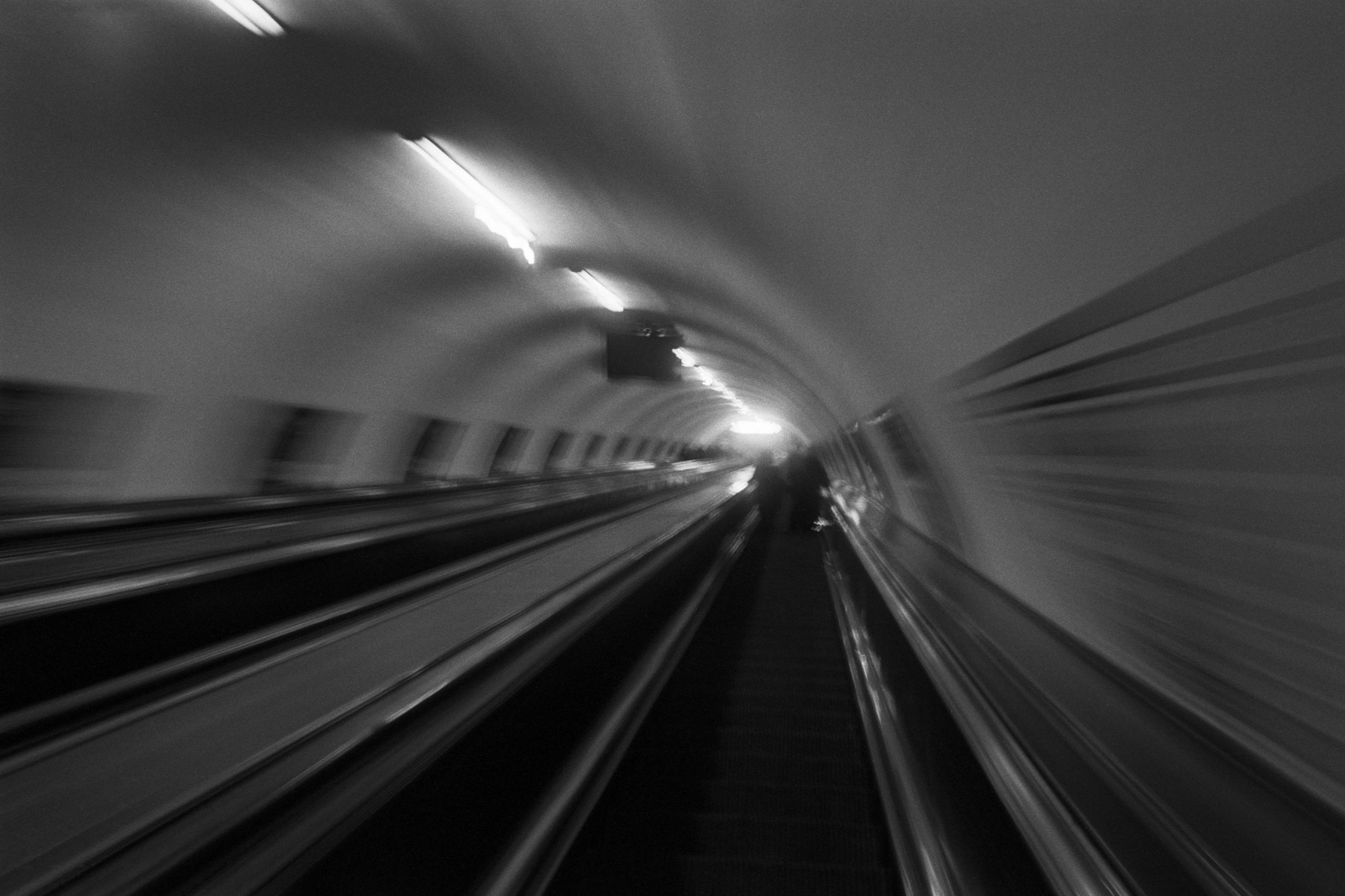
The Wall
2015Winner of the 1st prize & Golden Glass Award at the 11th Photographic Open Championship Olsztyn, and 1st place with the Special Prize of FORMAT magazine at the 3rd Biennial of Art in Piotrków Trybunalski.
View Series →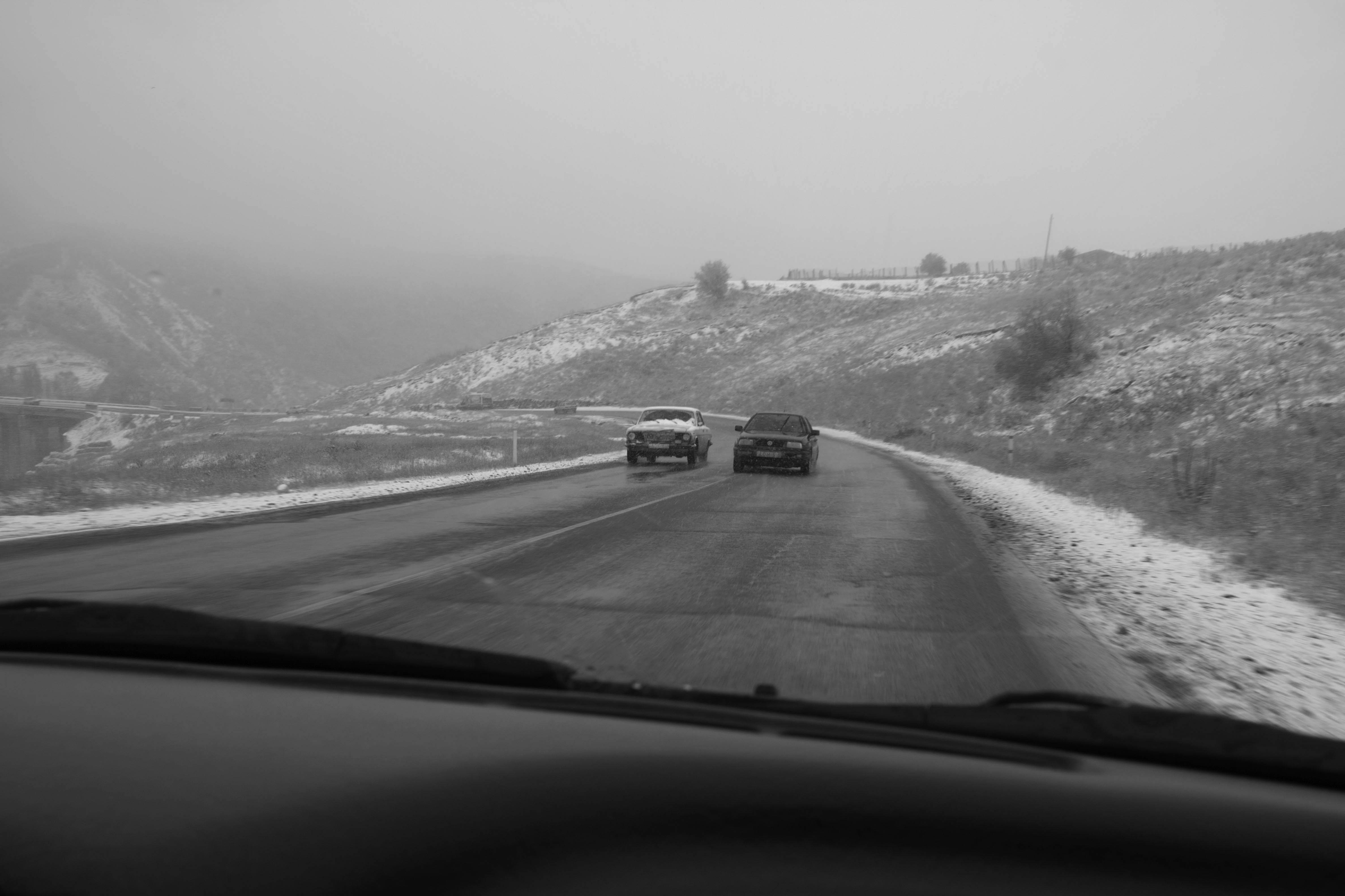
An Engagement Ring
2011A narrative series set in Wrocław in August 2011. Awarded 2nd prize & Silver Glass at the 10th Photographic Open Championship Olsztyn in 2014.
View Series →
Heat Wave
2014A documentary series recording spontaneous events across August and September 2014, capturing the raw energy of a city under the grip of summer.
View Series →