"Photography is not about the thing photographed. It is about how that thing looks photographed."
Behind a corporate headshot campaign
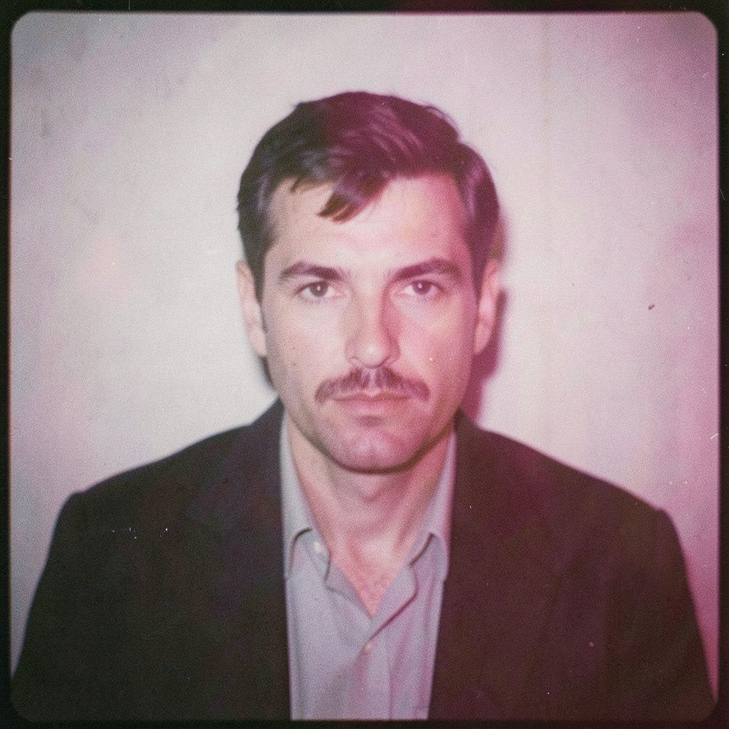
A strong corporate portrait does more than place a face beside a job title. It gives a business a visual language: credible, approachable, considered and recognisable across its website, LinkedIn profiles, annual reports, media releases and recruitment channels. For one recent client campaign, Rafal Michalak Photography was commissioned to create a complete set of executive and team portraits that felt polished without becoming stiff or generic.
The brief called for consistency across several offices, while allowing each person enough space to look natural. The client wanted photographs that would work in a wide range of layouts, from small staff biographies to large-format conference material. This client spotlight, behind a corporate headshot campaign, shows how planning, direction, lighting and post-production shaped the final collection.
Defining the visual brief
The client was a growing professional services organisation with teams in Sydney, Melbourne and Brisbane. Its existing photographs had been taken at different times, by different photographers and in unrelated locations. Some images were tightly cropped, others used inconsistent backgrounds, and the overall collection lacked the visual confidence expected from a national brand.
The first stage was a focused briefing session with the marketing and people teams. Rather than treating the assignment as a sequence of individual portraits, Rafal approached it as a visual identity project. The discussion covered the company’s values, audience, internal culture and intended applications. The photographs needed to feel authoritative for clients, warm for prospective employees and flexible enough for editorial use.
The team also reviewed the organisation’s website, brand colours and existing design templates. This revealed an important practical requirement: the portraits had to leave enough negative space for web banners, staff directories and printed brochures. A headshot that looks excellent as a square image may become unusable when a designer needs room for a headline or a call to action.
Building consistency across locations
Corporate portrait photography becomes more complex when people are photographed across multiple cities. Sydney’s available locations and weather patterns can differ sharply from Melbourne’s changing light or Brisbane’s humidity and intense daylight. Travel schedules, office access and busy calendars add another layer of coordination.
To keep the campaign visually unified, Rafal established a repeatable lighting structure before the first session. The key light, background relationship, camera height and posing guidance were documented so the same approach could be recreated in each office. This did not mean every portrait looked identical. Small variations in expression, posture and framing preserved the individuality of each subject while maintaining a coherent collection.
The production plan also allowed for the everyday realities of Australian workplaces. Sessions were scheduled around client meetings and school-hour traffic, with early starts avoided where possible in offices affected by peak commuting periods. A compact setup reduced disruption to working teams, while a clear call sheet helped employees arrive prepared rather than waiting in a crowded reception area.
In some offices, the best background was not a blank wall but a restrained view of the workplace. Glass, timber and soft architectural lines gave the images a sense of place without competing with the subject. In other rooms, a controlled neutral background offered greater flexibility for the client’s design team. The choice was made according to the building, the brand and the intended use of the photograph.
Preparing people to look like themselves
Many people feel uncomfortable in front of a camera, particularly when the image is connected to their professional reputation. A portrait session can feel more formal than an ordinary workplace interaction, and a subject may become overly aware of posture, clothing or facial expression. Good direction reduces that pressure before it appears in the photograph.
Employees received practical guidance ahead of the campaign. They were encouraged to bring a small selection of professional clothing, avoid distracting patterns and choose garments that reflected how they normally present themselves at work. For the Australian corporate market, this can mean anything from a tailored jacket in a Sydney boardroom to a more relaxed combination of knitwear and open-collar shirts in a creative Brisbane office.
Rafal used conversation and small changes in movement to help each person settle. Instead of asking everyone to hold a fixed smile, he directed the eyes, shoulders and chin separately, then made subtle adjustments between frames. A subject might begin with a straightforward executive portrait and finish with a more relaxed image suited to an interview, staff profile or conference speaker page.
This approach is especially valuable for leadership teams. Senior executives often need portraits that communicate clarity and authority without appearing distant. The strongest frame is not necessarily the most serious one. A measured expression, natural eye contact and balanced posture can create greater trust than an exaggerated smile or rigid pose.
Combining analogue character with digital efficiency
Rafal’s practice brings together medium-format photography, black-and-white film, darkroom principles and contemporary digital workflows. For this campaign, the primary deliverables were made with a controlled digital process to provide speed, colour accuracy and dependable consistency across hundreds of files. Digital capture was the right tool for a project with multiple locations and a demanding delivery schedule.
The analogue influence remained visible in the way the photographs were shaped. Lighting was kept deliberate rather than excessive, skin tones were treated with care, and the final images retained natural texture. Retouching focused on temporary marks, minor distractions and clothing adjustments, rather than removing the features that make a face recognisable. Corporate headshots should look refined, not artificially reconstructed.
A smaller group of portraits was also produced in black and white for the company’s leadership stories and editorial communications. Without colour, attention moved towards expression, gesture and light. These images connected the commercial assignment with Rafal’s fine art practice and gave the client a distinctive secondary visual style for long-form content.
The result was a two-part library: clean colour portraits for everyday business use, and more expressive monochrome photographs for selected communications. Both groups belonged to the same campaign because they shared the same approach to light, composition and human presence.
Managing privacy, consent and image usage
Professional photography for a company involves more than producing attractive images. The organisation must understand where each portrait will appear, who can access it and how long it will remain in circulation. This matters particularly in Australia, where personal information is handled within the framework of the Privacy Act 1988 and the Australian Privacy Principles.
Before the sessions, the client distributed a clear photography consent form explaining the planned uses. These included the company website, social media, internal communications, proposals, media materials and printed marketing. Employees were given an opportunity to raise concerns about specific uses, and the marketing team maintained a record of approvals rather than relying on informal verbal agreement.
A usage discussion also clarified the difference between commissioning photographs and owning every possible right in them. The client received agreed commercial usage for its business communications, while copyright and portfolio permissions were documented separately. This helped prevent uncertainty when the organisation later wanted to use selected portraits in a recruitment campaign or an industry award submission.
The same care applied to the background. Office screens, documents, visitor badges and whiteboards were checked before photography began. Removing sensitive material protected the client’s privacy and made the images easier to use. In a busy Australian workplace, these small checks are as important as lens choice or lighting design.
Delivering a useful portrait library
The final delivery was organised for practical use rather than simply sent as one large folder. The client received high-resolution files for print, web-ready versions for digital platforms and a consistent naming system that matched employee records. Cropping options were prepared for common placements, including square profile images, horizontal website banners and vertical editorial layouts.
The photographs were reviewed at several sizes before delivery. A portrait that feels balanced on a large monitor can lose impact when reduced to a small LinkedIn thumbnail. Reviewing both extremes helped identify the most versatile frames and ensured eyes remained clear in smaller applications. The marketing team could then select images quickly without repeatedly returning to the original gallery.
The campaign also gave the organisation a stronger internal process. New employees could be photographed using the same lighting and framing notes, allowing the visual library to grow without drifting away from the established identity. This is valuable for businesses expanding across Australia, where teams may be added in Perth, Adelaide or regional offices over time.
The finished work demonstrated why a corporate portrait is a strategic brand asset rather than a compulsory staff directory image. Each photograph represented a person, yet the collection expressed the standards of the organisation as a whole: composed, open and confident. The camera recorded the face, but the planning gave the campaign its consistency and purpose.
Practical recommendations for a smoother campaign
A successful corporate headshot session depends on decisions made well before the camera is unpacked. These recommendations can help marketing teams, HR departments and business owners prepare a portrait campaign that is efficient, respectful and visually consistent.
- Define the intended uses before booking the photographer, including websites, LinkedIn, proposals, media releases, recruitment and printed publications.
- Create a simple clothing guide that reflects the organisation’s real dress culture rather than imposing a style employees would not normally wear.
- Nominate one internal coordinator to manage schedules, consent records, office access and communication between the photographer and each team.
- Allow enough time for conversation and direction, particularly for executives or employees who have little experience in front of a camera.
- Request a delivery structure with print-ready files, web-sized versions, clear file names and documented usage rights for future campaigns.
Selected Series
A cross-section of commissioned and personal projects spanning fine art, commercial, and conceptual work.
The Wall
2015Winner of the 1st prize & Golden Glass Award at the 11th Photographic Open Championship Olsztyn, and 1st place with the Special Prize of FORMAT magazine at the 3rd Biennial of Art in Piotrków Trybunalski.
View Series →
An Engagement Ring
2011A narrative series set in Wrocław in August 2011. Awarded 2nd prize & Silver Glass at the 10th Photographic Open Championship Olsztyn in 2014.
View Series →
Heat Wave
2014A documentary series recording spontaneous events across August and September 2014, capturing the raw energy of a city under the grip of summer.
View Series →