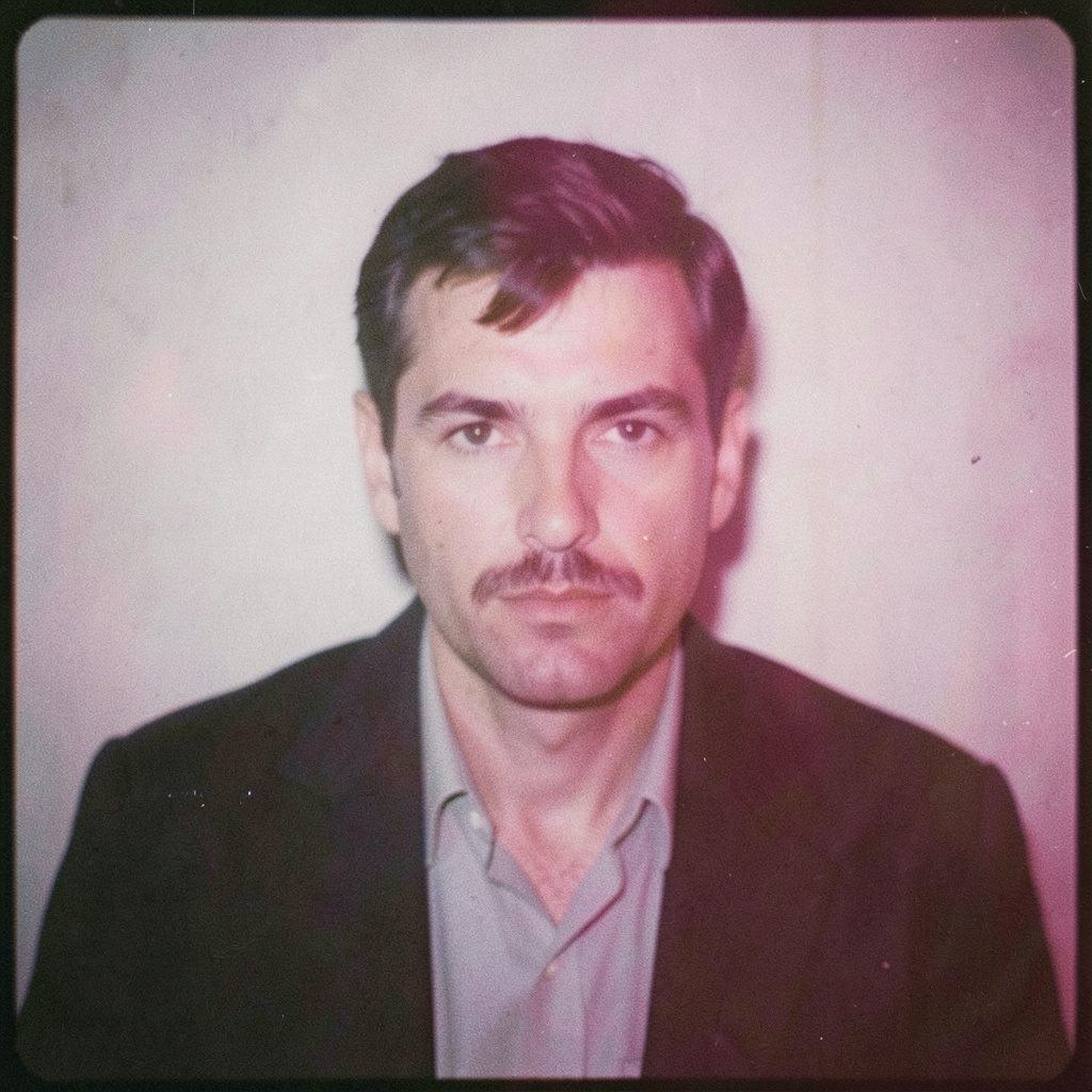
"Photography is not about the thing photographed. It is about how that thing looks photographed."
How a photograph moves from contact sheet to final edit
A workflow is rarely a straight line. It bends, loops, and occasionally doubles back when a frame refuses to behave. For me, the path from a freshly exposed roll of film, or a tethered studio session, to a delivered file is less a checklist than a conversation between intention, material, and time. Sharing that conversation openly feels more useful than a polished ending.
I am based in Wrocław, but a significant share of my commercial work now arrives from clients in Sydney, Melbourne, and Brisbane. Australian fashion labels, business portraiture for Sydney-based founders, and conceptual series commissioned by Melbourne galleries have become a steady part of the calendar. Coordinating across time zones, currencies, and slightly different copyright conventions has reshaped my post-production rhythm as much as the lighting setups on set.
There is also a quiet pleasure in the slow, analogue side of things. Even when the final deliverable is a digital file destined for a Sydney agency grid or a Melbourne print studio, the discipline of working from a contact sheet keeps the eye honest. Edits become slower, more deliberate, and the photographer's hand stays visible in every frame.
Most days, the workflow falls into recognisable stages: capture, contact sheet, selection, grading, retouching, and delivery. What follows is an honest walk through those stages, including the software, the film stocks, the hard drives, and the small pieces of Australian-specific administrative reality that sit quietly behind the images.
Tethered capture and the first conversation with the image
When a commercial client books a session, the first frame rarely matters as much as the first ten. Tethered shooting into Capture One lets me see the file at near-final exposure within seconds, invaluable for hair, beauty, and fashion work. The model, stylist, and make-up artist see the result on a calibrated monitor, and the conversation shifts away from guesses and toward specific choices. The contact sheet is being built in real time.
For business portrait sessions, the tether usually stays private. Clients are rarely served by watching themselves on a screen. I shoot with intent, review quietly, and only share selects later. This separation between the live process and the curated edit is part of the service, and it keeps the contact sheet honest, because the first instinct is preserved rather than overwritten by mid-session feedback.
Medium format digital backs have changed how I approach a job, but they have not replaced film. For selected campaigns, particularly for Sydney-based fashion houses that still ask for analogue grain, I shoot both. Digital frames provide insurance and flexibility, while film frames carry the texture the client is paying for. Two parallel workflows begin the moment the shutter clicks.
The first RAW files are ingested into a structured folder system the same evening, copied to two physical drives, with a third backup sent to encrypted cloud. Naming follows date, project code, and sequence number. Boring, yes. Boring also means the contact sheet I build later can be located without a sigh.
Film, darkroom, and the digital bridge
For conceptual and personal work, the path is slower. A roll of Ilford HP5+ or Kodak Portra 400 is exposed with patience, often across several days. The contact sheet, in this case, is a literal darkroom print: a strip of small thumbnails made under the enlarger, fixed, washed, and dried. It carries the look and feel of the negatives themselves.
I scan film at high resolution on an Imacon scanner, then import those TIFFs into the same folder structure used for digital work. The hand-off between analogue and digital is one of the most rewarding parts of the workflow. A black-and-white series shot in Wrocław's Old Town can sit, contact sheet and all, in the same library as a colour campaign from a Sydney studio. The contact sheet simply becomes a different kind of metadata.
After scanning, I print a fresh contact sheet for the wall above my desk. It anchors the project in a physical object. The digital folder can be opened anywhere, but the darkroom print reminds me of the work behind the negative. Dust removal and basic colour balancing happen in Capture One, protecting grain and gentle highlight roll-off.
Building a contact sheet that actually works
A good contact sheet is a tool, not a presentation. Mine is a large grid of every frame, labelled with the roll number, the date, and a brief note about the lighting setup. I print it at A3 and pin it to the studio wall. Smaller copies are filed in archival folders. The wall copy stays for the duration of the edit, then moves into long-term storage.
Grid order matters. I prefer to keep frames in the order they were shot, preserving the sequence of decisions made on set. A client looking at the sheet can read it almost like a storyboard. For fashion and editorial work, this is often what an art director wants. For portraiture, it helps the subject see themselves as the photographer saw them.
Digital contact sheets, built in Photo Mechanic or Lightroom, serve a different purpose: smaller, faster, and sortable. I use them for the first cull before printing a physical contact sheet for the final shortlist. The wall copy reveals things the monitor does not, particularly skin tones and subtle exposure shifts.
Australian clients respond well to this two-stage approach. The digital pass keeps the project moving during the working week across time zones, while the physical contact sheet becomes a more considered moment.
The selection process: editing down to the keepers
The cull is where most of the work happens. A typical commercial session may produce 600 to 1,200 frames. A conceptual series, shot on film over several days, might yield 80 to 120 negatives. Either way, the goal is the same: identify the keepers, the near-keepers, and the frames useful only as reference.
I work in three rounds. The first is intuitive, a quick yes or no, often done late at night when the eye is less forgiving. The second reconsiders the borderline frames the next morning. The third is the hardest: cutting the near-keepers down to 20 to 40 frames depending on the brief.
Star ratings and colour labels carry the weight of the decision: five stars for the absolute standouts, three for solid options, and red for technical rejects. A second folder holds near-keepers in case the brief shifts, and has saved projects when a Sydney art director asked for a softer, more introspective edit a week after the first delivery.
Selection is also where I make my first compositional decisions. A frame that is technically perfect but compositionally repetitive is dropped in favour of one with a small flaw that adds character. The contact sheet becomes a kind of essay, and the final edit is the version of the argument I want to publish.
From RAW to polished: colour, tone, and texture
Once the keepers are locked, the grading begins. I work in Capture One for the bulk of the colour work, then move to Photoshop for retouching. A consistent base preset is applied to each project, then every frame is adjusted individually. Batch grading is a trap. Even within a single lighting setup, the skin, fabric, and background respond differently from frame to frame.
For black-and-white film work, the grading is subtler. The goal is to honour the darkroom print while preparing the file for digital reproduction. Highlights are protected, midtones are gently opened, and the contrast curve is set with reference to a printed proof. The digital file becomes a transcription of an analogue original.
I keep a small library of reference prints from past projects. When a new series feels uncertain, pulling out a print from a previous Wrocław winter or a Sydney summer shoot recalibrates the eye. Tones are easier to trust when there is a physical object to compare against.
Texture is a quiet obsession: grain structure in film scans, the tooth of a printed matte surface, the way a wool coat catches light. None survives an aggressive sharpening pass. I keep sharpening low, mostly restricted to output resolution, and let the original texture do the work.
Retouching, compositing, and final refinements
Retouching is reserved for the keepers. The aim is never to make a face look like someone else, but to remove the small distractions that pull attention away from the photograph itself: a blemish on a chin, a stray hair across a collar, a hot spot on a background. Frequency separation, dodge and burn, and selective colour are the tools, each applied carefully to specific frames.
Compositing is rare in commercial work, more common in personal and conceptual series. A frame from Wrocław's Rynek can be combined with a studio-lit portrait to create a scene that never existed. The contact sheet in these cases is more of a sketchbook, with notes scribbled in the margin about which elements to combine.
The final pass is a slow one. Files are exported at full resolution, then opened in Photoshop for a last check at 100 per cent. Sharpness, colour cast, exposure, and crop are all reconsidered. A small notebook next to the monitor records the date, the file name, and any final adjustments, later transferred to the project's metadata as a keywording note.
Archival follows. The original RAW or scanned TIFF, the edited master, and a high-resolution JPEG are saved in three locations: two external drives in different rooms, and one encrypted cloud backup. Australian privacy expectations around client images are strict, and a redundant archive is the simplest way to honour them.
Delivering, archiving, and working with Australian clients
Delivery is the moment the workflow becomes visible. For private portrait clients, this means a curated online gallery, a short PDF of selects, and high-resolution files prepared for print. For commercial clients in Sydney, Melbourne, and Brisbane, the gallery is often shared first with a producer or art director, with watermarked previews and a separate link for the final masters.
Australian commercial photography falls under the Goods and Services Tax when billed to local clients. The standard rate is 10 per cent, applied to the full service including creative fees, production, and licensing. A clear, itemised quote helps avoid awkward conversations. The Australian Taxation Office publishes guidance on what counts as a taxable supply, and most agencies expect a properly formatted tax invoice with an Australian Business Number for cross-border services.
Copyright in Australia sits with the photographer by default, under the Copyright Act 1968. Even when an image is commissioned, the photographer retains the rights unless a written assignment transfers them. Most Sydney and Melbourne agencies work with this convention, building usage licences into the contract rather than asking for a buyout. I keep a standard licensing template that distinguishes editorial, commercial, and exclusive use, with duration and territory clearly stated.
Archiving, after delivery, is the part of the workflow that pays for itself years later. Every project, from a portrait session in a Parramatta boardroom to a multi-day campaign on a Tasmanian shoreline, is stored on a labelled drive, indexed in a searchable database, with a redundant cloud copy. The contact sheet, the prints, and the notebook pages are scanned and added to the archive. The goal is simple: any frame I have ever delivered should be retrievable, with its full history, in under five minutes. The contact sheet is the beginning of the conversation, the final edit one of its possible endings.
Selected Series
A cross-section of commissioned and personal projects spanning fine art, commercial, and conceptual work.
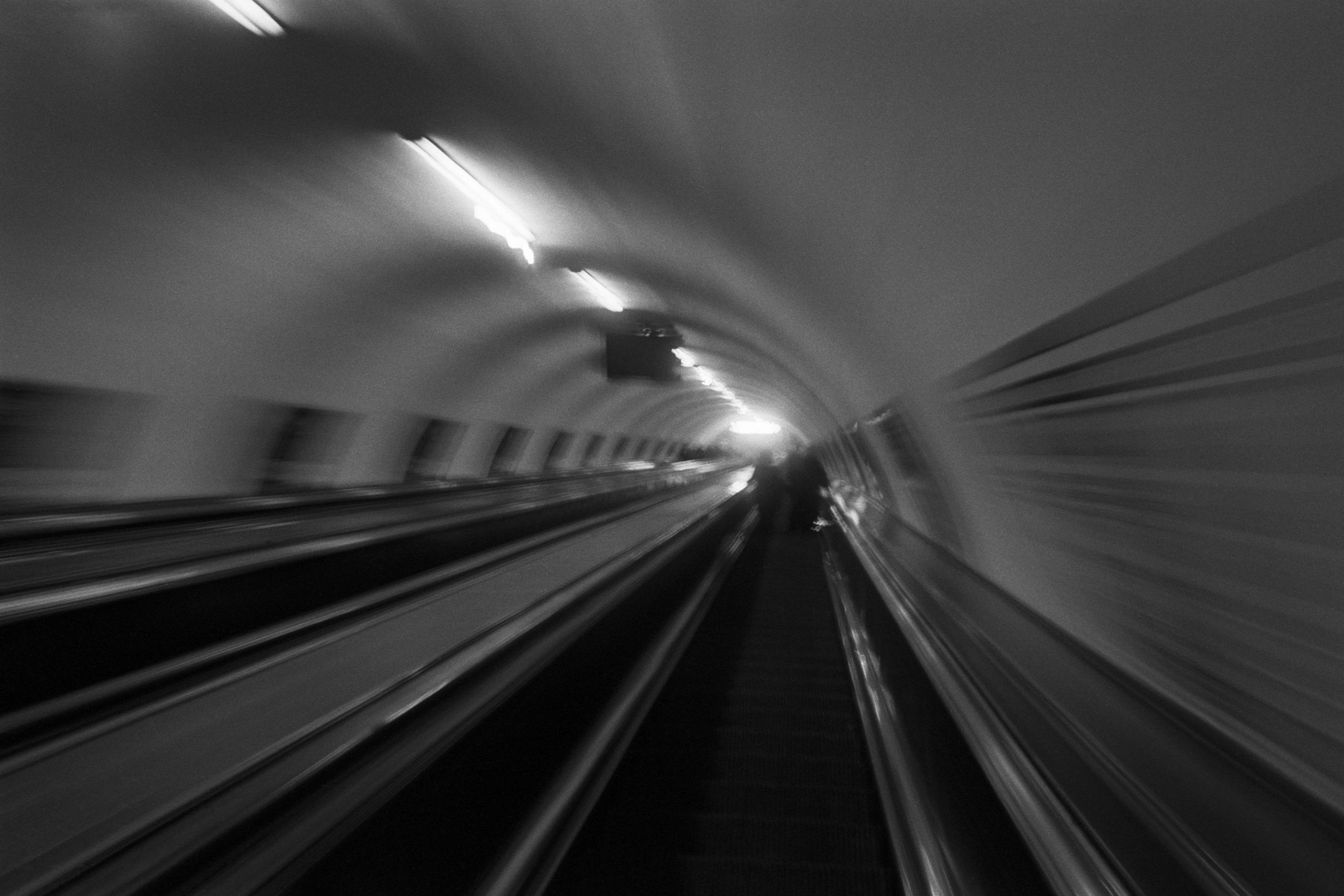
The Wall
2015Winner of the 1st prize & Golden Glass Award at the 11th Photographic Open Championship Olsztyn, and 1st place with the Special Prize of FORMAT magazine at the 3rd Biennial of Art in Piotrków Trybunalski.
View Series →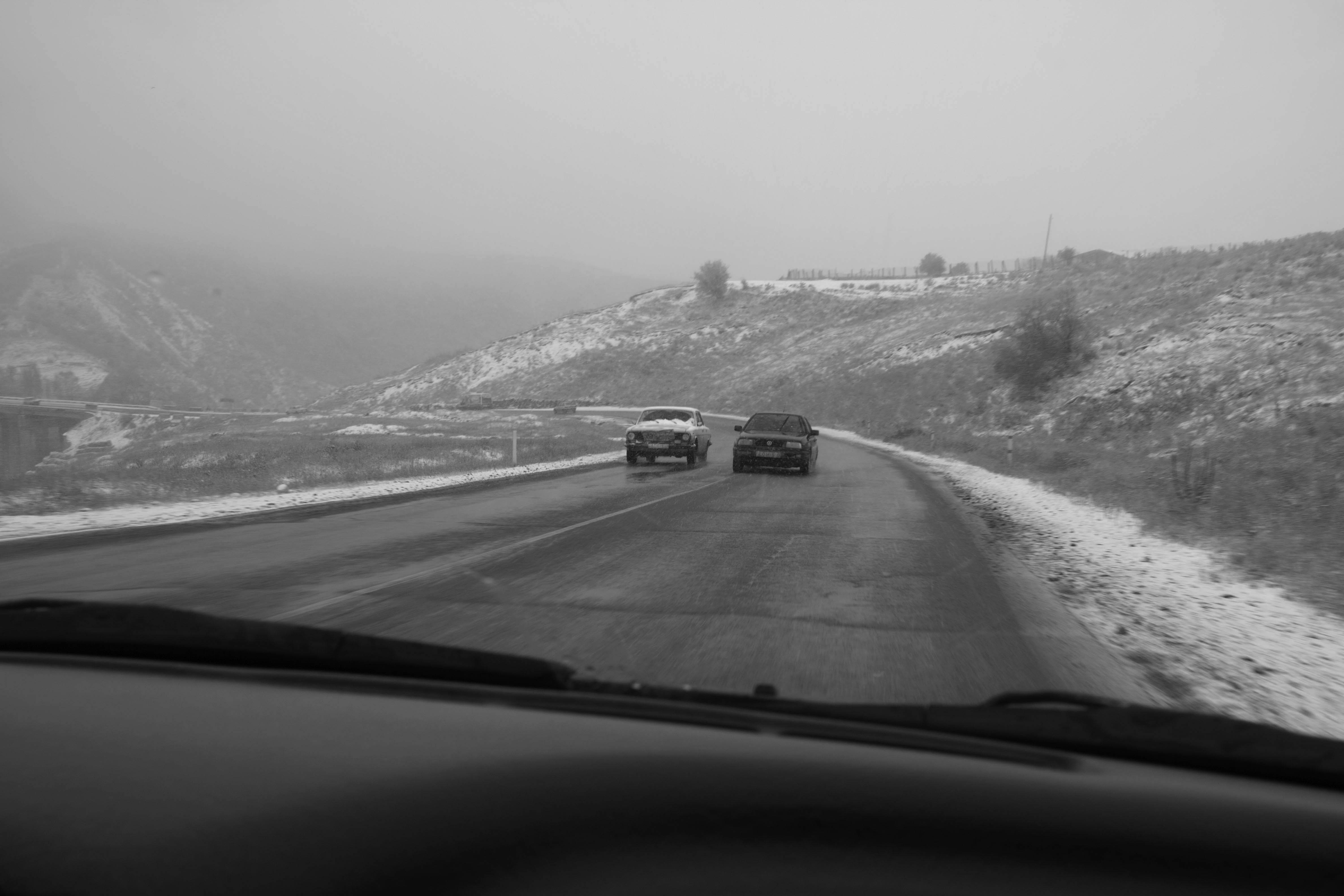
An Engagement Ring
2011A narrative series set in Wrocław in August 2011. Awarded 2nd prize & Silver Glass at the 10th Photographic Open Championship Olsztyn in 2014.
View Series →
Heat Wave
2014A documentary series recording spontaneous events across August and September 2014, capturing the raw energy of a city under the grip of summer.
View Series →