
"Photography is not about the thing photographed. It is about how that thing looks photographed."
Crafting a Cohesive Instagram Feed That Showcases Your Photography Portfolio
Photographers today operate in a market where clients often decide within seconds whether to scroll past or stop and explore. The Instagram grid has effectively become a digital gallery wall, and the way your work flows across nine posts or ninety can make the difference between being remembered and being forgotten. For portfolio-driven shooters, the challenge is balancing artistic integrity with the platform's demand for visual flow.
Visual consistency on the platform is not about posting the same type of image repeatedly. It is about ensuring that every photograph, regardless of genre, communicates the same underlying values: your signature use of light, your preferred tonal palette, and the emotional register you want clients to associate with your name. A photographer whose work spans fashion editorials, corporate headshots, and conceptual fine-art series must find a thread that ties these worlds together, or the feed will feel fragmented.
This guide walks through the practical decisions that transform a scattered collection of uploads into a deliberate, recognisable body of work. Whether you shoot exclusively in Melbourne's inner-north creative scene, take commissions along Sydney's coastal suburbs, or service clients across Brisbane and Perth, the principles below translate across every Australian market.
Defining Your Photographic Voice Before You Press Publish
Every cohesive feed begins long before the first image reaches the upload screen. The strongest portfolios emerge from photographers who have already articulated, even quietly to themselves, what their work stands for. Is it the warm, honeyed tonality reminiscent of Portra 400 film? Is it high-contrast black and white editorial work? Or is it the clean, almost architectural framing that corporate clients in Sydney's CBD tend to favour?
Spend a week auditing the last fifty images you posted. Look for repetition in compositional choices: where lines fall, how much negative space you allow, the typical distance between subject and camera. Patterns will emerge that reveal your natural tendencies. These tendencies form your visual signature. Once identified, every new shoot should be evaluated against them. If a project genuinely departs from your established voice, accept that it may not belong on the main grid and consider relegating it to a Story highlight or secondary account.
For commercial photographers chasing contracts with Australian brands like Country Road, Aje, or Bassike, this clarity becomes a sales tool. Art directors scan feeds to assess whether a shooter's aesthetic aligns with the brand's seasonal campaign direction. A jagged, unpredictable grid suggests risk; a considered one signals reliability.
Establishing a Colour Palette That Anchors the Grid
Colour is the single most recognisable variable in any visual sequence. Two photographers can shoot identical subjects with identical cameras and still produce feeds that look nothing alike, simply because one gravitates towards clean blues and bright whites while another lives in deep olive, terracotta, and shadow. Neither is wrong, but committing to one is essential.
A useful exercise for any photographer is to collect twenty to thirty screenshots of work they admire, both from established masters and contemporary Australian creators featured in ACP (Australian Centre for Photography) annual exhibitions. Drop them into a single collage and look at the dominant hues. Pull out three to five colours that appear most often. These become the working palette of your grid.
There is a coastal version of this exercise, drawing from the bleached sandstone of Sydney's coastal rock platforms, the soft pinks of a Broome sunset, or the muted greens of a Hobart fern gully. There is also an inland palette, sourced from the ochres and umbers of the Red Centre. Neither regional palette is more valid than the other, but choosing one and honouring it gives the grid a sense of place even when the work itself is studio-based.
Remember that black and white counts as a colour choice. Many of the most compelling photographer feeds treat monochrome as a deliberate accent rather than a default, weaving it into a colour-dominant grid once every four or five posts.
Planning Content Pillars and Thematic Threads
Once voice and palette are established, the next layer is structure. A cohesive feed still requires variety, because clients want to see range, but variety without intention reads as chaos. The solution is content pillars: broad categories of work that you commit to rotating through.
For a portfolio photographer, typical pillars might include personal projects, commercial commissions, behind-the-scenes documentation, client testimonials rendered as carousel posts, and curated recommendations of other artists. The proportion matters. A commercial-leaning photographer targeting Brisbane advertising agencies might weight the grid seventy percent towards finished client work and thirty percent towards personal projects that demonstrate creative range. A fine-art photographer based in Adelaide might invert that ratio entirely.
Within each pillar, look for thematic threads that recur over months. A fashion photographer might run a year-long exploration of red as a dominant accent. A portrait specialist might photograph twelve creatives from different fields, one per month, all in the same natural light condition. These long arcs give the grid narrative depth and give followers a reason to return, because they sense that returning will reward them with the next chapter.
Designing the Grid Itself: Layout Patterns That Work
The Instagram grid, viewed as a whole, is a separate composition problem from each individual image. The way three posts sit together in a row, or how the alternation between landscape and portrait frames the edges, creates rhythm. Planning tools such as Preview, Later, or even a simple sketchbook can help you visualise this before you publish.
The most common architectural pattern is the three-row alternation, where every third post shares a colour or compositional link. Another is the chessboard approach, alternating between subject-led images and texture or environment shots. A third, more daring pattern, is the diagonal flow, where each post connects to its neighbour through a shared hue or shape that runs across the row rather than down a column.
For photographers, restraint serves the work best. The images themselves are doing the heavy lifting; the grid should amplify them rather than compete with them. Overly clever layouts tend to date quickly as the platform's algorithm prioritises Reels and carousels over single static posts. A clean, predictable arrangement will age better and let each new piece of work speak clearly.
Editing for Consistency Across Diverse Shoots
The darkroom taught generations of photographers the importance of finishing. A print only becomes finished through careful choices in development, exposure, and paper grade. The same principle applies digitally: a cohesive feed is finished in post-production, not captured in-camera alone.
Developing a small library of Lightroom presets, perhaps seven or eight carefully tuned looks that span your full tonal range, will save countless hours and ensure every image returns from a shoot with the same underlying character. If analogue processes are part of your practice, as they are for photographers who still shoot medium-format or 35mm film, align your digital processing to honour the qualities of your chosen emulsion. A grain structure, a gentle halation around highlights, a slight toe in the shadows; these details make a digital file sit comfortably beside a film scan.
The temptation is to keep adding presets. Resist it. Two cohesive looks across a feed will outperform twelve inconsistent ones every time. If a new look is genuinely needed, retire an old one rather than expanding the library indefinitely.
Beyond presets, pay attention to white balance consistency across the feed. A single warm-toned portrait dropped into a grid of cool-toned images registers as a mistake, even when viewers cannot articulate why. When you notice drift, address it in editing before publication.
Writing Captions That Add Meaning Without Adding Noise
A grid of compelling imagery invites engagement, but it is the caption that converts that engagement into a booking. Captions for portfolio accounts serve a different purpose from captions for personal accounts. They should educate, contextualise, and gently guide the reader towards working with you.
For a fashion shoot, a caption might describe the collaboration with a local designer, name the stylist, credit the model agency, often Cavalry or Kult in Australia, and explain the conceptual thread of the series. For a corporate portrait, the caption can reference the client's industry, the location of the shoot, and one detail about the subject that humanises them. For conceptual work, captions can offer a brief interpretive reading, an invitation to consider the image more carefully.
The voice you use should match the voice that emerges through your imagery. If the grid is spare and architectural, captions should be short and considered. If the imagery is warm and intimate, captions can breathe a little more. Avoid the temptation to chase engagement with questions, or worse, the kind of generic statements that clog up the photography hashtags. The Australian photography community, including editors who write for D-Photo and Capture, tends to reward writers who say something specific about their craft.
Growing an Australian Audience Through Considered Outreach
A portfolio feed is only useful if the right people see it. For Australian photographers, that means reaching art directors in Sydney and Melbourne, agency producers in Brisbane, and the small but engaged community of collectors and curators who attend exhibitions at venues such as the Museum of Contemporary Art or the Perth Centre for Photography.
Geographic hashtags remain useful, but use them as accents rather than crutches. Branded location tags such as #sydneyharbour or #melbournecafeculture can connect your work to local discovery searches, while broader categorisation tags like #fashioneditorial or #analogportrait will reach international audiences who commission Australian photographers for remote shoots. Rotate between the two; never stuff a single post with thirty tags, because that signals desperation to most viewers.
Building genuine local relationships often delivers more than hashtags ever will. Collaborate with a Melbourne-based stylist on an unpaid editorial, then tag them generously. Offer to shoot a small campaign for a Brisbane fashion label's lookbook in exchange for credit and cross-promotion. Tag the venue when shooting a corporate event in the Adelaide Hills. Each of these small acts builds a network that, over twelve to twenty-four months, becomes a reliable source of inbound enquiries. The grid will reflect these collaborations, and a feed threaded through genuine relationships will always feel more cohesive than one built purely on growth hacks.
Selected Series
A cross-section of commissioned and personal projects spanning fine art, commercial, and conceptual work.
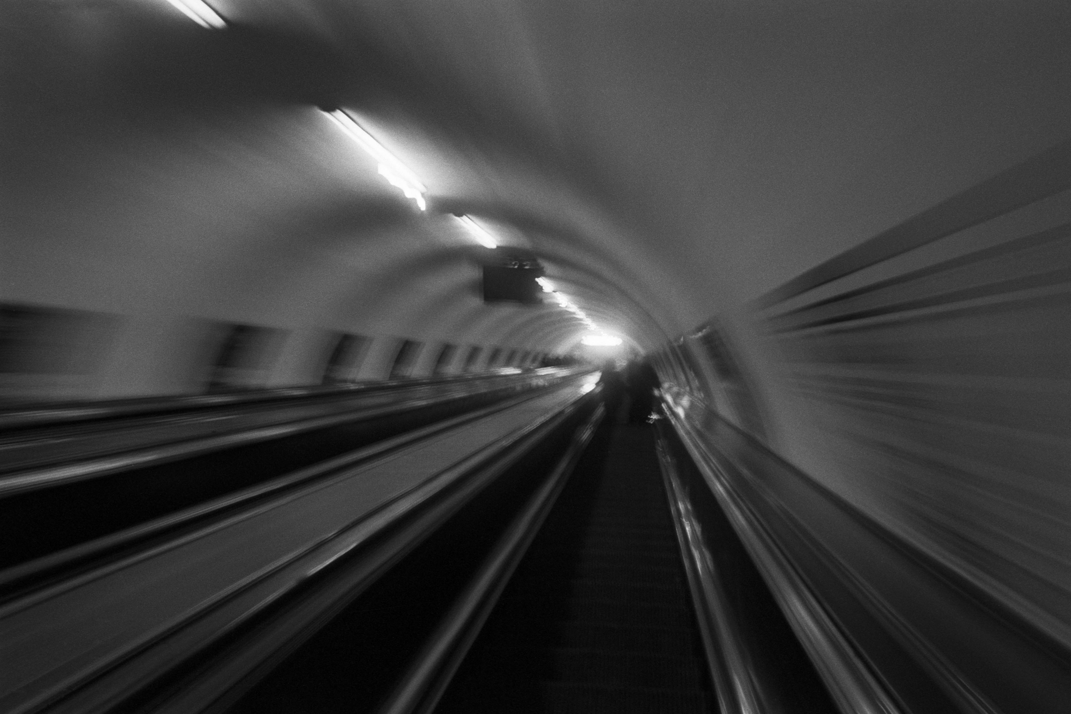
The Wall
2015Winner of the 1st prize & Golden Glass Award at the 11th Photographic Open Championship Olsztyn, and 1st place with the Special Prize of FORMAT magazine at the 3rd Biennial of Art in Piotrków Trybunalski.
View Series →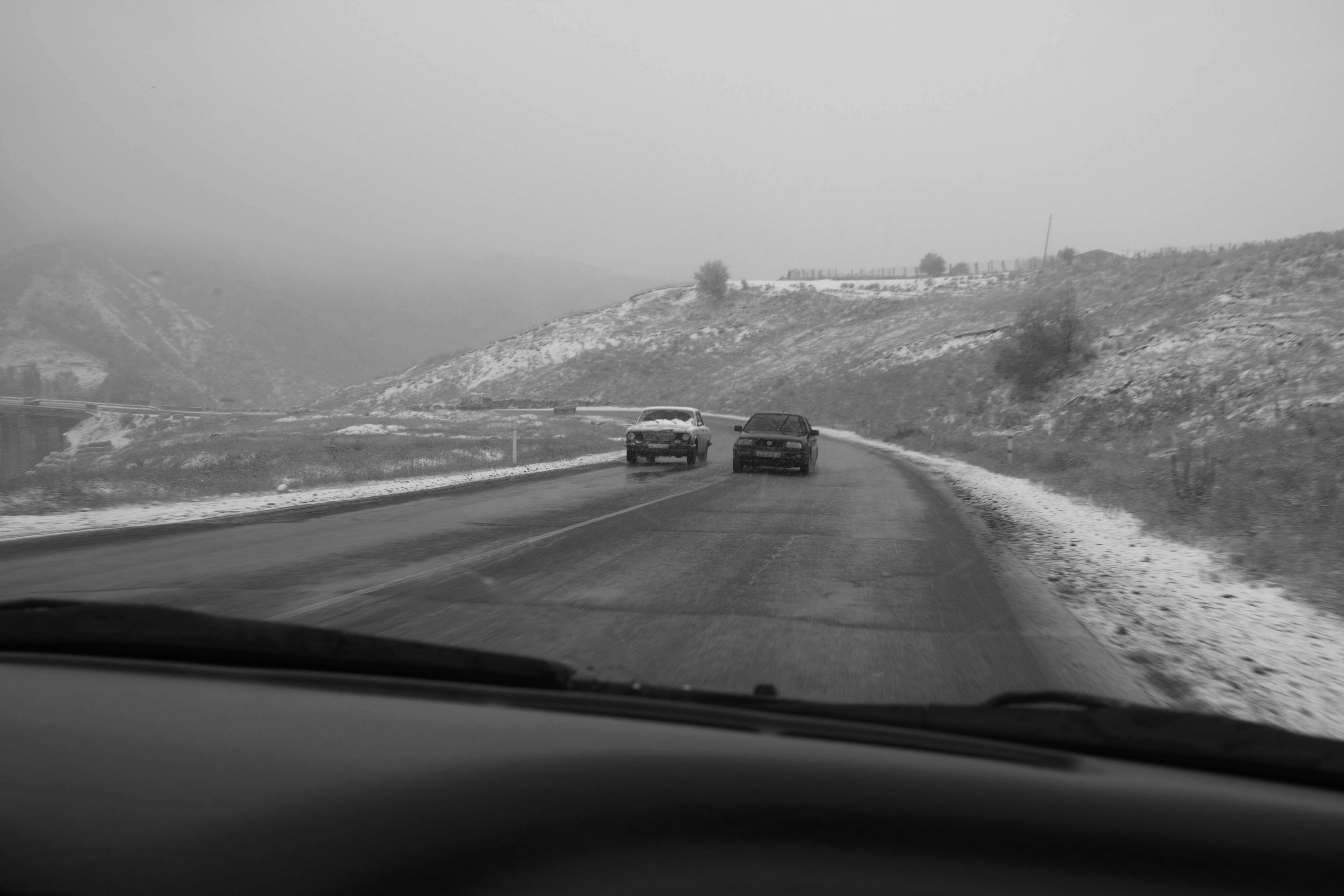
An Engagement Ring
2011A narrative series set in Wrocław in August 2011. Awarded 2nd prize & Silver Glass at the 10th Photographic Open Championship Olsztyn in 2014.
View Series →
Heat Wave
2014A documentary series recording spontaneous events across August and September 2014, capturing the raw energy of a city under the grip of summer.
View Series →