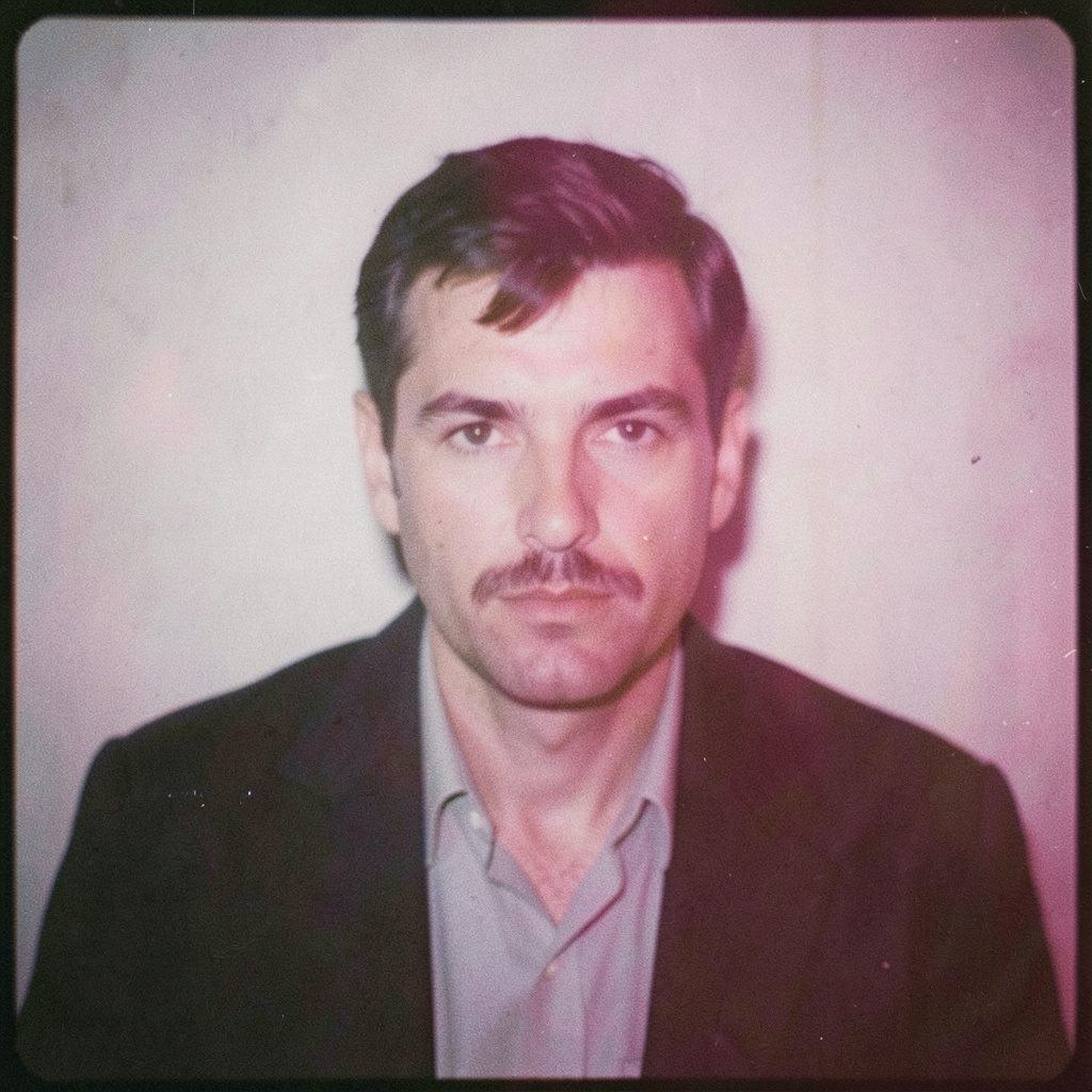
"Photography is not about the thing photographed. It is about how that thing looks photographed."
Crafting a Cohesive Photography Portfolio That Holds Together
A photographer's hard drive is rarely the place where a portfolio actually lives. The real portfolio is the curated sequence of images that survives the cutting room floor and reaches a viewer. Even an extensive archive of technically excellent frames can feel scattered when assembled without intention. What separates a memorable body of work from a digital stack is the editorial thinking that binds the pictures together.
Curation is, at its core, a series of decisions about what belongs and what does not. For photographers working between commercial commissions and personal projects, the temptation to include everything that worked on a single shoot often undermines the overall reading experience. A cohesive portfolio behaves like a short film or a song album: each image carries the next, and the whole sequence speaks louder than any single frame. In a market as visually saturated as Australia's, where Sydney and Melbourne host most editorial offices and gallery openings, that cohesion becomes a competitive advantage rather than a stylistic luxury.
Finding the Through-Line of Your Body of Work
Before a single image is selected, the curator needs a through-line, a single quality that runs through the work and gives it identity. This might be a recurring subject matter, a consistent palette, a recurring compositional habit, or a particular mood the photographer keeps returning to without forcing it. For portrait and fashion photographers, the thread often appears as a specific way of posing, lighting, or directing subjects. For those working on conceptual series, the thread tends to be thematic, tied to a question the photographer keeps exploring across shoots and locations.
Studying a wide body of earlier work reveals patterns that are rarely obvious mid-project. A spreadsheet, a print contact sheet, or simply laying every candidate image on a long studio table helps the eye recognise clusters and outliers. Australian photographers with access to local peer groups, whether through the Australian Centre for Photography's programming in Sydney or a casual critique night in a Brisbane studio, often find that outside eyes spot these threads faster than the maker can. The through-line is rarely declared loudly. It usually whispers, and the curator's job is to listen for it.
Editing With Ruthlessness and a Steady Rhythm
Editing is the most generous act of photography, because it removes the photographer's least favourite task: choosing between favourites. A workable rule is to start by cutting every image that does not contribute to the chosen thread, then cut again from what remains, then cut once more. Three rounds of progressive reduction usually produce a tight selection where every frame earns its place. Australian photographers preparing submissions for festivals such as Head On Photo Festival in Sydney, or for editorial features in Capture Magazine, know that juries respond to confident editing far more than to exhaustive submissions.
Rhythm matters as much as content. A portfolio made entirely of high-intensity, high-contrast frames exhausts the viewer. A sequence that alternates quieter, more contemplative images with stronger ones allows the eye to rest and return. Thinking in terms of breath, the way a musician phrases a melody, keeps the portfolio alive. Viewing the sequence away from the screen, ideally as small inkjet proofs on a pinboard, exposes pacing problems that a monitor hides. The eye behaves differently when it scans twenty thumbnails at once than when it lingers on a single print at arm's length.
Sequencing Images for Visual Storytelling
Once the edit is final, sequencing takes over. A photograph at the start of a sequence carries a special responsibility: it sets tone, signals genre, and gives the viewer permission to enter. A photograph at the close carries equal weight, leaving a final impression that lingers after the page turns. Between those anchors, transitions should feel inevitable rather than arbitrary. A wide establishing frame often benefits from being followed by a tighter, more intimate shot, while a colour frame reads differently depending on whether the previous image was monochrome or saturated.
Diptychs and triptychs can act as punctuation, but used too often they break the narrative into fragments. Treating the sequence as a continuous flow, where each image borrows something from the one before and lends something to the one after, produces a portfolio that holds together even when viewed out of order. Galleries in Melbourne's laneway precincts, where pop-up exhibitions have become part of the cultural rhythm, often hang emerging photographers' work in tight salon-style arrangements. Studying how those curators mix scale, subject and palette informs how a flat digital sequence might be reconsidered on screen or in print.
Balancing Genre, Mood and Post-Processing
Cohesion does not require homogeneity. A portfolio that moves between colour and black and white, between location and studio, between documentary and constructed imagery, can still feel unified if the underlying mood remains steady. What breaks cohesion is inconsistency in post-processing: a portfolio in which one image looks heavily graded in teal and orange, the next looks like a faded analogue print, and the third looks like a forensic documentation shot. Picking a processing language and applying it across the entire selection is a faster route to unity than trying to make every image look identical.
For photographers working with both analogue and digital workflows, the choice is between embracing the visible differences between formats or smoothing them out. Black-and-white film work naturally reads differently from digital monochrome files, even when printed on the same paper. A practical approach is to group images by process, rather than mixing silver gelatin prints with heavily manipulated digital composites throughout the sequence. Australian fashion photographers working between Sydney and Melbourne often keep separate portfolio sections for analogue personal projects and digital commercial work, rather than weaving them into one stream. That separation protects the integrity of each body of work while still signalling a single authorial voice.
Reading Your Audience and the Local Market
A portfolio is not a single object. The selection shown to a gallerist preparing a solo show will differ from the selection sent to a creative director briefing a campaign, even when the photographer is the same person. Knowing the audience shapes both the edit and the sequencing. Editorial buyers in Sydney tend to look for strong storytelling and contemporary style; commercial clients in Brisbane's growing brand sector often prioritise flexibility and consistent lighting across multiple setups; arts programmers in Perth or Adelaide may favour longer, more contemplative series with a clear conceptual core.
The Australian commercial market rewards versatility within a defined style. Photographers who shoot both fashion and business portraiture, for example, often maintain two portfolio tracks: a fine-art track for galleries and festivals, and a commercial track for agencies and brands. The shared visual language keeps both recognisable as the work of the same photographer, while the image selection serves each context. Chatting with peers at industry events, asking what kind of work they are currently booking, and reading between the lines of job briefs gives a clearer sense of what local decision-makers respond to at any given moment. A portfolio that ignores its audience quickly reads as self-indulgent, no matter how strong the individual frames.
Presentation Details That Carry Weight
How a portfolio is shown matters as much as what it contains. For online viewing, file sizing, compression, and aspect ratio consistency across the sequence prevent jarring jumps between frames. A square crop on one image and a panoramic crop on the next, even when both look fine in isolation, can read as sloppy when placed side by side. For print, paper choice, framing consistency, and edition size all communicate something about the photographer's seriousness. A portfolio that mixes matte cotton paper with glossy resin-coated prints suggests two different projects rather than one body of work, even when the images themselves are strong.
Negative space on the page or screen also belongs to the portfolio. Crowding too many small images into a single contact-sheet style layout dilutes the impact of the strongest frames. Letting a single image breathe, surrounded by generous white space, signals confidence in the edit. In Australian galleries, particularly those working with established mid-career photographers, hanging decisions tend to favour generous spacing, and that same restraint translates well to a digital presentation. No single technical detail will rescue a poorly edited portfolio, but consistent presentation protects the integrity of a well-edited one and rewards the time already spent on selection.
Refreshing the Portfolio Without Losing Identity
A portfolio is never finished. New projects demand entry, dated work quietly loses relevance, and an audience's expectations shift with cultural mood. The temptation during a refresh is to swing the work in a new direction, chasing trends or chasing the kind of imagery that landed a peer a recent commission. The stronger move is to evolve from within the established through-line, introducing new threads that connect to what already exists rather than replacing the spine. Identity built over years of consistent editing is harder to rebuild than it is to extend.
A practical rhythm is to review the full portfolio once or twice a year, removing images that no longer represent the current direction, archiving older projects into a separate section for interested viewers, and rotating in recent work that fits the established tone. Keeping an archive of every project, fully edited but ungated, allows the photographer to respond quickly to unexpected opportunities without scrambling. Australian photographers who show work at festivals like Head On, or contribute to group shows in regional centres from Fremantle to Hobart, often find that audiences return to a portfolio over months rather than days. A slow rotation strategy rewards that patience and keeps the body of work feeling alive rather than fossilised.
Practical Steps for a Cohesive Final Edit
- Lay every candidate image on a long surface, in person if possible, and step back to see the whole rather than the parts.
- Identify the thread you keep returning to and remove anything that does not serve it, however strong on its own.
- Sequence with a clear opener and a strong closer, then test the flow by reversing the order to expose weak transitions.
- Match post-processing language across the entire selection, including any black-and-white and analogue work, so the eye reads it as one body of work.
- Show the sequence to a trusted peer, then revise once based on what they noticed and once based on what they missed.
Selected Series
A cross-section of commissioned and personal projects spanning fine art, commercial, and conceptual work.
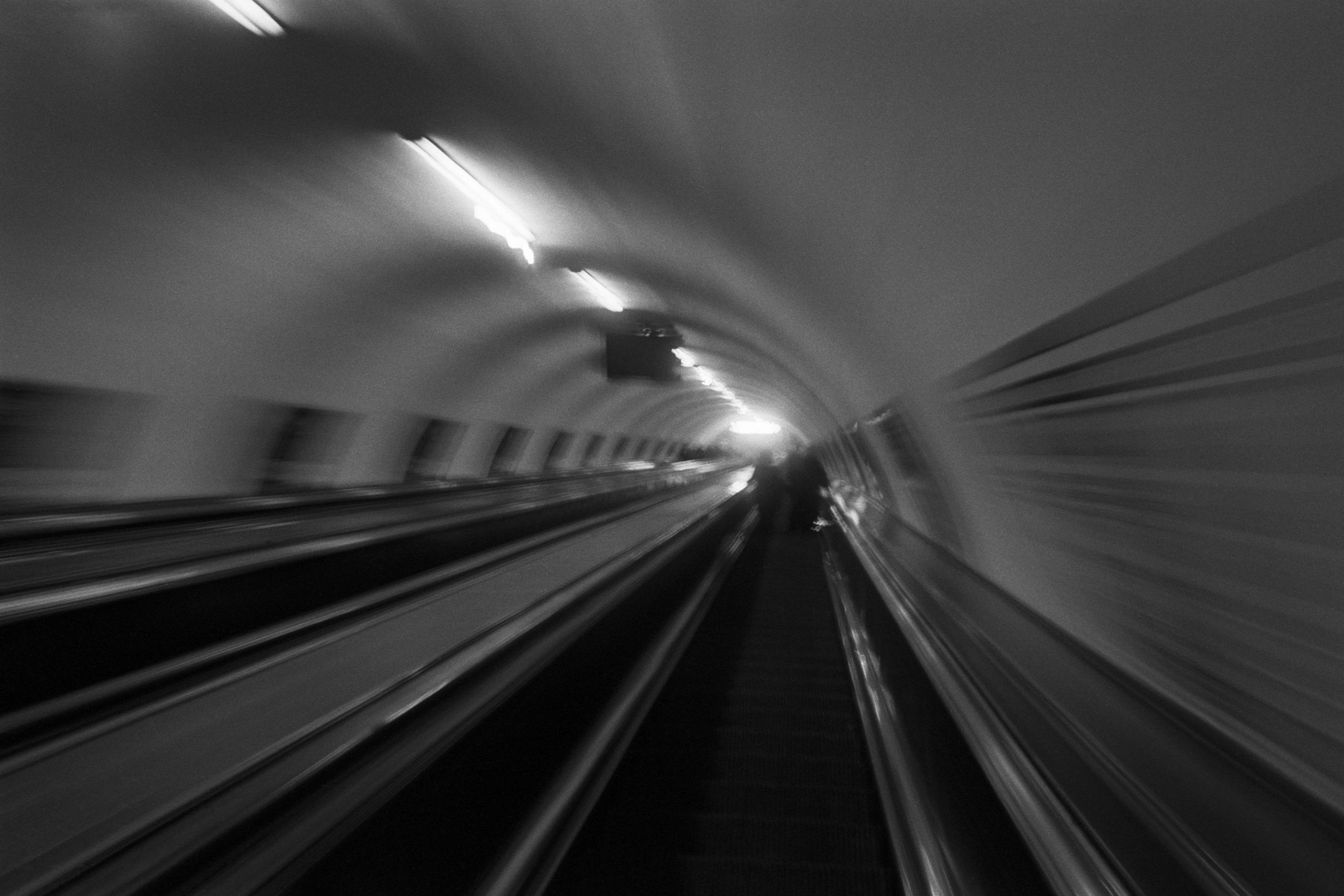
The Wall
2015Winner of the 1st prize & Golden Glass Award at the 11th Photographic Open Championship Olsztyn, and 1st place with the Special Prize of FORMAT magazine at the 3rd Biennial of Art in Piotrków Trybunalski.
View Series →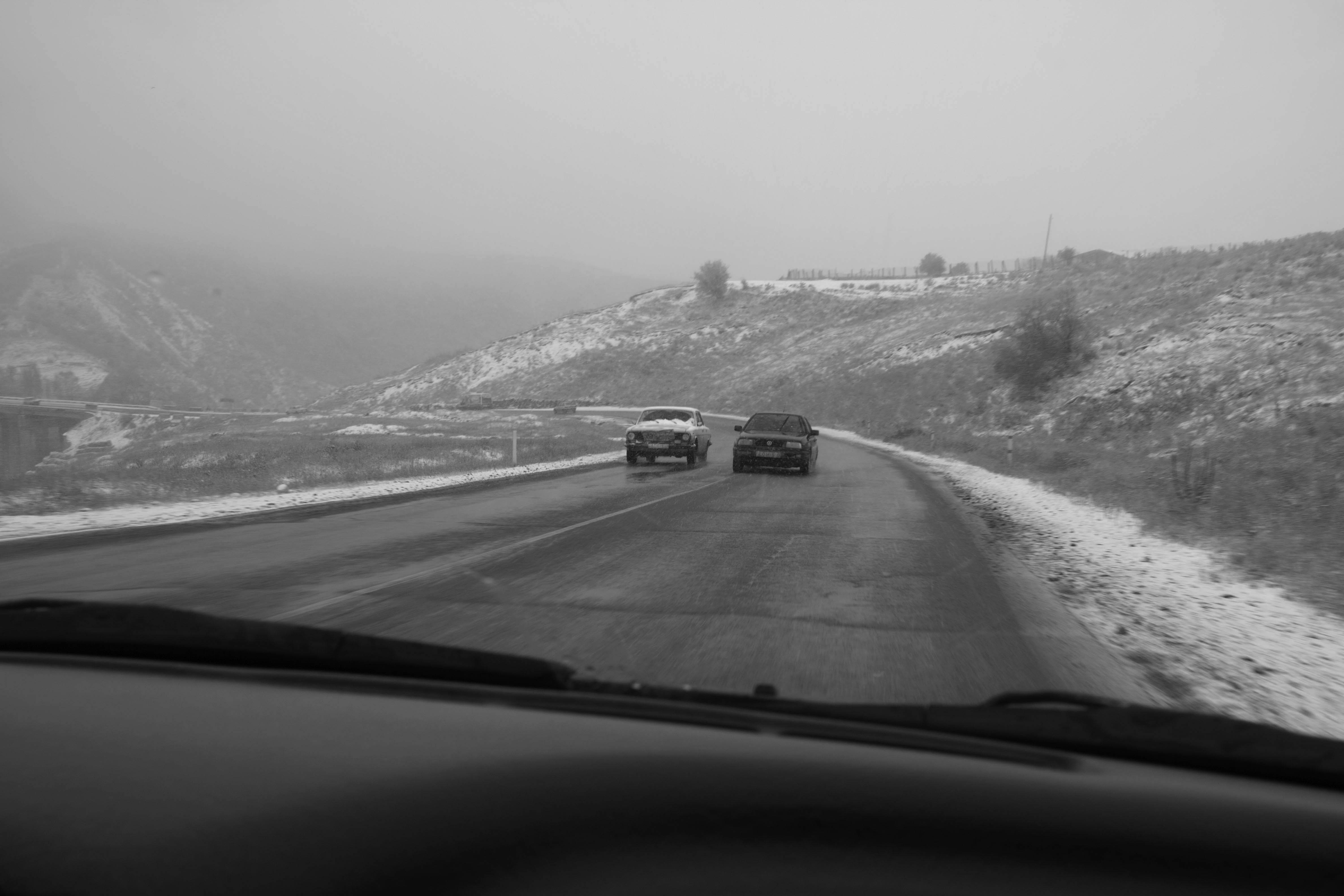
An Engagement Ring
2011A narrative series set in Wrocław in August 2011. Awarded 2nd prize & Silver Glass at the 10th Photographic Open Championship Olsztyn in 2014.
View Series →
Heat Wave
2014A documentary series recording spontaneous events across August and September 2014, capturing the raw energy of a city under the grip of summer.
View Series →