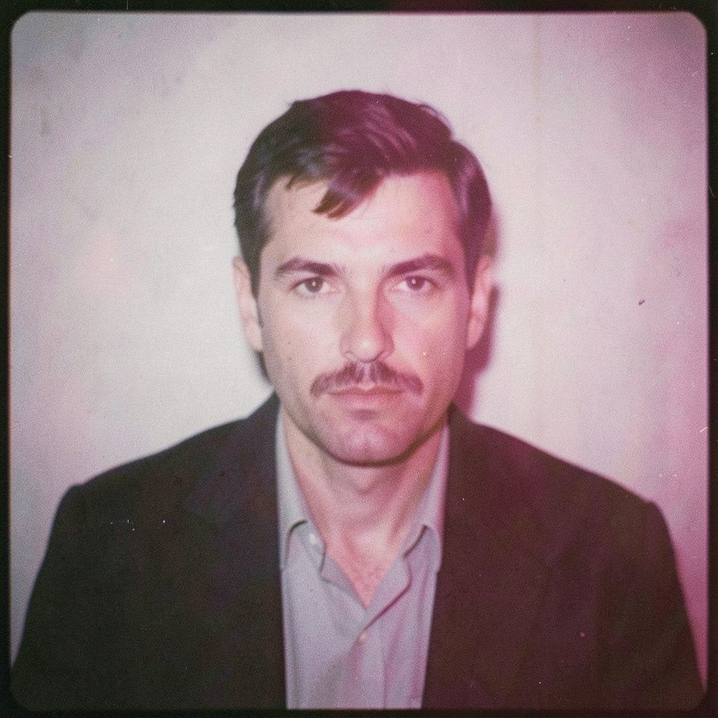
"Photography is not about the thing photographed. It is about how that thing looks photographed."
An Interview with a Photographer About Artistic Influences
Rafal Michalak’s photographs occupy a space between observation and invention. His portraits can feel direct and quietly psychological, while his conceptual series invite a slower reading through texture, gesture, shadow and absence. Based in Wrocław, Poland, he works across fine art and commercial photography, bringing together medium-format cameras, black-and-white film, analogue processes and carefully controlled digital production.
In this conversation, Michalak reflects on the artists, materials and visual experiences that have shaped his practice. He discusses why the darkroom remains important in an age of instant images, how fashion and business portraiture can share a common language, and what happens when a commissioned photograph is approached with the attention usually given to a personal project.
For Australian viewers, his approach offers a useful counterpoint to the fast-moving visual culture of Sydney, Melbourne, Brisbane and Perth. Whether a photograph is made for an annual report, a fashion label, an event or a gallery wall, Michalak believes its strength depends on the relationship between intention and presence.
The first image I remember
What first drew you towards photography?
I was fascinated by the way a photograph could make an ordinary moment feel charged. It was not necessarily a dramatic scene. Sometimes it was a face turned slightly away from the camera, a room after somebody had left, or light falling across a wall. Photography gave these details a kind of permanence without explaining them completely.
My early interest was shaped by curiosity rather than a clear career plan. I wanted to understand why some images stayed in my mind while others disappeared almost immediately. That question still guides me. I am interested in atmosphere, but atmosphere is never enough on its own. There must be tension, a human decision, or a visual uncertainty that keeps the viewer involved.
Were you influenced by particular photographers at that stage?
I looked at many different traditions: documentary photography, fashion editorials, portraiture and experimental photographic books. The names mattered, but the larger lesson was that a photographer can develop a recognisable voice without using the same subject every time. A portrait, an abstract detail and a staged image can belong to one practice if they share a way of looking.
I was also influenced by cinema, painting and architecture. The composition of a film still, the restraint of a monochrome painting or the proportion of a doorway can affect how I frame a person. Artistic influence is rarely a single direct line. It is more like a collection of impressions that gradually becomes visible in the work.
Learning from the darkroom
What does analogue photography give you that digital photography does not?
Film slows down the act of taking a photograph. That delay encourages concentration. With a medium-format camera, each frame carries a physical and financial decision, so I pay closer attention to the arrangement of hands, the direction of light and the emotional temperature of the scene. I do not want to make fewer photographs simply for the sake of discipline; I want each exposure to have a reason.
The darkroom adds another form of concentration. A negative is not the finished image. Printing involves choices about contrast, exposure, paper and the balance between detail and shadow. Even when I work digitally, I often think through those principles. I ask where the eye should rest, which areas should remain quiet and how much information the photograph really needs.
Does this process affect your commercial assignments?
Very much. A business portrait may need to communicate confidence, approachability or authority within a few seconds, yet it should still feel like a portrait of a person rather than a generic corporate image. Analogue thinking helps me search for the essential gesture. The final file may be digital, but the process behind it can remain tactile and deliberate.
This is relevant to the Australian market, where a portrait might appear on a law firm’s website in Sydney, a technology company’s profile page in Melbourne or a leadership report produced in Brisbane. Clients need images that function clearly across screens and publications, but clarity does not have to remove character. A controlled tonal range and an attentive relationship with the subject can make a professional image feel more human.
Why black and white still speaks
What attracts you to black-and-white photography?
Black and white removes one layer of information, but it does not make an image simpler in every sense. Without colour, the viewer becomes more aware of texture, tonal transitions, shape and expression. A shadow can become architectural. Skin can become a map of light. A white shirt may merge with the background or separate from it depending on the smallest shift in exposure.
I also appreciate the emotional ambiguity of monochrome. Colour often tells us how to interpret a scene: warm, cold, festive, clinical or natural. Black and white leaves more room for the viewer’s own response. It can feel historical, though I am not interested in using monochrome merely to create nostalgia. For me, it is a contemporary tool for directing attention.
How do you decide whether an image should be monochrome or colour?
The decision usually begins with the subject’s internal rhythm. If colour adds information about place, material or mood, I keep it. If it distracts from the relationship between figure and space, I consider removing it. In fashion photography, colour may be central to the identity of a garment. In a conceptual series, the absence of colour may allow the idea to become more open.
Australian light has its own visual associations, from the hard brightness around Perth to the softer shifts seen along parts of the Victorian coast. I would not try to imitate those conditions from a distance. If I were photographing in Australia, I would first observe how people use shade, interiors and outdoor space, then let the location influence the work rather than forcing it into a preconceived style.
Between portrait and performance
Your portraits often feel carefully staged. How much is directed?
Every portrait contains a degree of direction, even when the photographer claims to be doing nothing. Choosing the location, lens, distance and moment already shapes the result. I prefer to make that process transparent. I speak with the subject, establish a shared purpose and then look for the point at which their natural behaviour becomes visible within the constructed setting.
The strongest portrait is rarely the most polished expression. It may be a pause, a slight tension in the shoulders or a moment when the subject stops presenting an answer. That is why time matters. People need to move beyond the first version of themselves they offer to the camera.
How does this translate into fashion and event photography?
Fashion photography allows more artifice, but it still depends on collaboration. Clothing, styling, movement, background and light must support one another. I am interested in images where the model is not simply displaying an outfit but inhabiting a mood. The picture should communicate something about attitude and presence as well as fabric.
Events require a different kind of awareness. The photographer must respond quickly to changing light, crowded spaces and unpredictable interactions. In Melbourne, for example, an exhibition opening may move between a gallery interior, a laneway and a crowded reception area within one evening. I look for gestures that reveal the character of the gathering rather than trying to document every person equally.
Influences beyond photography
Which other art forms continue to shape your visual language?
Painting has taught me to respect the edge of a shape and the silence around it. Some paintings hold the viewer through an almost physical balance between empty and occupied space. That principle is important in photography because a background is never truly empty. A wall, curtain, pavement or patch of sky affects the subject even when it appears visually quiet.
I am also drawn to handwriting, lettering and the evidence of the human hand. Marks carry pressure, rhythm and hesitation. They can suggest a person before the words are understood. Exploring ink-based lettering offers a useful reminder that line quality can hold emotion, particularly when the material responds unpredictably to the maker.
Do these influences appear directly in your conceptual series?
Sometimes they appear through materials, but more often they appear through structure. I may use repetition, erasure, a restricted palette or a deliberate interruption in the frame. These methods create a visual grammar that can suggest memory, identity or instability without illustrating those ideas literally.
I am interested in the boundary between what a photograph records and what it invents. A staged image can contain genuine feeling, while a documentary image can be shaped by countless decisions. Rather than treating those categories as opposites, I use them as points on a spectrum. The important question is whether the image creates a convincing relationship between its elements.
Working across borders and briefs
How do you balance a personal vision with a client’s needs?
A commission begins with listening. I need to understand what the client wants the image to do, where it will appear and what sort of response it should create. A campaign image, an executive portrait and a gallery series each require different forms of communication. My role is not to impose one visual solution on every situation.
At the same time, a photographer’s perspective is part of the value of the commission. Clients usually approach me because they respond to the way I use light, space and restraint. I try to protect those qualities while adapting them to the purpose. A strong brief gives enough structure to make decisions and enough trust to allow discovery.
What have you learned from working with different audiences?
People often describe photography as a universal language, but viewers bring local expectations to an image. In Australia, a corporate portrait may need to feel less formal than an equivalent image for a traditional European institution. A Sydney agency may favour directness and energy, while an Adelaide cultural organisation may respond to a quieter, more contemplative tone. These are not fixed rules, but they are useful starting points.
The practical side matters as well. Australian clients may need photographs prepared for LinkedIn, media releases, annual reports, outdoor advertising and social platforms, often within one project. The photographer must understand delivery requirements without allowing technical decisions to dominate the creative process. I see consistency, preparation and communication as part of the artistic service.
What remains after the frame
What do you hope viewers take from your photographs?
I do not expect every viewer to identify the original intention. An image should have enough structure to reward attention, but it should not close down interpretation. I want people to feel that they have encountered a person, object or space with a little more intensity than they expected.
That intensity can be quiet. It may come from a look, a folded garment, a dark corner or the unusual distance between two figures. Photography does not need to be loud to be memorable. Sometimes an image stays with us because it leaves a small unresolved space in the mind.
How should someone approach a photographic series or commission?
I recommend looking first, before searching for an explanation. Notice what catches your eye, where the image feels balanced and where it becomes uncomfortable. Then consider the technical choices: the format, tonal range, depth of field and relationship between subject and background. These choices often reveal the photographer’s priorities.
For clients, the same attention can make collaboration more productive. A business portrait becomes stronger when the setting, clothing and intended audience are discussed as part of the image rather than treated as separate details. For collectors and gallery visitors, a series can be understood through repetition and variation: what changes from frame to frame, and what remains constant.
Ways to engage with the work
- Spend time with the full frame before focusing on the subject’s face or central object.
- Compare colour and black-and-white images for differences in mood, texture and visual emphasis.
- Read the biography and project notes alongside the photographs, while leaving room for your own interpretation.
- For a commissioned portrait, define the intended audience and usage before discussing style.
- Revisit a photographic series after a pause; quieter details often become more visible with distance.
Selected Series
A cross-section of commissioned and personal projects spanning fine art, commercial, and conceptual work.
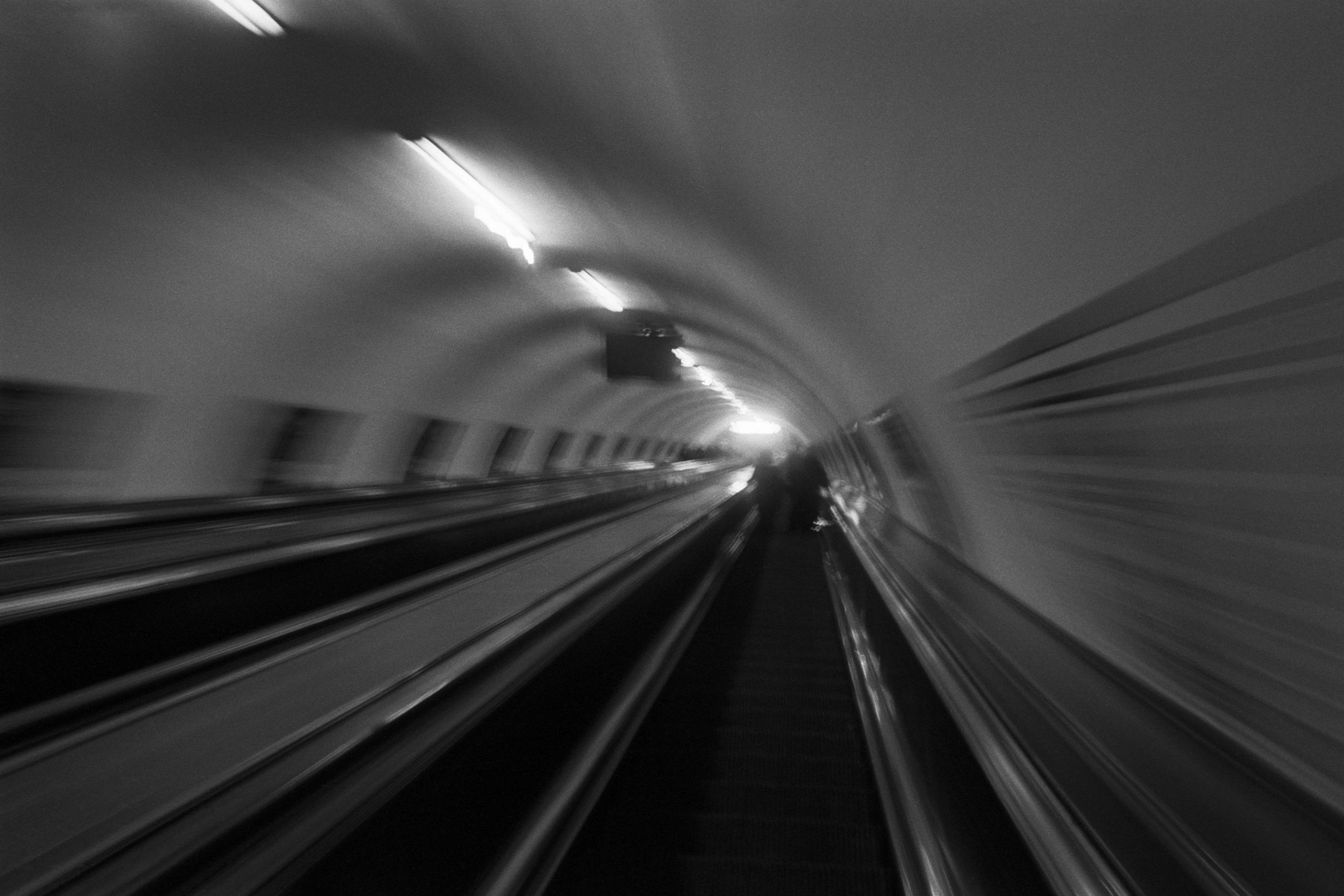
The Wall
2015Winner of the 1st prize & Golden Glass Award at the 11th Photographic Open Championship Olsztyn, and 1st place with the Special Prize of FORMAT magazine at the 3rd Biennial of Art in Piotrków Trybunalski.
View Series →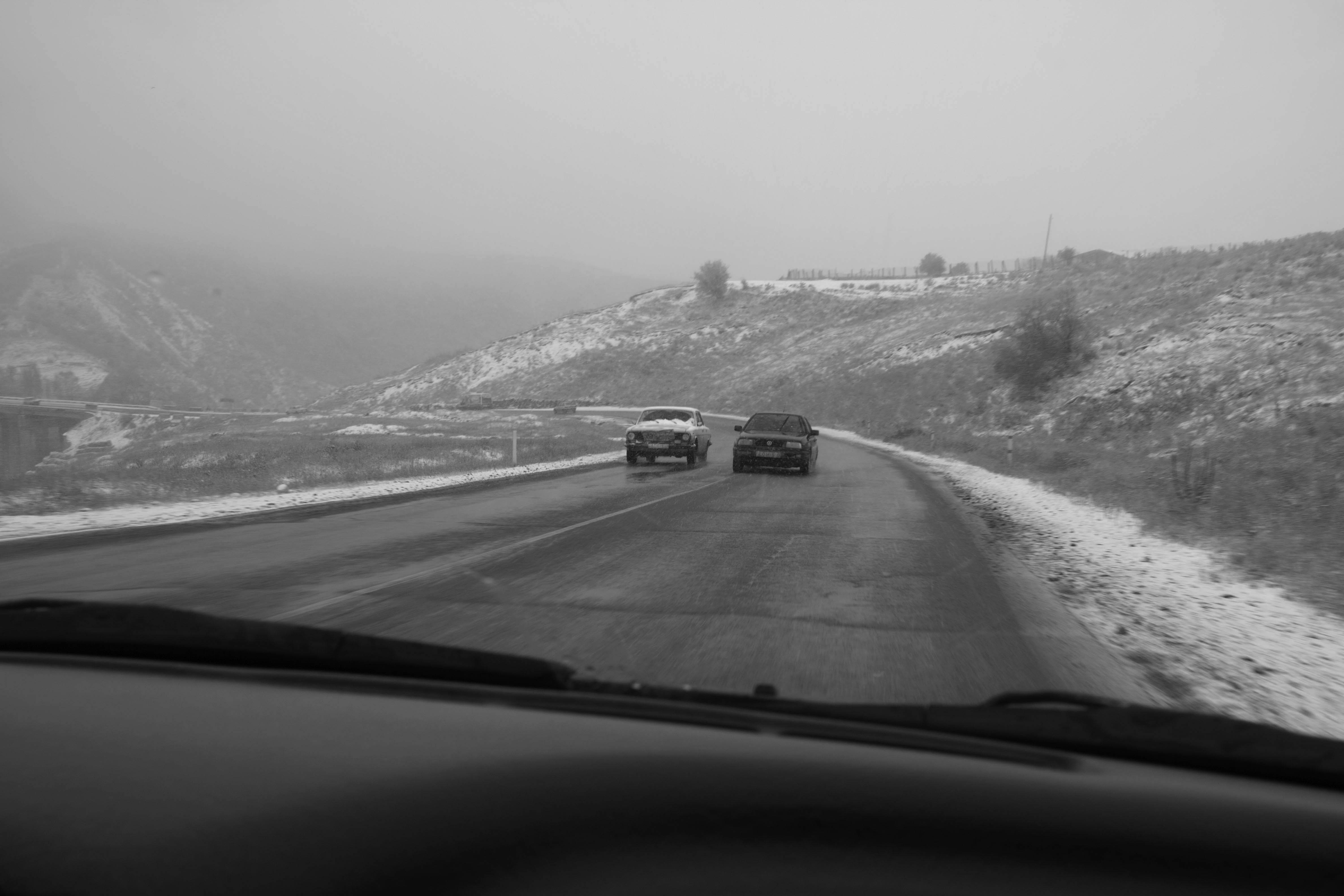
An Engagement Ring
2011A narrative series set in Wrocław in August 2011. Awarded 2nd prize & Silver Glass at the 10th Photographic Open Championship Olsztyn in 2014.
View Series →
Heat Wave
2014A documentary series recording spontaneous events across August and September 2014, capturing the raw energy of a city under the grip of summer.
View Series →