
"Photography is not about the thing photographed. It is about how that thing looks photographed."
Photographing Textures for Abstract Fine Art Prints
A weathered wall can become a landscape when the camera moves close enough to separate grain from subject. For fine art photography, that shift from recognition to sensation is where an ordinary material starts to operate as an abstract image. Award-winning photographer Rafal Michalak approaches this transition through a Wrocław-based practice combining medium-format cameras, black-and-white film, darkroom thinking and controlled digital workflows. The resulting photographs invite prolonged looking rather than quick explanation.
His city is a strong source of material stories. Wrocław’s repaired façades, postwar concrete, brick courtyards and working workshops show how surfaces carry memory: scratches soften paint, repairs interrupt brickwork and shadows collect in seams. For a conceptual photographic series, these details become the vocabulary, with scale, edge and tonal contrast doing expressive work that colour or narrative might carry elsewhere. Local surroundings provide starting points, not limits on where the work can travel.
The same attention supports his commercial photography in business portraits, fashion and events, where tactile surroundings can strengthen a visual identity. A tailored jacket against ribbed concrete introduces a precise material relationship without distracting from the person. For Australian clients, this language is adaptable because it rests on observation rather than a landmark. A Melbourne café, a Sydney warehouse or a domestic interior can become a setting whose force comes from light, texture and balance.
Making an abstract fine art print is a sequence of decisions rather than an effect added at the end. The surface needs a camera position, light and an exposure; the negative or file then needs a print process that preserves its character. Understanding that chain helps buyers distinguish a polished digital image from a photograph shaped through deliberate exposure, editing, paper and tonal control. It also makes each edition more than a reproduction of a file.
Finding a Visual Vocabulary in Everyday Surfaces
Begin with material behaviour rather than a predetermined picture. Raking light reveals the raised fibres of paper, while frontal light flattens them. Rust creates irregular blooms, terrazzo distributes fragments and corrugated iron establishes repeating ridges. Looking for these differences produces a library of visual motifs: fracture, erosion, sheen, grain, condensation and the geometry of construction. Each offers a different balance of order and accident, useful when developing a cohesive body of work.
In Australia, that survey can happen during ordinary movement rather than through a dedicated expedition. A walk to a local market may reveal painted timber, stacked crates and waxed floors. Public transport exposes brushed metal, scratched acrylic and pale plastic seats. Coastal walks may bring salt-bleached wood, dark basalt and smooth pebbles, while a suburban kitchen offers terrazzo, glazed tiles and worn worktops. These everyday surfaces are neither exotic nor insignificant; their familiarity gives abstract images an indirect connection to daily life.
Wrocław offers another useful counterpoint. Paths beside the Oder, older tenements and workshops carry a different patina from Sydney sandstone or Melbourne bluestone, yet both cities reward close attention. Instead of copying a landmark, the photographer can isolate one relationship: warm timber against cool metal, a bright edge cut by deep shadow, or translucent material layered over rough plaster. Such pairings create tension through texture and keep the series grounded in place without relying on obvious tourism.
Shaping Light and Surface with the Camera
Texture depends on the direction and softness of illumination. Side light skims across a surface and exaggerates relief; diffuse light reveals broader tonal fields; a narrow beam can isolate a fragment within a darker frame. A black card creates a clean gradient, whereas a white reflector lifts shadow detail without erasing its density. Measured separation between highlights, midtones and blacks gives the finished print room to breathe.
Medium-format and full-frame digital cameras offer the resolution needed for close studies, but resolution alone does not guarantee an expressive image. A 90–120mm macro lens or a bellows camera allows a field of view narrow enough to remove most literal context. Focus is critical at that scale, so a tripod, careful depth-of-field control and a bracketed series can preserve both grain and ridge. For work involving several planes, focus stacking can extend clarity, provided the source files retain enough detail for the intended print size.
Analogue film adds another layer of response. Fine-grain black-and-white emulsions can give concrete a sculptural weight, while colour transparency stock may render wet pavement, oxidised copper or varnished wood with unexpected shifts. Reflected light and flare become part of the image when handled deliberately, though a circular polariser should be used sparingly because it can remove the reflective cues that make a surface vivid. Exposure tests, rather than a single meter reading, reveal how each material behaves.
Developing Texture Studies from Negative to Screen
The darkroom provides useful discipline even when the final edition is printed digitally. Contact proofs and test strips establish a tonal hierarchy before judgement reaches a large sheet. Dodging and burning can hold detail in reflective highlights or deepen a textured shadow; careful development can preserve separation in dense blacks. In a digital workflow, the same decisions occur through calibrated monitors, exposure bracketing and controlled contrast curves. The tool changes, but responsibility for a full tonal range remains.
Scanning should match the photograph’s intended use. A high-resolution scan retains enough information for a large cotton-rag print, while a smaller scan may suit a compact edition or framed group. Colour-managed workflows help prevent shifts in muted greys, deep browns and cool blues, especially where subtle material differences carry the composition. It is useful to work from a calibrated reference rather than an unadjusted screen, then compare the digital proof with the test print under neutral light.
Editing should clarify the visual idea rather than decorate it. Straightening a diagonal may strengthen the composition; reducing colour noise may reveal a cloud of mineral-like grain; a restrained crop can turn a patch of shadow into a broad field. Black-and-white conversion deserves particular care because texture often depends on delicate luminance differences that disappear when channels are pushed too aggressively. The finished file should still feel like evidence of a photographed surface rather than a synthetic texture assembled from effects.
Printing and Preserving the Final Work
The print process gives the image its physical scale and tactile character. Archival pigment inks on museum-grade cotton rag produce a matte surface that holds fine grain without forcing gloss onto the subject. A deep black paper can lend density to a charcoal study, while warmer white stock changes the emotional register of a pale wall or oxidised metal. Selection of size, border and mount should follow the image’s internal rhythm, allowing enough surrounding space for a dark passage to remain dark rather than appearing crowded.
Limited editions make the decisions visible. Each print is produced to a stated edition size, inspected, numbered and signed, with its title, year and medium documented. An edition represents a commitment to consistent materials and quality. A certificate of authenticity can accompany the numbered work, giving collectors a clear record for comparison, insurance and future resale.
Framing and placement matter in Australian interiors, where strong daylight can reveal paper tone and surface texture quickly. UV-filtering glazing, archival mounts and spacing from the glazing help protect a work without flattening its depth. In humid regions such as Brisbane, stable framing materials and controlled storage are sensible, while salt-laden air near the coast adds another reason to choose durable materials and monitor condition. The frame should protect the print and respect its scale, not compete with the abstract composition inside it.
Connecting Texture Photography with the Australian Market
Sydney and Melbourne have established audiences for limited-edition photography through independent galleries, design stores, architecture practices and curated online collections. Buyers often compare how a photograph lives at home with how it reads on a gallery wall, so paper, aluminium and canvas formats can suit different settings. A restrained palette may sit easily beside neutral Australian interiors, while a concentrated field of colour can become a focal point in a busy room. Scale, finish and framing therefore belong to the artistic discussion rather than the delivery process.
The commercial framework needs equal care. Under the Copyright Act 1968, the photographer normally retains copyright unless it is assigned, and moral rights generally remain with the author. Owning a physical print does not itself grant rights to reproduce it commercially. For consumer purchases, the Australian Consumer Law provides guarantees that cannot simply be excluded, so descriptions of materials, condition and edition size must be accurate. GST should be clearly included or added in Australian quotations, with freight, insurance and customs treatment explained.
Prints shipped from Poland can also attract GST on low-value imported goods, generally where the value is A$1,000 or less, while customs treatment depends on classification. A transparent checkout should distinguish the sale price from charges collected for freight and import. Where a gallery or stockist sells the work, written consignment terms should cover commission, payment timing and responsibility for transit damage. These practical details matter to Australian buyers comparing a local gallery purchase with an international studio. The final effect still rests on the image itself: the tension between a material surface and the open field of the photograph invites sustained attention, even when the work first appears almost impersonal.
Selected Series
A cross-section of commissioned and personal projects spanning fine art, commercial, and conceptual work.
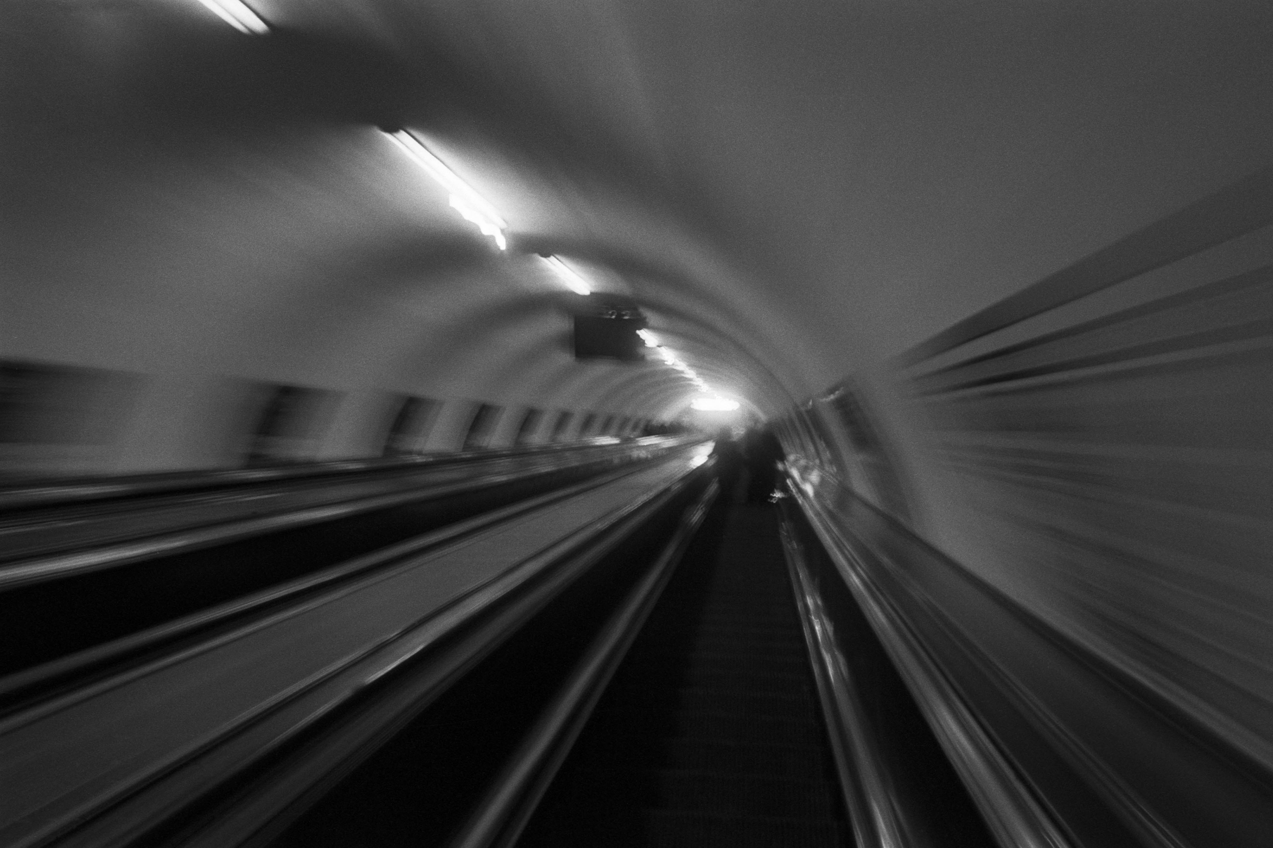
The Wall
2015Winner of the 1st prize & Golden Glass Award at the 11th Photographic Open Championship Olsztyn, and 1st place with the Special Prize of FORMAT magazine at the 3rd Biennial of Art in Piotrków Trybunalski.
View Series →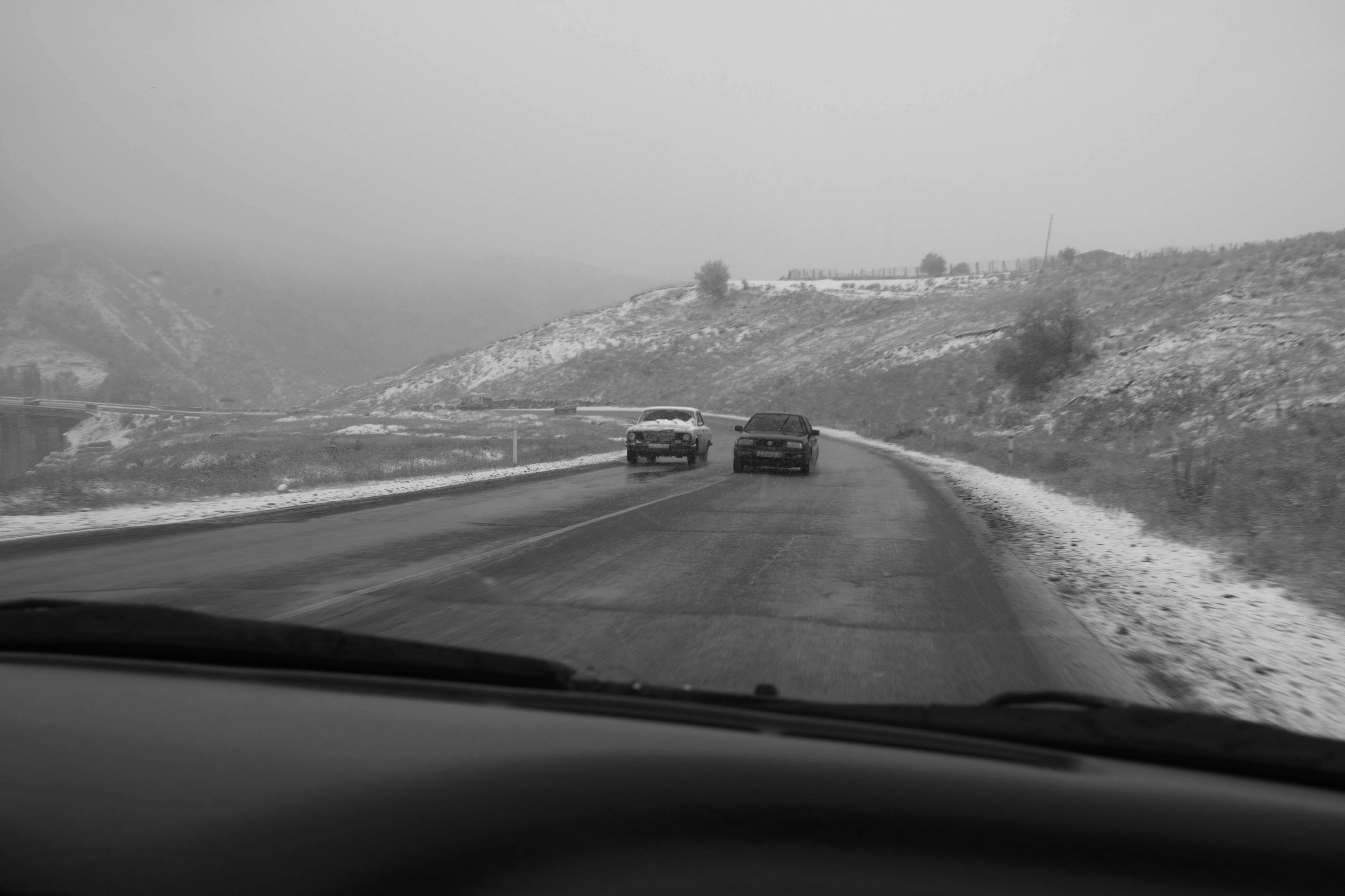
An Engagement Ring
2011A narrative series set in Wrocław in August 2011. Awarded 2nd prize & Silver Glass at the 10th Photographic Open Championship Olsztyn in 2014.
View Series →
Heat Wave
2014A documentary series recording spontaneous events across August and September 2014, capturing the raw energy of a city under the grip of summer.
View Series →