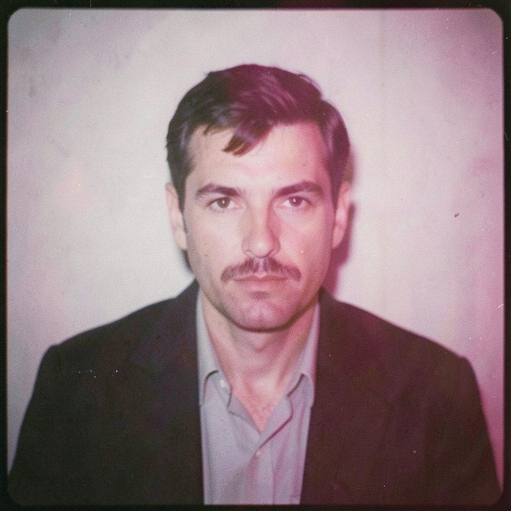
"Photography is not about the thing photographed. It is about how that thing looks photographed."
The Art of Simplicity: Minimalist Composition Techniques
Minimalist photography begins with a decision: what can be removed without weakening the image? The answer may be a distracting colour, a busy background, an unnecessary prop or even a familiar way of framing the subject. What remains must carry greater visual weight, so simplicity demands attention rather than reducing it.
For fine art, portraiture and commercial work, a restrained composition can create an image that feels calm, direct and memorable. A single figure beside a broad wall, a carefully placed object on an empty table or a narrow shaft of light across a face can communicate more than a crowded frame. This approach also suits the clarity expected in Australian branding, editorial campaigns and professional online profiles.
Seeing What Can Be Removed
A useful starting point is to examine the scene before lifting the camera. Look for the primary subject, then identify everything competing with it. A bright sign behind a person, tangled cables near an architectural line or a second colour attracting the eye may be enough to weaken the composition. Moving a step to the side, lowering the camera or waiting for a passer-by to leave the frame can create order without elaborate equipment.
Minimalist composition is not the same as photographing very little. It is a method of editing reality through viewpoint, timing and visual hierarchy. A sparse image can still contain texture, gesture, shadow and emotional tension. The goal is to ensure that each visible element earns its place.
This discipline is particularly valuable in business portrait photography. In a Sydney or Melbourne office, a polished portrait might need to express confidence while keeping the background quiet enough for a website header, media profile or LinkedIn image. A simple wall, window reflection or controlled patch of negative space gives the subject room to communicate.
Letting Empty Space Work
Negative space is the area around a subject that appears relatively unoccupied. It may be a pale sky, a dark studio backdrop, a concrete floor or a softly blurred interior. Rather than treating this space as a gap to be filled, consider it an active part of the composition. Its scale can suggest solitude, authority, stillness or anticipation.
Placement changes the meaning of that emptiness. A figure at the far edge of a wide frame can appear contemplative, while a centrally positioned figure surrounded by equal space may seem formal and self-contained. Leaving space in the direction of a subject’s gaze or movement creates a visual path, which is useful in advertising layouts where copy may later be added.
Australian light often makes this technique especially expressive. The hard sun found in Brisbane, Perth or the open streets of Adelaide can create clean blocks of brightness and shadow. At midday, a plain rendered wall may become a strong graphic background. Near sunset, the same wall may take on warmer tones and softer transitions, changing the emotional register without introducing any additional object.
Building Order Through Shape
Minimalist images often rely on geometry: verticals, horizontals, circles, diagonals and repeated intervals. Architecture provides ready-made structure, from a row of windows in a Melbourne laneway building to the long lines of a suburban swimming pool. By aligning the subject with these forms, the photographer can create a sense of stability or deliberate tension.
Symmetry communicates calm and control, although perfect balance is not always necessary. A small interruption can make a static composition feel alive: one open window, a person standing outside a repeated pattern or a single dark shape within a pale field. Asymmetry works when the visual weight on each side of the frame remains considered.
The edges of the photograph deserve equal attention. A partial object entering the frame can look accidental, while a clean crop can make it feel intentional. Check corners, background lines and the space above the head. In a portrait, a small adjustment to the crop may turn an ordinary head-and-shoulders image into a more distinctive study of posture, clothing and expression.
Shaping Meaning With Light
Light is one of the most effective tools for subtracting information. Side lighting can separate a face from a dark background, while backlighting can reduce a figure to a recognisable silhouette. Diffused window light reveals form gently and is often suitable for editorial portraits, whereas a hard source produces sharper transitions and a more graphic effect.
Black-and-white photography makes tonal structure especially important. Without colour to provide contrast, the image depends on the relationship between highlights, mid-tones and shadows. A pale shirt against a grey wall may disappear unless texture or directional light separates it. A dark coat against a lighter surface can create a strong shape even when facial detail is restrained.
Analogue methods encourage patience with these decisions. Medium-format film records subtle tonal changes and asks the photographer to consider exposure before pressing the shutter. Darkroom principles, such as controlling contrast and protecting highlight detail, can inform digital work as well. The final image may be produced through a modern workflow, yet its clarity can still come from observing light slowly and precisely.
Using Colour With Restraint
Colour minimalism does not require monochrome. It may involve one dominant hue, a limited palette or a carefully chosen accent. A red chair in an otherwise neutral room can become the compositional centre. Muted greens, stone tones and soft blues can create an atmosphere of quiet observation, while a pair of complementary colours can provide energy without making the frame feel crowded.
Before shooting, identify the strongest colours in the scene and decide whether they support the subject. Australian streets can present intense combinations: vivid surf lifesaving equipment, sun-faded signage, eucalyptus greens and the orange tones of brick or late afternoon dust. These colours can be powerful, but reducing saturation or changing the angle may create a more cohesive visual language.
Wardrobe and styling matter in portraiture. A simple outfit with a controlled colour relationship allows expression and body language to lead. For a fashion series, restraint can direct attention to silhouette, fabric and movement. For a corporate commission, it can help the subject appear polished without making the photograph feel overproduced.
A useful reference for the relationship between visual language, written expression and editorial restraint is The Paintbox Letters, where attention to tone and detail can inspire photographers working across image-led projects.
Moving From Capture to Final Image
Minimalism continues during editing. Cropping, tonal adjustment and colour grading should clarify the original intention rather than decorate the frame. Removing a tiny distraction may be valuable, but excessive retouching can flatten texture and make the image feel disconnected from its setting. A controlled workflow preserves the small details that give a restrained photograph its credibility.
File preparation also affects how simplicity is perceived. A fine-art print needs sufficient resolution, accurate tonal transitions and a considered paper surface. A website image must load efficiently while retaining edge definition and subtle contrast. A campaign delivered across social media, outdoor signage and a printed brochure may require several versions, so the composition should survive different aspect ratios.
There are practical and legal considerations in Australian commercial photography. Under the Copyright Act 1968, the photographer generally owns copyright unless rights are assigned or licensed through an agreement. A client may receive permission for specific uses rather than automatic ownership of every file. Usage terms should cover territory, duration, platforms, exclusivity and whether the image may be altered.
Privacy also deserves attention when identifiable people are photographed for commercial purposes. The Privacy Act 1988 and Australian Privacy Principles apply to organisations covered by the legislation, although their application varies by circumstance and photographer. Clear model releases, client agreements and informed consent help establish how a portrait can be used, especially when the work moves from a private commission into advertising or public promotion.
Applying Minimalism to People and Brands
A minimalist portrait begins with trust. When there are fewer props and less visual activity, the subject becomes more exposed, so direction must be calm and specific. Small adjustments to chin position, shoulders, hands and gaze can alter the whole image. Instead of asking for a dramatic pose, a photographer might create a simple action: pause, turn towards the light or look beyond the frame.
For events, simplicity can be found within complexity. At a crowded conference in Melbourne or a gallery opening in Sydney, seek a moment of separation: a speaker isolated against a screen, a pair of hands exchanging an object or a guest framed by a doorway. These details can tell the story of the event while avoiding a generic record of the room.
Commercial clients often need images that work hard across different contexts. A clean composition can leave room for a headline, maintain recognisable brand colours and remain legible when reduced for mobile viewing. Australian businesses, from independent hospitality venues to national professional firms, often need a library of images that feels consistent without appearing repetitive.
For a considered commission, clients can discuss a photography project with a photographer whose practice connects fine-art observation, analogue technique and contemporary commercial delivery. The strongest brief will describe the intended audience, formats, locations and emotional character, allowing composition to serve a clear purpose.
Practical Ways to Refine a Sparse Frame
A repeatable process helps turn an aesthetic preference into a dependable working method. Before each frame, slow down long enough to check the subject, the light and the visual boundaries. Afterward, review the image at full size and as a small thumbnail. If the subject remains clear at both scales, the structure is likely doing its job.
The following habits are useful for portraits, still life, fashion editorials and location work:
- Remove one element from the scene before adding anything new.
- Use negative space to support the subject’s gaze, movement or intended copy.
- Check the corners and edges for accidental lines, bright spots or partial objects.
- Limit the palette to a dominant colour, neutral tones and one purposeful accent.
- Test both symmetrical and asymmetrical placements before choosing the strongest balance.
- Compare the image in colour and black and white to understand its tonal structure.
- Record agreed copyright, licensing, privacy and usage terms before commercial delivery.
Minimalist photography becomes convincing when every decision feels connected. Space, shape, light, colour, timing and post-production should point towards the same idea. The result does not need to be empty or austere; it needs to be deliberate. A quiet frame can hold considerable emotional and commercial force when the photographer knows exactly why each detail remains.
Selected Series
A cross-section of commissioned and personal projects spanning fine art, commercial, and conceptual work.
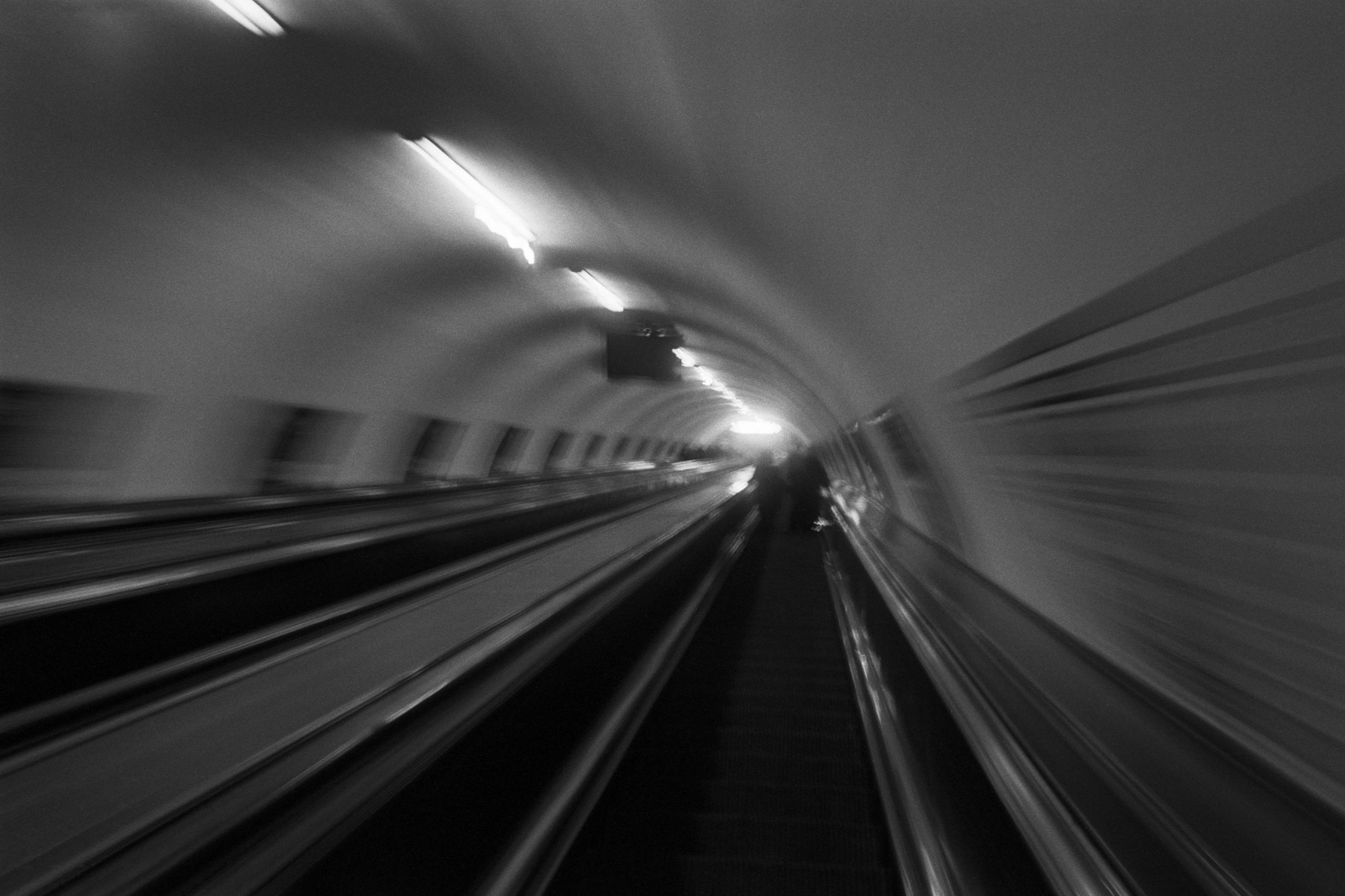
The Wall
2015Winner of the 1st prize & Golden Glass Award at the 11th Photographic Open Championship Olsztyn, and 1st place with the Special Prize of FORMAT magazine at the 3rd Biennial of Art in Piotrków Trybunalski.
View Series →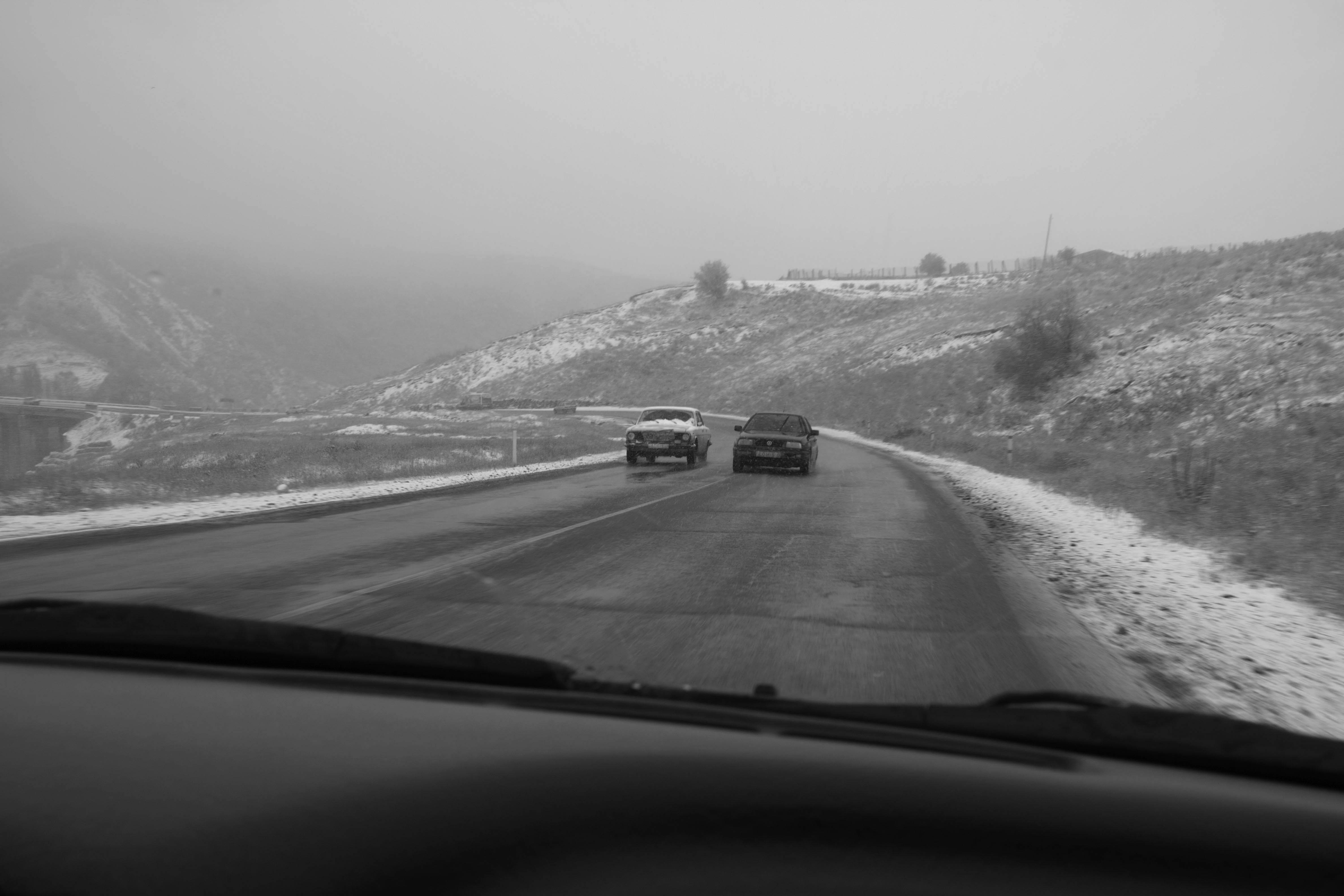
An Engagement Ring
2011A narrative series set in Wrocław in August 2011. Awarded 2nd prize & Silver Glass at the 10th Photographic Open Championship Olsztyn in 2014.
View Series →
Heat Wave
2014A documentary series recording spontaneous events across August and September 2014, capturing the raw energy of a city under the grip of summer.
View Series →