
"Photography is not about the thing photographed. It is about how that thing looks photographed."
Paper, Ink, and Presentation: The Quiet Craft Behind a Fine Art Print
A photograph can live as a glowing rectangle on a phone screen, but the fine art print is something else entirely. It is a physical object that occupies space, holds weight, and catches the light in ways no backlit device can replicate. The transition from image file to wall-hung piece is rarely accidental. It involves choices about paper fibre, pigment stability, mounting method, frame profile, and the way the whole object is signed, numbered, and protected for the decades ahead. For collectors in Sydney, Melbourne, Perth, and regional towns across Australia, these choices quietly determine whether a piece becomes a family heirloom or a faded memory within a few years.
The photographers who take this process seriously, like Rafal Michalak, treat printing as the final and arguably most intimate stage of their craft. His practice, which draws on analogue darkroom principles and a deep respect for medium-format black-and-white film, insists on the print as an object with presence. Visitors can explore his body of work through his portfolio to see how paper choice, tonal range, and presentation reinforce the stories told by the images themselves.
The paper as a surface of meaning
Photographic paper is rarely a neutral substrate. Each sheet carries its own voice, and that voice shapes the photograph before a viewer even registers the subject. Cotton rag papers, made from long-staple fibres, give a soft, slightly toothy surface that flatters portraits and is forgiving of subtle skin tones. Alpha-cellulose papers, made from purified wood pulp, tend to feel crisper and more uniform. Baryta-coated papers add a glossy, almost pearl-like surface reminiscent of traditional darkroom prints, while matte cotton surfaces absorb light and reward close inspection. Choosing between them is partly aesthetic and partly ethical, because archival longevity depends on the chemistry of what the paper is made from.
Weight, measured in grams per square metre, also matters. A heavy 310 gsm cotton rag behaves differently in a frame than a lighter 200 gsm sheet, and the difference is felt in the hand. For black-and-white work, photographers often favour papers with a warmer base tone, sometimes with a hint of cream or ivory, because the paper itself participates in the tonal dialogue. A snowy alpine image can read as colder on a bright white sheet and as nostalgic on a warmer one. These decisions are quiet but real, and they are part of why a hand-printed piece rarely feels interchangeable with a mass-produced poster.
Pigment inks and the question of longevity
The ink laid on the paper matters as much as the paper itself. Modern pigment-based inks, particularly those using carbon black and stable organic pigments, offer stability measured in decades rather than years. Dye-based inks, while often more vibrant on first printing, are vulnerable to oxidation and UV breakdown. This is why serious fine art printers reach for pigment systems almost exclusively. The small pigment particles sit on or just beneath the surface of the paper rather than soaking into it, locking the image into a more permanent relationship with the substrate.
In a country like Australia, where UV radiation is among the harshest in the world, this distinction becomes more than academic. A print destined for a sunlit room in Brisbane or a north-facing wall in Adelaide needs every advantage it can get. Many Australian collectors consult the Wilhelm Imaging Research longevity ratings or look for manufacturers like Epson, Canon, and Hahnemühle that publish tested fade-resistance figures for specific paper-ink pairings. The conversation may feel technical, but the consequences are visible within a single generation: a great portrait series hung on a poorly chosen paper with unstable inks can lose half its density in under a decade.
Mounting choices that shape perception
Once a print has been made, it must be presented, and the first decision is how to attach it to a substrate. Dry mounting, where the print is bonded to an aluminium or foam board using heat-activated adhesive, creates a perfectly flat surface with no risk of rippling. It is a common choice for large commercial work and for images meant to read at a distance. Archival alternatives, however, leave the print physically separate from its backing. Hinge mounting with Japanese tissue and wheat starch paste, or the use of archival corner mounts, allows the print to be removed later without damage. Museums across Australia, from the National Gallery of Australia in Canberra to the Museum of Contemporary Art in Sydney, generally insist on these reversible techniques.
The choice between flat mounting and a more flexible approach also influences how the print is framed. A dry-mounted print sits confidently behind glass and rarely needs additional support. A hinged print, by contrast, can gently float above its backing, casting a faint shadow that gives the work a sense of depth. For collectors thinking long term, the ability to de-mount, re-mount, or restore the print is part of the value. It is also part of the conversation around provenance, because the next owner should be able to verify the materials and methods used.
Framing as a final act of intention
The frame is not merely a border. It is a context, a containment, and sometimes a statement. A thin black aluminium profile can let a contemporary portrait breathe, while a deep walnut moulding suits a traditional landscape. Museums often specify conservation glazing with UV-filtering properties, sometimes combined with anti-reflective coatings, and similar options are increasingly available to private collectors. The Museum of Applied Arts and Sciences in Sydney, among other Australian institutions, has long championed the use of glazing that filters out at least 99 percent of UV radiation to protect light-sensitive media.
Matting is another expressive element. A wide, neutral mat draws the eye toward the image and gives it room to live. A flush-mounted print with no mat feels more contemporary and direct. Behind every mat, archival foam core or 100 percent cotton rag mat board should be used, because standard chipboard releases acids that yellow the paper edges over time. Glazing should never touch the print surface directly, because any condensation or trapped humidity can damage both ink and paper. Spacers, whether physical or simply the depth of a deep frame, allow air to circulate and prevent this.
Australian conditions and the climate of care
Australia's climate varies from the tropical humidity of Cairns and Darwin to the dry heat of Alice Springs, and each region asks different things of a photograph on the wall. Humidity encourages mould growth and foxing on cellulose-based papers, while very dry conditions can cause certain fibres to contract. The Australian Institute for the Conservation of Cultural Material publishes guidance aimed at both institutions and private collectors, suggesting stable relative humidity between 45 and 55 percent and temperatures close to 20 degrees Celsius. These are not merely academic recommendations; they reflect what keeps paper, ink, and frame intact across the decades.
Many Australian collectors also consider bushfire season when planning where to store original works. Smoke and ash can damage frames, glazing, and the paper itself, so important prints are sometimes relocated during high-risk periods. Some Sydney and Melbourne collectors invest in off-site storage or keep their most valuable pieces in climate-controlled facilities. For those displaying work in homes, simple practices such as keeping prints out of direct sunlight, away from air-conditioning vents, and away from kitchen steam make a tangible difference. The art of the fine art print is not finished at the moment of sale; it continues in the care it receives.
Limited editions, certificates, and the legal frame
Fine art photography in Australia is shaped by the Copyright Act 1968, which gives the photographer control over reproduction for the lifetime of the creator plus seventy years. This means that every print, unless otherwise stated, remains the intellectual property of the photographer even after the physical object changes owners. Limited editions, signed and numbered by the artist, formalise scarcity: a series of three, five, or fifteen prints establishes value and ensures the photographer's ongoing relationship with each piece. Certificates of authenticity, ideally on archival paper and including details of the print run, paper, and ink, accompany the work and become part of its history.
The Australian Competition and Consumer Commission also has a view on how artwork is sold. Resellers, galleries, and online platforms must avoid misleading claims about edition numbers, provenance, or materials. For collectors, this means that a signed print from an established photographer, accompanied by clear documentation, carries legal weight as well as aesthetic value. Auction houses operating in Australia, from the major Sydney salerooms to smaller regional specialists, treat properly documented prints differently from unsigned reproductions, and the difference is reflected in realised prices. The legal frame is rarely visible in a finished piece, but it quietly shapes the market around it.
Reading a print in person
The final argument for the fine art print is the experience of standing in front of one. A monitor flattens everything; it standardises contrast and colour in ways that suit the medium but betray the original. A hand-printed photograph on a beautiful cotton sheet, framed behind museum glass, responds to changes in light, angle, and distance. Walk closer and grain emerges; step back and the composition settles. Viewers in galleries such as Brisbane's Institute of Modern Art or in the smaller but significant regional spaces of Hobart and Ballarat often speak of this shift in perception, the moment a familiar image becomes a new object.
For photographers like Michalak, this encounter is the whole point. Every decision, from the camera's slow movements on medium-format film to the final mounting of a limited-edition print, builds toward that quiet moment when a viewer meets the work. The art of the fine art print is not a flourish at the end of production; it is the destination of the entire photographic act. Paper, ink, and presentation are not the trappings of an image; they are the language in which the image finally speaks.
Selected Series
A cross-section of commissioned and personal projects spanning fine art, commercial, and conceptual work.
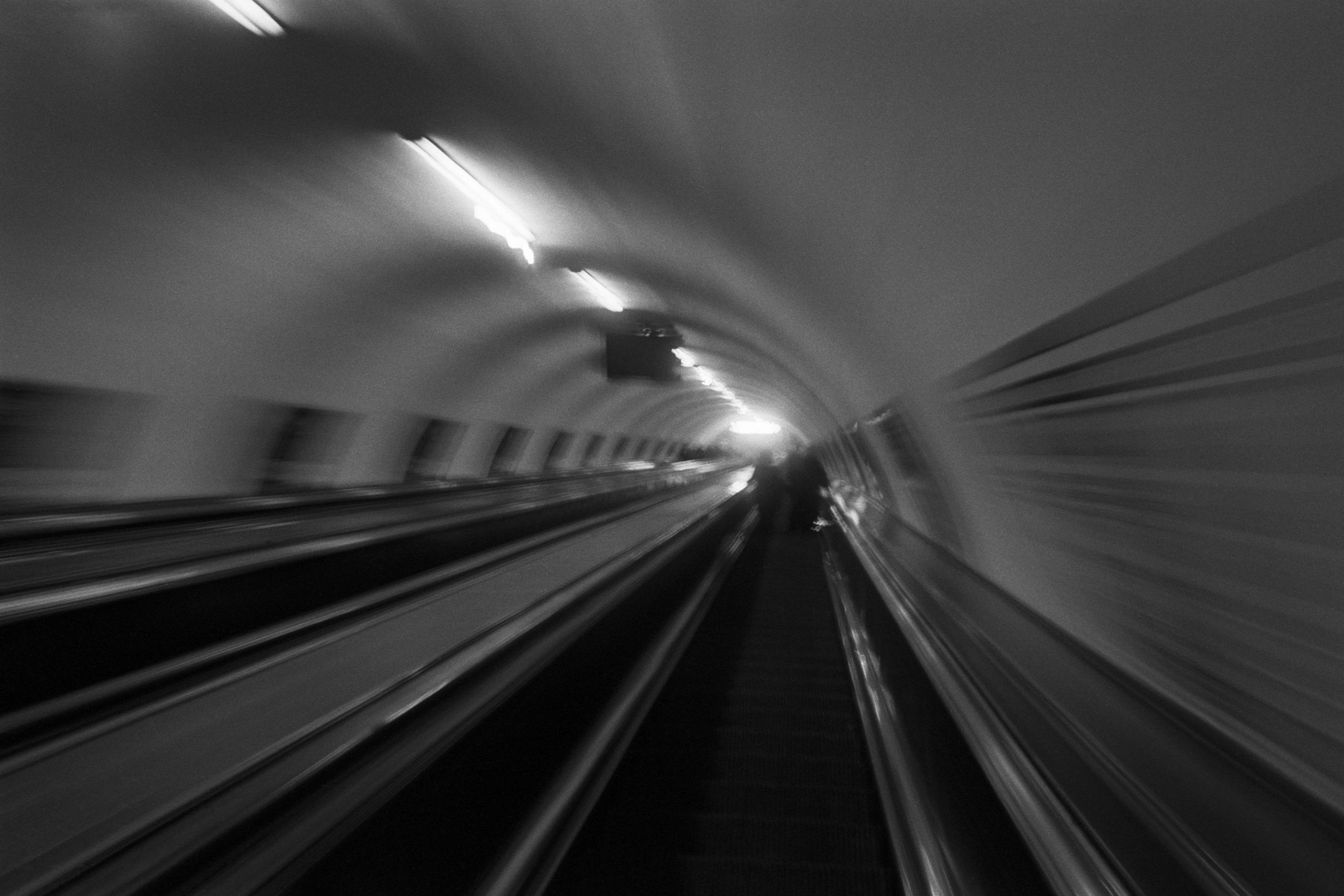
The Wall
2015Winner of the 1st prize & Golden Glass Award at the 11th Photographic Open Championship Olsztyn, and 1st place with the Special Prize of FORMAT magazine at the 3rd Biennial of Art in Piotrków Trybunalski.
View Series →
An Engagement Ring
2011A narrative series set in Wrocław in August 2011. Awarded 2nd prize & Silver Glass at the 10th Photographic Open Championship Olsztyn in 2014.
View Series →
Heat Wave
2014A documentary series recording spontaneous events across August and September 2014, capturing the raw energy of a city under the grip of summer.
View Series →