"Photography is not about the thing photographed. It is about how that thing looks photographed."
The beauty of imperfection: Embracing grain and noise
Photographs that appear flawless can feel strangely distant. An immaculate surface, flawless skin and mathematically even light may satisfy a brief, yet they can remove the small visual accidents that reveal a photograph was made by a person. Grain, mottled tone, a clipped highlight or visible sensor noise can give an image a pulse, directing attention toward atmosphere rather than polish.
Rafal Michalak’s award-winning practice, based in Wrocław, treats those accidents as deliberate material. His fine art and commercial work spans business portraits, fashion, events and conceptual photographic series, combining medium-format and black-and-white film with darkroom principles and digital workflows. Texture becomes a form of authorship rather than carelessness, adding emotional proximity while keeping each image coherent.
Grain as evidence of light
Grain begins with the physical structure of photographic film. Unevenly distributed silver halide crystals respond to light, then become visible as a pattern of fine density and irregularity after development. Instead of creating a perfectly uniform surface, this organic texture records the conditions of exposure. Shadows gather granular detail, highlights become slightly less absolute, and the tonal range gains a tactile depth.
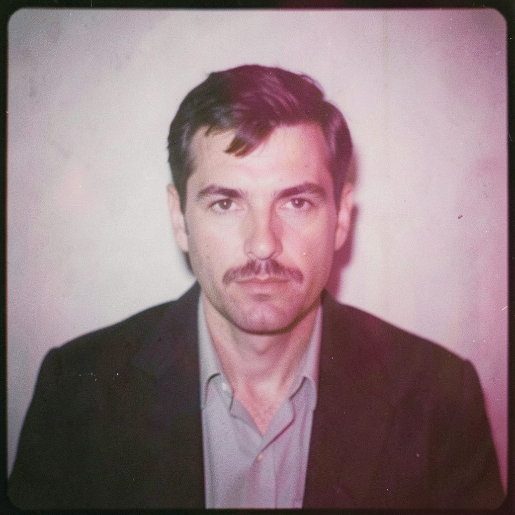
Medium-format film is particularly valuable for this approach because its larger negative can hold subtle transitions and dense shadow detail. In black-and-white portraiture, that tonal information gives skin texture, hair and fabric a convincing presence. The result can feel natural rather than aggressively retro. Grain supports the sitter’s expression and the character of the light without overwhelming either.
The intention is not to make every photograph look old or damaged. Grain should establish rhythm and weight, while areas of visual priority remain clear. A face can hold attention even when the surrounding tones fluctuate. This balance transforms a technical irregularity into part of the photograph’s structure.
Noise between control and character
Digital noise has a different origin, arising from the conversion of light into electronic signals and the processing needed to reconstruct an image. Luminance noise affects brightness, while colour noise creates small fluctuations in hue. At high ISO or in deep shadows, these artefacts become more visible. In commercial work, they may require correction; in a fine art image, they can contribute atmosphere when used with care.
A hybrid workflow allows Michalak to judge texture according to its role in the final picture. A clean digital base may be appropriate for a sharply controlled business portrait, while an analogue scan can add atmosphere to a fashion story or conceptual series. Keeping both versions during editing reveals how grain changes emphasis, depth and perceived authenticity.
The same attention to minute variation appears in surface variation in engineering, where a small departure from an ideal can influence performance. Photographic noise has no mechanical purpose, yet the comparison is revealing: irregularity gains meaning through context, scale and control.
Australian light and visual context
For audiences in Australia, textured photography often meets a landscape of strong environmental contrasts. Sydney can produce hard coastal glare, while Melbourne’s rapidly changing cloud cover can shift a portrait from broad daylight to subdued, directional light within a short session. Such variation rewards images that do not rely on a uniformly polished surface.
The Australian visual environment also offers distinctive materials and colours: pale sandstone, red earth, corrugated metal, weathered timber and the silver-green foliage of eucalyptus. These elements sit naturally beside grain-rich blacks and slightly softened highlights. At events held in warehouses, pubs, community halls and coastal venues, the same texture connects formal presentations with the texture of everyday surroundings.
Commercial expectations remain equally practical. Australian buyers often describe a desired result in concise terms, such as “keep it natural” or “make it work for the website and social media”. For portrait commissions, a package may need a high-resolution master, a square campaign crop and usage rights for several channels, all delivered against a firm deadline. Clear licensing, colour-managed files and reliable turnaround can be as important as the aesthetic effect.
A visual vocabulary of controlled irregularity
In portrait work, imperfection is most valuable when it belongs to the person in front of the camera. Useful details might include:
- Flyaway hairs softened by shallow focus
- Natural creases in linen, cotton and jackets
- Brief changes of expression between adjacent frames
- Edge detail that falls gently out of focus
The choice of which frame to use becomes part of the storytelling. A portrait that catches someone between formal poses can communicate warmth and concentration more effectively than an image assembled from perfect but disconnected moments.
For conceptual and fine art series, the visual vocabulary can become more pronounced:
- Dust or fine scratches recorded on the negative
- Slight shifts in density across a darkroom print
- Uneven illumination that preserves spatial depth
- Fine sensor grain visible within deep tones
These effects should never be applied indiscriminately. A portrait may benefit from restrained softness, while a conceptual image about distance or memory might use stronger disruptions. Consistency matters more than the amount of grain. The texture should belong to the same visual world as the subject.
From commission to finished frame
A strong commission begins by deciding where irregularity will serve the narrative. Michalak’s commercial process considers the audience, location, clothing, lighting and intended output before choosing a capture method. Medium-format film may suit a portrait commission in which skin, expression and tonal depth are central. Digital capture can provide the flexibility required for fast-moving fashion and event coverage.
The production process then determines how much texture can be retained. Film negatives can be scanned carefully and adjusted within a digital workflow, allowing the artist to compare the character of the original negative with a controlled reproduction. For events, available light, flash, backlighting and movement all create natural variations that can give otherwise similar frames distinct emotional qualities.
Post-production should remain faithful to that recorded character. Distracting sensor artefacts, accidental reflections or blown highlights may be corrected, while grain that reinforces the intended mood is preserved. Commercial clients can also receive a clean master alongside a more textured interpretation. This approach meets clear brand requirements without separating the finished image from the atmosphere established on set.
Keeping character through reproduction
Grain can change as an image moves between a camera, editing screen, printer and web page. Large displays reveal fine detail that disappears on a phone, while aggressive sharpening can turn subtle silver structure into harsh digital texture. Working with calibrated monitors, high-quality scans and colour-managed profiles helps maintain a consistent visual result.
File formats also affect the final impression. Sixteen-bit TIFF files preserve a broad tonal range for print, while carefully compressed JPEGs are more practical for online delivery. A portrait displayed on a large screen in a Wrocław gallery may reveal shadow detail that becomes compressed in a social media crop, so the grain should be evaluated at every intended scale rather than in isolation.
A finished photograph can be controlled without becoming sterile. Its strongest irregularity gives the eye something real to encounter: a trace of emulsion, a stubborn shadow, a moment that could not have been repeated. In Michalak’s work, imperfection is not an aesthetic effect added after the fact. It is part of the record, carrying the atmosphere of the place, the presence of the subject and the physical reality of light into the final image.
Selected Series
A cross-section of commissioned and personal projects spanning fine art, commercial, and conceptual work.
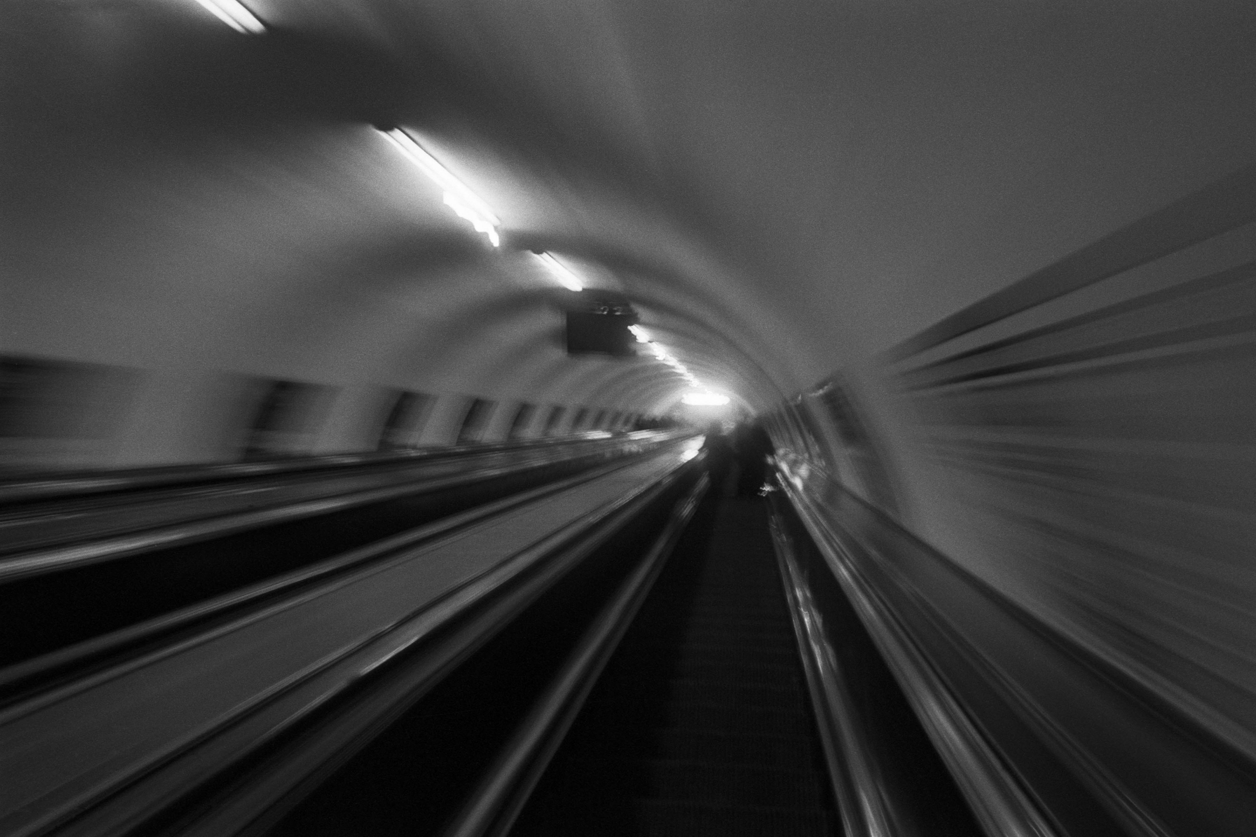
The Wall
2015Winner of the 1st prize & Golden Glass Award at the 11th Photographic Open Championship Olsztyn, and 1st place with the Special Prize of FORMAT magazine at the 3rd Biennial of Art in Piotrków Trybunalski.
View Series →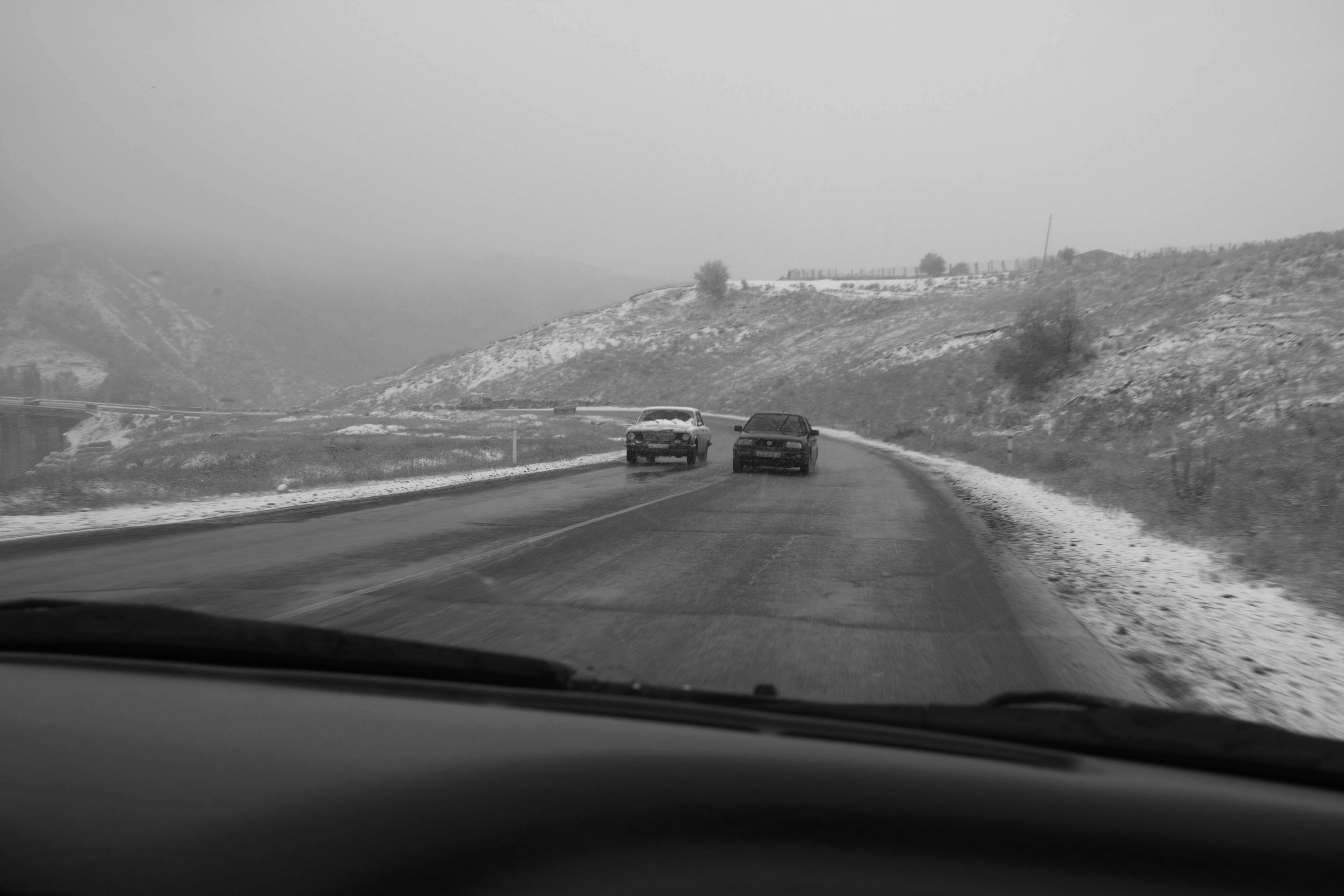
An Engagement Ring
2011A narrative series set in Wrocław in August 2011. Awarded 2nd prize & Silver Glass at the 10th Photographic Open Championship Olsztyn in 2014.
View Series →
Heat Wave
2014A documentary series recording spontaneous events across August and September 2014, capturing the raw energy of a city under the grip of summer.
View Series →