"Photography is not about the thing photographed. It is about how that thing looks photographed."
Why Monochrome Photography Still Moves Us
Colour can describe a scene, but monochrome photography often makes us feel it before we understand it. By removing hue, a black-and-white image draws attention to expression, gesture, texture, contrast and the quiet spaces between objects. A face becomes a study in character, while an ordinary wall can carry the weight of memory.
This emotional response is especially valuable in portraiture, fashion, events and conceptual photography. Whether an image is made on medium-format film in a darkroom or shaped through a careful digital workflow, the absence of colour creates room for interpretation. For Australian audiences accustomed to intense coastal light, bright advertising and fast visual communication, a restrained monochrome image can feel unusually direct.
The Psychology Of Black And White
Colour brings associations with temperature, season, place and culture. Red may suggest urgency, blue can feel calm or distant, and green may connect a viewer with nature. When these signals disappear, the eye turns towards luminance: the relationship between light and dark. This shift can make an image feel more concentrated, asking the viewer to notice the emotional structure of a scene rather than its decorative details.
A monochrome photograph also encourages slower looking. A subtle change in shadow around the eyes, the angle of a shoulder or the texture of a worn jacket may become more important than the subject’s surroundings. These small visual cues can communicate vulnerability, confidence, fatigue or restraint. The photograph does not need to state what someone is feeling; it gives the viewer enough evidence to form a personal response.
The effect varies according to tonal range. Deep blacks and sharp highlights can create drama, tension or authority. Soft greys and gentle transitions often suggest intimacy, recollection and tenderness. A low-key portrait may feel private and psychologically intense, while a high-key image can appear open, fragile or dreamlike. Emotional impact comes from the relationship between these choices and the subject, not from black and white alone.
Memory, Time And The Filmic Look
Many viewers associate black-and-white images with family albums, newspapers, cinema and historical records. This association gives monochrome photography a sense of time, even when the photograph was made yesterday. Grain, imperfect edges and darkroom marks can suggest that the image has survived an event or belongs to a longer story.
Analogue film contributes physical qualities that digital simulations often struggle to reproduce. Silver-based film responds to light with a particular softness and irregularity. Medium-format negatives can hold remarkable detail while retaining a gentle fall-off in focus. When printed through darkroom principles, the image becomes a material object, with paper surface, exposure and chemical process influencing how the photograph is experienced.
That sense of age should be used with care. A vintage appearance does not automatically create emotional depth, and excessive grain can turn a sincere portrait into a visual effect. The strongest film-inspired work uses texture to support meaning. In a conceptual series, a rough grain structure might express uncertainty or dislocation; in a business portrait, a cleaner tonal treatment may communicate trust and precision.
For Australian viewers, this relationship with memory can be particularly powerful in places where old and new sit close together. A monochrome photograph of a weatherboard house in Hobart, a quiet laneway in Melbourne or a weathered coastal structure near Newcastle can connect contemporary life with layers of local history. The image becomes less about nostalgia than about recognising time in the present.
Portraits That Reveal Character
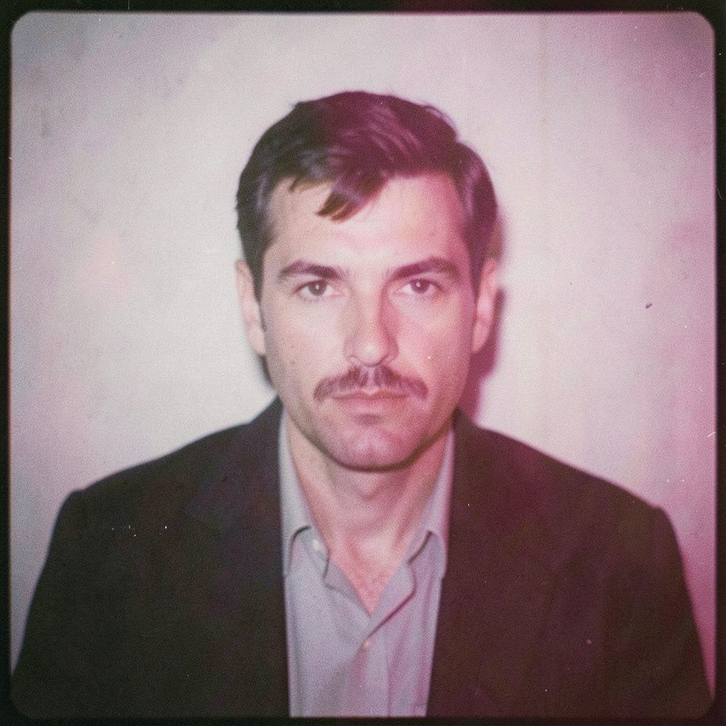
A colour portrait can immediately communicate wardrobe, branding and environment. These qualities matter in commercial photography, especially for LinkedIn profiles, annual reports, media kits and company websites. Yet a monochrome business portrait can place greater emphasis on the person’s manner, gaze and presence. It can make a leader appear considered, capable and human without relying on a polished office background.
The photographer’s direction remains central. A subject who is told simply to “look confident” may produce a stiff expression. More thoughtful direction creates space for a natural posture, a pause between expressions or a moment of genuine concentration. The resulting image may contain a slight asymmetry or an unguarded look, allowing viewers to sense the person behind the professional role.
This approach suits Australian businesses that want to appear credible without becoming overly formal. A creative director in Fitzroy, a solicitor in Perth or a startup founder in Surry Hills may need photographs that feel polished yet approachable. The local preference for plain speaking and a relaxed professional manner can be reflected in an image with controlled lighting, honest expression and understated styling.
Monochrome can also support a consistent visual identity across a team. When staff members are photographed in different offices or under changing conditions, the same tonal treatment creates cohesion. The result can work across a corporate website, recruitment campaign or conference programme. For an organisation operating between Sydney, Melbourne and Brisbane, a unified portrait style helps build recognition without making every person look identical.
Careful attention is needed when photographing people from different cultural backgrounds. A black-and-white treatment should preserve skin texture and individual character rather than flattening difference into a generic aesthetic. Consultation, respectful direction and accurate representation matter as much as technical control. Emotional seriousness is achieved through attention, not through making every face look solemn.
Light, Texture And Visual Tension
Monochrome images depend on the behaviour of light. Side lighting can describe the planes of a face, reveal fabric and deepen a room. Backlighting can reduce a subject to a silhouette, creating mystery or separation. Diffused light softens skin and gives an intimate impression, while a harder source can produce graphic shadows and a more confrontational mood.
Texture becomes especially expressive when colour is absent. Rust, concrete, skin, paper, hair and water each respond differently to light. A fashion photograph may use the folds of a garment as a sculptural element. An event image may find emotion in a hand resting on a shoulder or the sheen of a dance floor after a long evening. In a conceptual series, repetition of texture can connect separate photographs into a visual language.
Australian light offers many opportunities for this kind of work. The sharp sun around Adelaide, the humid brightness of Darwin and the cooler overcast conditions found in parts of Victoria all shape shadow differently. A photographer working outdoors must observe how the light changes across the day rather than treating natural illumination as a neutral backdrop. Early morning at Bondi can feel spare and silvery, while late afternoon in the Dandenong Ranges may produce richer, more layered tones.
A strong monochrome composition also depends on what is left out. Negative space can make a subject appear isolated, contemplative or exposed. Crowded framing can create pressure and visual noise. In event photography, a decisive moment may carry more emotional force than a complete record of the venue. The image becomes a distilled account of atmosphere: a glance, a pause, a burst of movement or the calm after the crowd has gone.
From Personal Expression To Commercial Use
Emotional imagery has a practical role in commercial communication. Brands are remembered through feeling as much as through information, and monochrome photography can give a campaign a distinctive visual position. It may signal confidence, craftsmanship, seriousness or editorial sophistication. For a fashion label, it can direct attention to silhouette and movement. For an architect, it can emphasise structure, proportion and material.
The style should be connected to the brand’s audience and purpose. A monochrome portrait for a mental health organisation may need warmth and openness rather than stark contrast. A hospitality campaign for a restaurant in Melbourne’s laneways could use rich shadows to create atmosphere, while a technology company might choose clean, bright tones to suggest clarity. The emotional register must support the message instead of becoming a decorative layer placed over it.
Australian commercial photography also involves practical considerations such as image licensing, usage periods and campaign placement. A photograph commissioned for a website may later be requested for outdoor advertising, a trade stand or social media. Clear agreements help protect the photographer’s work and give the client confidence about how the images can be used. This is especially relevant for agencies and growing businesses managing campaigns across several states.
Digital workflows make monochrome production flexible, but flexibility does not remove the need for craft. Exposure, contrast, channel mixing, grain, sharpening and print preparation all influence the final response. A file that looks subtle on a calibrated monitor may become too flat in a newspaper advertisement or too harsh on a bright mobile screen. Professional work considers the full journey from capture to publication.
For exhibitions and fine art prints, the physical result becomes part of the emotional experience. Paper choice can soften a shadow or increase its density. A large print can make the viewer feel surrounded by a landscape or figure, while a small print may create a more private encounter. In Wrocław, where this photographic practice bridges analogue methods, medium-format imagery, darkroom thinking and digital control, the process remains visible in the finished work without overwhelming its subject.
The most affecting monochrome photographs leave a trace because they give viewers space to participate. They do not explain every detail or force a single interpretation. Instead, they balance precision with ambiguity: a face that holds several emotions, a familiar place made strange, a gesture that suggests a story beyond the frame. That balance allows black-and-white imagery to function across personal portraiture, editorial work, commercial campaigns and conceptual series, carrying feeling with remarkable clarity.
Selected Series
A cross-section of commissioned and personal projects spanning fine art, commercial, and conceptual work.
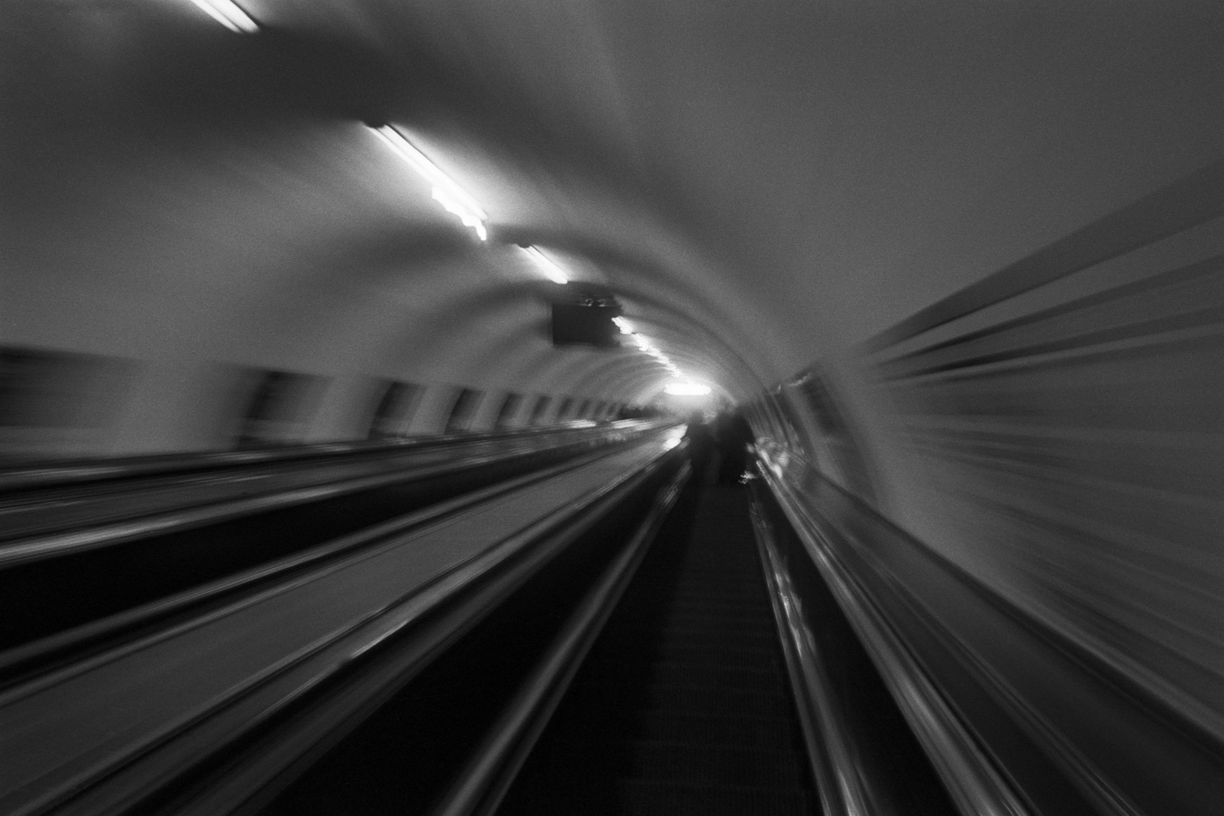
The Wall
2015Winner of the 1st prize & Golden Glass Award at the 11th Photographic Open Championship Olsztyn, and 1st place with the Special Prize of FORMAT magazine at the 3rd Biennial of Art in Piotrków Trybunalski.
View Series →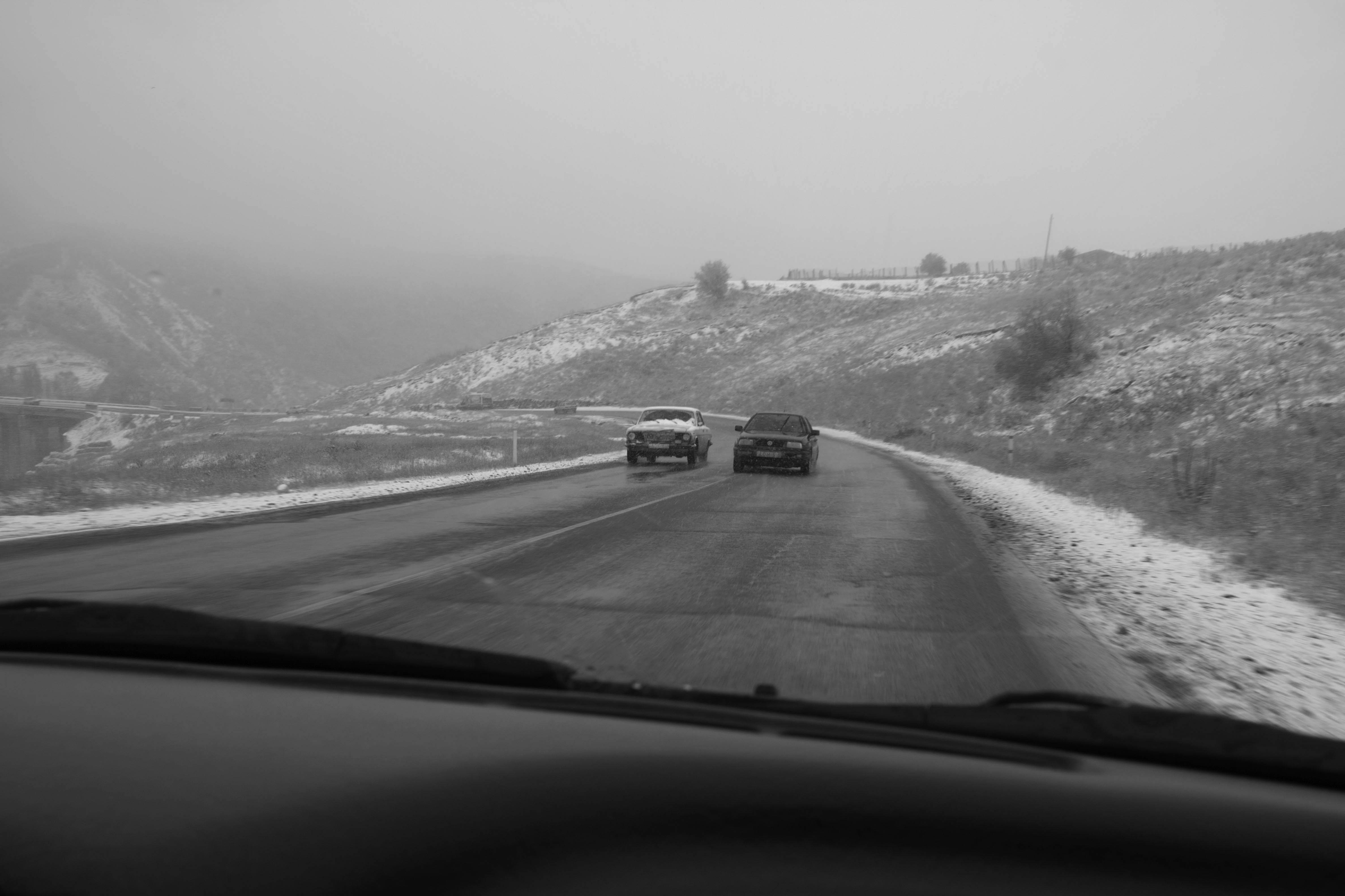
An Engagement Ring
2011A narrative series set in Wrocław in August 2011. Awarded 2nd prize & Silver Glass at the 10th Photographic Open Championship Olsztyn in 2014.
View Series →
Heat Wave
2014A documentary series recording spontaneous events across August and September 2014, capturing the raw energy of a city under the grip of summer.
View Series →