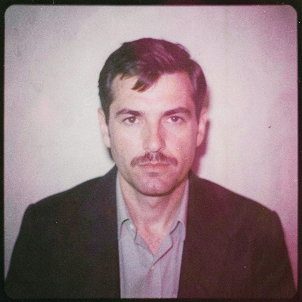
"Photography is not about the thing photographed. It is about how that thing looks photographed."
Polish poster art and the architecture of my photographs
Polish poster art entered my visual education before I treated photography as a record of what a place looked like. Growing up in Wrocław, I encountered the postwar Polish poster school in books, exhibitions, shop windows and the city’s everyday visual noise. Flat colour, enlarged figures, sharp diagonals and disciplined negative space offered another way of thinking about images: less as neutral windows and more as active structures that organise a viewer’s eye. That early attraction has become a lasting structural influence on my photographs.
My award-winning practice moves between fine art and commercial commissions, including business portraits, fashion, events and conceptual photographic series. Analogue methods sit beside medium-format cameras, black-and-white film, darkroom thinking and digital post-production. The influence of Polish poster art on my composition is not a nostalgic theme applied to each frame. It is a practical method for deciding what a photograph must emphasise, what it can withhold and how its parts hold a viewer’s attention.
Lessons from the Polish poster school
The Polish School of Posters flourished after the Second World War, especially around Łódź and Warsaw, with designers such as Henryk Tomaszewski, Jerzy Janiszewski, Franciszek Starowieyski and Jan Lenica transforming public information into visual drama. Their work ranged from forceful social commentary to dreamlike photomontage, yet the strongest examples shared a clear command of scale, silhouette, colour and type. I studied them as graphic designers, paying attention to how a small headline, a human figure and a field of colour could create tension without explanation.
What I took from those designers was not a formula for making photographs look like posters. It was the discipline of reduction. A figure could be cropped at the shoulder, a building could become a hard vertical, and a narrow strip of sky could carry as much emotional weight as the subject. Their compositions make every visible element negotiate with the frame. I ask the same of a portrait or documentary scene: if a detail does not clarify the rhythm, hierarchy or meaning of the image, it may not need to remain.
This history also keeps my work from becoming self-conscious pastiche. I can use a poster-like diagonal or oversized gesture while changing the colour, pace and texture of the result. The purpose is to draw the viewer into the image, then reward a second look. Since Polish posters often occupied streets, cinemas and cultural institutions, their public voice still feels connected to my base in Wrocław, where contemporary murals, gallery walls and independent design studios sit beside traces of that earlier graphic culture.
Colour, contrast, and visual hierarchy
Colour in the Polish poster tradition often behaves like architecture. Large areas of red, black, cream or saturated blue establish rooms of attention, while a contrasting shape opens a route through them. That approach has changed how I test colour on location. Instead of accepting every hue found in a scene, I look for a dominant family and a limited counterpoint. In a business portrait, that might mean a restrained backdrop against a warmer skin tone; in a fashion image, a single garment colour can become the visual anchor.
Black-and-white film offers an even sharper lesson. With colour removed, tonal separation must do the work once colour and typography did in the poster. I pay close attention to the brightest highlight, the deepest shadow and the middle grey that holds the subject together. Hard light can break a face into graphic masses; soft light can dissolve it into atmosphere. Darkroom printing reinforces this way of seeing because every adjustment changes the relationship between shapes, not merely their brightness.
Hierarchy is the final test. A poster rarely allows the eye to wander evenly across the page, and a successful photograph should have a similar internal order. I decide which element arrives first, where the gaze pauses and what remains unresolved. That may be a hand, a reflection or the edge of a coat. The frame can then feel dense at one point and open at another, producing movement without clutter. This principle informs commercial work as effectively as it shapes a conceptual series made for a gallery wall.
Cropping people into graphic shapes
Cropping is where poster composition becomes most tangible in my camera work. Rather than framing every body from head to toe, I often move close enough for an arm, jawline or back to become a shape with weight. The edge of the photograph can cut through a figure in a way that implies a larger world beyond it. Low viewpoints and steep diagonals can lend authority to a portrait, while unusual distances can make an event scene feel observed rather than staged.
In business portraiture, this approach helps me create an image with presence while keeping the person recognisable. A tightly structured crop can reduce the distance between viewer and sitter, while a small area of environmental detail can indicate a workplace without turning the image into a catalogue record. For fashion, I use the same tension between body and frame: clothing may carry the colour, and the crop may turn posture into a line. The aim is a photograph with an immediate graphic pull and enough human information to hold attention.
At events, I apply the lesson with more restraint. A room contains many possible stories, and an inclusive frame can weaken all of them. Poster thinking helps me select a decisive cluster of gestures, faces and light. In conceptual series, I go further, photographing ordinary objects and locations so they can interact like symbols in a designed page. The Polish influence is then structural rather than literal. It shapes attention and sequence, while the people and situations keep the resulting work rooted in lived experience.
Designing space for words and brands
Negative space in a Polish poster is active. It can separate competing ideas, hold a small area of copy or let an enlarged image breathe. I rarely think of that empty region as wasted, especially when a photograph will sit beside a headline, appear on a screen or support a campaign. I plan the edge of the frame around the message the image must share, creating enough quiet area for legibility without making the photograph feel like an advertisement waiting for text.
Typography can also change the meaning of a photograph. A bold sans serif beside a restrained portrait creates a different voice from delicate lettering paired with a sharply cropped fashion image. Rather than adding type as an afterthought, I consider the image’s scale, density and implied rhythm as if they were one visual unit. This is useful for hotels, cultural organisations, independent labels and professional services, whose communications often need consistency across outdoor posters, social platforms and editorial features.
Commercial intent should never flatten the image into decoration. The brief sets a purpose, while the photograph contributes observation, atmosphere and a point of view. Before a commissioned image is made, its audience, crop and publication context can be agreed through the studio contact page. That early alignment helps me decide where visual tension belongs and where silence will do more work. A business portrait, for example, can communicate confidence through posture and light while leaving room for the client’s own words.
Analogue instinct in a digital workflow
My starting point is usually an analogue habit: make the essential decisions before entering a digital editing room. A medium-format camera forces attention onto slower gestures and finer compositional control. Black-and-white film removes distraction and encourages me to organise a scene around tone, gesture and texture. These are not obstacles to efficiency. They are ways of arriving at an image with a settled structure, so later adjustment can refine rather than rescue the frame.
Darkroom principles remain central even when the final file is digital. I think in terms of density, edge, highlight and shadow, but also in terms of rhythm and the space around a subject. The analogue process gives physical consequence to each choice. It can also leave traces of grain, slight softness or an imperfect transition that lend a photograph the material character associated with printed posters. My preference is for texture that supports the idea, never a generic filter added because it looks fashionable.
Digital tools broaden what I can test without erasing that foundation. I can refine contrast, build alternative crops, align colour relationships and prepare images for different formats. The Polish poster lesson enters through sequencing and hierarchy: which version moves first, which detail is isolated and how the palette reads when reproduced at a smaller scale. The result is a hybrid workflow, with precise finishing supporting an image that still feels observed, made and printed rather than manufactured by software.
Adapting the visual language for Australia
Australian settings bring their own visual conditions. Melbourne’s laneway cafés and Sydney’s gallery walls provide familiar contexts for bold graphics, while summer light in Sydney and Brisbane can create hard-edged shadows and clipped highlights. Portraits may also move between a shaded office, an outdoor venue and a coastal location as the day changes. I use these realities to test the poster-derived composition under local light, architecture and pace rather than transporting a fixed Wrocław atmosphere into an Australian commission.
Four visual principles transfer particularly well:
- Make one silhouette or gesture dominant, then subordinate surrounding detail.
- Reduce the palette until colour relationships become unmistakable.
- Preserve deliberate areas of quiet around the subject.
- Integrate the frame with the intended headline or placement.
The commercial market here includes independent fashion labels, hospitality groups, professional firms and large corporate campaigns, so image-making must work across very different scales. I adjust the visual emphasis to the channel rather than applying one dramatic treatment everywhere. A portrait for a company report needs trust and clarity; an event sequence for a Melbourne launch needs energy and social texture; an art-directed campaign can carry stronger abstraction.
Privacy and production rules also shape the brief. Commercial clients must account for the Privacy Act 1988 and Australian Privacy Principles where those laws apply, particularly when identifiable people appear in advertising, publishing or online material. Consent records, intended-use terms and image-rights agreements should be clear from the outset. Event work can also involve council permits, venue approvals and public liability requirements, which vary across Australian states and local authorities.
Three practical details deserve attention:
- Schedule portrait sessions to control harsh midday sun and protect colour consistency.
- Document consent, licensing, capture method and approved uses for every commercial subject.
- Confirm location permissions, venue insurance and signage rules before an event shoot.
The Polish posters did not give me a repeatable house style. They gave me a rigorous way to see relationships between figure, type, colour and empty space. In Australia, that grammar meets a culture of outdoor café life, energetic street art, independent design and direct commercial exchange. The photographs remain rooted in real people and specific places, but their internal order carries the echo of Polish graphic modernism: bold enough to catch the eye, disciplined enough to reward sustained attention.
Selected Series
A cross-section of commissioned and personal projects spanning fine art, commercial, and conceptual work.
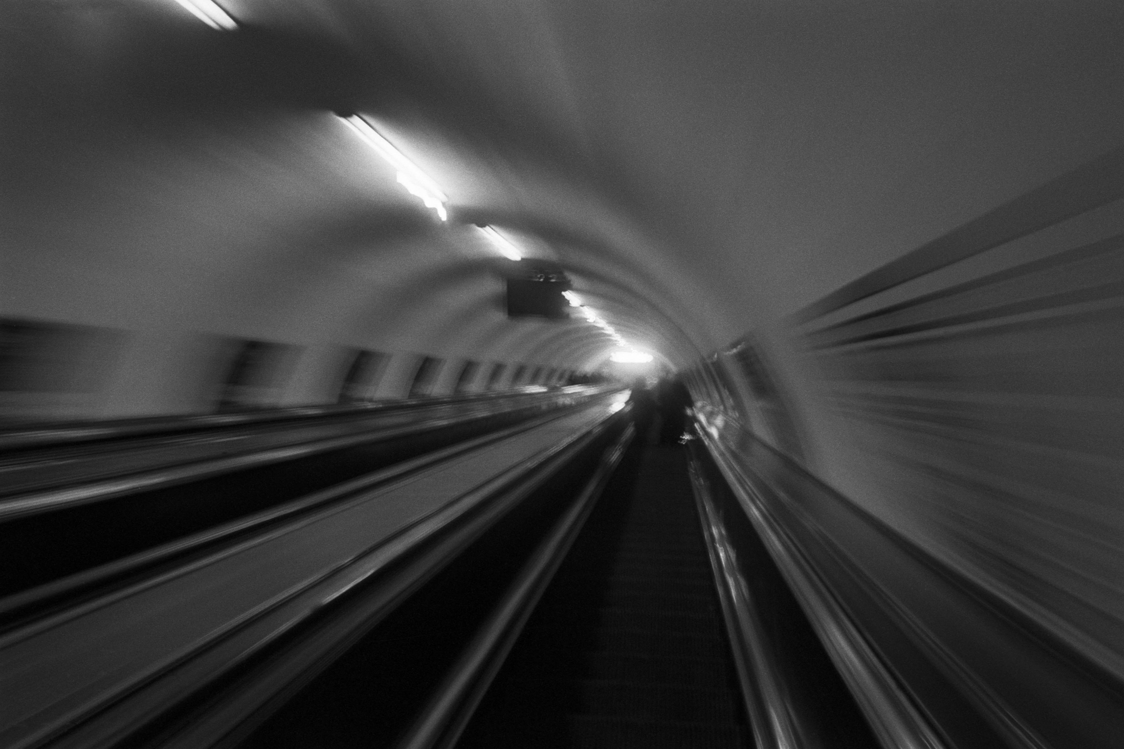
The Wall
2015Winner of the 1st prize & Golden Glass Award at the 11th Photographic Open Championship Olsztyn, and 1st place with the Special Prize of FORMAT magazine at the 3rd Biennial of Art in Piotrków Trybunalski.
View Series →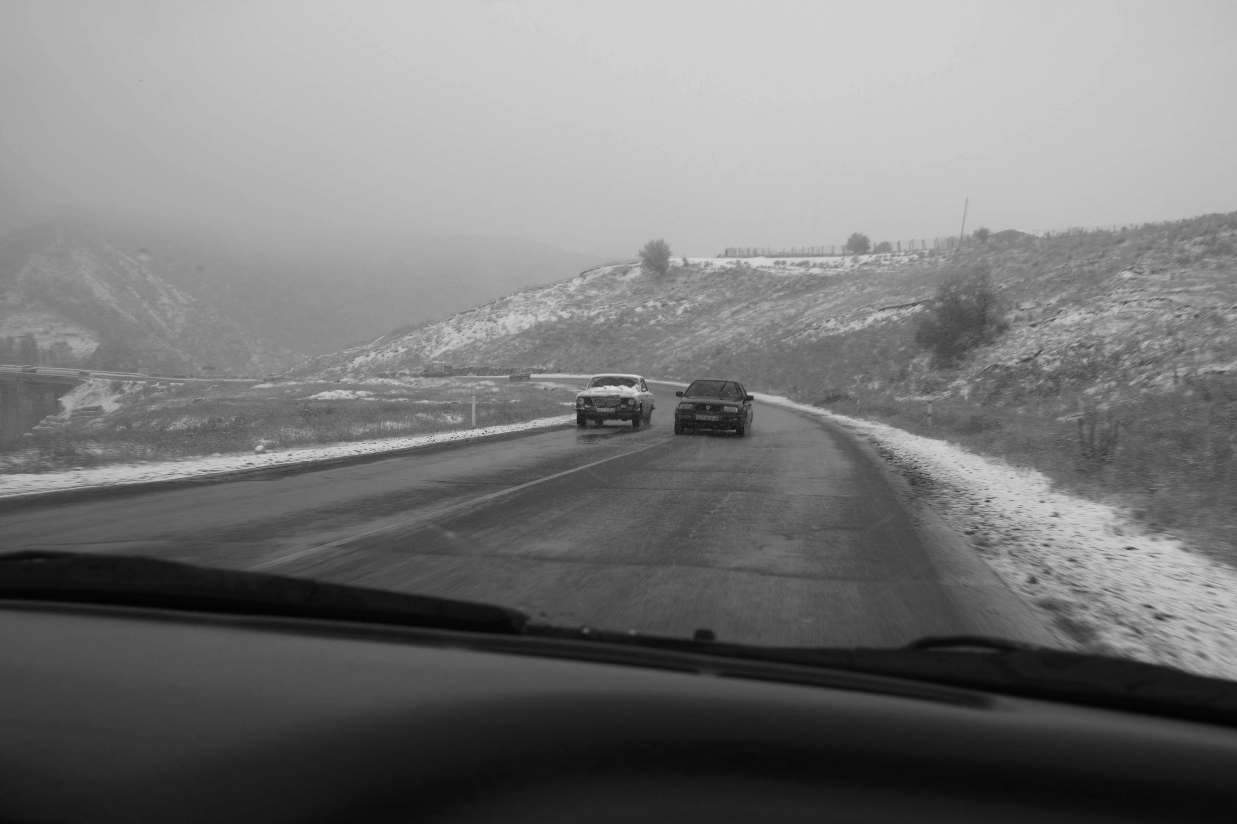
An Engagement Ring
2011A narrative series set in Wrocław in August 2011. Awarded 2nd prize & Silver Glass at the 10th Photographic Open Championship Olsztyn in 2014.
View Series →
Heat Wave
2014A documentary series recording spontaneous events across August and September 2014, capturing the raw energy of a city under the grip of summer.
View Series →