
"Photography is not about the thing photographed. It is about how that thing looks photographed."
The Psychology of Colour in Portrait Photography
Colour can change the emotional temperature of a portrait before the viewer has consciously studied the subject. A deep blue background may suggest distance, authority or calm, while a warm ochre wall can make a face feel grounded and intimate. These responses are shaped by cultural associations, personal memory, lighting conditions and the visual language surrounding the sitter.
In portrait photography, colour is therefore more than a decorative choice. It can support a person’s professional identity, reveal something about character or create tension between appearance and mood. The same red garment might communicate confidence in a fashion editorial and urgency in a conceptual photographic series.
For a photographer working between analogue film, darkroom principles and digital workflows, colour also has a physical dimension. Pigment, reflected light, film stock, paper and screen calibration each influence how a colour is experienced. A restrained palette can feel deliberate and tactile, whereas uncontrolled colour often weakens the story within the frame.
This is especially relevant in Australia, where intense sunlight, pale coastal architecture, eucalyptus greens and broad urban colour palettes influence how portraits are made and viewed. A business portrait in Sydney, a fashion image in Melbourne and an outdoor family session in Brisbane may require entirely different approaches to colour, skin tone and contrast.
How colour shapes emotional perception
Colour psychology in portrait photography should be treated as a set of possibilities rather than a fixed code. Blue is frequently associated with trust and composure, yet a cold blue cast can also imply isolation. Yellow may feel optimistic in one setting and artificial or unsettling in another. Meaning comes from the relationship between colour, expression, gesture, composition and cultural context.
Saturation has a strong influence on perceived energy. Highly saturated colours attract attention and can create a sense of confidence, playfulness or theatricality. Muted colour tends to slow the image down, allowing texture, expression and negative space to carry greater weight. A desaturated portrait may suit an architect or legal professional, while a vivid palette may better reflect a musician, designer or fashion label.
Brightness matters as much as hue. Pastel colours can soften a portrait and create an approachable atmosphere, while dark tones add visual gravity. A bright red feature against a low-key background may become the emotional centre of the image, even when it occupies only a small part of the frame. Careful photographers use this hierarchy to guide attention rather than allowing every colour to compete.
Skin tone, white balance and visual honesty
Portrait colour must begin with credible skin tones. Human skin contains subtle variations of pink, gold, olive, brown and neutral grey, and these can be distorted by mixed lighting. Fluorescent interiors, warm household lamps, LED panels and window light may all appear in the same frame. If the colour balance is not controlled, a considered mood can become an unintended technical error.
White balance is not simply a matter of making every surface neutral. A slightly warm tone can make a portrait feel welcoming, while cooler shadows may create a more introspective mood. The essential point is that the decision should be intentional and consistent with the subject. A corporate portrait should rarely leave skin looking green or excessively orange, while an editorial image can accommodate a more expressive colour treatment.
Australian light can be particularly demanding. Midday sun in Perth or Adelaide produces strong contrast and can push warm surfaces towards yellow, while open shade near the coast may create a cooler blue cast. Photographers often choose early morning or late afternoon for softer directional light, especially when photographing outdoors. Reflectors, diffusion and controlled flash help retain natural skin colour without flattening the atmosphere.
Cultural associations and personal meaning
Colour symbolism changes across communities, generations and personal histories. White may be associated with simplicity, celebration or mourning depending on cultural context. Red can signify luck, romance, warning or power. Green might suggest nature and renewal, although a particular shade may also evoke a sports team, workplace or political association. Portraits become more respectful when photographers avoid assuming that a colour carries one universal meaning.
Clothing often brings the sitter’s own interpretation into the frame. A person may choose a particular jacket because it represents authority, a family tradition or a significant period in their life. In a personal portrait session, discussing wardrobe and location can reveal useful information without forcing the subject into a prescribed visual identity.
Australian portrait work also takes place within a culturally diverse population, including Aboriginal and Torres Strait Islander communities with distinct relationships to land, colour and visual representation. Photographers should avoid borrowing motifs or palettes associated with Indigenous art without permission, context and appropriate collaboration. Listening to the person being photographed is more reliable than applying broad symbolic assumptions.
Choosing palettes for professional portraits
Colour can help position a business or professional in the viewer’s mind. Navy, charcoal and cool neutrals often support an impression of competence and stability. Earth tones can communicate approachability, craft and connection to place. A carefully selected accent colour may link a portrait to a company’s brand without making the image look like an advertisement.
The setting should support the subject rather than duplicate their clothing. A navy suit against a similarly dark blue wall may lose definition, while a warm neutral background can separate the figure and soften the overall impression. Complementary colours can create energy, but they need to be controlled around the face. Strong orange or green areas close to the skin may reflect unwanted colour onto the complexion.
The Australian commercial market is broad, from technology companies in Sydney and Melbourne to tourism, health, construction and creative businesses across regional areas. A portrait for a Brisbane start-up may benefit from a brighter, more open palette, while a financial services firm may require a restrained visual language. The final images should work across websites, LinkedIn profiles, annual reports and media coverage, where colour consistency affects brand recognition.
Analogue processes and the material quality of colour
Film changes the relationship between colour and time. Medium-format negatives can render skin, fabric and background tones with a distinctive density, while analogue grain introduces a tactile quality that is difficult to imitate precisely with a digital filter. Even when the final work is scanned, the colour response of the film stock remains part of the image’s character.
Black-and-white photography removes hue but leaves other colour decisions intact. A red garment and a green garment may become similar in tone, depending on the film and lighting. Filters can alter their separation, allowing a photographer to control how colour translates into luminance. This demonstrates that the emotional effect of colour is closely connected to contrast, texture and tonal structure.
Darkroom thinking is valuable in digital portrait photography because it encourages purposeful editing. Instead of applying a preset to every image, the photographer can consider whether shadows should remain cool, whether highlights need warmth and how much saturation the subject can carry. Digital tools offer precision, but restraint preserves the physical credibility of faces, clothing and environments.
Colour as a narrative device
A portrait can use colour to describe change, contradiction or memory. A vivid accessory may suggest a hidden aspect of a reserved subject. A limited palette can make the image feel suspended in time, while a clash of colours can express pressure or uncertainty. Conceptual portrait photography often depends on these relationships, using colour as part of the narrative rather than as a finishing effect.
Repeated colours can connect a photographic series. A thread of red may appear in a hand-held object, a wall, a reflection and a piece of clothing, creating visual rhythm across several images. Alternatively, a single colour may be deliberately absent until it appears at a significant moment. These methods give a body of work structure and encourage viewers to notice connections gradually.
Location contributes its own visual vocabulary. The greens and grey trunks of eucalyptus trees, the faded tones of weatherboard buildings and the bright surfaces of beach suburbs can all become part of a portrait’s story. In Melbourne, overcast conditions may support a subdued palette, while the intense glare of an Australian summer may call for shade, polarising control or a more graphic approach to colour.
Ethical and practical decisions in commissioned work
Colour grading should preserve the person’s identity. Excessive smoothing, shifting skin tone or altering clothing beyond recognition can create a polished image that no longer represents the sitter. In commercial photography, the client may request a specific brand treatment, but professional judgement is needed to keep the face believable and the colour relationship coherent.
Privacy and consent also matter when portraits are made for businesses, events or public campaigns. Australia’s Privacy Act 1988 regulates the handling of personal information in many contexts, although its application depends on the organisation and situation. A photographer should establish how images will be used, where they will be published and whether the subject has agreed to promotional or archival use. Model releases and written permissions are especially important for commercial campaigns.
Colour choices can affect accessibility as well. A design that relies solely on red and green distinctions may be difficult for people with colour vision deficiency, particularly when portrait images are placed beside charts, buttons or branded graphics. Providing tonal contrast and checking images across calibrated screens helps ensure that the photograph remains legible in websites, social media feeds and printed materials.
The strongest portrait colour decisions are usually quiet, deliberate and responsive to the person in front of the camera. They may come from a vivid garment, a neutral studio, a weathered urban wall or the particular way sunlight enters a room. When colour, lighting and expression support the same idea, the portrait gains emotional clarity without needing to explain itself.
Selected Series
A cross-section of commissioned and personal projects spanning fine art, commercial, and conceptual work.
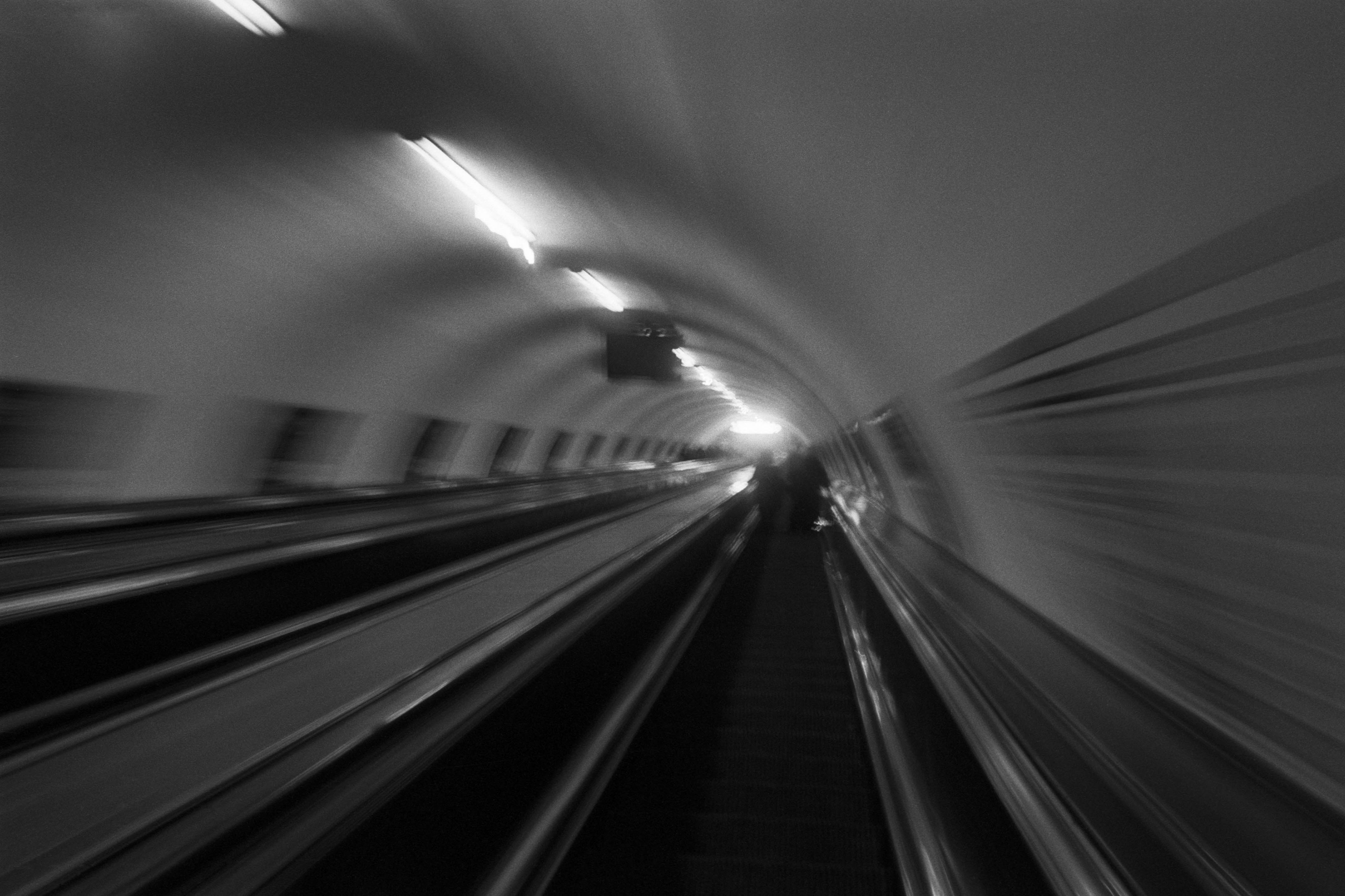
The Wall
2015Winner of the 1st prize & Golden Glass Award at the 11th Photographic Open Championship Olsztyn, and 1st place with the Special Prize of FORMAT magazine at the 3rd Biennial of Art in Piotrków Trybunalski.
View Series →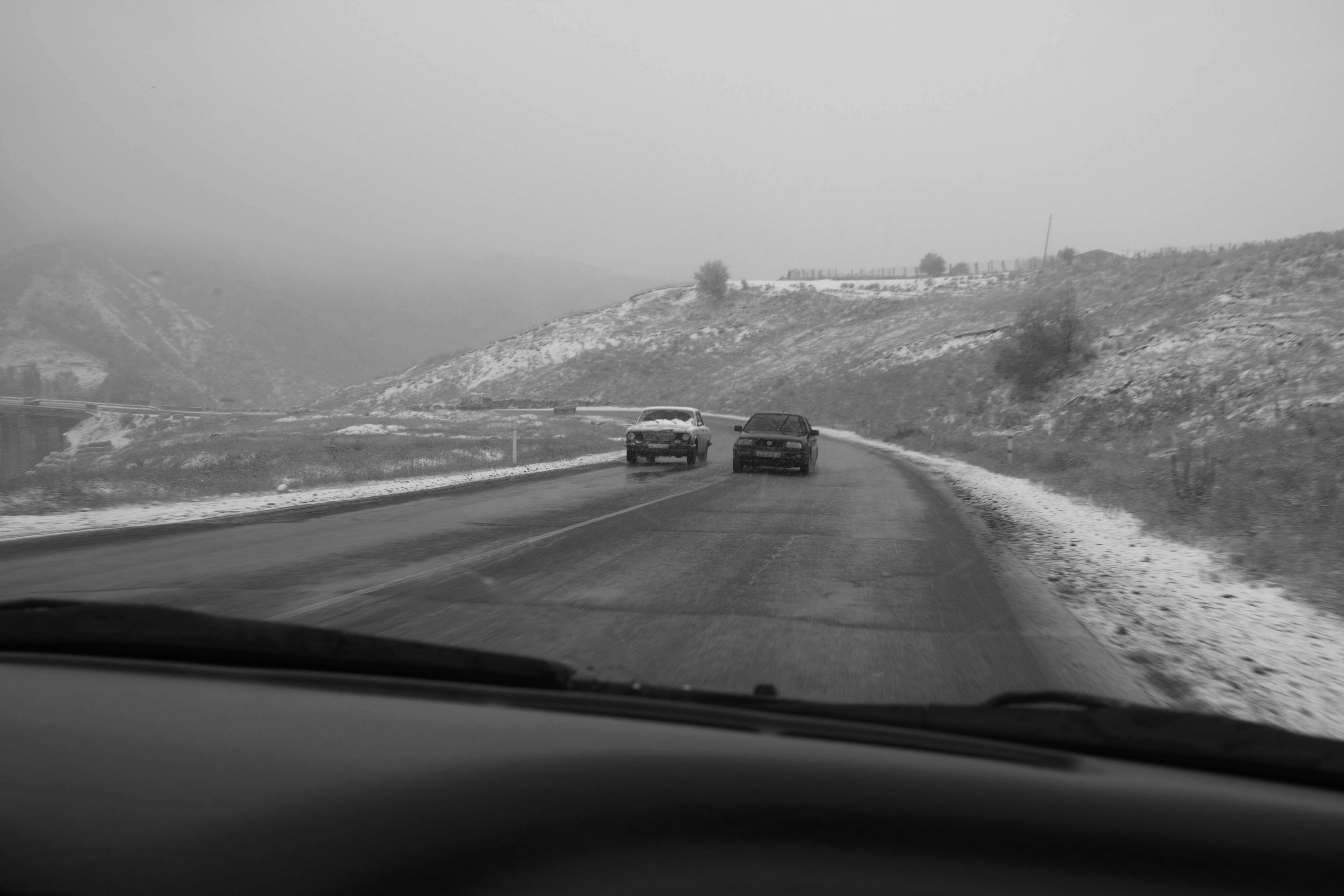
An Engagement Ring
2011A narrative series set in Wrocław in August 2011. Awarded 2nd prize & Silver Glass at the 10th Photographic Open Championship Olsztyn in 2014.
View Series →
Heat Wave
2014A documentary series recording spontaneous events across August and September 2014, capturing the raw energy of a city under the grip of summer.
View Series →