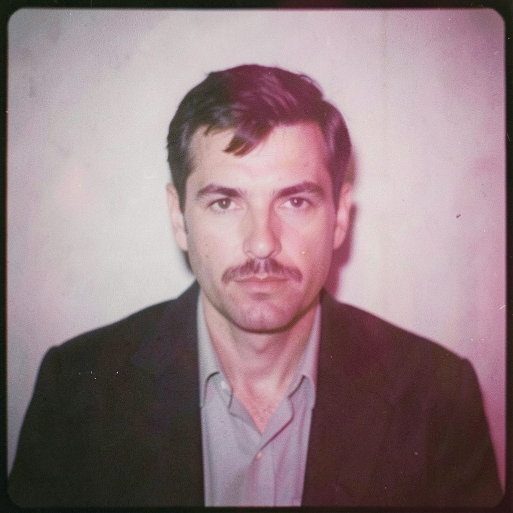
"Photography is not about the thing photographed. It is about how that thing looks photographed."
The story behind my first commissioned commercial shoot
My first paid commercial assignment came from Fieldwork Supply, a Melbourne company making weatherproof daypacks for city travellers. A product designer had found my black-and-white street photographs from Wrocław and asked whether I could make similar restrained images for an Australian launch. The brief covered a new Transit 24 pack, photographed across Sydney and Melbourne for online retail, social posts and shop-window displays. It was my first project with a client, budget and deadline attached.
For years, my work had existed mainly as personal projects made on my own schedule. Even when I photographed portraits or events for money, I usually chose the pace, the cast and the final frame. This commission was different. I had to translate a visual idea into a set of pictures another business could use, sometimes on a crowded Saturday and sometimes before the first ferry. What I remember most is not the finished campaign but the decisions between frames: which one looked honest, which one would work cropped on a phone, and which details the client could actually sell.
A brief that crossed time zones
Fieldwork’s creative director, Mara Bell, joined a video call from Melbourne while I was locking my Wrocław studio. Her central instruction was to make the bag feel part of Australian life without turning the campaign into a tourism advertisement. She wanted commuters, changing weather and practical movement, with enough negative space for advertising copy.
The mood board was quiet: eucalyptus, sandstone, wet pavement and charcoal. Three pack colours had to be identifiable, yet the images could not feel like catalogue cut-outs. Mara supplied rough art directions for Sydney’s harbour edge, inner-city laneways and a more tactile Melbourne setting. I turned those notes into a working sequence of wide scenes, medium portraits and close product details.
Australian daily life informed the sequence. A city bag might carry a laptop to the office, vegetables home from the market, or clothing for a swim; weekend rail travel could take the same person well beyond the city. The useful picture was not an extreme hiker in heroic landscape, but someone checking a train timetable, lifting a coffee or fastening a rain shell. Those actions felt credible in both Sydney and Melbourne.
Chasing a Sydney winter light
I arrived in Sydney in June with a medium-format camera, a flash kit and more clothing than the forecast justified. The client wanted harbour movement and recognisable city texture, so we planned ferry wharves, a Surry Hills laneway and a sandstone park for the first day. Because the work included council-managed public space, we submitted the relevant film permit through the City of Sydney and followed the location conditions attached to it.
The first morning brought drizzle, a cold wind and brief shafts of hard winter sun. Between clouds, the light changed from soft to severe within minutes. The weather forecast had promised usable overcast conditions, and my visual plan depended on it. By lunch, our frames contained wet umbrellas, stray pedestrians and too much empty pavement. The images were atmospheric, but they did not sell the pack.
Rather than keep chasing weather, we changed the method. We used the covered edge of an old ferry terminal as a wind break and lit the bag with a flash bounced into a pale wall. People crossed the background at intervals instead of performing for us. Their interruptions gave the set a pulse, and the repeated horn of the ferry became part of the session rather than an obstacle to it.
Building a set that could move
Across the next two days, we built a compact set inside a warehouse in Alexandria. It consisted of grey seamless paper, a plywood bench, a canvas panel and a wheeled rack holding the three colours of the Transit 24. High industrial windows supplied direction, while a large soft flash controlled the contrast. Nothing imitated a café or station; the simple materials allowed both the product and the people to remain believable.
My main camera was a Hasselblad 500C/M with an 80mm lens, kept on a tripod for product work and braced against a low wall for people. I loaded black-and-white film for the portraits and kept a digital body tethered nearby for colour frames and product colour checks. A small monitor showed clients the general direction, but I still chose exposure and framing before anyone reviewed the files.
The assignment also taught me to design images as a sequence rather than as isolated favourites. Some frames had to establish the city, some had to show how the bag sat on a body, and others had to reveal the waterproof zip, strap adjustment or reflective panel. Every portrait carried a small piece of product information. It was an early lesson in commercial photography: visual interest and practical usefulness still have to occupy the same frame.
Directing people without holding them still
For the human images, we cast two local models with ordinary, recognisable Australian lives rather than seeking a famous face. One was a hospital orderly travelling on the train; the other worked in a Melbourne café and took public transport to the shoot. The modest Australian production budget favoured real clothing and natural locations over a large entourage, so hair, makeup and wardrobe were kept light and functional.
Before finalising our direction, I revisited BHC Clay Smith’s portraiture for its restraint and the way a small gesture carries a frame. I did not want a copied look, only a useful principle: give someone an action and allow the photograph to catch the second before or after it becomes self-conscious. For our model, that meant checking a receipt, accepting a coffee and looking across the street.
We stopped asking people to hold a pose and began giving them short tasks. One had to wait for the ferry, another had to move the bag from one shoulder to the other, and both had to walk three steps while we photographed. The strongest pictures came just after the task ended, when concentration softened into a habitual expression. The change also made the day calmer and gave the cast some ownership of the images.
Film, flash, and a safety net
Black-and-white film gave the portraits their density and let me judge expression before colour competed for attention. Digital capture, meanwhile, made the product shoot safer: exposure, focus, colour and branding could be checked on screen. The flash gave us repeatable light when the Sydney sky would not, and the film supplied subtle highlight roll-off and grain. I treated each method as insurance for the other.
Back in Wrocław, I processed the film in my darkroom, made contact sheets and enlarged the selected frames for tonal judgement. Digital scans then allowed me to compare the portraits with the colour files and build a complete delivery set. The analogue and digital versions were not competing finalists. Together they gave the campaign range, and the client received both consistent campaign images and detail frames that could be reproduced at different sizes.
One test taught me where sentiment and utility could separate. A moody black-and-white frame looked excellent on my screen, yet the small logo on the bag became almost impossible to read. A brighter colour image carried less atmosphere but showed the stitching, lining and hardware. We corrected the lighting, scanned a little lighter and kept enough shadow to preserve depth. Commercial work made redundancy a creative virtue rather than a compromise.
Returning the campaign to the Australian market
The final selection had to work in the places where Australians would actually encounter it: a phone held during a commute, a product page opened beside competing bags, and a poster viewed from across a Melbourne shopfront. I checked crops at small sizes, retained clear areas for copy and made sure the olive, ochre and charcoal versions did not drift apart. A successful frame had to remain convincing beyond the original photograph.
Returning the work also required checking claims rather than simply trusting the mood board. Under the Australian Consumer Law, terms such as “recycled” or “made for Australian weather” needed evidence before publication, while the Privacy Act 1988 and Australian Privacy Principles shaped how cast details, contact information and signed releases were stored. For the council locations, our permit conditions remained part of the production record. These checks may seem separate from the visual work, yet a campaign can fail commercially if its promise or permissions do not match what the image implies.
Copyright also needed a plain agreement. The Copyright Act 1968 meant I retained authorship unless the contract said otherwise, and Fieldwork licensed a defined set of uses across Australia and its export markets. The budget was calculated in Australian dollars, with extra fees for extended retail and digital use, a familiar issue for small local brands working beyond their first city. Once approved, the campaign launched first in Melbourne, then reached Sydney and interstate stockists.
What the assignment left with me
The campaign did not transform me overnight, and I would be foolish to pretend one brief solved every question about commercial work. It did show me that persuasion is a craft: I had to guide the viewer toward the bag without making the person disappear. The strongest images sold the idea because they felt observed rather than arranged, and because the product details had been included with care.
It also changed how I assess a frame. I now ask what happens when it is cropped, compressed, enlarged or placed beside advertising copy. I retain the analogue curiosity that draws me to film, but I plan digital captures around the same discipline of exposure and continuity. That hybrid approach still anchors my work in Wrocław, whether the client is nearby or watching from Melbourne.
Most importantly, I learned to welcome direction without surrendering judgment. A good brief narrows the field, and useful feedback can sharpen an image without flattening it. That first assignment gave me a practical measure for my own pictures: they should hold attention, survive their commercial context and still leave room for a human presence. The experience became the foundation for the commercial work I continue to build today.
Selected Series
A cross-section of commissioned and personal projects spanning fine art, commercial, and conceptual work.
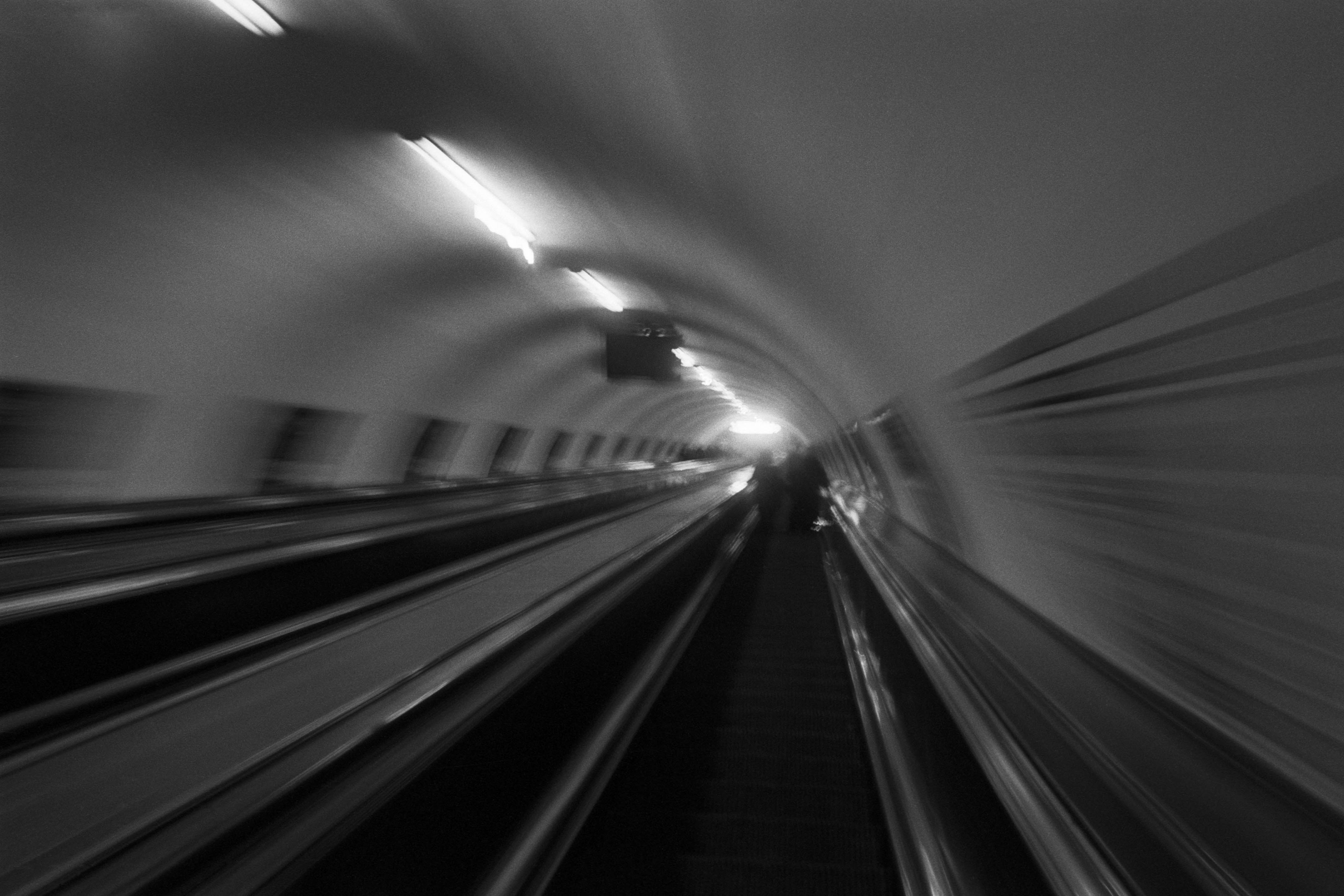
The Wall
2015Winner of the 1st prize & Golden Glass Award at the 11th Photographic Open Championship Olsztyn, and 1st place with the Special Prize of FORMAT magazine at the 3rd Biennial of Art in Piotrków Trybunalski.
View Series →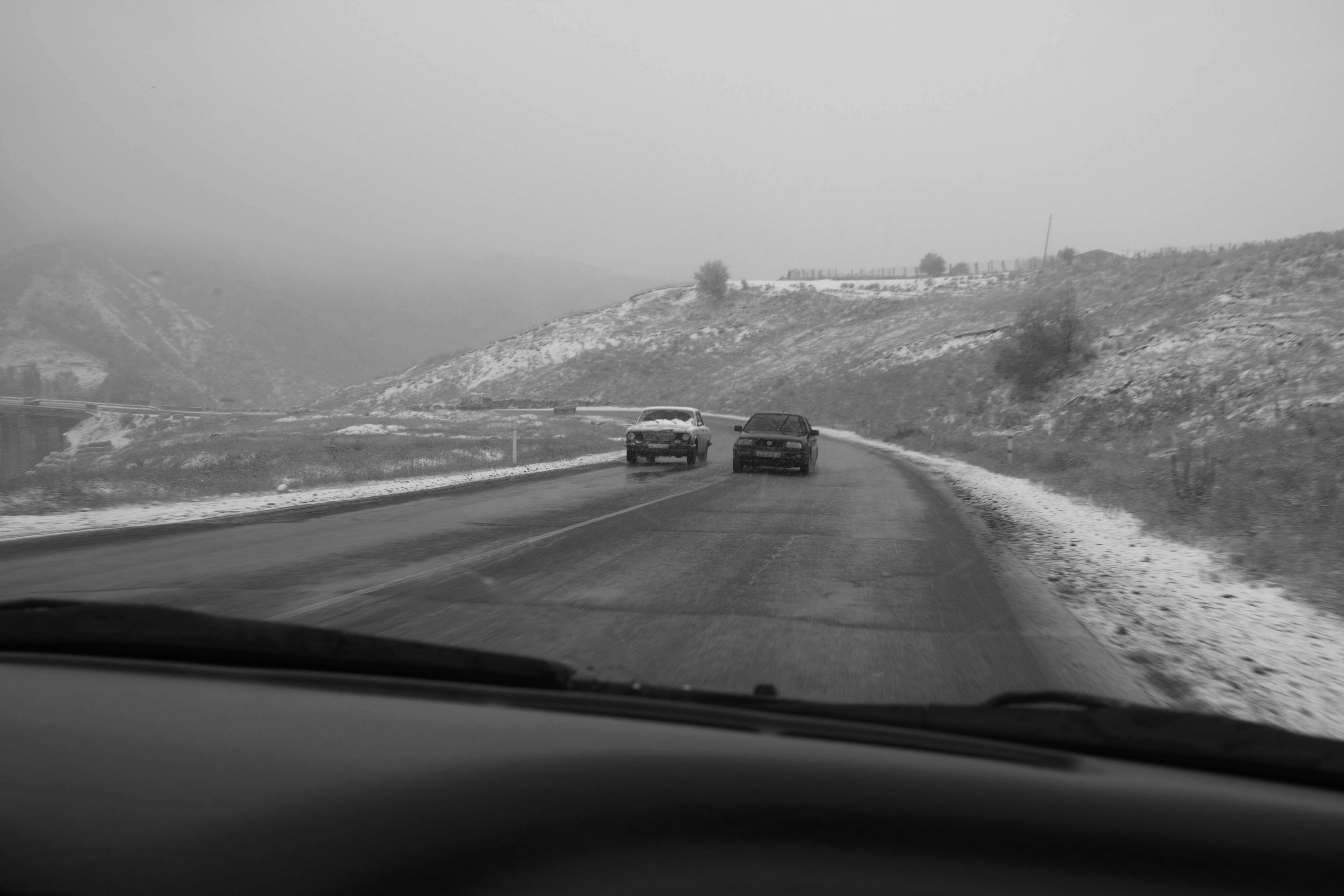
An Engagement Ring
2011A narrative series set in Wrocław in August 2011. Awarded 2nd prize & Silver Glass at the 10th Photographic Open Championship Olsztyn in 2014.
View Series →
Heat Wave
2014A documentary series recording spontaneous events across August and September 2014, capturing the raw energy of a city under the grip of summer.
View Series →