"Photography is not about the thing photographed. It is about how that thing looks photographed."
Shaping Light Through Burning And Dodging
In a traditional darkroom, a photographic print is built through controlled exposure. The negative carries the captured information, yet the final image depends on how that information is translated onto light-sensitive paper. Burning and dodging allow the printer to adjust this translation locally, giving selected areas more or less light than the base exposure receives.
These techniques remain central to analogue photography because they bring interpretation into the printing process. A portrait can gain attention around the eyes, a fashion image can acquire stronger separation between fabric and background, and an architectural scene can retain detail in both shadowed interiors and bright skies. For photographers working between film and digital media, the darkroom offers a tactile way to understand contrast, texture and visual emphasis.
What Burning And Dodging Actually Control
Dodging means shielding part of the photographic paper during exposure so that it receives less light. The covered area prints lighter than it would under the full exposure. Burning has the opposite purpose: additional light is directed onto a selected section after the general exposure, making that area darker.
The distinction sounds simple, yet both methods influence more than brightness. Local exposure changes can alter the apparent weight of a subject, the direction in which the eye moves through a frame, and the emotional character of a print. A slightly darkened edge can contain a restless background, while a carefully lightened face can make a subdued expression feel more immediate.
The process begins with a base exposure, sometimes called the foundation exposure. This establishes the broad tonal relationship of the image before local refinements begin. A printer may first expose the entire sheet for ten seconds, then add three seconds to the lower corners or hold back a highlight for part of that initial exposure.
The aim is rarely to make every tone equally clear. Fine art printing often benefits from hierarchy. Some details should remain quiet, while others deserve prominence. Burning and dodging provide a way to establish that hierarchy without altering the negative itself.
Reading A Negative Before Making The Print
A negative should be assessed as a map of potential tones rather than a finished picture. Dense sections of the negative usually produce lighter areas on the print, while thin sections produce darker ones. Looking at the negative on a light table can reveal where exposure may need restraint, though the enlarger projection remains the final authority.
A contact sheet is an essential working tool. It shows the overall character of a roll and helps identify useful frames, but it also reveals whether the chosen negative has enough information for local adjustment. A poorly exposed negative may tolerate limited correction; an expressive, well-developed negative can offer substantial room for interpretation.
Before placing paper in the enlarger, examine the projected image under the same aperture and filtration you expect to use for the final print. Look at the edges, corners, faces, skies and areas of concentrated texture. Ask where the image loses attention or where the tonal transitions feel abrupt. These observations form a practical map for burning and dodging.
A soft pencil sketch on a scrap sheet can help. Mark areas that need extra exposure with one symbol and areas that require shielding with another. Note the approximate timing beside each mark. This prevents the process from becoming random and makes later comparisons more meaningful, especially when a print includes several local adjustments.
Tools, Timing And Movement
A basic darkroom kit for local exposure work includes an enlarger, a timer, opaque card, thin wire, tongs or a shaped mask, and a reliable supply of photographic paper. The tool should be large enough to cover the intended area while remaining easy to move. A small hole or narrow edge can create a tight adjustment, whereas a broad card is better for a sky, wall or foreground.
Movement is critical. A stationary object creates a sharp boundary that can appear as a visible halo. During dodging, move the shape gently or vary its distance from the paper. During burning, move the mask or use a hole cut in card so the added exposure blends gradually into the surrounding tones. The closer the mask is to the lens or paper, the more defined its edge tends to be.
Timing should be repeatable. A test strip can establish the base exposure, after which separate strips can measure a burn. If the full exposure is twelve seconds and a corner still appears too pale, try additional strips at two, four and six seconds. Keep the aperture and filtration unchanged while testing, unless the overall contrast also needs revision.
For variable-contrast paper, filtration affects the character of the adjustment. A harder filter can increase local contrast, while a softer filter produces a gentler tonal transition. Split-grade printing can be useful when the negative contains both flat shadows and harsh highlights. One exposure with a soft filter can build shadow detail, followed by a harder exposure to strengthen the highlights and midtones.
Some printers use a metronome, spoken counting or a written timing chart to repeat movements. This may sound methodical, yet repeatability is what turns an uncertain experiment into a controlled craft. Fibre-based paper can also curl or change slightly during processing, so keep the workflow consistent from one test to the next.
Building A Print Through Small Adjustments
A successful print usually develops through several modest interventions rather than one dramatic correction. Begin with the overall exposure and contrast. Once the general image feels balanced, identify the areas that still compete for attention. A portrait may require a gentle dodge on the eyes, a burn along the jacket, and a controlled darkening behind the head.
The human face deserves particular care. Dodging the forehead or cheeks too broadly can flatten the structure, while burning beneath the chin can create an artificial edge. It is often better to work with short exposures and soft movement, checking each result under normal viewing light rather than judging only beneath the darkroom safelight.
Edges are equally important. A dark border can create a visual frame, yet an overly heavy edge makes the print feel enclosed. Burning the corners gradually, with irregular timing or varied mask movement, can preserve the natural fall of light. This is especially effective in black-and-white medium-format portraits, where subtle tonal changes carry much of the image’s presence.
In a fashion photograph, local exposure can describe material. A slight burn may bring out the weave of wool or the shape of a pleat, while a dodge can preserve the brightness of silk or polished metal. The correction should support the garment and gesture rather than announce the printer’s hand.
Conceptual images permit a more visible approach. A narrow path of light through a dark field may be deliberately strengthened, or an object may be separated from its surroundings through a restrained burn. The technique becomes part of the image’s language, linking the physical labour of the darkroom with the psychological atmosphere of the series.
A useful test is to place the finished print at a distance and then view it close up. From across a room, the major tonal structure should guide the eye naturally. Up close, the local adjustments should feel integrated. If the viewer notices the correction before the subject, the burn or dodge may need to be reduced.
Practical Darkroom Habits For Australian Printers
Darkroom conditions vary widely across Australia. A shared facility in Melbourne may have excellent enlargers and communal chemistry, while a home setup in Brisbane may require careful attention to humidity, ventilation and paper storage. In Sydney, where photography schools, galleries and independent studios create an active print culture, a consistent testing routine helps work stand apart from quick digital output.
Paper should be stored flat and protected from heat and moisture. In warmer regions, keep unopened packs in a cool, stable environment and allow them to reach room temperature before use. Avoid placing paper near chemical trays, washing areas or direct sunlight. Changes in humidity can affect handling, drying and the final surface of fibre-based prints.
When working for the Australian fine art market, presentation matters as much as the darkroom result. Collectors, galleries and photography fairs commonly expect clean borders, even processing and clear documentation. A print with expressive tonal control still needs careful washing, drying and spotting before it is signed or offered for exhibition.
The local light can also influence creative decisions. Harsh summer conditions in Perth or Adelaide may encourage a printer to preserve delicate highlight structure, while overcast winter light in Hobart can make a stronger tonal separation feel appropriate. These are not fixed rules, but awareness of the environment can shape how a series is edited and printed.
A darkroom print should be judged under viewing conditions similar to its intended setting. A work destined for a Sydney gallery may be seen under controlled illumination, while a portrait displayed in a Melbourne home may encounter softer domestic light. Comparing prints under different sources can reveal whether the shadows are too dense or the highlights too dominant.
Timing And Evaluation Checklist
- Make a clean base exposure before local corrections.
- Record every burn, dodge and filtration change.
- Compare prints under ordinary viewing light.
- Keep a successful timing chart for edition consistency.
Common Areas To Check
- Faces, eyes and hands in portrait work.
- Bright skies, windows and reflective surfaces.
- Corners and borders that pull attention outward.
- Clothing, skin and background separation.
A print should also be evaluated after processing, not while it is wet in the tray. Wet paper often appears darker and more contrasty than the dried print. Fibre-based paper can change noticeably as it dries, so keep a finished reference nearby and allow enough time before deciding whether another correction is necessary.
Consistency becomes especially important when producing an edition. Keep the same enlarger height, lens aperture, filtration, paper batch and chemistry conditions whenever possible. Small variations are part of analogue practice, but a disciplined record helps distinguish intentional interpretation from accidental drift.
Why The Technique Still Matters
Digital software can reproduce many local tonal adjustments, yet the darkroom offers a different relationship with time and material. Every correction passes through exposure, development, stopping, fixing, washing and drying. The printer sees the image emerge gradually and learns to anticipate how light becomes silver on paper.
That physical sequence encourages patience. A dodged highlight cannot simply be restored with a keystroke, and an over-burned shadow may require a new sheet. The limitations are productive because they make each decision visible. They encourage restraint, repetition and attention to the whole print rather than isolated pixels.
For an artist working across analogue and digital formats, these principles remain transferable. The darkroom teaches how tonal contrast creates emphasis, how edges control movement, and how small changes can alter the emotional balance of an image. Those lessons inform digital retouching, scanned film, exhibition printing and commercial commissions alike.
Business portraits, fashion campaigns and event photographs all benefit from this awareness. A carefully printed portrait can feel more confident without becoming artificial. An event image can retain atmosphere while clarifying the central gesture. A conceptual series can use tonal variation to create continuity across separate frames.
Burning and dodging are therefore more than corrective procedures. They are methods of interpretation. The negative provides the recorded material, while the printer decides how that material should be seen. Through measured exposure, controlled movement and repeated observation, the final print becomes a considered translation of the original photograph.
Selected Series
A cross-section of commissioned and personal projects spanning fine art, commercial, and conceptual work.
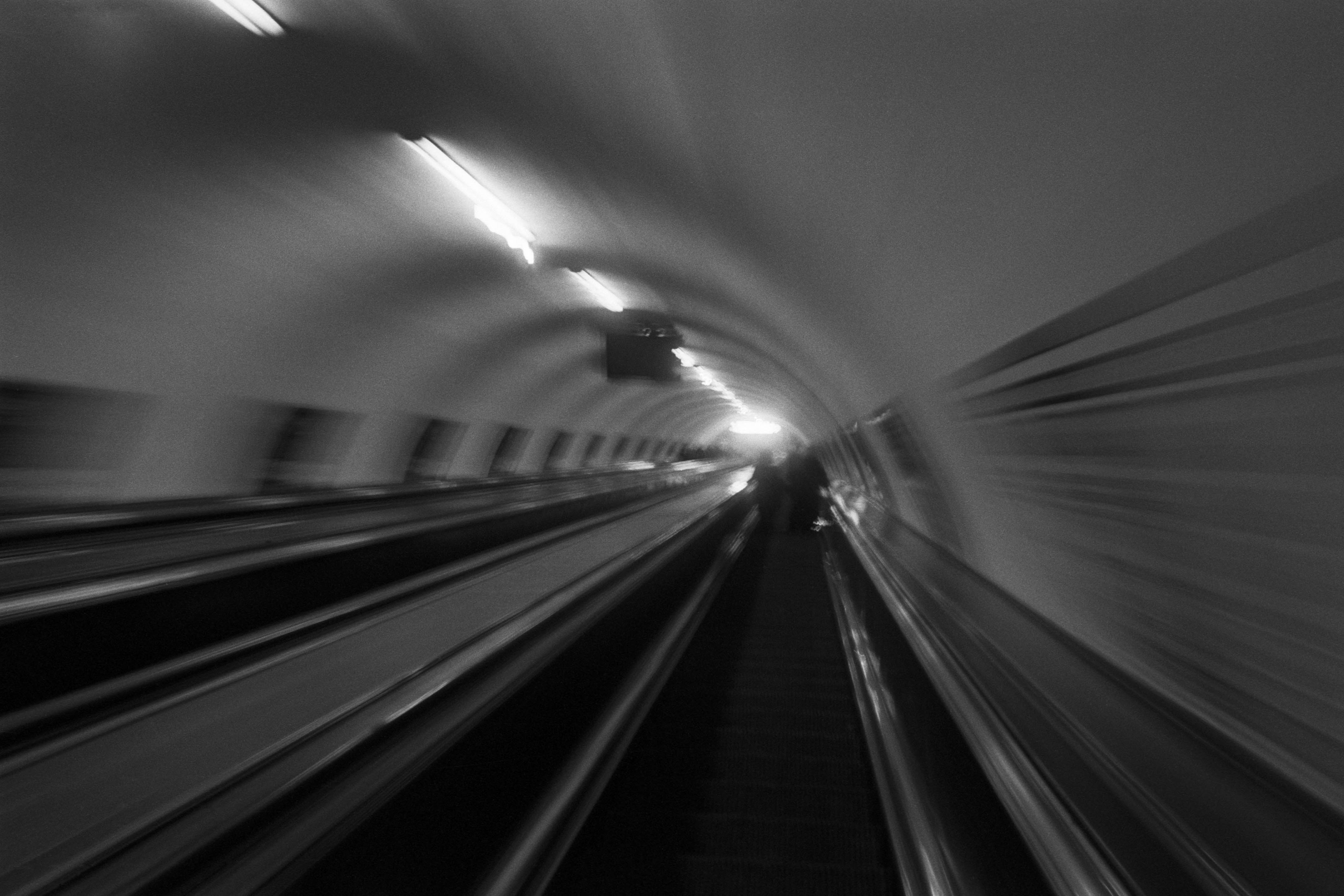
The Wall
2015Winner of the 1st prize & Golden Glass Award at the 11th Photographic Open Championship Olsztyn, and 1st place with the Special Prize of FORMAT magazine at the 3rd Biennial of Art in Piotrków Trybunalski.
View Series →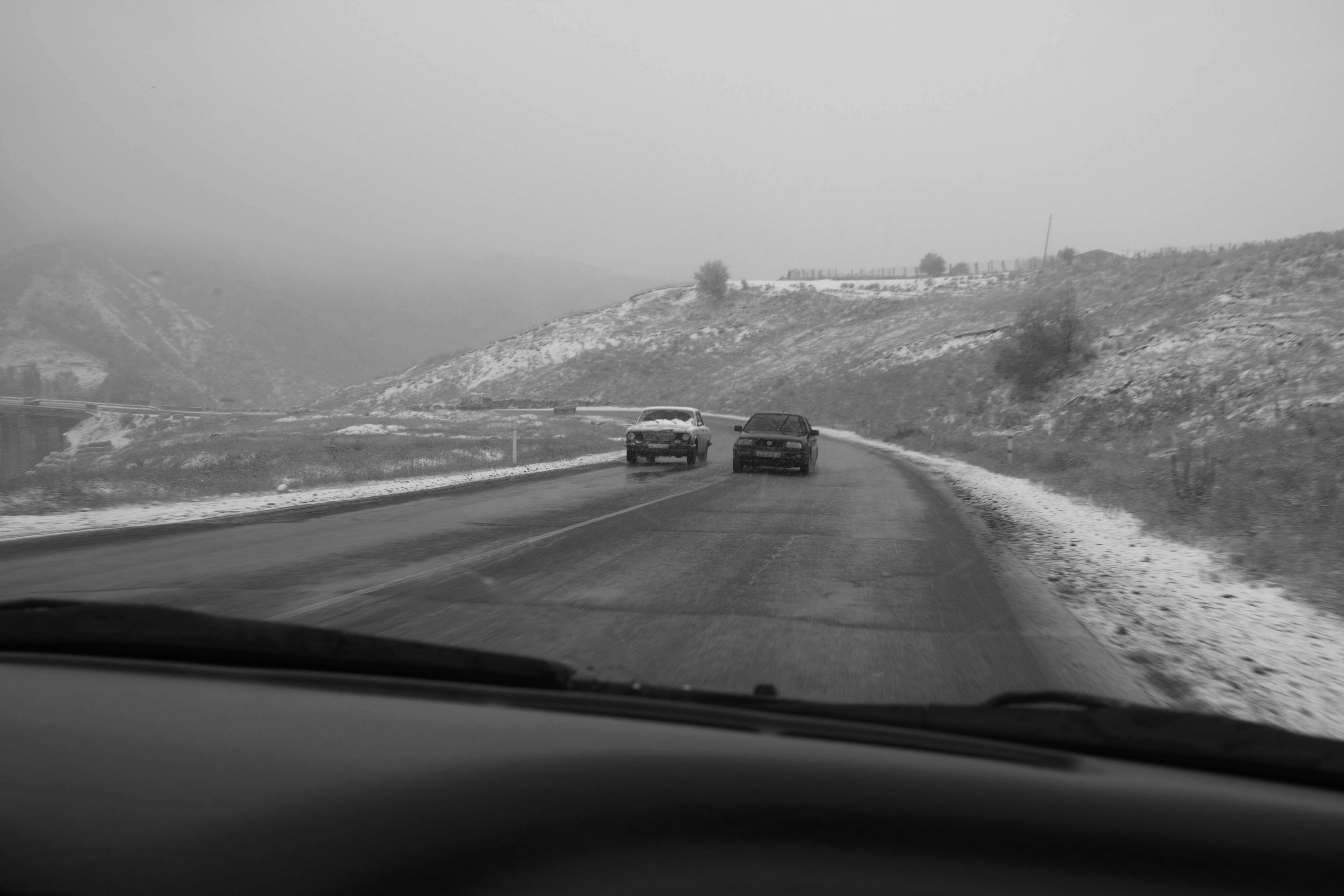
An Engagement Ring
2011A narrative series set in Wrocław in August 2011. Awarded 2nd prize & Silver Glass at the 10th Photographic Open Championship Olsztyn in 2014.
View Series →
Heat Wave
2014A documentary series recording spontaneous events across August and September 2014, capturing the raw energy of a city under the grip of summer.
View Series →