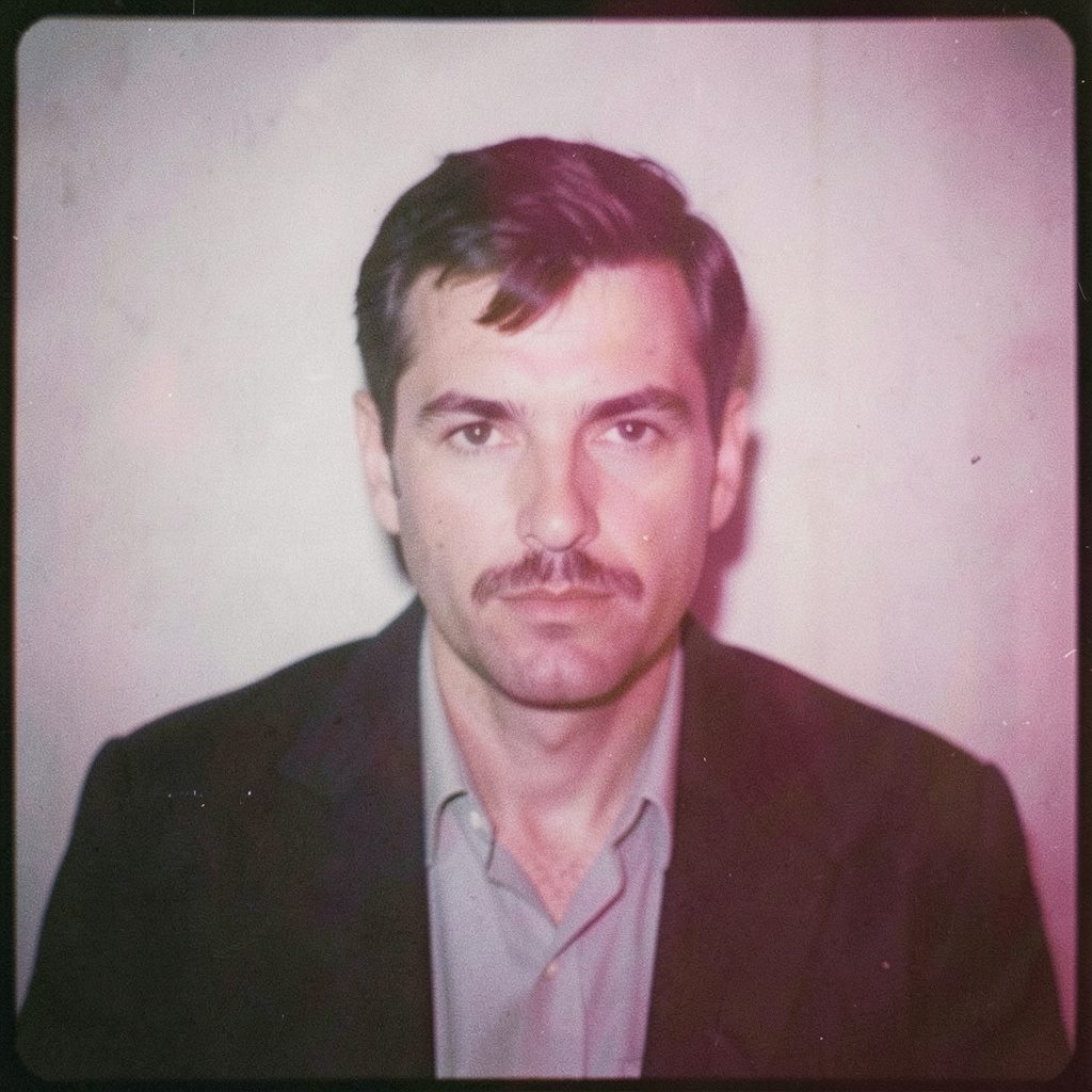
"Photography is not about the thing photographed. It is about how that thing looks photographed."
Why I avoid overly edited images in my portfolio
My portfolio is not meant to be a catalogue of perfect-looking pictures. It is a record of how I see, stage and develop an image, and of the decisions required to turn a raw frame into a finished photograph. When potential clients in Australia compare photographers, they often look for consistency and reassurance as much as technique. A believable image gives them something solid to discuss.
By overly edited, I mean images in which retouching becomes the dominant event. Skin is made glassy, facial features are reshaped, backgrounds are unnaturally clean, and every tonal irregularity has been removed. This does not mean I reject post-production. Exposure, contrast, colour correction and restrained retouching are part of every professional image. The distinction is between edits that support the photograph and edits that replace it.
I work from Wrocław, combining medium-format and black-and-white film with a considered digital workflow. That process gives my images a defined character before any software is opened. My responsibility is to protect that character while removing technical faults. The photographs in my portfolio therefore show finished work without disguising how that work was made.
What excessive editing changes
An overly retouched frame may appear immaculate at first glance, yet it can remove the visual evidence of a real person and place. Every blemish is corrected, but so is every trace of pores, hair, movement and reflected light. The result may be polished, but it can also feel distant. Viewers recognise faces, environments and materials through small imperfections. Erasing all of them can weaken the connection between the image and the scene it represents.
This matters especially in business portraits. The subject may want to look alert, approachable and professionally prepared, but they should not become unrecognisable. I can soften temporary redness, lift shadows and refine clothing without manufacturing a face that never existed. Australian clients working in technology, finance and creative industries often appreciate this balance because their teams value personality as well as presentation. A sharply dressed person with visible character is usually more useful in a campaign than a generic corporate template.
The same principle applies across fashion, events and conceptual photography. A fashion image may need careful cleanup of a garment or background. An event frame may need distracting objects removed. A conceptual series may depend on the tension between polished and accidental elements. When editing goes beyond those needs, the image loses its atmosphere and begins to resemble every other aspirational photograph in the market.
Keeping the process visible
Traditional techniques give me a strong foundation for judging what should remain in a photograph. I shoot medium-format film because the detail and tonal depth force me to slow down and compose with care. Black-and-white work strips away some surface information, leaving shape, gesture and light to carry the frame. These are not nostalgic choices; they are working methods that keep my attention on what is actually present.
Darkroom principles influence my digital workflow as well. I think in terms of density, blocked shadows, highlights and the relationship between adjacent tones rather than applying a preset and accepting the result. A digital file can support subtle changes in local contrast and monochrome rendering, but it should not look mechanically processed. The aim is a photograph that feels coherent from highlights to shadows, not one that announces how many sliders were used.
Printing provides the final test. A portrait or conceptual frame can look convincing on a calibrated monitor while revealing weak tones, oversharpened texture or an unnatural colour balance on paper. I examine test prints at different sizes because a face that works across a large wall may behave differently in a magazine reproduction or an online crop. Keeping the process visible means respecting the limitations of each output rather than assuming every flaw can be hidden in software.
Trust matters more than perfection
Trust is essential when I photograph people for professional use. A business portrait may appear on a company website, in a media interview or across a recruitment campaign, so its visual language must remain credible. The person in the photograph should recognise themselves in the image. Colleagues should also recognise the individual. Excessive reshaping can create flattering pictures, but it can also create uncertainty when the subject later sees them in a different context.
Working with Australian clients has reinforced the value of straightforward communication. Phrases such as “have a look”, “not a drama” and “fair enough” often accompany an exchange of images and feedback. The tone may be relaxed, but the commercial expectations are precise. I explain what can be corrected, what will remain and why a particular expression or environmental detail contributes to the result. That conversation creates approval based on shared intent rather than an expectation of automatic perfection.
There is also a practical benefit to honest retouching. Agencies, brand teams and independent businesses need images they can use confidently across different formats. If the first presentation relies on heavy digital reconstruction, changes become harder when the image moves from a website to print or an outdoor campaign. I prefer to resolve issues while I can control lighting, wardrobe, posing and composition, then make only measured finishing adjustments in the digital workflow.
Fine art needs room for ambiguity
Fine art photography operates differently from commissioned portraiture. A conceptual series does not need to explain every detail, and its power often comes from unresolved relationships between the body, the setting and the frame. Excessive cleanup can make an image too literal. Removing a shadow, softening a gesture or perfecting a rough surface may improve individual components while destroying the emotional tension that holds the series together.
This is why I keep some irregularities in my fine art work. Dust, uneven light, awkward edges and subtle human gestures can carry meaning. The objective is not to celebrate technical failure, but to preserve elements that make the photograph specific. A picture may be quiet and unresolved because life is often like that. Giving it a commercially polished surface can make it feel manufactured before the viewer has had time to interpret it.
Consistency across a series is equally important. If I use the same visual rules throughout a body of work, viewers can follow its internal logic. That might mean retaining a consistent grain structure in black-and-white photographs, allowing colour to shift gently across a set, or preserving the same degree of sharpness. Editing standards should serve the sequence rather than announce themselves within it. The photograph should reveal itself gradually, not arrive as a heavily branded package.
Commercial polish still has a place
Not every edit should disappear. Product photography often requires clean backgrounds, accurate colour, controlled reflections and the removal of small defects. Commercial work also has strict brand and usage requirements. I would be less useful if I treated those necessities as evidence of a weak photographic practice. The question is whether each change answers a clear brief, preserves material truth and remains believable when reproduced.
Australian assignments show how varied those briefs can be. A Melbourne café may need images that suit its laneway setting, a Sydney fashion label may want a clean background for online presentation, and a Perth company may need portraits made under intense sunlight without every shadow becoming harsh and theatrical. These are different visual problems. Rather than applying one house style, I adjust the lighting and workflow to suit the environment and audience.
The Australian commercial market also rewards adaptable collaboration. Work may come through a local creative agency, an in-house brand team or a direct commission from a small business, with deliverables agreed through a detailed quote. Colour management, image usage, retouching limits and delivery timelines all need to be clear. When production requires on-location assistance, I can work with an Australian photographer, producer or retoucher. A shared standard is more reliable than forcing every technical decision through a workflow designed for another country.
Physical and digital delivery must carry the same intention. International shipping from Wrocław takes planning, and a fine-art print needs protection from heat, humidity and shifting temperatures. I specify the paper, edition and framing method so the final object can be reproduced faithfully. On screen, I check profiles and crops for common platforms; in print, I approve a physical proof. Polish is justified when it serves clarity and consistency, not when it merely conceals the photographer.
The standard behind my selections
Portfolio selection follows the same principle. I choose frames with a clear visual idea, a believable treatment and enough detail to demonstrate how I work. That may be an expressive portrait, a fashion study, an event photograph or an image from a conceptual series. The categories need not share one look, but they should share my approach to light, structure and human presence.
My editing standard is deliberately narrow. I correct exposure errors, refine distracting backgrounds, balance colour and remove temporary flaws that distract from the intended image. I do not invent anatomy, add synthetic detail to disguise weak lighting or remove every sign of texture. If a substantial alteration is necessary for a commissioned concept, I agree on it during production and make the final image credible. The portfolio is not a showroom for invisible labour.
This approach also keeps the work open to change. Equipment, assignments and visual ideas evolve, so the portfolio should not imply that one era or technique defines me completely. What remains is the commitment to images with a recognisable point of view and a credible relationship to reality. In Wrocław, that means respecting the limitations of film, the discipline of the darkroom and the precision of digital tools. The finished photograph may be polished, but it should never lose the evidence of the moment from which it came.
Selected Series
A cross-section of commissioned and personal projects spanning fine art, commercial, and conceptual work.
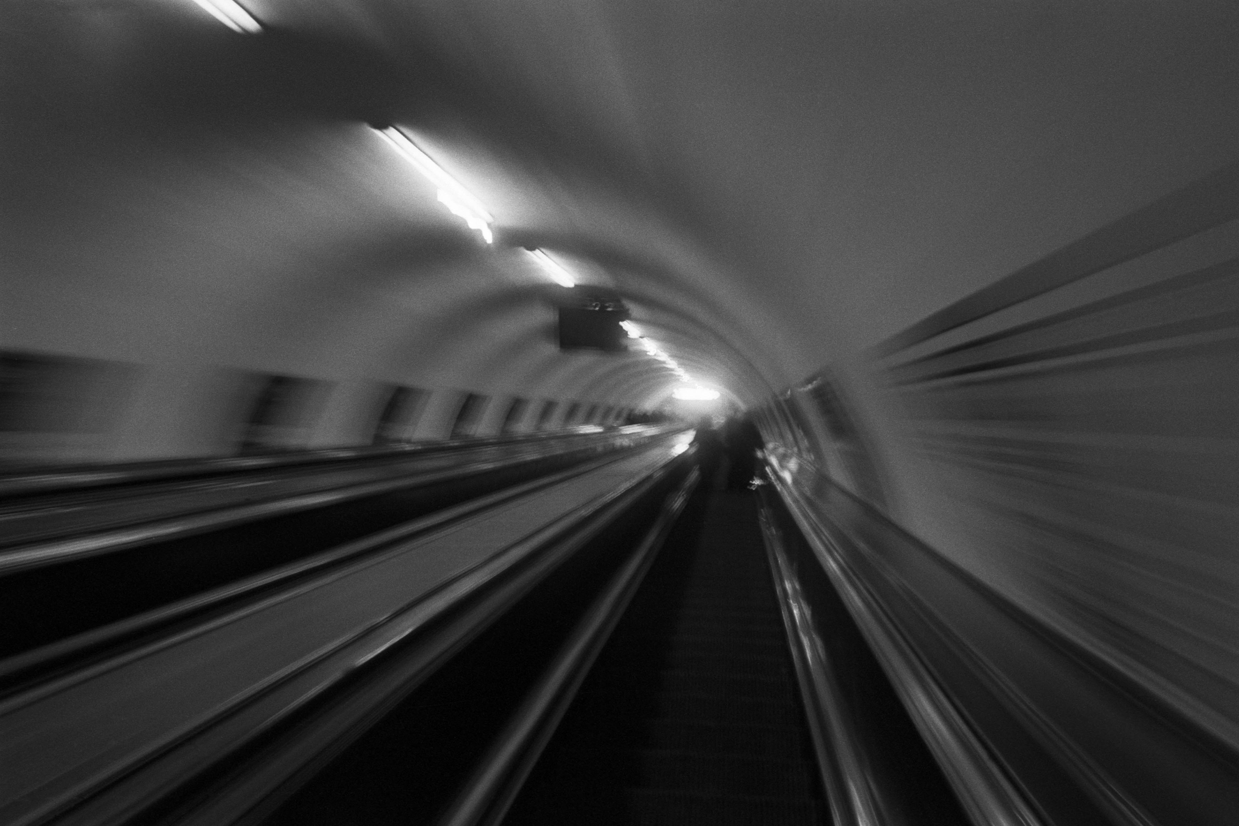
The Wall
2015Winner of the 1st prize & Golden Glass Award at the 11th Photographic Open Championship Olsztyn, and 1st place with the Special Prize of FORMAT magazine at the 3rd Biennial of Art in Piotrków Trybunalski.
View Series →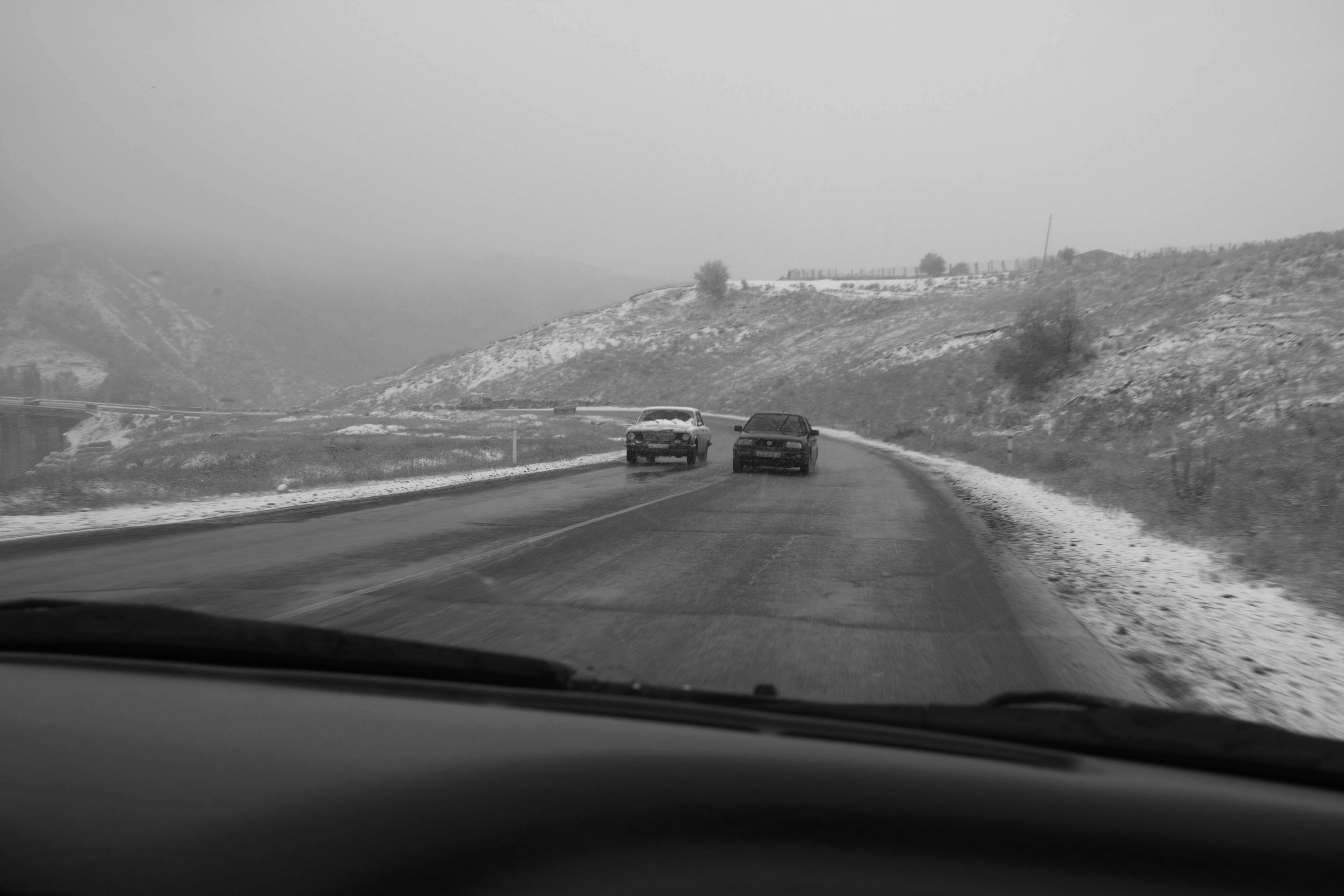
An Engagement Ring
2011A narrative series set in Wrocław in August 2011. Awarded 2nd prize & Silver Glass at the 10th Photographic Open Championship Olsztyn in 2014.
View Series →
Heat Wave
2014A documentary series recording spontaneous events across August and September 2014, capturing the raw energy of a city under the grip of summer.
View Series →