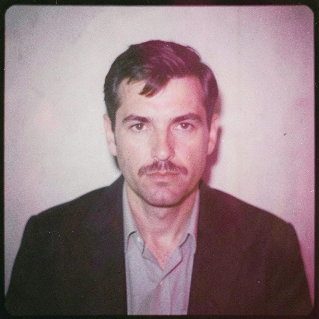
"Photography is not about the thing photographed. It is about how that thing looks photographed."
Why I sometimes break the rule of thirds
The rule of thirds is one of those pieces of photographic shorthand that can look self-evident once the grid is visible. Divide a frame into nine rectangles, place the subject near an intersection, and give the eye a route into the image. I learned its usefulness in my Wrocław, Poland studio while working with medium-format film, where every negative and contact sheet encouraged me to study balance before I printed an image. It remains a strong instinct, particularly for portraits, fashion, and documentary work, because it can create space around a person and a sense of movement without making the composition feel engineered.
Yet a grid is a tool rather than a law. Some photographs become quieter, stranger, or more urgent when the subject leaves the familiar intersection. Across my fine-art and commercial commissions, I have learned to treat that departure as a decision with consequences. Sometimes the rule creates exactly the hierarchy a client needs; at other times it flattens a relationship, hides the setting, or turns a living moment into a diagram. This is why I sometimes break the rule of thirds: not as a gesture against tidy composition, but to serve the photograph’s emotional and commercial purpose.
Composition begins with attention
The thirds grid works because it balances emphasis and openness. A face placed off-centre can feel more alert than one in the middle, while the empty side of the frame gives that gaze somewhere to travel. I often use this structure in business portraits: the subject sits near a third, the shoulders make a diagonal, and the background carries enough detail to describe a workplace without competing for attention. Even in a formal frame, the arrangement can feel natural because the eye is invited rather than commanded.
Over time, I became interested in what happens when those relationships are disturbed. If a subject leans toward the edge, the open space can imply anticipation or vulnerability. If a figure is crowded against one side, the frame acquires pressure. Centring can do the opposite, producing calm, formality, or confrontation. These effects are not automatically improvements. They are choices, and they need to connect to the brief, the body language, and the larger narrative of the series.
I still return to thirds when it clarifies a difficult scene. At an event, a speaker may be surrounded by gestures and reactions; in a fashion frame, a garment may need room to project beyond the body. A precise placement can make either scene legible at a glance. Breaking the rule becomes meaningful only when the conventional solution fails to express what the camera is actually seeing.
Balance, tension, and visual weight
Photographic balance is more physical than the grid suggests. A small, sharply rendered face can outweigh a large area of pale sky. Dark shapes carry weight, while repeated verticals can create a rhythm that either steadies the frame or makes it rigid. When I compose on location, I look for these forces before deciding where a person should stand. The subject does not need to sit at an intersection if the surrounding architecture already occupies that point.
This is especially useful for business portraits that sit between corporate convention and personal character. A centred head and squared shoulders can communicate authority, but an off-centre stance with a little environmental context may suggest confidence without stiffness. Clients often ask for images that feel approachable and credible. In Australian briefs, that combination is frequently expressed in plain language: relaxed, direct, and professional. The visual answer may be an asymmetrical frame, with the subject held securely and enough looking room for the scene to breathe.
In conceptual work, tension can carry the idea itself. I might place a figure almost at the border so that the architecture seems to interrupt the body, or centre an element that a thirds-based composition would have pushed aside. The resulting image can unsettle the viewer and remain unresolved. That unease is deliberate; random deviation would merely look careless. My aim is to create a relationship the viewer notices before naming it.
The environment deserves its own frame
Environmental portraits often reveal why strict placement can feel artificial. A person in a Melbourne laneway may be framed by brick, steel shutters, painted signs, and the bright rectangle of an open doorway. A narrow third can let the lane recede beside the subject, making the location part of the story. If the figure is placed centrally, those competing lines pull it in two directions. Moving the camera a step, waiting for a pedestrian to pass, or accepting a less balanced frame can make the place feel inhabited.
Backgrounds in Australia can be visually forceful. Along the coast, pale sandstone and hard sunlight reduce a figure to a dark silhouette; in Sydney’s humid haze, distant buildings soften while foreground textures become pronounced; in Perth’s dry glare, edges and shadows are exceptionally defined. Each condition changes which element should dominate. Sometimes the person belongs on an intersection. Sometimes the setting should.
I also treat clutter as part of the decision. A bright sign, a cropped head, or a chair cutting through the lower corner may be distracting in a conventional layout, yet it can establish the rhythm of a documentary frame. Rather than erase every irregularity, I assess whether it contributes to the photograph’s truth. In conceptual series, I may retain a collision that a clean commercial image would remove. For a portrait commission, I make the correction. The context decides the standard.
Film, digital tools, and deliberate control
My practice began with analogue habits: medium-format negatives, black-and-white film, and darkroom printing. On a contact sheet, composition can be judged without the polish of a finished print. Weak placements announce themselves quickly. I still work this way when a series needs tonal subtlety, because the grid’s visual logic becomes clearer when colour and detail temporarily fall away. A face beside a block of shadow may hold more force than a centred face surrounded by even grey.
Digital workflows give me another kind of control. I can test a crop, compare it with a full frame, and check how the hierarchy survives on a phone or a large screen. This matters for Australian clients whose images may move between a presentation deck, a website, social media, and print. The off-centre composition must remain clear at small size as well as in a gallery. Sometimes I refine a film frame through digital capture; sometimes I use digital capture to resolve a lighting idea developed in the darkroom.
Technology has not replaced judgement. It has made experimentation cheaper and reversals easier, which can also encourage excess. I limit adjustments to what the original frame supports. If the subject is too close to the edge, correcting that in software may rescue the image, yet a different camera position would usually have produced a stronger result. The workflow should reveal intention, not disguise indecision.
Working within the Australian market
Australian commissions have sharpened my understanding of communication. A creative brief may be concise: capture the team, show the person approachable, keep it suitable for external use. Workplace conversations are often direct and informal, with first names used quickly. Phrases such as “fair enough” acknowledge a point without turning it into a debate. I listen for the distinction between a stated preference and the emotional result the client wants. “Relaxed” might mean natural light, an uncrowded frame, or a candid moment after the formal portrait.
The market also shapes delivery. A business portrait may need versions for a LinkedIn profile, an annual report, a media release, and a campaign landing page, with different crops and usage expectations. Fashion and event work may involve stylists, agencies, production schedules, and tightly agreed shot lists. I explain what each composition is doing, because a client who understands the purpose can judge the photograph more accurately than by asking whether every line obeys a grid. Licensing, territory, and duration need to be clear for commercial use in Australia and beyond.
Geography adds another layer. Briefings can arrive from Sydney, Melbourne, Brisbane, or Perth, and teams often work across Australian time zones. Event timing follows daylight and venue access, while portrait sessions may be planned around office hours and harsh midday sun. I build the shoot around practical constraints rather than treating them as interruptions. A reliable location, a well-timed break in the weather, or a short walk to better light can produce a more convincing frame than an elaborate setup that the schedule cannot sustain.
Making the exception with purpose
When I depart from the thirds grid, I do so through a repeatable process. First, I identify the subject’s visual priority: face, gesture, garment, environment, or an abstract relationship between them. Then I assess balance through weight, direction, and open space. Finally, I compare the proposed frame with the conventional one. If the break adds tension while preserving clarity, I keep it. If it merely makes the photograph feel busy, I return to the grid.
This approach gives both commissioned and personal work room for accident without surrendering control. On a conceptual shoot, the first frame may follow the rule and the second may challenge it. The pair can expose a contradiction at the heart of the series. For a client portrait, the deviation may be nearly invisible: a shoulder allowed to cut the edge, a background line that no longer sits squarely behind the head, or a subject given more space on the side they face. The photograph feels different because it is truer to the person, not because it announces technical rebellion.
Technique matters here. I compose, shoot, review, and revise with the same attention to relationships in each stage. The rule of thirds has earned its place in my practice through years of useful discipline. It teaches the eye to distribute attention and make space meaningful. I keep that lesson available when it serves the image, then set it aside when a stronger frame asks for asymmetry, pressure, or ambiguity. The decision is complete when the composition feels inevitable, even if a viewer can see that another possibility was rejected.
Selected Series
A cross-section of commissioned and personal projects spanning fine art, commercial, and conceptual work.
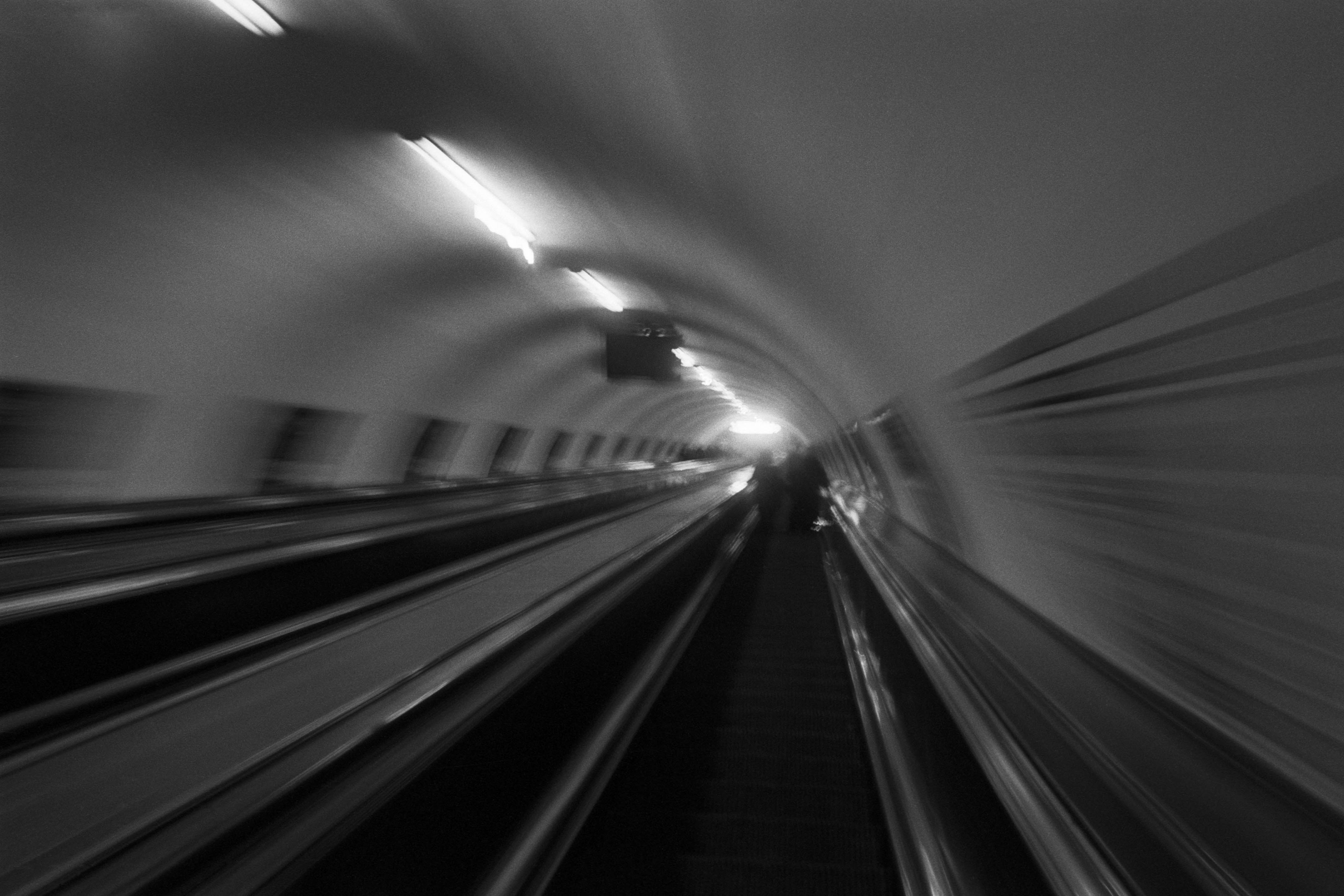
The Wall
2015Winner of the 1st prize & Golden Glass Award at the 11th Photographic Open Championship Olsztyn, and 1st place with the Special Prize of FORMAT magazine at the 3rd Biennial of Art in Piotrków Trybunalski.
View Series →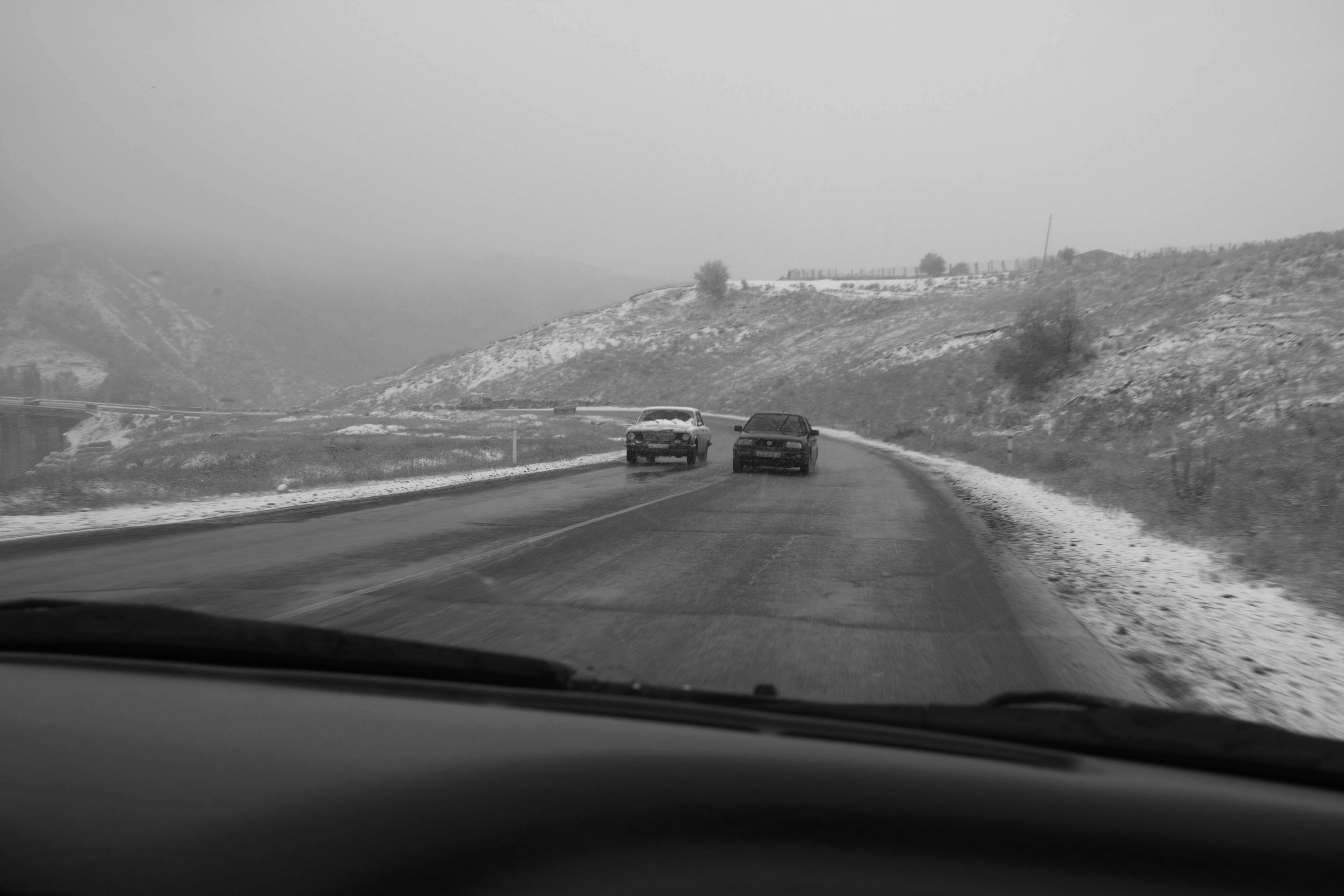
An Engagement Ring
2011A narrative series set in Wrocław in August 2011. Awarded 2nd prize & Silver Glass at the 10th Photographic Open Championship Olsztyn in 2014.
View Series →
Heat Wave
2014A documentary series recording spontaneous events across August and September 2014, capturing the raw energy of a city under the grip of summer.
View Series →