
"Photography is not about the thing photographed. It is about how that thing looks photographed."
How to photograph food for commercial clients
Commercial food photography must make food appetite-appealing without losing the honesty of a real kitchen. A client may need a polished hero image for a launch, a complete menu library, supermarket-ready pack shots or social assets built from one shoot. The strongest results treat every frame as both a commercial tool and a carefully observed still life. Technical precision matters, but food, light, colour and composition must support the offer being sold.
For Australian brands and hospitality groups, that balance must work across different buying contexts. Melbourne venues may want moody detail for laneway dining, while Sydney restaurants often need bright images that hold up beside the harbour. The same client may also be preparing for weekend brunch crowds, takeaway coffee orders and a Woolworths or Coles shelf. Good art direction starts by recognising those everyday moments and the standards Australian consumers expect from food imagery as well as from the product.
Begin with the commercial brief
Before unpacking equipment, turn the request into a written brief covering the product, audience, channels, competitors, deliverables and approvals. Ask what the image must prove: freshness, value, comfort, speed, indulgence or craft. A restaurant may need a visual tone, while a packaged-food producer requires variants and label panels to remain legible. Defining the job prevents attractive but unusable frames from dominating the shoot.
Build a shot list around buying decisions. For each item, plan a hero, detail, preparation and in-context image; add horizontal, vertical and square crops early. Hero shots should still work as ecommerce thumbnails because a supermarket listing can reduce a frame to a narrow strip. For print, outdoor advertising or paid social, capture sufficient resolution and composition space rather than treating one master image as universal.
Styling decisions belong in the brief too, particularly with allergens or accurately depicted dishes. Agree on garnishes, portion size, vessel, brand colours and whether props imply an origin. A menu photographed with the wrong dish misrepresents the offer. Rigid styling can also make a meal feel manufactured. Set a practical standard: appetising and consistent, but recognisably close to what the customer receives.
Match the setting to Australian service
Location choice should follow the service, not just the visual mood. In Melbourne, a café near Degraves Street may offer texture and street activity; in Sydney, a bright waterfront setting can become generic, so controlled direction inside may be more effective. Think about how customers order. A busy counter needs images for fast breakfast favourites, while a suburban café may rely on brunch cues such as avocado toast, long lunches and coffee to go.
For packaged goods, the Australian retail reality should shape the plan. Woolworths and Coles sit alongside Aldi, independent grocers and specialist stores, each with different visual expectations. Buyers compare clean backgrounds, accurate labels and consistent product families, while independents may value a maker-led story. Decide whether the image must reassure a category buyer, distinguish a crowded range or communicate provenance, then design for that position.
Production planning should include a working kitchen’s ventilation, burners, fridge access, wash-up distance, power and time for hot food to settle. Build these into the schedule for a multi-dish menu. Australian daylight can shift quickly, so confirm how produce should look at the planned time. Allow flexibility for weather, service interruptions or last-minute substitutions.
Shape appetite with controlled light
Light determines appetite and product accuracy. A large window with sheer diffusion gives soft directional light suited to bread, coffee and pale ceramics, while a smaller hard source reveals gloss, condensation and texture. Position the light around forty-five degrees to the food for dimension, then move sideways for drama. White cards or black foam board control the shadow side without adding another lamp’s colour cast.
Most kitchens mix daylight with tungsten, fluorescent and LED fittings, each producing a different colour temperature. Switch off or flag unnecessary fixtures, then meter the light with a grey card or colour checker. Set a deliberate white balance and compare food colour with packaging and brand references. On overcast days, window light may be broad and gentle; in bright conditions, shade and diffusion help prevent clipped highlights and rapid heat loss.
A circular polarising filter can reduce glare on sauces, ceramics and glossy packs, although it changes reflections and may cost two stops of light. Angle it to avoid an unnaturally dark centre. Use a reflector with enough fill to preserve texture, and judge exposure from the highlight that must not clip. Food that looks correct on a monitor can still be too pale on a printed menu or outdoor board.
Combine analogue character with digital control
Film can add character and physical craft to commercial work, but it should answer a creative need rather than decorate the set. Medium-format and black-and-white film offer generous detail, a distinctive tonal range and slower exposure. A film frame may suit a bakery ritual, a chef’s hands or a restrained still life. Keep the lens and viewpoint consistent with digital coverage, bracket carefully, and confirm handling, storage and scanning with the processor before the session.
Darkroom thinking remains useful when final files are digital: observe the full tonal range and protect shadows that give ingredients dimension. A black-and-white conversion should preserve separation in glossy leaves, toasted crumb and dark sauces rather than merely lowering saturation. For colour, record a neutral reference and retain the raw file. Fine-art principles can shape physical campaign presentation, as explained in this limited-edition print process, which covers paper, editioning and hands-on finishing.
A hybrid workflow gives control without sacrificing efficiency. Capture hero images and pack details digitally, then use film selectively for texture and atmosphere. Photograph colour charts and grey cards at each setup, and include a clean plate for composite corrections. In post-production, match frames for hue and density, remove crumbs or fingerprints that break brand standards, and retain natural texture. Never let retouching turn a flexible, moist ingredient into a synthetic prop.
Protect accuracy in styling and claims
Styling is a visual language, not camouflage. Build meals from believable ingredients, then introduce one deliberate accent to guide the eye. Use steam where it can be produced honestly, add condensation close to shooting, and select the moment when a sauce or filling still looks fluid. For clean pack shots, remove damaged labels and control dust, but retain signs of use where they support freshness. Consistency across a range matters more than making every dish identical.
Packaging and claims require accuracy in Australia. Domestic food labels must comply with the Food Standards Code and Food Standards Australia New Zealand requirements, including ingredient and allergen information where prescribed. Photography may show a pack or support nutritional and origin claims, while the Australian Consumer Law governs how businesses represent products. Check approved artwork and wording, and never alter a label in a way that changes its meaning. Photograph the production label, test small text and preserve pack proportions. Document regional and promotional variants because campaign images often circulate beyond their original placement.
If people appear, make consent and dignity part of production. A chef’s hands, a server carrying a plate or a diner in a Melbourne café window can humanise the story, but a recognisable customer may bring obligations under the Privacy Act 1988 and Australian Privacy Principles for covered organisations. Avoid private conversations, screen details, car registrations or payment information. Use informed releases where appropriate, offer an alternative shot, and confirm whether the client needs exclusivity or extended usage.
Build a controlled production workflow
Strong pre-production prevents costly problems. Share a call sheet, styling plan, prop list, capture list and schedule with the client, food stylist, retoucher and kitchen team. Keep reviews focused on selection rather than every technical frame. Approve the hero composition, background, props and crop before multiplying similar products. For a new menu, assign reference images to each dish and confirm portions, recipes and garnishes with the kitchen.
Treat the food set as a working catering environment. Wash hands, separate raw and ready-to-eat items to reduce cross-contamination, protect allergen ingredients and keep props away from food. Follow the venue’s food safety procedures, temperature controls and applicable Australian requirements; the rules apply to the business even when a photographer is present. Photograph cooked food quickly and use clean dishes and utensils. If a dish must be held for lighting tests, agree on a safe method rather than sacrificing hygiene.
During the shoot, move from complex tabletop work to faster handheld or overhead frames while the meal is at its best. A set can produce many usable images, but only if camera position, plate and lighting remain controlled. Capture a reference after each meaningful change, label take numbers and note recipe corrections. If a dish fails stylistically, replace it early. A scheduled retake is less expensive than approving a flawed hero and trying to repair the evidence in software.
Deliver assets that support the full campaign
Post-production should protect the truth captured on set while meeting a commercial system. Remove temporary dust, unwanted highlights and distracting crumbs; reconstruct only damage on the physical product; and avoid changing ingredient colour, fill level or shape. Maintain consistent hue, contrast and shadows across a menu range. Produce layered files if the client’s team creates adaptations, including clean backgrounds, alternate crops and web exports. Retouch from the approved frame, not a compressed social file, because aggressive sharpening makes bread look gritty and labels hard to read.
Delivery is more than attaching files to an email. Confirm whether the client receives full-resolution masters, web files, crops and working files, and document which remain licensed for the agreed use. Usage may cover packaging, menus, websites, paid advertising, organic social, print or retailer materials, while channels can carry different terms. Define the licence period, territories, renewal fee and responsibility for third-party use. This matters for Australian franchises because a national campaign can appear in Melbourne, Sydney and franchise locations under one master file.
Think ahead to where each asset will live. An ecommerce thumbnail needs immediate recognition, a menu board needs viewing distance and a paid ad may need space for copy. Test typography and crop overlays before export, and confirm whether the printer expects sRGB or a specific profile. For a physical presentation, paper choice, colour testing and controlled editioning should be planned as carefully as the digital assets.
The finished image succeeds when it identifies the product quickly, feels native to the Australian context and remains convincing at every planned scale. Commercial clients buy consistency, speed and usable detail as much as a beautiful frame. Connecting the brief, styling, light, capture method and rights in one production plan creates images that support the sale while retaining the texture and humanity of the food itself.
Selected Series
A cross-section of commissioned and personal projects spanning fine art, commercial, and conceptual work.
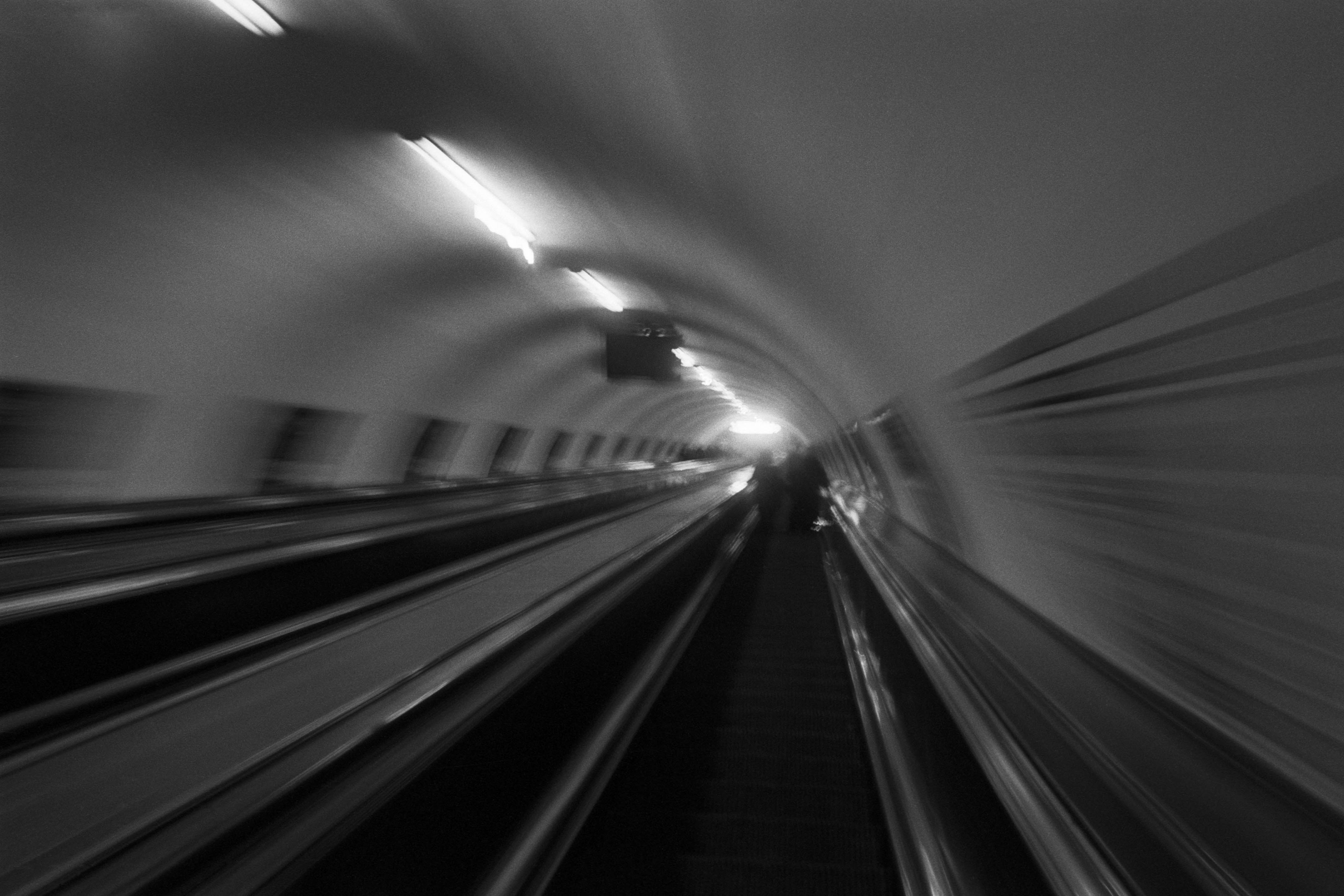
The Wall
2015Winner of the 1st prize & Golden Glass Award at the 11th Photographic Open Championship Olsztyn, and 1st place with the Special Prize of FORMAT magazine at the 3rd Biennial of Art in Piotrków Trybunalski.
View Series →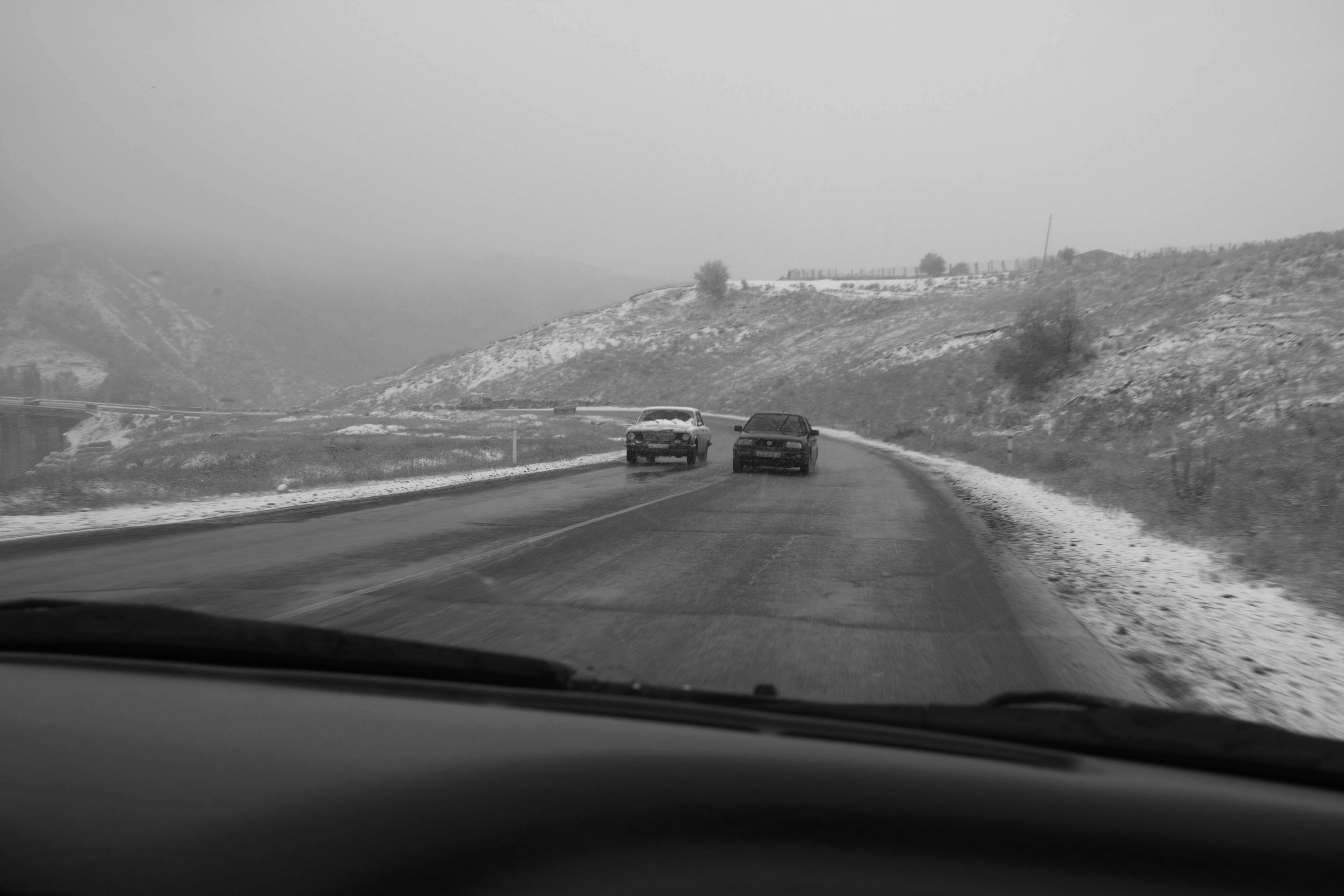
An Engagement Ring
2011A narrative series set in Wrocław in August 2011. Awarded 2nd prize & Silver Glass at the 10th Photographic Open Championship Olsztyn in 2014.
View Series →
Heat Wave
2014A documentary series recording spontaneous events across August and September 2014, capturing the raw energy of a city under the grip of summer.
View Series →