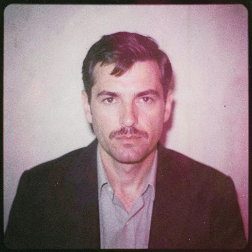
"Photography is not about the thing photographed. It is about how that thing looks photographed."
Colour Theory for Portraits That Flatter Every Subject
Color theory offers a practical way to coordinate what a subject wears with the light, background and mood of a portrait. Rather than treating clothing as decoration, consider it part of the image’s visual structure: colour can direct attention, soften contrast, connect the subject to a place or quietly recede. The goal is not a perfect colour wheel, but choices that feel natural, flatter the person and give the photographer room to shape the picture.
Rafal Michalak is an award-winning photographer based in Wrocław, Poland, whose portfolio spans business portraits, fashion, events and conceptual photographic series. His practice moves between medium-format and black-and-white film, darkroom principles and digital workflows. That combination is useful here because wardrobe colour and photographic colour are connected decisions: fabric affects reflected light, contrast and the way skin appears on the final print or screen.
This guide is for photographers, stylists and portrait subjects who want to understand how hues, saturation and tone work together. It can help someone preparing for a corporate headshot, a relaxed outdoor session or an editorial story. It can also help a photographer give clear, tactful wardrobe direction without prescribing one narrow style or making colour sound like a rigid scientific formula.
A useful wardrobe plan offers several combinations that work in different light, not merely one outfit that happens to suit the photographer’s favourite colour. Start with what the person already owns, then add purpose: a neutral foundation, one controlled relationship between colours and one deliberate accent. The final palette should suit the brief, the body and the location while leaving enough flexibility for movement and spontaneity.
Read the Light Before Choosing Clothes
Start by observing the light in the portrait location. Cool north-facing window light makes blues and greys appear cleaner and more restrained, while direct sun warms skin and strengthens yellows, reds and oranges. A subject’s outfit may look balanced indoors but become harsh under midday sun. Lightness, direction and hardness therefore matter more than the colours shown on a garment tag.
Colour also changes with the camera settings used to capture it. A photograph made under warm light can look artificially orange if the white balance is left uncorrected, while a blue garment may turn grey when filmed through tinted glass. This selective control resembles darkroom burning and dodging, where light and shadow shape attention instead of applying one even tone to the entire frame.
For an outdoor session, check the location at the planned shooting time rather than relying on assumptions. Australian light can shift considerably between morning, the harsh middle of the day and the softer glow of late afternoon. Photographing or testing near the same window at the same hour reveals which neutrals will hold their shape and which bright colours will dominate. Light may be the final destination for an outfit, but it should be the first consideration.
Start With Skin Tone and Undertone
Skin complexion provides a useful starting point, but no single colour belongs exclusively to one type of skin. Complexions contain warm and cool elements in different balances, and those undertones interact with fabric sheen, makeup and surrounding light. A colour that looks lively in a shop may mute beneath a particular face, while a subdued garment can allow natural skin colour to become the strongest feature in the portrait.
Warm undertones often respond well to earthy hues such as rust, terracotta, olive and warm brown. Cool undertones can suit blues, violets, teal and soft greens, although saturation still matters. More useful than assigning a category is comparing several garments directly against the subject’s face and neck in natural light. Hold each option near the jaw and examine whether the colour appears crisp, harmonious or slightly dull.
Neutral clothing gives the photographer dependable control. Cream, oatmeal, charcoal, navy and soft black provide anchors against which skin can remain clear and directional. When a brighter hue is introduced, repeat it in a smaller accessory rather than covering the face in competing colour. This creates a visual hierarchy: a clear subject, a supporting outfit and a controlled point of emphasis.
Build Colour Harmony Without a Rigid Formula
Colour harmony describes relationships between hues, not rules that must be followed exactly. An analogous palette uses neighbouring colours on the wheel, such as dusty blue, sage and muted teal. A complementary pairing places opposites together, like terracotta and blue-green. Split combinations borrow the contrast of opposites while adding a third related colour, often producing a result that feels energetic without becoming difficult to balance.
Keep the number of dominant colours manageable. Two coordinated hues plus a neutral often appear more intentional than five individually attractive pieces. Texture can supply variety when the palette is quiet: matte linen beside brushed cotton, fine knitwear beside a smoother shirt. Conversely, a simple monochrome outfit can feel rich when its pieces differ in tone. The photograph gains depth through subtle differences in value rather than an abundance of separate colours.
For further combinations, Emily’s styling notes offer a helpful source of everyday outfit ideas to adapt to a portrait brief. Translate the colour relationships rather than copying an entire look. A patterned shirt that works with denim in casual settings might become a corporate portrait outfit when paired with tailored trousers and a plain blazer. The colour relationship survives because its purpose has been reconsidered.
Let the Location Share the Palette
A background does not need to match the wardrobe exactly, but the two should belong to the same visual world. Warm timber, brick and sandstone support earthy clothing, while concrete, steel and cool painted walls suit sharper contrasts and cleaner colour. Echoing one background colour in the outfit creates unity; introducing a measured contrast separates the subject and gives the frame greater depth.
Local surroundings can supply a strong palette without any deliberate staging. Canberra’s dry, ochre-toned light and eucalyptus greens form a warm natural setting that works well with olive, rust, sand and cream. Sydney sandstone has a warmer character than painted office interiors, so navy, stone and soft blue can create an appropriately crisp contrast. In coastal locations, pale sky, salt-bleached textures and blue water lend themselves to airy colours and simpler silhouettes.
A background can also compete when it contains too many colours or patterns. Rather than remove every distraction, let the wardrobe reduce the visual noise. A confident single-colour garment can calm a detailed environment, while a bright accent may be effective against an otherwise quiet wall. Australian crews often call especially flattering late-afternoon light a “beaut”; that quality of light can make a bold choice feel subtle, provided it has been tested in advance.
Balance Pattern, Fabric and Visual Weight
Fabric influences how strongly a colour announces itself. Wool, linen and brushed cotton absorb light and create soft edges, while silk, satin and polished surfaces reflect bright highlights. Dark clothing may disappear against a dark background unless the subject’s hair, skin or an edge light separates the outline. A pale garment can similarly merge with a bright wall. Value contrast matters even when the wardrobe uses very little colour.
Pattern deserves the same practical attention. Fine stripes can create unwanted interference with a sensor, while large checks may pull attention away from the face. Medium-scale patterns usually work better in close portraits when the background is simple. For a creative or fashion series, scale can be used deliberately: graphic prints with plain separates, or a restrained outfit placed against a detailed environment. The relationship should support the story rather than simply demonstrate variety.
Fit and proportion remain more important than perfect colour matching. Clothing should move naturally, sit comfortably and allow the subject to adopt their own posture. A well-cut garment in a slightly imperfect neutral often photographs better than a rigid outfit in a flattering hue. When directing a subject, explain the colour intention through familiar language: “The blue echoes the wall” or “The rust will warm the late light.” Such notes are easier to act on than an abstract request to find complementary colours.
Plan Wardrobes for Australian Realities
Heat affects both comfort and appearance. Lightweight cotton, linen and Tencel can breathe during an outdoor session, while synthetic performance fabrics may hold their shape but create strong reflections under direct sun. Dark colours absorb heat, and layered outfits can become impractical on a warm day. Bring an alternative layer or outer garment that preserves the palette, especially when moving between sun, shade and air-conditioned interiors for an event or workplace portrait.
Australian wardrobe shopping offers a mixture of independent boutiques in cities such as Melbourne and Sydney, national department stores including Myer and David Jones, online marketplaces and an active second-hand market. That makes it possible to build a varied portrait wardrobe without buying everything new. Check existing clothing first, then source one missing colour through a local vintage store, rental service or online retailer. Second-hand pieces can also add distinctive texture to a concept-driven portrait.
Workplace culture adds another layer. Australian offices often use terms such as “business casual” or “smart business”, and many workplaces relax their dress standards on Friday. A portrait still needs visual authority, but it may not require a full traditional suit. A navy overshirt over a plain tee can read as polished, while a well-fitted linen jacket can suit a creative director or design professional. Confirm the brief’s expectations before selecting formality, then use colour to create coherence across relaxed pieces.
Test the Palette and Make It Collaborative
Testing turns colour theory into a workable wardrobe rather than a speculative exercise. Photograph the shortlisted garments together and separately under the intended light. Compare them on the camera display, but also consider how they behave on an analogue colour negative or a print with its own tonal response. A neutral that appears slightly warm on a screen may become beautifully neutral on film, so the final medium should influence the final choice.
During the session, make a few test frames before committing to a complete look. Keep combinations within reach and photograph small changes, such as removing an accessory or rolling a sleeve, before changing the entire palette. This creates a visual hierarchy and gives the subject time to settle. Their comfort is part of the portrait: a person who feels self-conscious in an unfamiliar garment usually shows it in their shoulders, hands and expression.
Wardrobe styling works best as a conversation between photographer, subject and, when involved, stylist. Explain what each colour or texture contributes, but remain responsive to how the person feels in it. The final look may combine a neutral base with one warm accent and a familiar piece that already carries confidence. When clothing supports posture, colour supports the setting and the light supports the face, the portrait gains coherence without appearing over-designed.
Selected Series
A cross-section of commissioned and personal projects spanning fine art, commercial, and conceptual work.
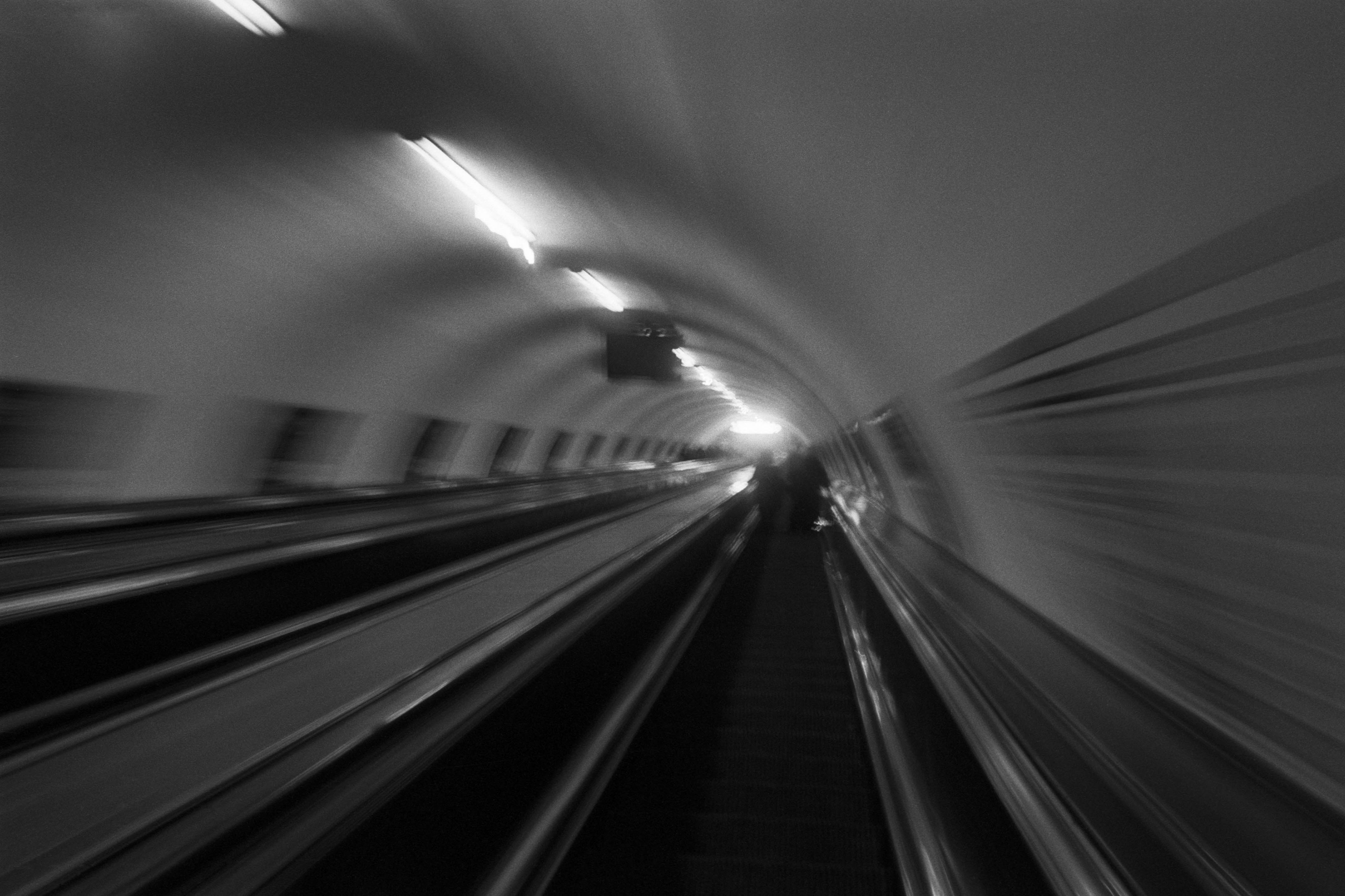
The Wall
2015Winner of the 1st prize & Golden Glass Award at the 11th Photographic Open Championship Olsztyn, and 1st place with the Special Prize of FORMAT magazine at the 3rd Biennial of Art in Piotrków Trybunalski.
View Series →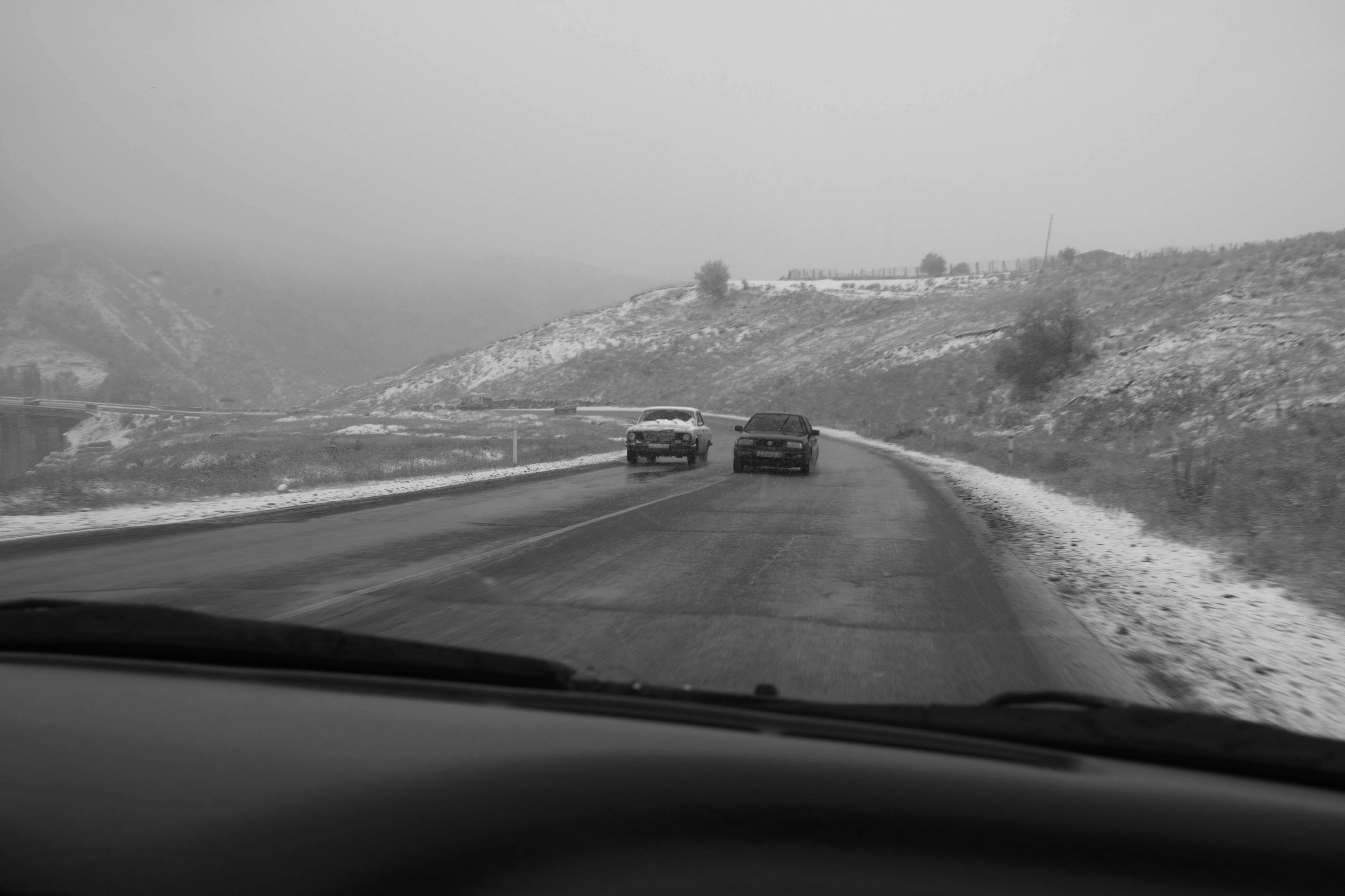
An Engagement Ring
2011A narrative series set in Wrocław in August 2011. Awarded 2nd prize & Silver Glass at the 10th Photographic Open Championship Olsztyn in 2014.
View Series →
Heat Wave
2014A documentary series recording spontaneous events across August and September 2014, capturing the raw energy of a city under the grip of summer.
View Series →