"Photography is not about the thing photographed. It is about how that thing looks photographed."
Mastering shadow in black and white portraits
Mastering shadow in black-and-white portraits means treating darkness as an active design element that can give a face weight, character, and emotional focus. The way it wraps around a cheek, cuts across an eye, or separates a head from its background determines how the viewer reads the sitter. Used with intent, shadow turns flat light into sculptural form and gives a photograph depth that survives the removal of colour.
Black-and-white portraiture makes these tonal relationships immediate. A bright highlight can carry attention, a midtone can reveal texture, and a dense passage can hold the composition together. The craft lies in controlling the ratio between those values rather than chasing perfect illumination. At Rafal Michalak Photography, my Wrocław-based practice, this balance supports atmospheric fine-art series as well as business portraits, fashion imagery, and commissioned events.
Those aims meet a distinctive visual environment in Australia. The hard, high-angle sun around Sydney and Perth can turn a conventional setup harsh, while Melbourne’s changeable sky can erase shadows altogether. Australian studios also work around summer heat, coastal glare, and winds that make reflectors and flags awkward. The technical response is consistent everywhere: observe the light, decide what the shadow should say, and then shape it deliberately.
Shadow as portrait architecture
A monochrome portrait gains its structure from the relationship between illuminated planes and shaded ones. A forehead, cheekbone, nose, and jaw need not all receive equal light to appear convincing. Let one plane recede and another project forward, and the face acquires volume. This sculptural use of chiaroscuro is especially effective in business portraits, where controlled shadow can suggest composure, and in conceptual portraiture, where it can imply ambiguity or psychological distance.
Rembrandt lighting is often described by its small triangle of light on the shadow-side cheek, but the pattern is a consequence of placement rather than a recipe. Move the source slightly higher, lower, or farther to the side and the triangle changes, along with the apparent shape of the head. The useful question is not whether the setup matches a named pattern; it is whether the pattern reinforces the sitter’s features and the intended mood.
For a fine-art series, shadow can also act as a compositional mass. It may conceal part of a uniform, merge with a dark background, or create a silhouette that makes the body readable as a shape. For commercial work, the same principle must protect identity and clothing detail. The goal is a shadow rich enough to hold attention but open enough to reveal what the brief needs the audience to see.
Reading the light before shaping it
Before touching a light, read the existing illumination. Notice where the sun enters, whether the source is direct or diffused, how large it appears to the sitter, and what surfaces return light into the face. A metre reading tells you only how much light reaches the sensor or film; it does not describe the quality of that light or where its shadows fall. Spend time with the room before changing its character.
Australian conditions make this observation especially valuable. Around Bondi, reflected light can come from pale sand, salt, and water, filling shadows under the jaw. In central Melbourne, overhead cloud produces a broad, soft source that can be ideal for restrained corporate portraits, while a laneway doorway may create a hard-edged patch of sun. Perth’s dry brightness offers another lesson: contrast can appear severe even when the air is clear.
Once the source is understood, establish a deliberate contrast ratio. Protect the important highlights, allow the deepest tones to remain dense, and decide which values carry the face. Black-and-white files may look flat on a small screen, so check the histogram rather than trusting the apparent brightness of a laptop. A portrait with a few luminous highlights and a stable range of midtones usually feels more natural than one in which every feature is forced into the same brightness.
Building form with one source
A single source can create most of the form needed for a convincing monochrome portrait. Place it about forty-five degrees to the side and somewhat above eye level to produce gradual modelling across the face. Raise it and move it nearer the axis for a short, graphic shadow across the cheek; lower it for a more generous transition beneath the brow and jaw. Small positional changes can matter more than extra equipment because they alter the direction, length, and edge of the shadow simultaneously.
Negative fill is equally important. A white card opposite the key may open the shadow side, but a black flag or dark fabric can return it to a deeper, more decisive tone. For a bright, direct look, keep the fill close and subtle. For a dramatic portrait, remove the reflector, place black material near the face, and let the background fall toward black. The darkest area should retain detail rather than becoming a featureless hole.
Catchlights provide a second point of control. A small catch in the eye can make the gaze feel alert, while a broad catch may appear softer and more intimate. Ensure the catch corresponds to the actual key and check that it does not overpower the tonal story. Backlight can separate hair and shoulders from the background, but it also creates a rim of high contrast; expose for the face, then use the shadow shape to guide the eye back toward the eyes.
Controlling edges, reflections, and spill
Flags, nets, reflectors, and barn doors shape a source after its basic direction is established. A flag removes flare from the lens or blocks a bright edge before it reaches the sitter. A net softens the apparent size of the source, while a white or silver surface lifts the shadow side. Their effects depend on distance: a reflector close to the face creates noticeable fill, whereas the same reflector moved back has a subtler effect. Make changes in small increments and watch how the texture of skin changes.
Wardrobe and set styling decisions affect this process as much as the lighting itself. Glossy fabric, polished jewellery, pale walls, and glass can each create a second, uncontrolled source. Matte materials and carefully placed tonal blocks are easier to control. In set styling decisions, I show how practical choices on a constrained fashion set can simplify the photographer’s work and leave enough visual space for the light to perform its role.
Outside, wind changes both equipment and fabric, so larger flags may need separate weights and clothing may move between frames. Coastal light also calls for attention to flare, especially around bright water or painted signage. A black V-flat can shield the camera, a white board can redirect a hard patch, and a darker background can stop pale hair from disappearing into a bright wall. Small tools become valuable when the location cannot be altered.
Translating tone between film and pixels
Film gives shadow a physical density and tactile grain that digital imagery can imitate but should not simply copy. The negative has a limited tonal range, so highlight detail is easily lost while dense shadows can merge on the print. Medium-format black-and-white film suits portraits because its larger negative records subtle texture, but exposure still needs intent. Meter for the skin highlight, bracket when the contrast is extreme, and judge density rather than assuming transparency means brightness.
Digital capture offers immediate control and greater latitude, yet the raw file still needs a considered conversion. A neutral black point gives the image weight; a clean highlight preserves skin texture; the midtones determine whether the face feels luminous or severe. Working in a calibrated monitor and a consistent colour space reduces surprises during delivery. Film, darkroom practice, and digital post-production can complement one another rather than compete.
Darkroom printing offers a subtractive way to refine the final image. Global contrast establishes the foundation, while dodging and burning shape light selectively across the face. Burn the outer cheek or background when it competes with the eyes, and dodge a forehead or jaw when it needs separation. A test strip and a restrained print make these decisions visible. The digital edit should aim for the same tonal logic, whether the result began on film or in a raw file.
Adapting portraits to Australian conditions
Australian portrait commissions often arrive through a direct studio brief or through an agency handling a larger campaign. Either way, it helps to establish the use: profile image, press editorial, internal communications, and paid advertising require different degrees of sharpness, tonal simplicity, and licensing. For a polished executive portrait, the shadow should imply confidence without hiding the eyes. For a fashion image, it may define the garment. The commercial decision and the aesthetic decision should be made together.
Local portraiture also draws on a varied range of environments. Corporate clients may prefer a quiet room in Sydney or an architecturally interesting studio in Melbourne; independent labels often request street-level images around Fitzroy, Collingwood, or Surry Hills. Events bring their own moving light, from marquees to hotel interiors. In each case, shadow can organise a busy frame by separating faces from overlapping bodies and preventing every illuminated detail from receiving equal attention.
Australian client conversations often favour plain requests such as “keep it real” or “nothing too fancy.” Such phrases can signal a preference for an approachable, authentic result rather than a heavily stylised image. Translate that feeling into specific tonal choices: restrained contrast for a corporate headshot, visible texture for an editorial profile, or a strong silhouette for a campaign with a more distinctive voice. Connecting the feedback to these practical choices keeps the conversation focused on the photograph.
A disciplined shadow-control workflow
A repeatable workflow prevents beautiful light from becoming an accident. Begin with the intended emotional and commercial result, identify the face’s most effective light-to-shadow transition, and then choose the simplest arrangement that can produce it. Photograph the ambient light first, make a measured test frame, and compare the result on a neutral display rather than on a phone held at an angle. The aim is control without making the sitter feel engineered.
Before the session, work through a compact preparation list:
- Define the portrait’s use, mood, and required crop.
- Inspect the room, window direction, surfaces, and background.
- Choose key, fill, and negative-fill positions before moving furniture.
- Test wardrobe textures and remove reflective distractions.
During the session, use a second set of checks:
- Compare catchlights and shadow shape before changing settings.
- Watch the histogram and protect facial highlights.
- Move the subject or light rather than chasing exposure alone.
- Review the frame at final crop and delivery size.
The final frame should hold together at full size and in a small thumbnail. Check that the eyes remain the first point of attention, that the shadow describes the face rather than obscuring it, and that bright edges do not pull the eye away. Then stop refining an image that already expresses the sitter: effective black-and-white portraiture is shaped, not crowded.
Selected Series
A cross-section of commissioned and personal projects spanning fine art, commercial, and conceptual work.
The Wall
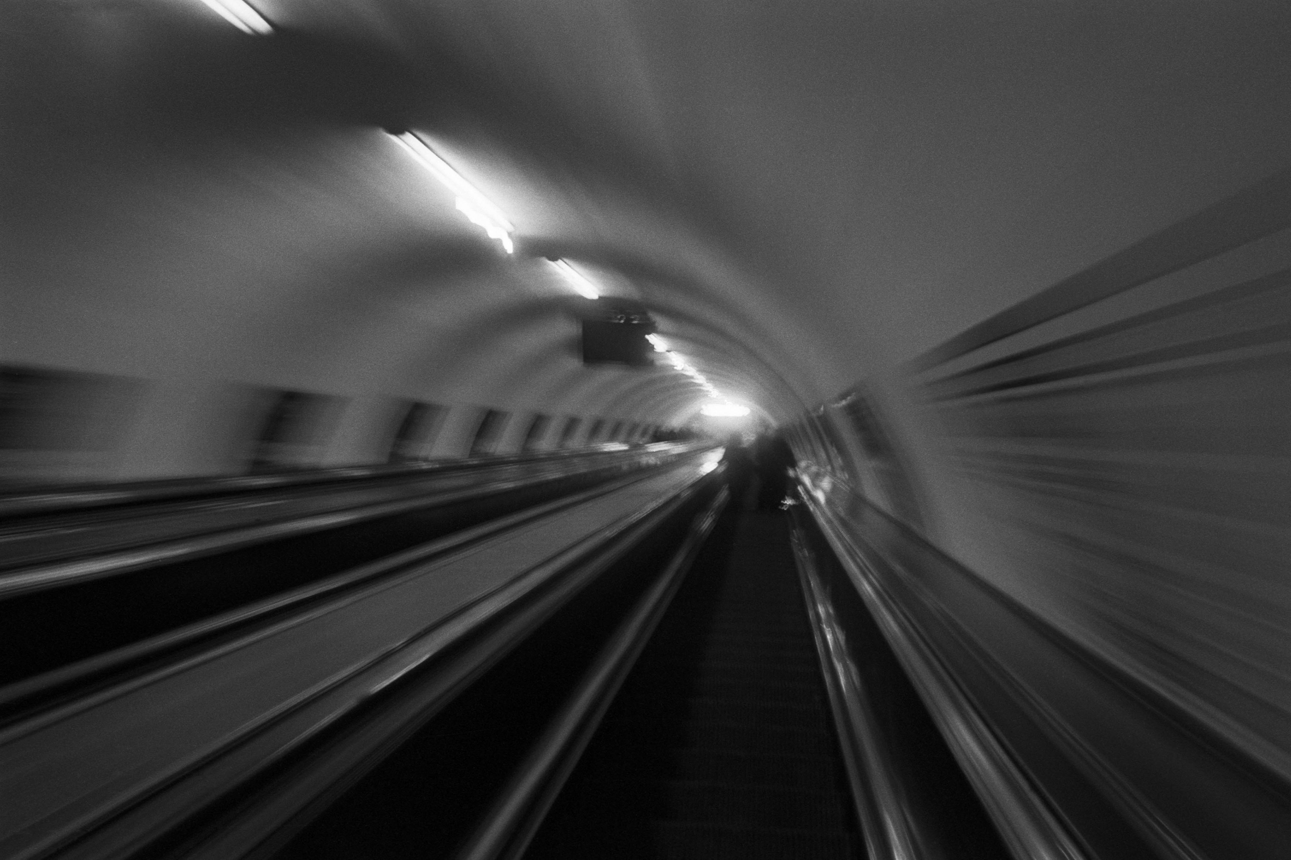
2015Winner of the 1st prize & Golden Glass Award at the 11th Photographic Open Championship Olsztyn, and 1st place with the Special Prize of FORMAT magazine at the 3rd Biennial of Art in Piotrków Trybunalski.
View Series →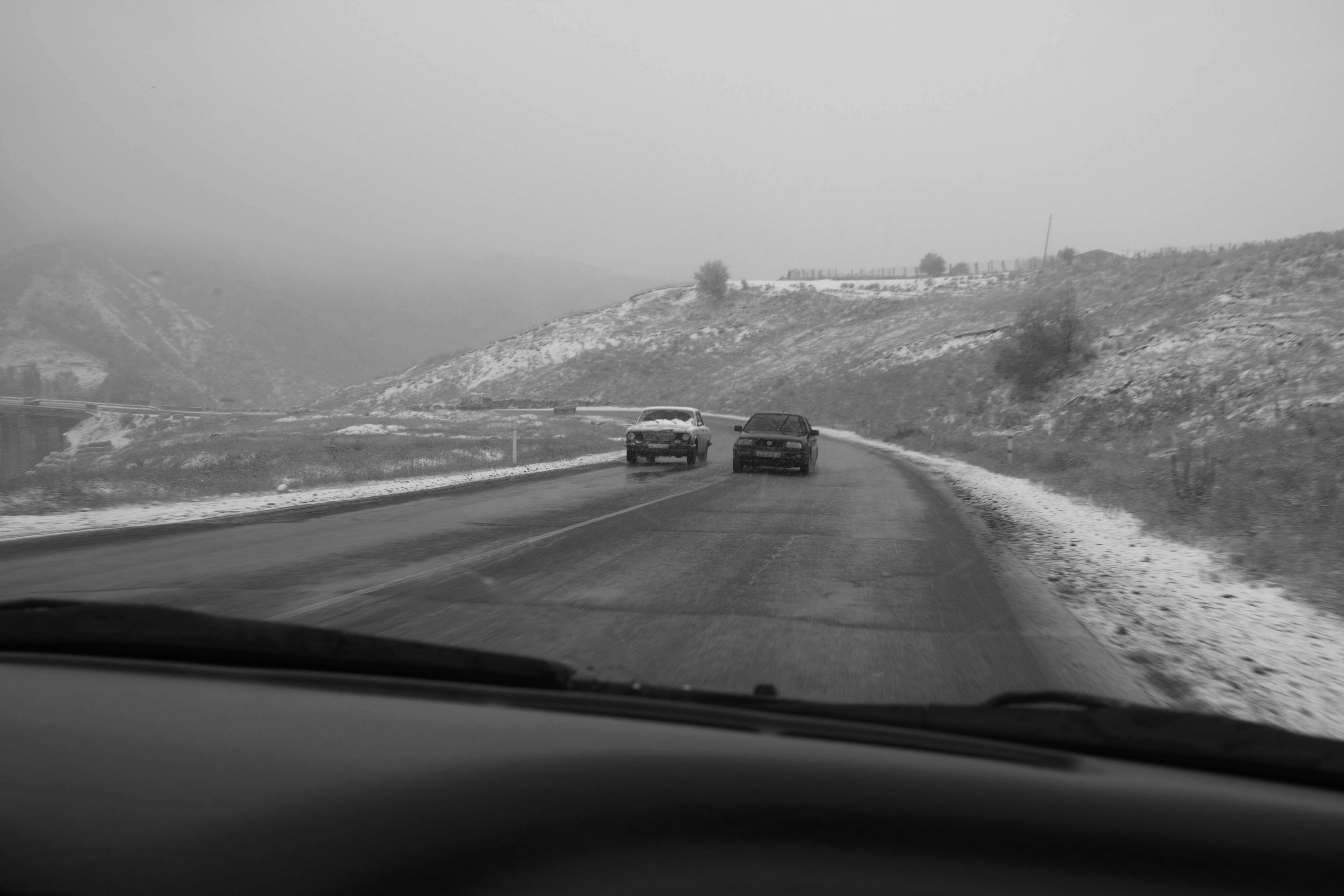
An Engagement Ring
2011A narrative series set in Wrocław in August 2011. Awarded 2nd prize & Silver Glass at the 10th Photographic Open Championship Olsztyn in 2014.
View Series →
Heat Wave
2014A documentary series recording spontaneous events across August and September 2014, capturing the raw energy of a city under the grip of summer.
View Series →