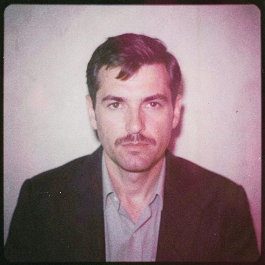
"Photography is not about the thing photographed. It is about how that thing looks photographed."
Choosing the right images for a photographic project
The art of editing a photographic project begins with selection, but selection is only the first editorial decision. The photographs placed beside one another reveal differences that are easy to miss when each frame is viewed alone. A portrait may be technically clean yet emotionally distant; an event image may be slightly soft but hold the charged expression that matters. The editor’s task is to decide which qualities deserve the viewer’s attention and which contradictions weaken the work. Learn more about The Influence Of Polish Landscape On My Visual Style.html.
The process is especially deliberate in a practice rooted in both analogue and digital work. Medium-format negatives, black-and-white film and darkroom habits encourage attention to density, grain and tonal transitions. Digital captures bring speed and volume, often producing many plausible frames. Comparing those frames on a calibrated display, then checking the chosen files against prints or projected images, keeps technical polish from taking over the narrative. Editing is therefore a cycle: observe, compare, select, refine and observe again.
For Australian viewers and commissioning clients, the selected work must also travel well beyond the room in which it was made. A portrait may appear on a website, in a proposal deck or beside unrelated content on a phone. An event series may be read as a scrolling sequence far from the venue. The editor has to preserve a clear purpose while accepting changes in scale, colour and context. That balance between artistic integrity and practical use makes image selection a creative decision rather than clerical housekeeping.
Editing as an interpretive act
Before opening a contact sheet, define what the project is meant to make a viewer feel, understand or remember. A business portrait needs confidence and credibility without becoming a rigid corporate template. Fashion work may rely on attitude, silhouette or movement. An event gallery needs coverage and atmosphere; a conceptual series needs enough ambiguity to sustain attention. Each purpose creates a different standard for selection, so a single rule based on technical perfection will fail.
A fine-art series and a commercial commission can contain equally polished photographs while serving different aims. In a personal series, a quiet, unresolved frame may deepen the idea; in a business portrait, a clearer gesture and direct gaze may be essential. Technical precision establishes the floor, while relevance and emotional force determine whether an image earns space. Selection should therefore be judged against the agreed purpose, not against the editor’s taste in isolation.
Working from a temporary wall of prints or a large monitor reveals these differences quickly. Give each candidate enough time to register, then move it into the running order. A frame that needs repeated explanation may still be valuable in a conceptual project, but it should not dominate by default. The early edit should remain flexible enough to accommodate a stronger image discovered late in the process.
Giving the edit a visual grammar
A project becomes coherent when its images establish relationships. Contact sheets help, although their small scale can flatten subtle tonal and gestural differences. View the shortlist again as prints, then reduce it to a manageable group and study the transitions between photographs. Does the sequence move from public to private, preparation to release, stillness to energy? A deliberate visual grammar gives those changes weight and prevents the edit from feeling like an inventory.
Sequence also controls pace. A wide environmental frame creates room to breathe, while a close portrait can tighten attention. Repetition of colour, shape, gaze or camera height can unify unrelated scenes, and controlled variation can stop that pattern becoming predictable. Medium-format work often invites detailed passages, yet detail should be placed strategically. Several images competing for equal emphasis can leave the viewer without a clear path through the project.
Events provide a useful stress test for sequencing. Chronological coverage records what happened, but a narrative edit asks what the event felt like to participate in. Arrival images can establish anticipation, concentrated gestures can reveal character, and a shared reaction may hold more feeling than an orderly set of speeches. The decisive handshake can be less revealing than the moment immediately before it. Editing means preserving the structure that supports the story without allowing chronology to make every decision for you.
Reading light, gesture and emotional truth
Light is an editorial language because it directs attention before conscious analysis begins. Dark frames can feel enclosed, open shadows can suggest uncertainty, and a hard shaft of light may make an ordinary space charged. The same face can communicate differently under flat illumination, directional light or reflected colour. During selection, ask what each frame makes the viewer notice and whether that response belongs to the project’s purpose.
Rafal Michalak’s reflections on Polish landscape influences connect the weather, terrain and visual memory of one region with the photographer’s way of framing a scene. That connection is valuable beyond landscape photography. Polish light and landscape can shape pacing, tonal restraint and the treatment of negative space. Such influences become strongest when they inform observation rather than operate as a fixed visual signature applied to every assignment.
Closely observed gesture also determines whether a technically successful image feels alive. A slight turn of the head, imperfect hand position or moment of concentration may reveal more character than a meticulously corrected but emotionally vacant expression. Analogue practice makes that kind of attention especially tangible, while a large digital archive makes it easy to overlook the accident that distinguishes one frame from its near neighbours. The editor must recognise which irregularity is meaningful and which one merely distracts.
Refining images without erasing character
Once the narrative edit is secure, technical refinement can begin. Cropping changes emphasis and rhythm, tonal correction can clarify separation, and careful retouching can remove distractions that compete with the intended gesture. These adjustments should strengthen the selected frame without making every photograph look identical. If sharpness, clarity or polish are the only visible changes, the editor may have selected safe images rather than expressive ones.
Consistency should support the series while preserving differences between photographs. A strict colour grade can bind a fashion story together, although excessive uniformity may suppress the mood of individual garments or locations. The restrained visual language of the BHC portfolio offers a useful comparison: material, form and process can carry the story, while framing and pacing keep the viewer oriented without excessive explanation.
Black-and-white editing offers another test of editorial judgement. Converting a colour image can reveal shape, texture and gesture that colour initially concealed, yet the decision should follow the visual idea rather than novelty. A darkroom-inspired approach may favour deep blacks, luminous highlights and visible grain, while a cleaner digital treatment may suit fashion or portrait work. Dust, halation, unusual crop boundaries and subtle density shifts should be assessed individually, since the most visible artefact is not always the one that damages the image.
Working within Australian conditions
Australian light demands its own reading. Melbourne’s changing sky and sharp summer sun can make shadow decisive, while soft winter light rewards close observation. Humidity can also affect film handling, lens fog and the interval between exposure and processing. These conditions differ from those of Wrocław, yet the same principle holds: learn the light before deciding what it should communicate. A frame that appears neutral in a contact sheet may contain an atmosphere essential to its Australian setting.
Commercial expectations are equally concrete in the Australian market. A quotation may need to identify GST, usage rights, exclusivity, print quantities and the intended life of commissioned files. Corporate portrait buyers often require images for press releases, internal publications and social platforms, while fashion and event work may move between print, web and paid media. Clear editing decisions support this process when the selected photographs can perform their function across those formats without losing their central quality.
Plainspoken feedback is another local working reality. Comments such as “have another look” or “fair enough” can signal thoughtful Australian conversational directness, although clear agreements about tone remain important. Interstate distance also shapes delivery, data handling and long-term storage. Large photographic files may need managed backups before negatives travel between studios or archives. Heat and humidity can affect film storage, prints and shipping materials, giving preservation decisions the same editorial importance as choosing the final frame.
A repeatable selection standard
A repeatable standard makes subjective choices easier to test without turning the edit into a mechanical process. Begin with the purpose, identify the visual and emotional criteria, and apply them across several rounds. Change the criteria only when the project’s direction changes. This method creates a defensible record of why one image was retained, why another was removed and which technical corrections were applied.
- Define a decision brief naming the audience, intended use, required subjects and qualities that cannot be sacrificed.
- Build contact sheets and alternate sequences, keeping rejected frames available for comparison instead of dismissing them immediately.
- Judge emotional impact before sharpness, using technical quality as a baseline rather than the sole measure of value.
- Review the finalists at their intended viewing size, including mobile crops, full-screen images and physical prints where relevant.
- Separate sequence-level decisions from individual adjustments, preventing a strong crop or colour grade from rescuing a weak choice.
- Record selections, edits and usage conditions in a project file so future revisions remain consistent with the original visual intention.
After the final choice, preserve both the selected images and the reasoning that shaped them. Retain contact sheets, sequence notes, colour decisions and carefully archived source files for later commissions. The finished edit should then carry a visible purpose, a deliberate rhythm, images that hold emotional force and enough technical integrity to support its message across print and digital settings.
Selected Series
A cross-section of commissioned and personal projects spanning fine art, commercial, and conceptual work.
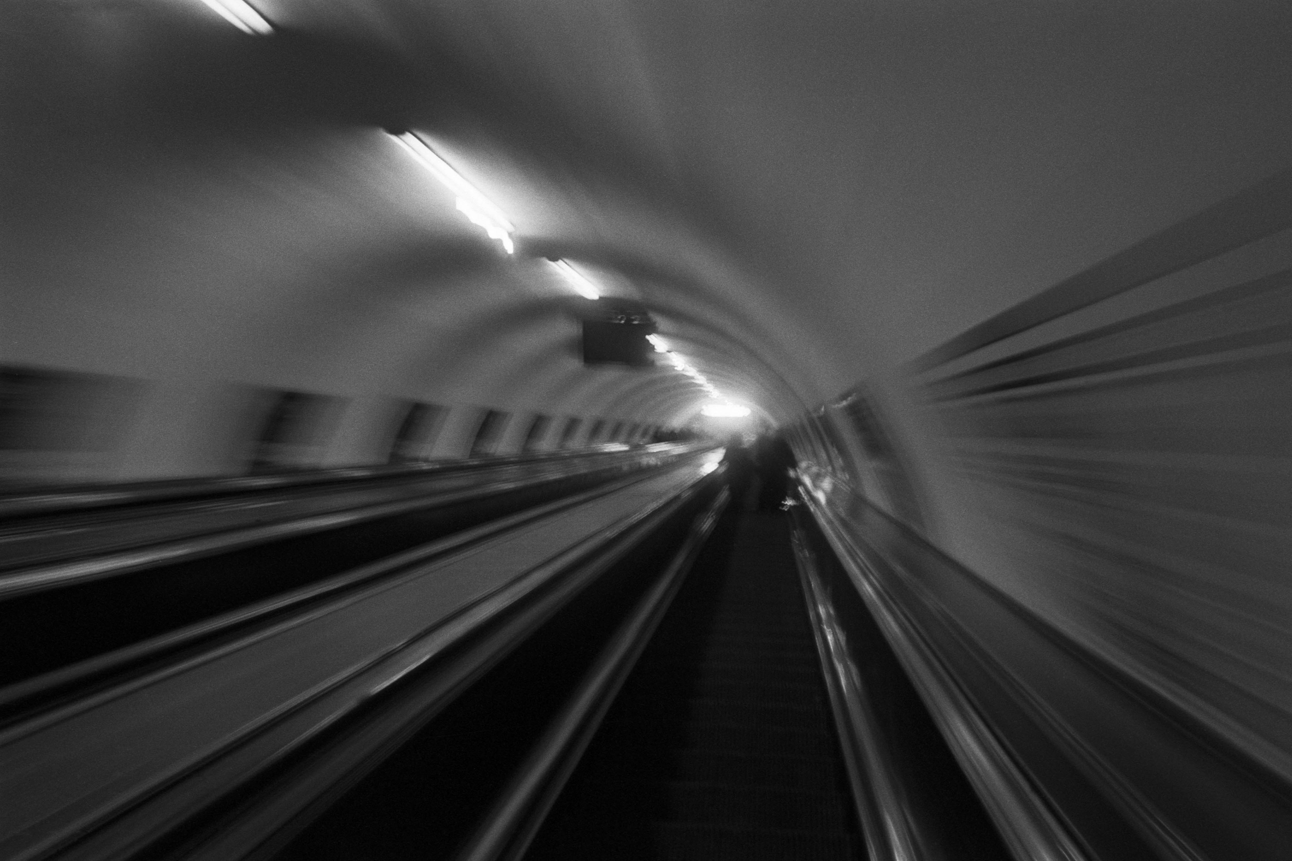
The Wall
2015Winner of the 1st prize & Golden Glass Award at the 11th Photographic Open Championship Olsztyn, and 1st place with the Special Prize of FORMAT magazine at the 3rd Biennial of Art in Piotrków Trybunalski.
View Series →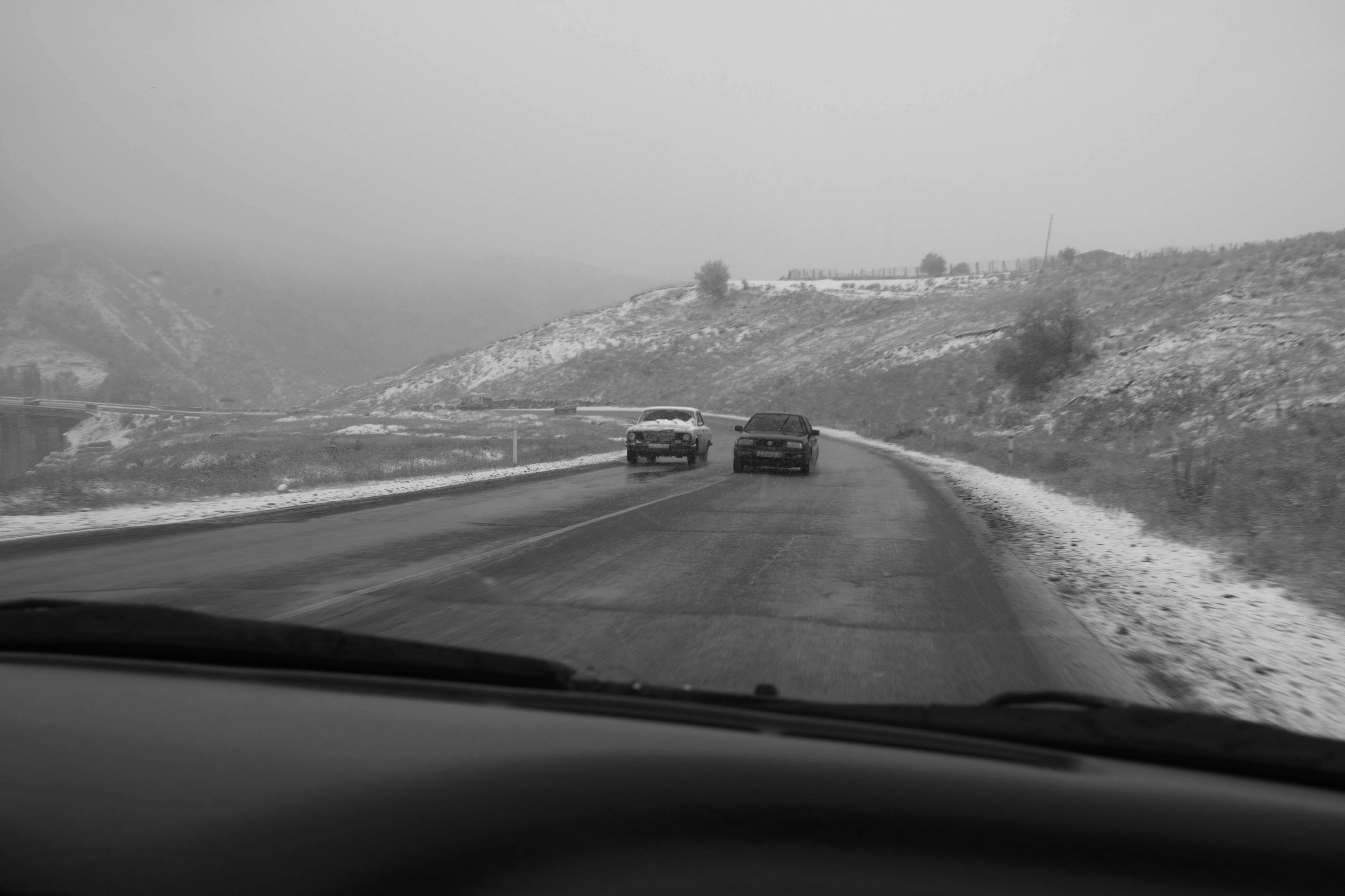
An Engagement Ring
2011A narrative series set in Wrocław in August 2011. Awarded 2nd prize & Silver Glass at the 10th Photographic Open Championship Olsztyn in 2014.
View Series →
Heat Wave
2014A documentary series recording spontaneous events across August and September 2014, capturing the raw energy of a city under the grip of summer.
View Series →