"Photography is not about the thing photographed. It is about how that thing looks photographed."
The Language of Empty Space
Negative space is the area of a photograph that appears unoccupied, yet it directs attention, establishes balance, and carries mood. A blank wall behind a sitter, clear sky above a landscape, or open pavement between figures is not merely background. It becomes a visual partner, defining the subject through distance and proportion. The art of negative space in composition therefore lies in deciding what deserves to remain visible and what can recede.
Based in Wrocław, Poland, award-winning photographer Rafal Michalak moves between fine-art series, portraits, fashion and events. This restraint supports analogue and digital methods. Medium-format film and black-and-white work reveal how tone can turn an empty area into a luminous field; careful cropping and sequencing can do the same digitally. When empty space is designed rather than left over, the photograph gains intention and gives its subject room to communicate.
Seeing What the Frame Omits
Negative space differs from accidental emptiness. A crowded scene can contain visual quiet if one small area is isolated by light, while a plain background can feel busy if texture or distractions compete with the sitter. The task is to understand which shapes the eye accepts as rest and which demand explanation. An open area works when its edges feel deliberate, not when the subject simply lacks company.
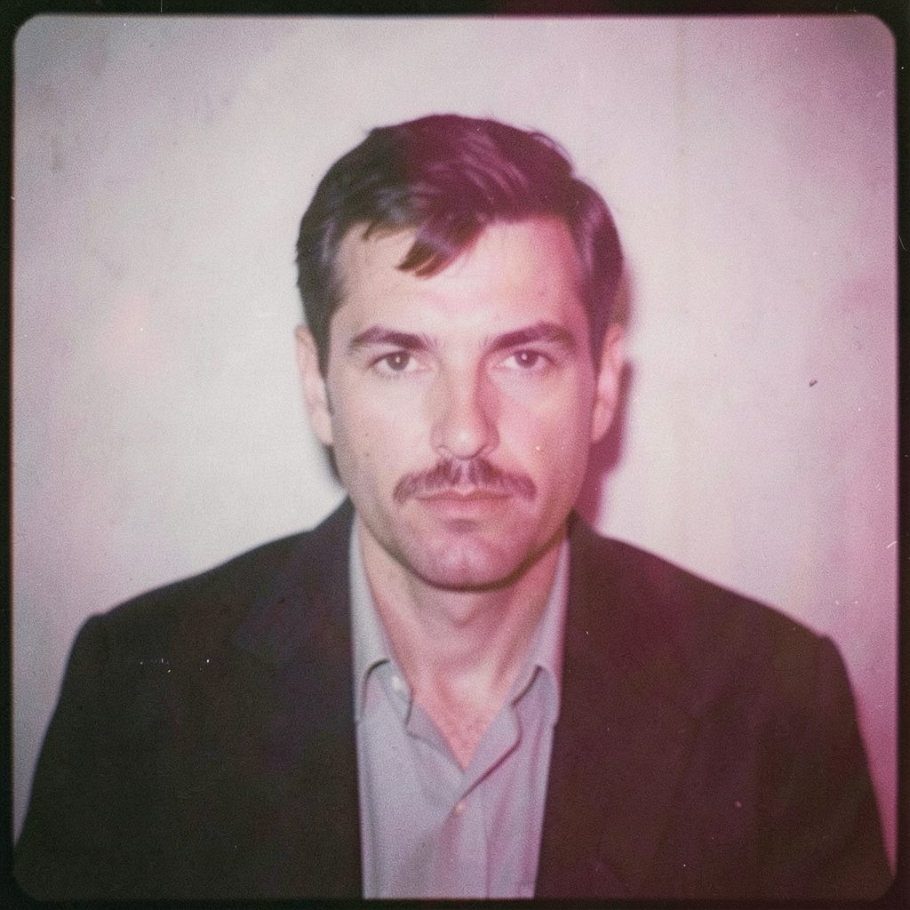
This matters in portraits, where space around a face can suggest status, solitude or transition. A business portrait may place an executive against a generous field of charcoal wall, giving authority without clutter. A fashion image might use a narrow band of clear colour beside the body to make posture and the garment silhouette more assertive. The same gap carries different meanings because scale, placement and tonal contrast change its relationship to the subject.
Simplifying a frame begins before the camera is lifted. Props drift out of view, furniture moves beyond the edge, and a background is selected for broad shape rather than detail. In a Melbourne apartment, an empty plaster wall can be more expressive than a styled living room; on a Sydney rooftop, open sky can separate a figure from the city. Composition starts with subtraction, and the silence feels authored.
Shape, Balance, and Visual Weight
Every solid form pushes against the space around it. A dark coat creates weight, a pale shirt feels lighter, and a small red object can carry disproportionate attention. When those masses sit off centre, negative space becomes the counterforce that keeps the image stable. The viewer reads this equilibrium physically: visual weight pulls towards one area, while breathing room on the opposite side prevents the frame from tipping.
Straight lines strengthen balance. A railing, table edge or doorway can direct the eye towards a face and beyond it. Curved shapes enclose space or produce a softer rhythm. Photographers working in black and white often notice these relationships more clearly because colour has been removed. Tonal masses become the picture’s architecture, and empty zones reveal whether the design holds together.
Weight also develops through detail. A sharply defined hand against a smooth field can carry more force than a face surrounded by equally sharp objects. Dense texture invites sustained looking, whereas uninterrupted tone lets one detail dominate. This hierarchy helps in commercial work by directing attention to a product, gesture or expression within a fraction of a second. The unused portion of the frame is part of the communication.
Direction, Scale, and Breathing Room
Where a subject looks matters as much as where it stands. A figure facing an open area appears to have somewhere to go, while one turned towards a crowded edge feels contained. This is often called looking room, and it depends on directional balance rather than a fixed rule. Designers may grant more space ahead of a moving subject and less behind, while a portrait can reverse that relationship to create tension.
Scale changes the emotional charge of that room. A tiny person within an expanse of beach or scrub can appear vulnerable, contemplative or dwarfed by place. Australia offers many such contrasts, yet a lone figure against a vast horizon can become a stock-image convention without context. A stronger treatment often includes a modest interruption: footprints, distant structure, changing cloud or a patch of vegetation. Such marks establish scale while preserving the larger emptiness.
Architecture supplies another version of this tension. Repeating windows, colonnades, station platforms and concrete walls create intervals of rest between patterns. Empty space can become a subject, directing attention towards rhythm, climate and movement through built environments. The more precisely that void is framed, the less arbitrary it feels. Its proportions can reveal as much about a place as a detailed view of its landmarks.
Light, Tone, and Emotional Distance
Light gives negative space its texture. A wall struck by afternoon sun may contain a gradient, shadow or reflection rather than being blank. Soft light dissolves edges, producing distance between subject and surroundings. Hard light draws crisp boundaries, making every interval active. A photographer can place a person in shade and leave the brightest region unoccupied, allowing the eye to travel through light before settling on the figure.
The logic becomes tangible in the darkroom process, where exposure, chemistry and timing translate tonal areas into visible relationships. Black-and-white film offers a direct lesson in tonal hierarchy. Highlights, midtones and blacks decide which forms advance and which recede. A restrained palette can turn an apparently empty background into a precise field of silver, charcoal or warm grey.
Colour can create emotional distance as readily as tone. A restrained palette separates a person from a location without making either compete, while a saturated accent may turn empty space into an extension of the subject. Muted colours suit corporate portraiture because they support credibility and leave attention on the person. Fashion and editorial work may use cooler or warmer fields for drama. The surrounding colour should reinforce the photograph’s purpose, not decorate it.
Negative Space Across Genres
Business portraits are among the clearest commercial uses of this principle. Australian companies in Sydney, Melbourne and Brisbane commission corporate imagery, campaign portraits and leadership photographs for annual reports, recruitment pages and investor communications. The market includes agencies, independent studios and direct engagements with small businesses, so visual restraint must work across scales. A clean field can unify executives from different workplaces while preserving individual character.
Fashion also depends on intelligent clearance. A garment gains definition when the area beside it is uncluttered, particularly if its line must remain readable in a small online image. Australian labels produce lookbooks, e-commerce campaigns and editorial stories, where one photograph may be cropped for a wide website banner and a narrow mobile screen. Purposeful space makes that adaptation safer because the subject is not trapped against an edge. It also gives art direction room to breathe.
Events and conceptual series use emptiness to redirect attention unpredictably. A crowded room can be framed so two empty chairs establish the emotional subject; a performer can be separated from the audience by the unoccupied stage around them. In documentary work, visual silence may reveal what words cannot. For a fine-art series about place or memory, repeated open areas create pacing, allowing each interruption to carry more meaning than the busiest frame. Decide what the viewer should feel before deciding what to include.
Working With Australian Places and People
Australian locations demand close attention to climate and everyday movement. Sydney’s sandstone, harbour light and apartment districts offer sharp urban contrasts, while Melbourne’s laneways and domestic interiors reward subtlety. Brisbane brings subtropical brightness, deep shade and broad verandah rhythms. These places are often photographed through recurring habits: coffee at a window table, a weekend market, a coastal walk or conversation on a pub verandah. Familiar routines can provide authenticity without turning the image into a literal record.
Working with people brings cultural and legal responsibilities. Under the Copyright Act 1968, copyright in Australian photographs generally belongs to the photographer unless employment or commissioning terms assign it elsewhere, so ownership clauses matter in commercial projects. The Privacy Act 1988 mainly governs government agencies and qualifying businesses, not every private photographer, yet consent and respectful conduct remain sound practice in paid campaigns. Public location does not remove a person’s dignity, and commercial use justifies clearer releases and expectations.
First Nations representation requires its own care. Indigenous Cultural and Intellectual Property protocols do not replace copyright law, but can guide consultation, attribution and restrictions on sensitive material. For commissioned work involving Country, communities, objects or ceremonies, early and respectful engagement is more useful than a generic visual solution. Negative space can appear neutral, yet a composition reflects choices about whose presence is centred, whose environment becomes background and whose story remains unspoken. Careful photography makes those choices visible and accountable.
From Concept to Final Frame
A convincing empty area rarely arrives by accident. During the brief, the photographer can define what the image must communicate and which elements can be withheld. References establish tone, while a sketch can clarify the intended balance before the set is dressed. On location, changing camera height, selecting a longer lens or moving one metre sideways may transform a cluttered view. The lens compresses and isolates; camera distance controls how much environment remains available to the viewer.
The darkroom and digital workflow offer corresponding tools. With film, exposure decisions preserve tonal separation, and printing can refine the relationship between subject and surrounding space. In digital post-production, cropping can repair an unbalanced frame, but can also remove the breathing room that gives the subject meaning. The strongest edit preserves deliberate intervals rather than filling every gap with detail. A modest reduction in contrast may reveal a quiet background overwhelmed by aggressive processing.
Finishing means testing the image against its setting. A portrait on a large print may tolerate stronger negative space than the same photograph on a phone, while a campaign image may need more immediate impact than an exhibition print. Viewing the frame at a distance, then at normal size, reveals whether the eye finds the subject and whether the surrounding silence feels purposeful. This is where analogue discipline and digital flexibility meet: empty space becomes one of the most consequential decisions.
Selected Series
A cross-section of commissioned and personal projects spanning fine art, commercial, and conceptual work.
The Wall
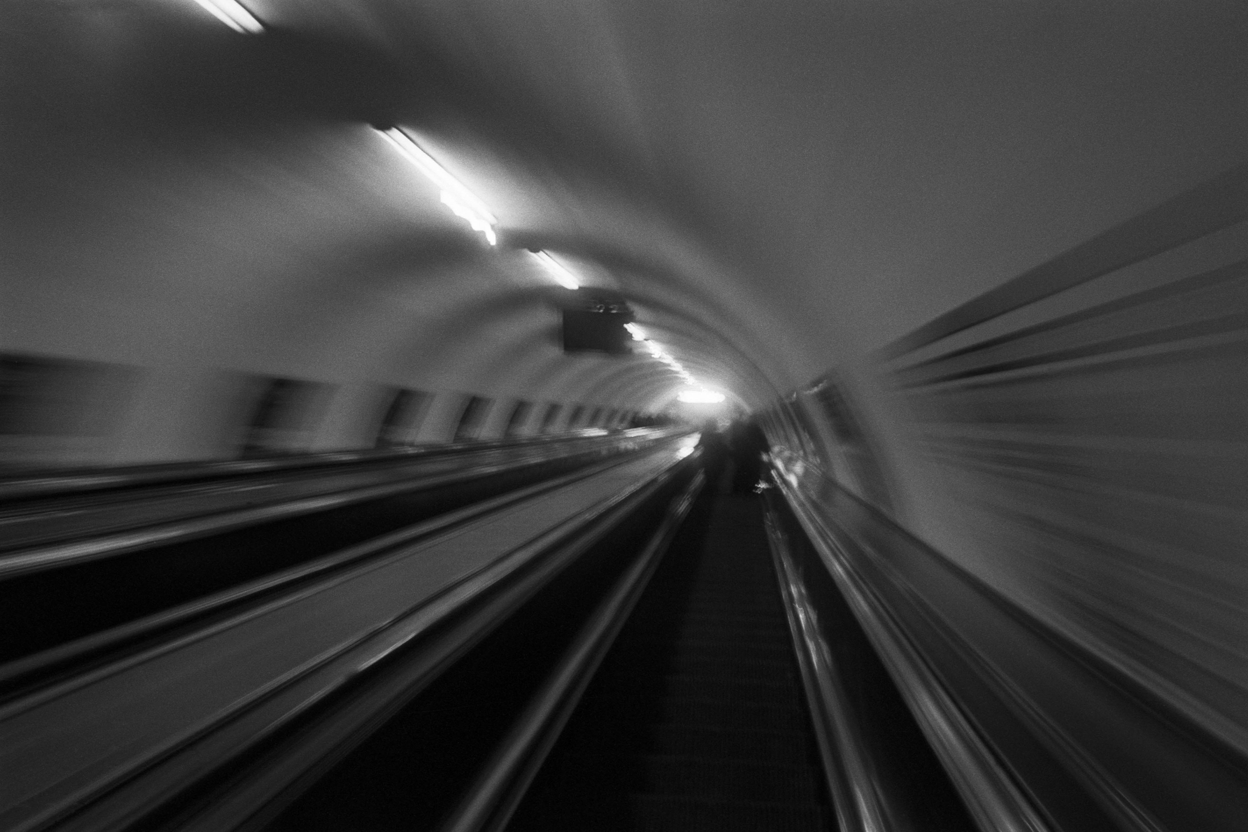
2015Winner of the 1st prize & Golden Glass Award at the 11th Photographic Open Championship Olsztyn, and 1st place with the Special Prize of FORMAT magazine at the 3rd Biennial of Art in Piotrków Trybunalski.
View Series →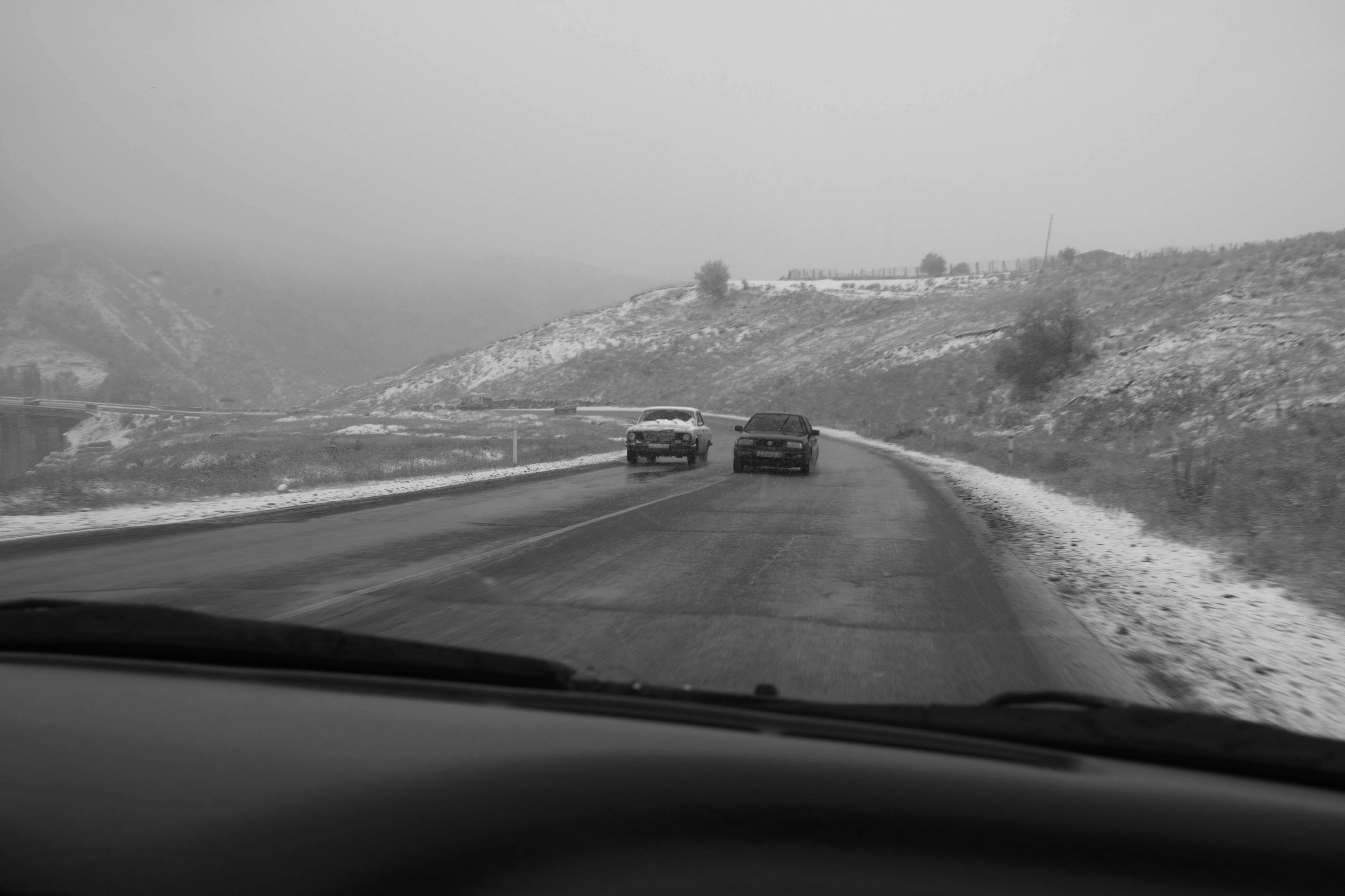
An Engagement Ring
2011A narrative series set in Wrocław in August 2011. Awarded 2nd prize & Silver Glass at the 10th Photographic Open Championship Olsztyn in 2014.
View Series →
Heat Wave
2014A documentary series recording spontaneous events across August and September 2014, capturing the raw energy of a city under the grip of summer.
View Series →