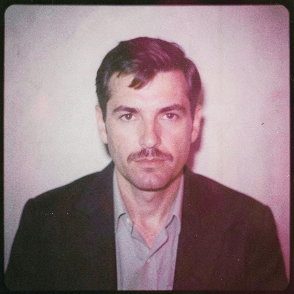
"Photography is not about the thing photographed. It is about how that thing looks photographed."
Social media has rewritten the rules of photographic style
The first image most people see of a photographer no longer hangs on a wall or sits in a printed portfolio. It appears in a scroll, cropped to a rectangle, compressed to a thumbnail and judged in the time it takes to flick a thumb. Clients arriving at my studio in Wrocław bring folders of saved posts rather than written briefs, and those saved frames already carry decisions about light, colour and framing that were never mine to make. The impact of social media on photographic style and trends now sits at the centre of every commission.
I work across fine art and commercial assignments — business portraits, fashion, events and long-form conceptual series — and I keep two processes running in parallel: medium-format film, black-and-white emulsion and darkroom printing on one side, digital capture and colour-managed post production on the other. Watching the change from both benches makes the shift easy to measure. Tools have never been faster, yet the space reserved for a considered image has narrowed, and style follows the feed.
The feed as a new gallery wall
A gallery tells its story with wall space and distance; a feed tells it with a grid judged as one design object. Photographers I work with in Melbourne and Sydney now plan the palette of a series before the first exposure, because a row of images with mismatched whites reads as careless however strong each picture is alone. That is a new skill, and a design skill as much as a photographic one.
Formats have shifted with it. Vertical frames, four-by-five crops and short sequences have overtaken the landscape single that once served as a portfolio standard, so a portrait that works on a printed page can fail as a vertical crop. Clients who scroll expect a run of six frames to be read as a single image, which pushes me to plan in series: an establishing frame, a middle, and a closing note the eye can land on.
The immediate impression now outweighs the deep one. Within seconds a viewer decides whether to keep swiping, and some of the loudest work circulating on any platform is the work that disappears soonest. That trade-off is the price of visibility.
What the algorithm rewards visually
Platforms reward signals that are legible at small size: a face, bright colour, a clean silhouette, movement caught mid-gesture, strong separation between subject and background. These incentives have become a shared grammar. Ring lights and phone lenses quietly rewrote the standard for "professional" imagery, and plenty of ordinary business photographs reach me asking for exactly that flatness.
The effect is visible on Australian streets. A baker, a florist and a small bar in Melbourne and Sydney all commission pictures that must work at thumbnail size in a feed crowded with text. The brief is no longer "make it look good" but "make it read instantly and match the posts before it". That is a fair demand, yet it narrows the range of lighting that gets funded.
Platform appetite for the apparently unpolished runs alongside this. Behind-the-scenes frames, unedited sequences and handheld snapshots perform well next to the polished set, though both share the same underlying production values. Trend lines turn quickly — muted palettes give way to candy colour, film emulation to heavy clarity — and each cycle arrives as a hundred near-identical frames.
Presets and the standardisation of the look
The one-click preset has done more than save time. Sold under labels like "the Instagram look", these bundles flatten contrast, lift shadows and apply a uniform cast, giving a recognisable finish to an enormous body of commercial imagery. When every bakery, boutique and consulting firm in a city can reach for the same preset in the same menu, differentiation has to come from elsewhere: real tonal separation, blacks that hold detail, skin with texture rather than plastic.
The darkroom still teaches me that. Printing a black-and-white negative onto baryta paper exposes every shortcut — a lifted black, a clipped highlight, a shadow with no separation — in a way no phone screen does. I bring that discipline into the digital workflow, grading gently and checking images on a calibrated monitor rather than trusting a phone in daylight. Clients are often surprised by how much more an image gives on paper than on a screen.
Over-sharpening is the other predictable casualty. Detail that looks crisp on a display can read as harsh on a wall, and a feed full of aggressive clarity sliders has taught many eyes to accept edges a photographer would normally soften. My habit is to shoot for the print, then adjust for the feed, the reverse of the order most studios now follow.
The photographer's own feed as a portfolio
A working photographer needs an audience before an agent needs one, so the feed has become the audition. I treat it as a portfolio with a heartbeat: finished frames posted with intent, a few notes on process, occasional frames from an ongoing series that show direction rather than polish. Consistency helps, but a grid of variations on one theme says more.
There is a commercial reason behind it as well. My first commissioned commercial shoot set the tone for what followed, and I recorded the decisions in https://rafalmichalak.com/news/the-story-behind-my-first-commissioned-commercial-shoot.html, including how the client's reference images shaped the lighting plan and how much of the finished series survived the edit. Showing the thinking, not only the frames, builds the trust that holds when a brief turns difficult.
The risk is the pressure to post at the rate the algorithm prefers. I schedule around the work instead of the reverse, because a constant trickle of near-duplicates says very little about depth. A quiet month carrying one strong series serves the studio better than a busy month of safe images.
Clients who brief with screenshots
The modern brief often arrives as a stack of screenshots and the instruction "we want that look". Those frames are not a specification; they are the visible result of choices made by another photographer with different lenses, different light and a different building. Reading a reference properly means reverse-engineering it: was that window light or a large softbox at forty-five degrees, was the lens wide or long, was the background moved or painted. Studios that build a coherent commercial practice, including BHC Laysmith, show how framing and lighting can be designed as a system instead of borrowed as a mood.
Australian clients add their own texture. Small businesses here run social-first campaigns on modest budgets with tight turnarounds, so emails arrive in the arvo asking for a same-week edit and a live feed before the weekend footfall. Fashion, hospitality and retail clients in Melbourne and Sydney frequently request a set that works as a nine-image grid, which is a question of design rather than photography and one that has to be planned on location.
The professional answer is to accept the platform as a delivery format while keeping the image independent of it. I shoot for the way a photograph behaves on a wall, a screen and a billboard, then build crop, grade and sequence so a client can use any of them without asking for a second version. That habit has cut rework sharply and keeps the work clear of the churn of a trend cycle.
The analogue counterpoint
Film keeps returning because a feed cannot reproduce what the process demands. Loading a medium-format back, metering for a portrait, developing negatives in the darkroom and watching a print emerge under safelight slow everything down in a useful way. Every decision is finite, and the results carry grain, tonal depth and small irregularities that a preset can imitate without matching. When emulated film trends climb, they signal an audience wanting evidence of a hand in the picture.
For commercial work I rarely choose one side. I might shoot a business portrait digitally for speed and consistency, then run the same subject through black-and-white film for a concept series, scanning the negatives and finishing them in a calibrated workflow. The client receives a coherent set; I keep the texture that gives it character. The audience for that kind of work in Australia is smaller than the audience for glossy frames and more loyal — collectors in Melbourne and Sydney keep a print for twenty years while a post disappears in a fortnight.
The analogue route also answers the anxiety of posting constantly. A series built over months cannot be copied in a week, and its scarcity is part of its value. For a conceptual body of work, the delay is not inefficiency; it is the method.
Where Australian audiences are pushing the conversation
Local conditions shape the pictures in ways that are hard to read from overseas. Wedding and fashion commissions around Byron Bay work with coastal light and open horizons, and clients there ask for frames with air in them, the opposite of the compressed crop that performs best in a feed. Event photography at the Adelaide Fringe rewards documentary instinct: eccentric performers, one-night rooms, hand-held movement and faces that never appear in a styled set.
Sydney's harbour and its business districts give corporate portraits a formal backdrop that still has to survive a vertical crop, and the local register matters as much. Campaigns here run on a casual voice — "fair dinkum", "no worries", "she'll be right" — so photographs that stiffen into generic corporate seriousness clash with the copy beside them. The Australian eye tends to reward warmth, humour and an uncluttered frame.
The market reflects that mixture. Some clients want the trend look and order it by the dozen; others arrive after years of scrolling and want work with a point of view, paying for a portrait or series that holds its shape when the platform that displayed it has changed twice. Both kinds of commission pay for the same fundamentals — control of light, deliberate framing, a grade that survives the screen — and both are best served by a photographer who understands how a platform rewards an image and who then decides what the image should say.
Selected Series
A cross-section of commissioned and personal projects spanning fine art, commercial, and conceptual work.
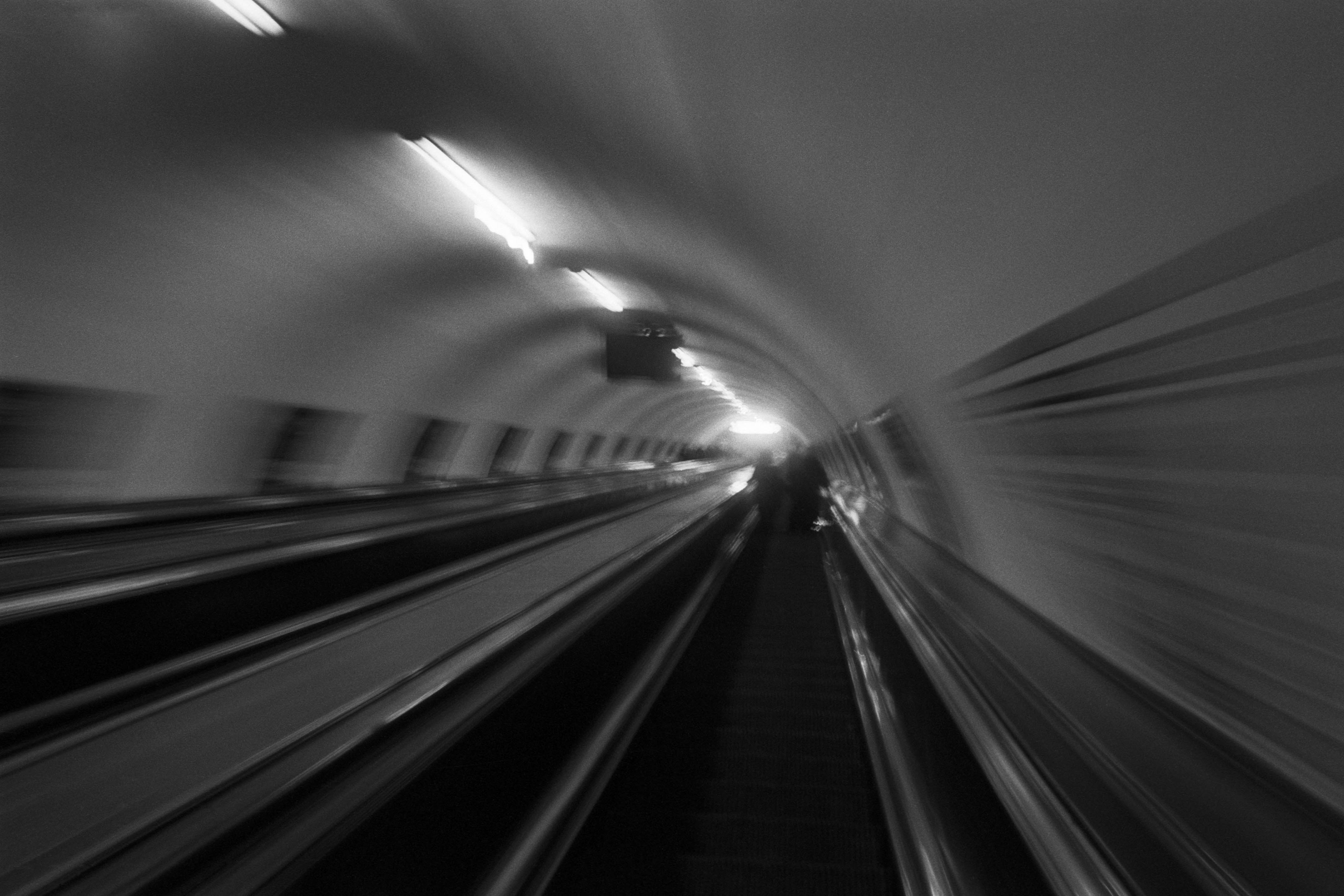
The Wall
2015Winner of the 1st prize & Golden Glass Award at the 11th Photographic Open Championship Olsztyn, and 1st place with the Special Prize of FORMAT magazine at the 3rd Biennial of Art in Piotrków Trybunalski.
View Series →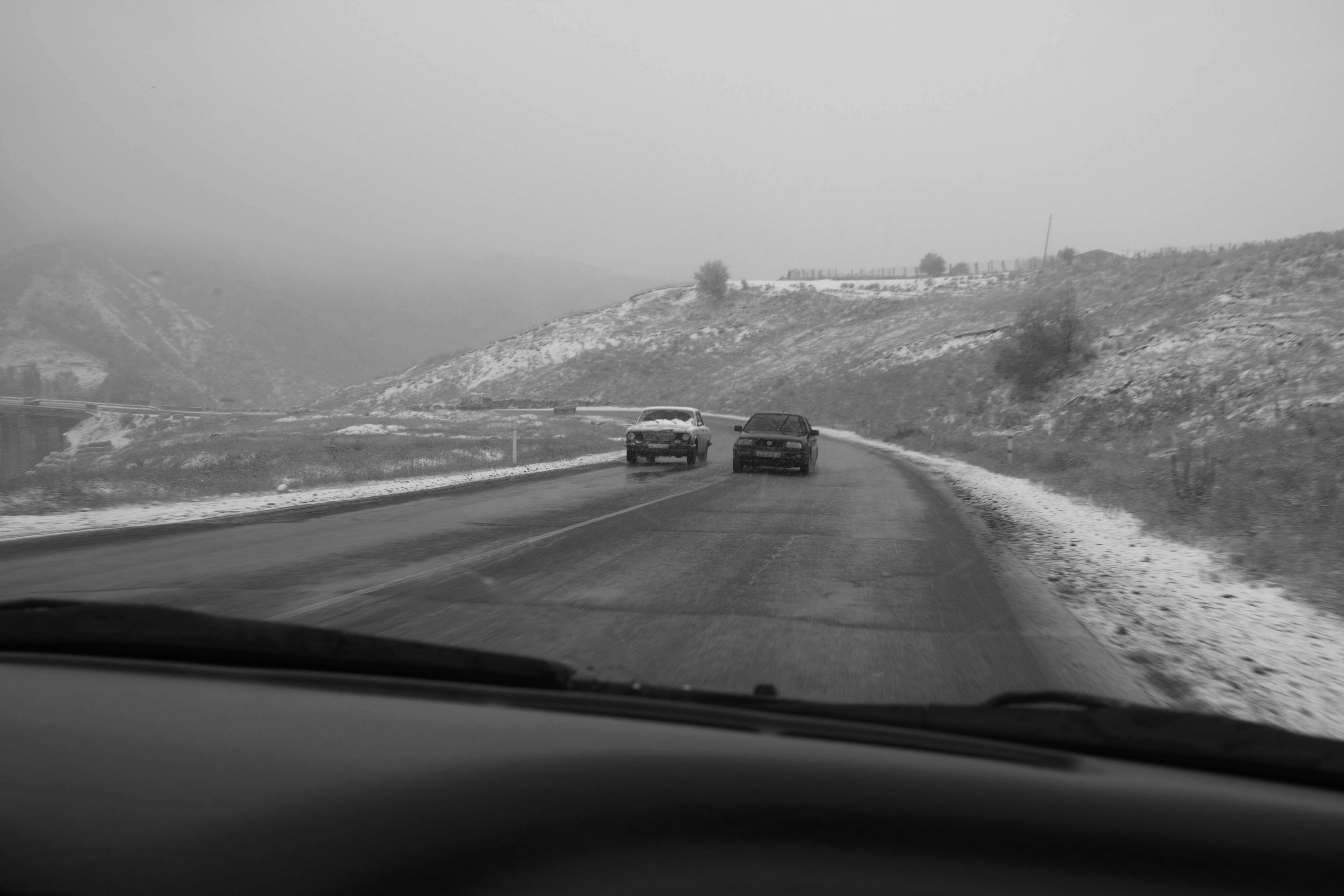
An Engagement Ring
2011A narrative series set in Wrocław in August 2011. Awarded 2nd prize & Silver Glass at the 10th Photographic Open Championship Olsztyn in 2014.
View Series →
Heat Wave
2014A documentary series recording spontaneous events across August and September 2014, capturing the raw energy of a city under the grip of summer.
View Series →