
"Photography is not about the thing photographed. It is about how that thing looks photographed."
The Hidden Language of Colour in Commercial Photography
Colour is the silent narrator of every commercial photograph. Before a viewer reads a logo, examines a product, or recognises a face, the hues on screen or in print have already shaped their response. In a marketplace crowded with carefully styled campaigns, the photographer who understands why certain tones feel trustworthy, energetic, or luxurious gains an edge that no amount of post-processing can replicate. This is the discipline of colour psychology applied to commerce, where pigment and temperature guide purchasing decisions as forcefully as any headline.
For practitioners working between fine art and client briefs, the study of colour offers a bridge between intuition and measurable outcome. An Adelaide-based fashion house responding to a magenta-styled shoot, a Melbourne hospitality brand reframing its menu imagery, or a Brisbane startup choosing between trust-building blues and disruptive chartreuse — each decision hinges on the connotations a colour carries into the viewing experience. The craft lies in translating those associations into intentional visual choices, rather than relying on aesthetic accident.
The foundations of colour psychology in commercial imagery
Colour psychology draws on a century of research spanning psychology, anthropology, and marketing. While individual responses vary, broad cross-cultural patterns have emerged. Warm hues tend to accelerate heart rate and stimulate appetite, which is why so much food, beverage, and lifestyle imagery gravitates toward reds, oranges, and amber browns. Cool tones generally slow the viewer, conveying calm, professionalism, or technological precision. Neutral palettes invite contemplation, signalling sophistication through restraint.
Photographers often absorb these principles intuitively through years of looking at advertising, cinema, and editorial work. The conscious practitioner, however, treats colour as a deliberate compositional element alongside shape, gesture, and light. Pre-production mood boards begin with written notes on emotional temperature: do we want appetite arousal, calm confidence, or aspirational warmth? Once that question is answered, the wardrobe stylist, location scout, and lighting designer can all work backward from the chosen palette.
In commercial photography, these decisions are rarely abstract. They convert directly into brand recall, click-through rates, and shelf appeal. A campaign shot in a consistent palette across seasons builds recognition that competitors struggle to dismantle, even with deeper pockets and louder campaigns behind them.
Warm tones and the energy they project
Few colours command attention like red. It signals urgency, passion, and appetite, which is why it dominates sales signage and culinary photography worldwide. Coral, terracotta, and burnt sienna carry similar warmth with a softer register, fitting for boutique hospitality and lifestyle brands seeking approachability. In commercial shoots for Australian cafés, bakeries, and casual eateries, these warmer palettes feel native to the relaxed, sun-drenched atmosphere of neighbourhoods from Surry Hills to Fitzroy.
The power of warm tones extends beyond food. Fitness brands frequently employ red-orange accents to project vitality and drive. Beauty campaigns targeting younger demographics often incorporate warm pastels, which read as friendly without feeling childish. The challenge for the photographer is controlling the saturation and temperature so warmth reads as invitation rather than aggression — a line often crossed when digital processing pushes reds too far into the unnatural.
Skin tone handling becomes critical in warm palettes. Portrait subjects photographed against amber backdrops require careful white balance considerations, otherwise complexions veer toward jaundice or sunburn. The Anatomy of a Perfect Portrait: Lens, Light, and Expression examines how cinematographers and still photographers shape warmth without sacrificing fidelity, an approach that translates directly to commercial work where subjects must look their absolute best.
The authority of blue in corporate imagery
Blue occupies more logo real estate than any other colour, and for reasons that have been repeatedly verified in brand-trust studies. It signals reliability, expertise, and quiet competence. Banks, insurers, technology firms, healthcare providers, and government agencies default to blue palettes because the associations are pre-built in the viewer's mind. In Sydney's central business district, where towering corporate headquarters compete for visual presence, blue-led corporate portraiture carries the same gravitational pull as the brand colours of the firms themselves.
The nuanced decisions lie in blue's spectrum. Navy conveys authority and tradition, favoured by law firms and established financial institutions. Mid-blue with a hint of cyan reads modern, fitting for fintech startups and software companies. Pale ice blue suggests wellness, clarity, and air — appropriate for skincare, dental, and clinical photography. A portfolio of blue tones, considered against the client's positioning, allows the photographer to recommend palettes rather than simply accept briefs.
It is worth noting that blue's calmness can become a liability in settings where disruption matters. Challenger brands in mining, cryptocurrency, or alternative energy sometimes deliberately choose hostile palettes — acidic yellows, electric violets, or near-black minimalism — to differentiate from a sea of corporate blue. The colour choice itself becomes a statement of intent.
Cultural fluency and audience targeting
Australia's demographic diversity complicates universal colour rules. Sydney and Melbourne house communities from East Asia, the Mediterranean, the Middle East, and Latin America, each bringing colour associations that diverge from Anglo-Celtic defaults. Red signals luck and celebration in many East Asian contexts, while it can read as warning or alarm in Western commercial signalling. White carries strong ceremonial meaning across South Asian traditions that runs counter to its Western bridal connotations.
Photographers working on campaigns for multicultural audiences in Brisbane or Perth regularly face brief ambiguity. Is the target viewer the recent arrival from Hanoi or the third-generation Australian of Vietnamese heritage? The answer determines whether a photo set leans on Vietnamese palette traditions or on contemporary globalised trends. The most successful campaigns reconcile both — using warm tonalities that speak to family connection while keeping compositions and stylings that feel current and Western.
Indigenous cultural protocols add another layer. The Australian Institute of Professional Photography has published guidance urging practitioners to engage respectfully when commissioned for projects that touch on First Nations stories, brands, or locations. Beyond ethical considerations, getting this right commercially is essential. A campaign photographed on Country without proper cultural consultation can damage a brand's reputation overnight in a social media environment where audiences are quick to call out tone-deaf imagery.
Working with skin tones and natural light
Portrait photography is where colour psychology collides most directly with technical demands. Clients want subjects to look healthy, trustworthy, and aspirational — three desires that all begin with accurate, flattering skin rendering. The latitude for error is small. A subject photographed slightly too warm appears unwell; rendered slightly too cool, they can look exhausted or distant. Most established commercial studios in cities like Adelaide and Melbourne have dedicated colourists on staff precisely to maintain this balance across large multi-shoot campaigns.
Natural light complicates and enriches the process. Australia's geographic spread means available light shifts sharply across regions: the harsh midday overhead of the Top End, the soft open shade of Hobart's winter mornings, the golden hour glow beloved along Sydney beaches. Photographers working in different cities often need to adjust not only exposure strategy but also palette expectations. A coastal lifestyle shoot will naturally sit in a cyan-leaning palette, while an outback campaign drifts into warm ochre and red earth.
Film photographers gain an additional colour cue from their chosen stock. Kodak Portra tends to render skin slightly warmer and more saturated than Fuji Pro 400H, which leans cool and pastel. Digital shooters can lean into these same temperature associations by building custom camera profiles around specific Kodak or Fuji simulation LUTs, marrying the consistency of digital workflow with the cultural shorthand these film stocks have accumulated over decades of fashion and editorial work.
Digital workflows and colour calibration
Even the most artful colour decisions are undone by inconsistent post-production. Australian Consumer Law demands that advertised products match the consumer's reasonable expectation of what they will receive, and imagery that significantly distorts colour — particularly in fashion, beauty, and homewares — can attract regulatory attention. Beyond compliance, the commercial photographer protects their reputation by delivering files that match the agreed palette across lighting conditions, retouchers, and delivery formats.
Calibration begins with the monitor. A display not profiled to a recognised standard, such as those from X-Rite or Datacolor, will lie about every colour it shows. Studio lighting consistency follows: the same modifier, set to the same intensity and fitted with the same gel or diffusion, must produce predictable colour through the meter reading. Capture settings, whether shooting RAW in a digital workflow or choosing a specific film stock, lock the foundation. From there, calibrated software profiles, agreed-upon colour spaces (ProPhoto for archives, sRGB for social, Adobe RGB for print), and consistent retouching protocols carry the vision through.
For photographers straddling analogue and digital pipelines, additional care is needed. Scans of medium-format negatives should be profiled to match the digital files they will sit beside in final layouts. Black-and-white grading decisions, while chromatically simple, still involve tonal balance that needs a benchmark reference. The discipline of colour management is less glamorous than lighting design, yet it is where reliable commercial reputations are built.
Building a cohesive visual brand
Colour is most powerful when it accumulates across time. A single photograph is a sentence; a sustained palette across a campaign, a season, and a decade becomes a language. Australian brands such as those established in Melbourne's fashion district or Perth's growing tech sector have absorbed this lesson and now commit to documented palette guidelines that span photographers, agencies, and internal teams.
The commercial photographer who masters colour psychology offers more than technical execution. They shape identity. Their grasp of warm and cool temperature, their sensitivity to cultural nuance, and their disciplined workflow allow clients to express consistent personalities across every customer touchpoint. The result is recognition, recall, and ultimately a measurable return on visual investment that elevates photography from commodity service to strategic asset.
Selected Series
A cross-section of commissioned and personal projects spanning fine art, commercial, and conceptual work.
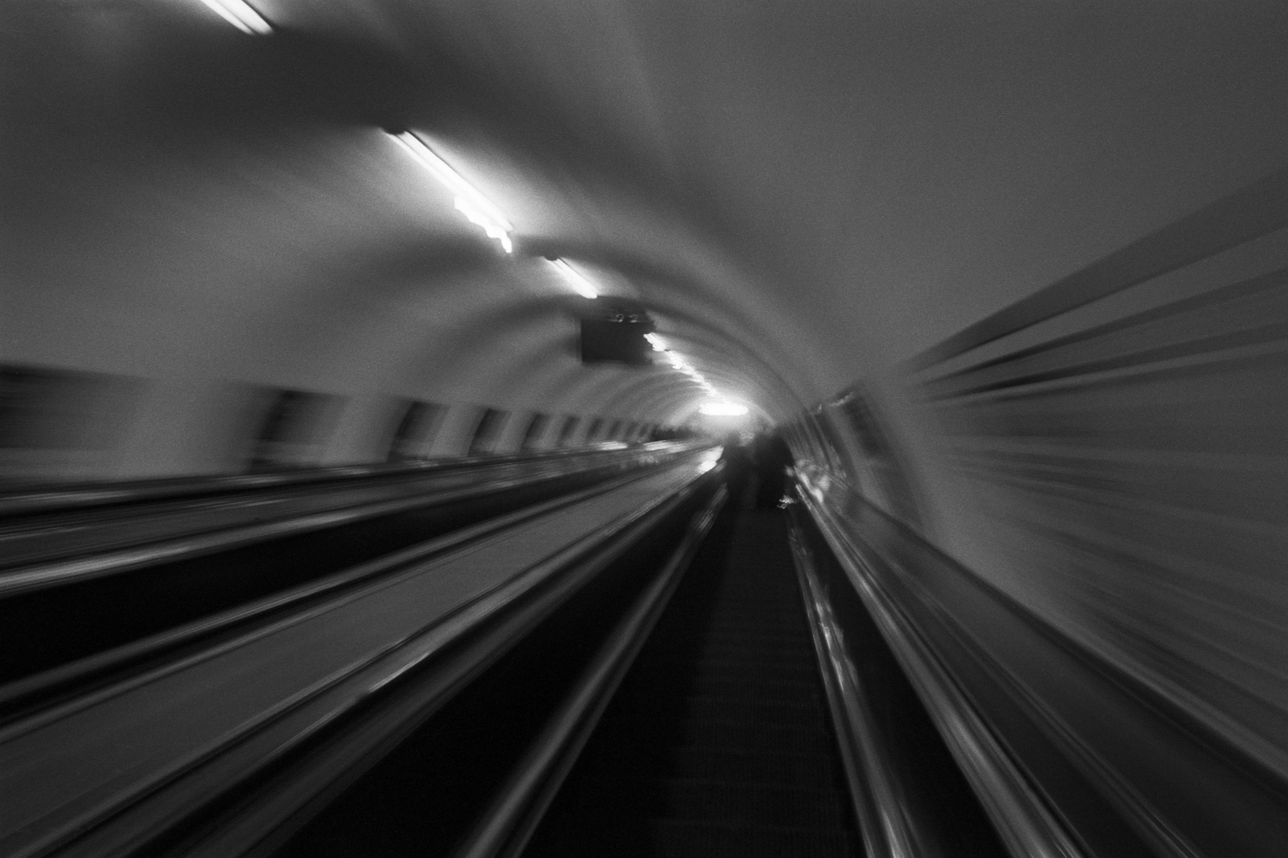
The Wall
2015Winner of the 1st prize & Golden Glass Award at the 11th Photographic Open Championship Olsztyn, and 1st place with the Special Prize of FORMAT magazine at the 3rd Biennial of Art in Piotrków Trybunalski.
View Series →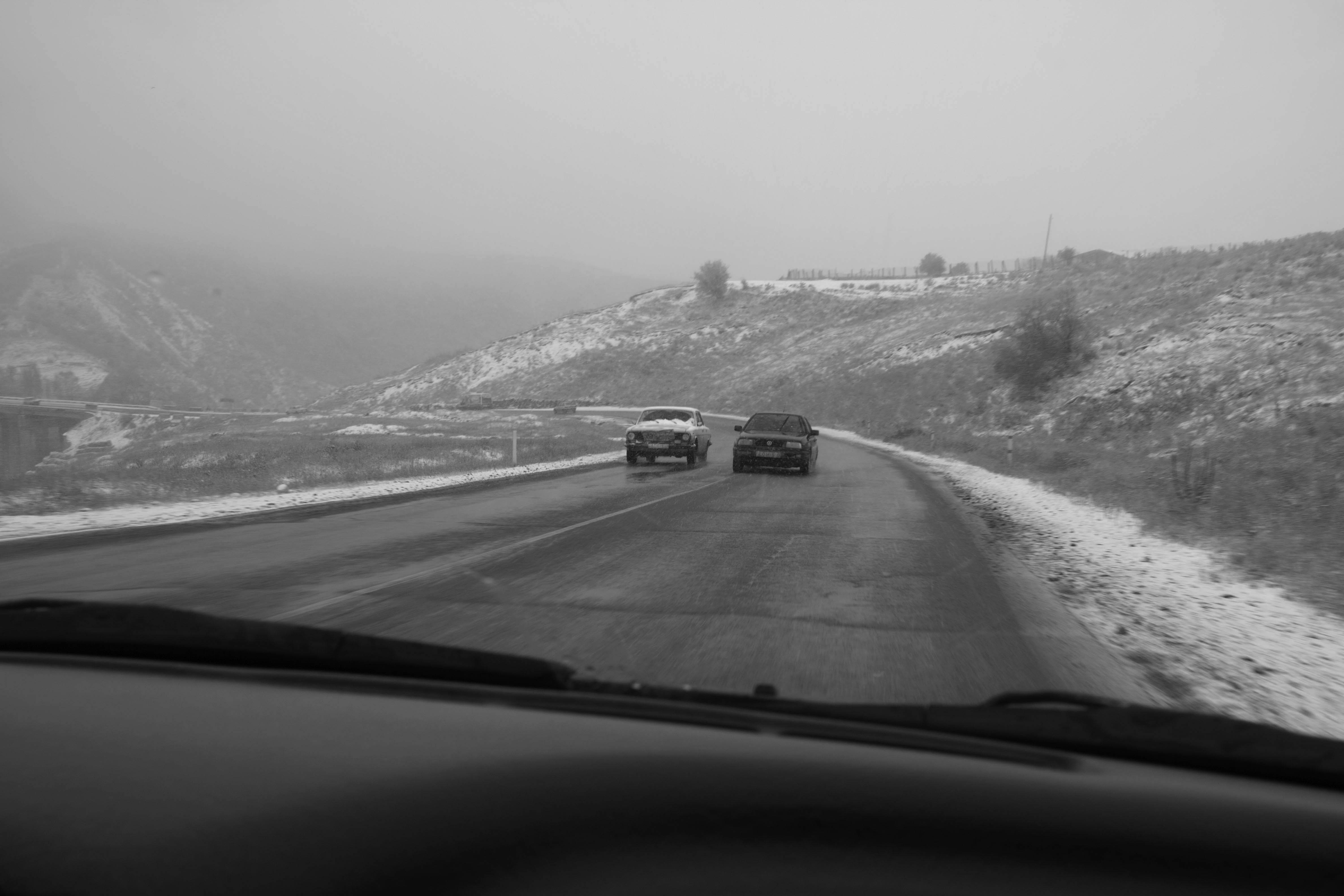
An Engagement Ring
2011A narrative series set in Wrocław in August 2011. Awarded 2nd prize & Silver Glass at the 10th Photographic Open Championship Olsztyn in 2014.
View Series →
Heat Wave
2014A documentary series recording spontaneous events across August and September 2014, capturing the raw energy of a city under the grip of summer.
View Series →