

"Photography is not about the thing photographed. It is about how that thing looks photographed."
The role of texture in black and white photography
Texture gives a black and white photograph its physical presence. It can make a weathered wall feel rough, turn skin into a record of experience, or give fabric enough weight to seem touchable. Without colour to carry mood or separate objects, the image depends on tonal contrast, edges, grain, and the small irregularities that make a surface believable.
For a photographer working between analogue and digital processes, texture is also a record of method. Medium-format film may preserve delicate transitions across a face, while a darkroom print can emphasise grain and silver-rich shadows. Digital files offer precise control, yet they can still retain the character of traditional photographic thinking when contrast and detail are handled with restraint.
Texture matters across portraiture, fashion, events, and conceptual work. A corporate portrait can use a clean background and controlled skin detail to communicate confidence. A fashion image may rely on the contrast between satin, wool, concrete, and polished metal. In a conceptual series, texture can become a symbolic language, suggesting memory, age, isolation, or resilience.
For Australian clients, the subject may be photographed in a Melbourne laneway, a sunlit studio in Sydney, or an industrial setting near Brisbane. The local environment supplies a remarkable range of surfaces, from corrugated iron and eucalyptus bark to salt-worn timber and sandstone. In monochrome, these details can be shaped into a visual identity that feels grounded rather than generic.
Texture as visual information
Texture is created by repeated visual variations: pores, scratches, fibres, ridges, cracks, dust, and changes in reflectivity. These details tell the viewer what a surface might feel like, even though photography remains a visual medium. A rough brick wall scatters light unevenly, while glass, silk, and water produce smoother highlights. Black and white photography translates those differences into a structure of light and dark.
The strongest images usually contain a hierarchy of textures. A face might be the primary area of attention, a woollen jacket a secondary surface, and a plain wall a quiet background. If every part of the frame has equally strong detail, the photograph can become visually noisy. Selective focus, controlled lighting, and tonal separation allow texture to support the subject instead of competing with it.
Texture can also create rhythm. Repeated windows, rows of seats, wrinkles in clothing, or branches against the sky guide the eye through a frame. This visual rhythm has a relationship with spoken rhythm: pacing, emphasis, and pauses influence how a viewer experiences a sequence. Even resources such as pronunciation practice can be understood through that broader idea of repetition and variation, where small changes create a recognisable pattern.
Why monochrome reveals surface
Colour can separate objects by hue, but monochrome asks the viewer to read brightness, density, and edge quality. A red dress and a green wall may appear distinct in colour, yet become similar grey values after conversion. Texture then becomes an important way to preserve separation. A change in weave, gloss, or pattern can define the subject even when the tones are close.
This is why black and white conversion should not be treated as a final filter. The photographer needs to consider how each colour will translate into grey. Red fabric may become dark and heavy, blue skies can deepen dramatically, and green foliage may lose the freshness it has in colour. Adjusting individual colour channels before conversion gives more control over the tonal character of skin, clothing, architecture, and landscape.
Monochrome also exposes poor decisions. Over-sharpening can produce brittle edges, while excessive noise reduction can flatten skin and erase fabric detail. A natural-looking black and white image often holds a mixture of crisp and soft information. Hair, eyelashes, and architectural lines may be defined, while shadows retain a gentle fall-off and less important surfaces remain understated.
Light direction and tonal depth
Texture appears when light moves across a surface rather than striking it evenly. Side lighting is especially effective because it creates small shadows along ridges and recesses. In portraiture, a broad source placed to one side can describe cheekbones, hair, and clothing without making the face look harsh. A harder source can produce a more graphic result, particularly for conceptual or editorial work.
The angle and size of the light source should match the material. A large softbox may reveal the shape of a wool coat while maintaining flattering skin tones. A narrow, harder light can make concrete, metal, and old timber feel more tactile. Natural window light is equally useful, especially when it changes gradually across a room. The relationship between illumination and environment is explored in this discussion of natural light in portraits.
Australian conditions offer distinctive opportunities. Harsh midday light in Western Australia can create pronounced shadows and strong surface contrast, while overcast weather in parts of Victoria produces quieter, more continuous tones. Near the coast, reflected light from sand and water can soften a portrait. In the Northern Territory, dry ground, weathered structures, and intense sun can provide a powerful graphic backdrop when exposure is carefully controlled.
Film grain and darkroom character
Grain is often mistaken for texture, although the two are different. Texture describes the subject’s surface; grain describes the photographic medium. When these elements work together, the image gains depth. The weave of a jacket may remain legible beneath a subtle layer of film grain, while a smooth studio background may carry just enough grain to avoid looking digitally empty.
Medium-format film is particularly valuable when fine tonal transitions matter. Its larger negative can render skin, paper, plaster, and fabric with a generous sense of detail. Black and white film stocks also have distinct personalities: some produce tight, discreet grain, while others create a more pronounced pattern that becomes part of the image’s emotional language.
Darkroom principles remain useful even in a digital workflow. Thinking in terms of exposure, negative density, local contrast, burning, and dodging encourages deliberate decisions. A print is judged as a complete object rather than as a collection of pixels on a bright screen. This matters for fine art work, where the final surface, paper choice, and viewing distance contribute to the meaning of the photograph.
Digital tools can preserve that discipline. Grain should be introduced with awareness of output size, subject matter, and viewing conditions. A texture effect that looks elegant on a monitor may become muddy in a large print or disappear in a small online image. The best result usually comes from adding character after tonal structure has been established, rather than using grain to disguise weak lighting.
Texture in business and environmental portraits
In a business portrait, texture helps establish context and personality. A polished office, a workshop bench, a concrete wall, or a timber interior says something about the subject’s working world. The background should support the person’s role without becoming a visual distraction. A lawyer photographed against restrained architectural surfaces requires a different treatment from a chef, designer, builder, or creative director.
Skin texture demands particular care. Excessive retouching can remove the details that make a face individual, while too much contrast may produce an unnecessarily severe impression. Black and white encourages attention to planes of light, expression, and gesture. Small details such as a collar, watch, hands, or hair can carry as much character as facial features.
Australian corporate photography has its own practical setting. A headshot may need to work across a company website, LinkedIn profile, annual report, media release, and internal directory. Clients in Sydney or Melbourne often expect a polished, adaptable image, while a regional organisation may want the portrait to feel connected to its workplace and community. Texture gives these images distinction without relying on dramatic styling.
Environmental portraiture benefits from honest surfaces. A café owner near Fremantle, an architect in a Fitzroy studio, or a producer in a regional Queensland shed can be placed within an environment that communicates credibility. The photographer’s role is to observe which details matter, then use framing and light to organise them into a coherent portrait rather than simply recording every available object.
Fashion, events, and conceptual series
Fashion photography depends on the tension between material and form. Black and white can make velvet appear dense, organza almost weightless, and leather sharply defined. Texture directs attention to the construction of a garment, particularly when colour would otherwise dominate the image. It also connects clothing to the body, allowing folds, seams, and reflective surfaces to shape the pose.
In event photography, texture helps build atmosphere when the light is unpredictable. A crowded dance floor, a paper invitation, a sequinned jacket, or condensation on a glass can become a small visual anchor within a larger story. At a Melbourne gallery opening or a Sydney fashion event, these details can convey energy without depending on posed group photographs alone.
Conceptual series use texture more symbolically. Peeling paint may suggest memory, while smooth plastic can imply artificiality or emotional distance. Repeated marks may represent routine, pressure, or time. When the same surface appears across several photographs, it can link separate scenes and create continuity within a body of work.
The surrounding Australian landscape offers strong conceptual material. Salt flats, eucalyptus trunks, rusted farm machinery, sandstone, and corrugated sheds each carry social and environmental associations. These surfaces should be approached with care rather than used as decorative shorthand. A thoughtful series considers place, history, and the way people interact with the environment.
A practical workflow for stronger texture
Begin by identifying the material qualities that matter in the scene. Before taking the photograph, look for direction, reflectivity, scale, and repetition. Move around the subject to see whether a change in viewpoint reveals a pattern or separates one surface from another. A small shift in camera position can make a wall recede, dominate, or disappear.
Expose for the most important tonal information. Highlights on polished metal, pale skin, or white fabric can lose texture quickly, while deep shadows may merge into a single block. Bracketing can help during unfamiliar conditions, but a consistent metering method and careful observation usually produce a more coherent series. In analogue work, keeping notes about film, exposure, developer, and lighting can make later refinements more purposeful.
During editing, work from broad tonal relationships towards fine detail. Establish the placement of highlights, midtones, and shadows before adjusting clarity or sharpening. Use local contrast selectively, especially around faces and important materials. If a background becomes too prominent, reduce its texture rather than trying to sharpen the subject more aggressively.
For Australian assignments, plan around the location and timing. Early morning or late afternoon light may provide more manageable contrast at an outdoor site, while a covered verandah can offer useful shade during a hot Queensland day. Check access, permits, weather, and travel time, particularly for commercial work outside metropolitan areas. Clear agreements about image usage, delivery formats, and GST-inclusive pricing also help keep a professional commission efficient.
Ways to control texture with intention
Texture works best when it has a defined purpose. Before shooting or editing, decide whether the image should feel tactile, restrained, raw, elegant, documentary, or abstract. That intention will influence the choice of lens, lighting ratio, film stock, background, and finishing process.
A short working checklist can keep the visual language consistent:
- Identify the primary surface and decide why the viewer should notice it.
- Use side light or a controlled angle to reveal relief without flattening the subject.
- Separate important textures through focus, tonal contrast, or composition.
- Preserve natural detail in skin, fabric, and architecture rather than applying uniform sharpening.
- Test the finished image at its intended size, from a web profile to a fine art print.
Texture should remain connected to human presence. A wall, garment, or landscape becomes meaningful when it supports a person, gesture, place, or idea. The most memorable monochrome photographs balance surface detail with emotional clarity, giving the viewer enough information to imagine touch while leaving room for interpretation.
Selected Series
A cross-section of commissioned and personal projects spanning fine art, commercial, and conceptual work.
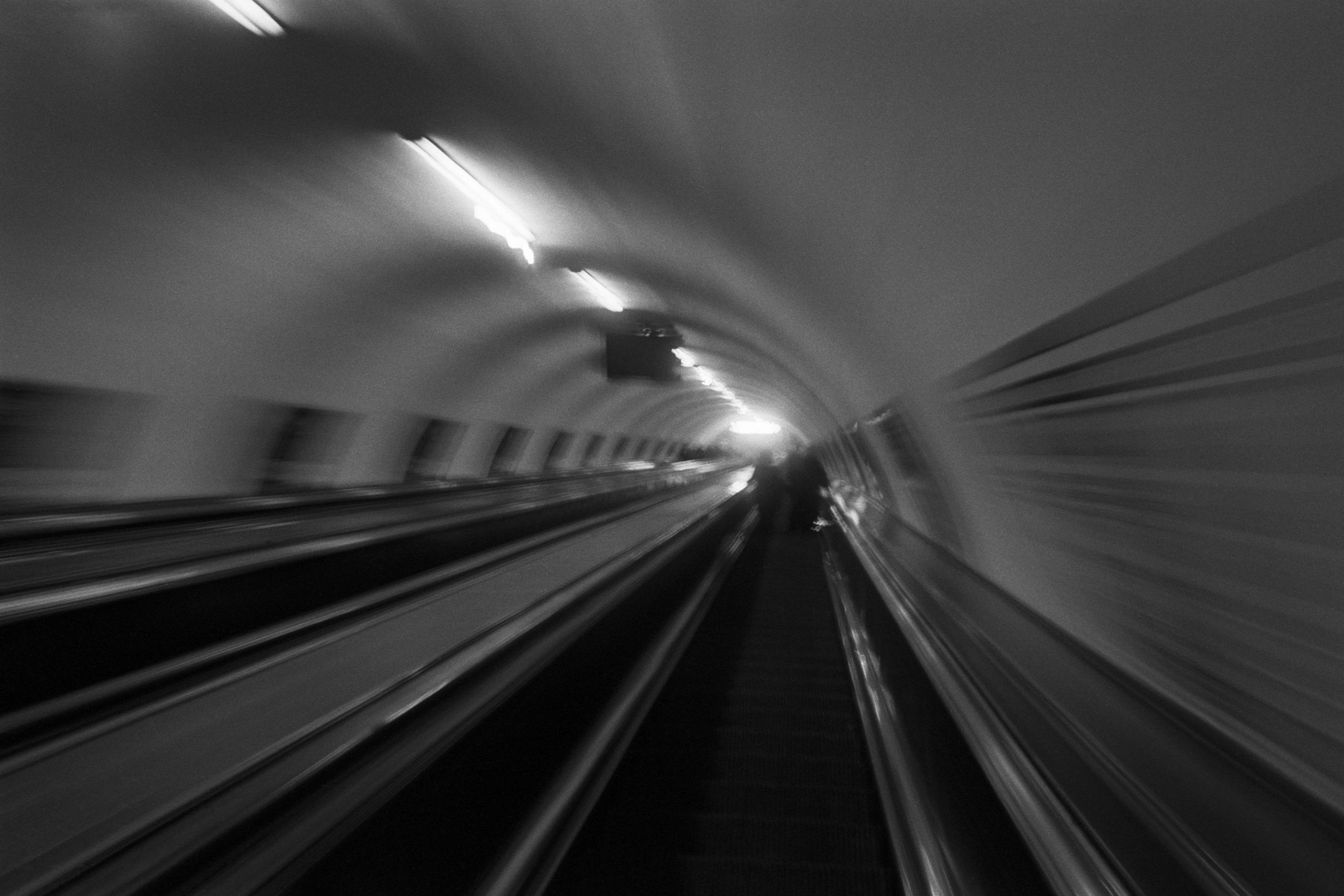
The Wall
2015Winner of the 1st prize & Golden Glass Award at the 11th Photographic Open Championship Olsztyn, and 1st place with the Special Prize of FORMAT magazine at the 3rd Biennial of Art in Piotrków Trybunalski.
View Series →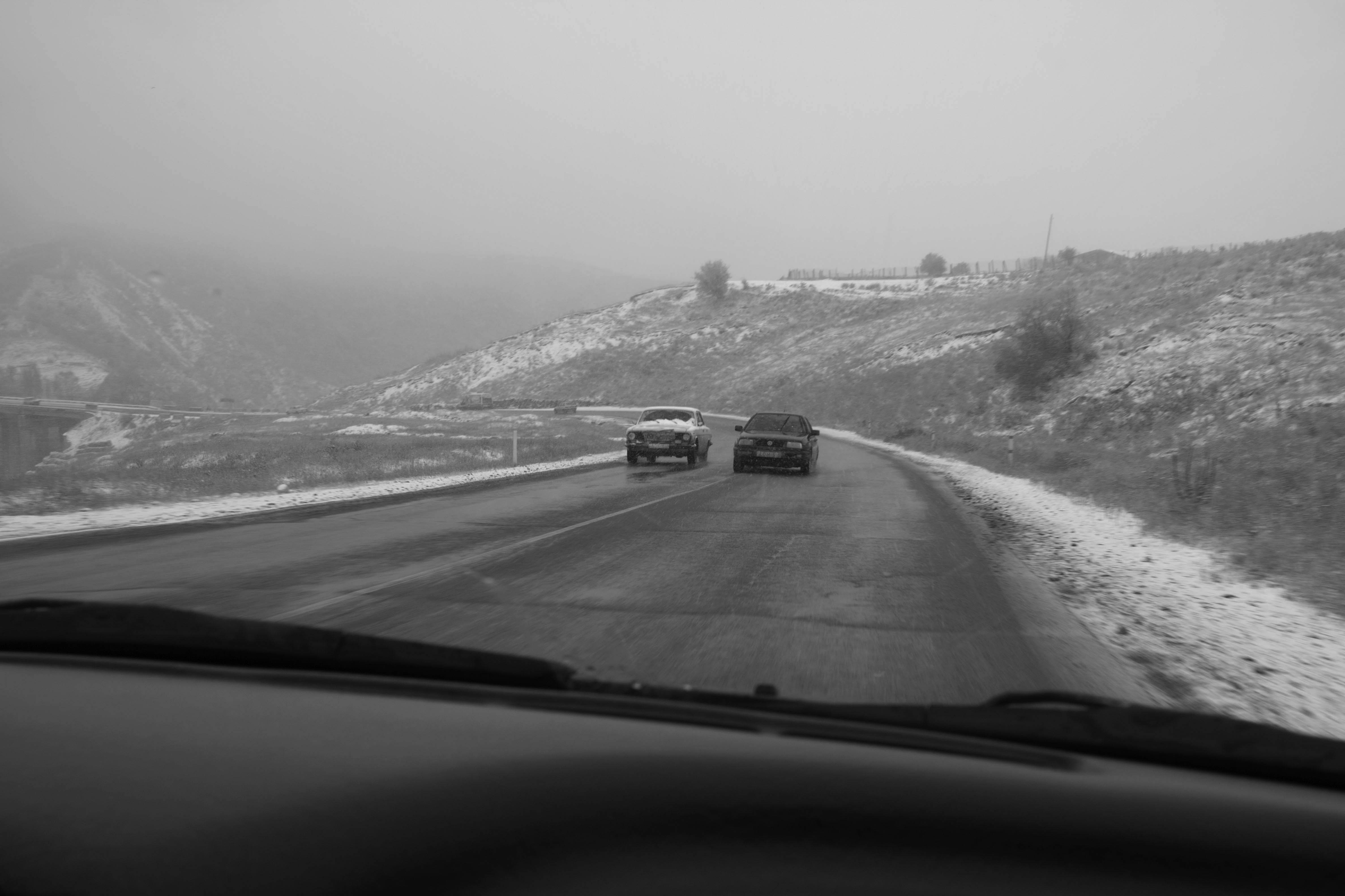
An Engagement Ring
2011A narrative series set in Wrocław in August 2011. Awarded 2nd prize & Silver Glass at the 10th Photographic Open Championship Olsztyn in 2014.
View Series →
Heat Wave
2014A documentary series recording spontaneous events across August and September 2014, capturing the raw energy of a city under the grip of summer.
View Series →