"Photography is not about the thing photographed. It is about how that thing looks photographed."
Turning a personal project into a published photo book
A personal photographic project often begins with curiosity rather than a finished proposition. Images accumulate, experiments follow one another, and the subject gradually acquires depth. Turning that body of work into a published photo book changes the task. Each photograph must operate as part of a sequence, earning its place through what precedes and follows it. The book becomes an argument made through pace, contrast, silence and repetition. It is therefore an editorial problem as much as a design one: the maker must discover the clearest route through work already made.
Rafal Michalak’s practice offers a useful starting point because it moves between personal inquiry and professional image-making. Based in Wrocław, Poland, he is known for fine art and commercial photography, including business portraits, fashion, events and conceptual series. His method combines medium-format and black-and-white film, darkroom principles and digital workflows. That hybrid approach is valuable when developing a photo book. Analogue photographs retain tactile density and subtle tonal transitions, while digital tools support sequencing, proofing and colour management. The aim is to preserve the rhythm of the work rather than flatten it into one aesthetic.
For an Australian audience, a book also needs coherence without borrowing a generic international template. Local expectations can shape its language, participants, setting and route to readers. Sydney and Melbourne hold much of the country’s publishing, bookselling and gallery infrastructure, yet photography is made in many other places as well. A book concerned with place might include Brisbane’s subtropical light, Perth’s exposed western sun or Melbourne’s layered laneways and arcades. Such details create specificity and invite recognition without reducing the subject to a tourist postcard.
Finding the project’s central idea
Begin by stating the project’s central proposition in a sentence that can survive without any photograph beside it. “This is about memory” is too broad for a book; a claim about how memory alters space, identity or belonging can guide both shooting and editing. The proposed reader should be defined without over-engineering the project for a demographic. Strong personal work often gains force from specificity, but it must remain open enough for viewers to find their own entry point. The sequence should test the proposition rather than merely illustrate it.
A useful research phase separates observation from interpretation. List the visual devices, recurring locations, gestures and unresolved details that keep returning. Build an archive with enough contextual information to identify exposure, date, lens and print notes, even if those details never appear in the volume. For Michalak, that archive might include film scans, contact sheets, darkroom test prints and digitally corrected files. Keeping these layers intact gives the editor and printer options while preserving evidence of how an image was made.
The relationship between an individual frame and the wider argument deserves particular attention. A portrait can be striking on its own while revealing little about the series; repetition can turn several unrelated pictures into a system. Michalak’s explanation of conceptual photography shows how an idea gains visual form through selection and arrangement. That process is especially important in a book, where images are encountered in a prescribed order. Review the sequence with fresh eyes and consider whether every image clarifies, complicates or productively disrupts the central idea.
Editing for narrative and rhythm
Editing for a book begins with candour, not speed. Place all plausible frames on a contact sheet, then reduce them through several rounds rather than defending the first edit. The first pass identifies the emotional range; later passes test transitions, visual variety and technical consistency. A sequence can appear coherent yet feel flat if every photograph makes the same point. Differences in scale, viewpoint, density and duration give the reader’s eye somewhere to rest and move. The editor should preserve evidence of the project’s uncertainty.
Rhythm is partly visual and partly temporal. A run of quiet images can slow the reading, while a sudden full-page frame changes the pace of turning pages. Test different placements of a key picture, but do not confuse surprise with arbitrariness. If an image feels out of place because it is inconsistent, the sequence needs work; if it feels wrong only because the expected path has been disrupted, it may create useful tension. Captions can confirm a reading too quickly, so let some photographs remain unexplained. Silence, margins and unnumbered openings are legitimate editorial tools.
Digital editing should support this rhythm without making every photograph conform to a uniform preset. Build the sequence at a high-resolution size, compare candidates at viewing scale and check the final pages as a physical proof. Black-and-white work requires attention to tonal separation, particularly when film scans are placed beside digitally captured colour frames. Medium-format detail can reward close reproduction, but only if the printing process preserves grain and tonal character rather than retouching them away. The correct workflow joins precision to restraint.
Choosing format, paper and binding
Format is not packaging added after the sequence is locked. A tall, narrow page may support vertical architecture or a measured portrait series, while a wide landscape format suits environmental work and paired images. Square pages can give conceptual projects formal discipline, but they also demand careful decisions about cropping and negative space. A traditional portrait format, perhaps close to 24 × 30 cm, offers Australian readers a familiar object that feels at home on a coffee table without becoming visually generic. Choose proportions that clarify the project’s internal logic.
Paper choice affects the emotional register of a photographic book. Coated stock can deepen blacks and enrich saturated colour, while matte uncoated paper softens contrast and reveals the tooth of the image. Soft-touch lamination may enhance a luxury finish, yet it can date quickly or reduce the tactile appeal of uncoated stock. Test several papers with the same opening spread. Check that the binding holds without obscuring a critical edge and that the pages open flat when a reader is annotating them. Physical quality should serve the photographs.
Australian production conditions make material testing especially valuable. Summer heat and humidity can affect paper flatness, adhesive performance and colour consistency during storage and transit, while coastal salt and dust complicate long journeys to regional venues. A printer in Melbourne or Sydney can provide a controlled proof, but pickup should be coordinated around seasonal weather rather than treating the book as a routine parcel. Specify a moisture-resistant wrap and use a sturdy carton for delivery to bookshops in Brisbane, Adelaide or Canberra. Material choices should hold up to Australian conditions.
Writing and designing the pages
A photo book needs enough written context to orient the reader without dictating every response. Captions should identify people, places and technical facts where those facts matter. They should also extend the sequence through a precise question, a fragment of testimony or a note about process. Keep the voice close to the project: lucid, reflective and capable of admitting ambiguity. Explanatory essays can connect photographs that resist immediate association, but each paragraph should earn its place. If text exists only to decorate the images, it weakens the book.
Design must translate editorial intention into a consistent visual system. Establish a baseline grid, decide how captions sit relative to images and vary that relationship only when the photographs demand it. A restrained typographic palette can give equal weight to black-and-white and colour work. Give the title page enough space to reset the reader before the first photograph, and use section breaks sparingly. The designer should work from the same master files as the printer, reducing the risk that a carefully edited sequence becomes visually fragmented on the page.
For an Australian edition, copy editing should follow local English conventions and use forms of address familiar to the intended readership. ISBN assignment, catalogue metadata and image permissions should be settled early because they affect files, credits and distribution. Where the project engages Aboriginal communities, an Acknowledgement of Country is more than a formal line: relevant Traditional Custodians should be identified through respectful consultation, and contributors should review how their knowledge is represented. Avoid decorative language and tokenistic references. Accuracy builds trust with Australian readers and collaborators.
Producing and distributing in Australia
The production schedule should connect editorial milestones with the printer’s real capacity. Delivery of final files, font licensing, cover proofing, binding samples and colour checks can each alter the timeline. Approve a physical dummy before printing the first run, then retain that signed copy as the reference for every later batch. For a limited edition, photograph the finished object, including its spine and fore-edge, and archive those details with the production files. The aim is consistency: a reprint should feel like the same publication rather than a new design assembled from memory.
Distribution in Australia begins with a realistic understanding of distance and infrastructure. Sydney and Melbourne are natural hubs for national publicity and specialist bookselling, but a book should also reach independent shops in Brisbane, galleries and museums in Canberra and Adelaide, regional libraries and readers beyond capital cities. Pitch stores in person where possible so buyers understand the object, its price and intended audience. An Australian book launch can be intimate, with a curator or photographer speaking briefly before signing copies in a nearby cafe. That format suits a visual project better than a crowded retail event.
Shipping and storage need planning beyond the warehouse. Use a tracked service, insure the consignment and avoid leaving copies in vehicles or unattended at outdoor venues. In summer, temperature spikes can threaten both the physical book and the stability of colour reproduction, so transit should be brief and packaging tested. Set aside a small number of presentation copies for fairs, but keep the majority properly stored and ready for reorders. A book is also a retail product: margins, wholesale pricing, returns and stock depth determine whether independent shops can support it.
Building a life beyond publication
A launch should reveal the book’s physical character rather than imitate a generic press conference. In Melbourne, an event in a photography space or bookshop can place selected spreads on tables before the reading begins. Brief talks about the project’s research and production help audiences understand why particular images were kept together. Display copies so visitors can handle them, then provide a clear route to purchase. The launch is also an opportunity to hear from readers whose interpretations exceed the curator’s intentions.
Marketing should continue the narrative rather than repeat the cover title at every touchpoint. A short studio film can show the darkroom, digital working screen and final bound pages as parts of one process. Extract details from the book for an exhibition, while keeping the complete sequence available online as a reading experience. Michalak’s commercial work in portraits, fashion and events can support a broader campaign: commissioned images may introduce the audience, while the personal series gives the project its distinct voice. The relationship should feel transparent rather than manufactured.
The finished book becomes a durable part of the photographer’s practice. It can anchor exhibitions, open conversations with commissioning clients and give the project a public life beyond the original shoot. It also changes how the photographs are understood: once printed together, they form a traceable record of decisions that might otherwise remain private. Keep the master book files, printer specifications and edition records in the same archive as the contact sheets and raw captures. For a photographer working between analogue and digital methods, publication turns an experiment into an object that can be held, examined and carried forward.
Selected Series
A cross-section of commissioned and personal projects spanning fine art, commercial, and conceptual work.
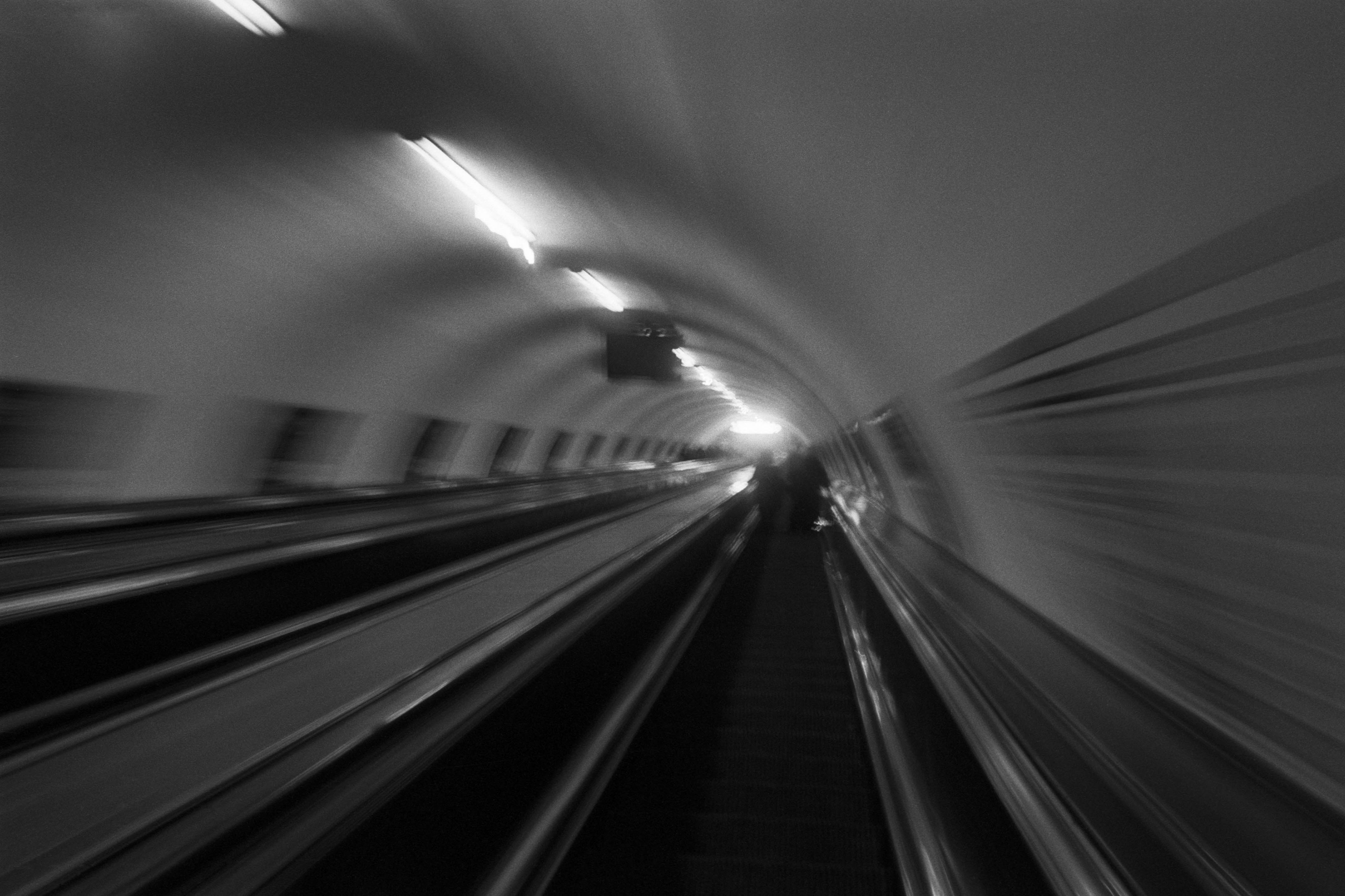
The Wall
2015Winner of the 1st prize & Golden Glass Award at the 11th Photographic Open Championship Olsztyn, and 1st place with the Special Prize of FORMAT magazine at the 3rd Biennial of Art in Piotrków Trybunalski.
View Series →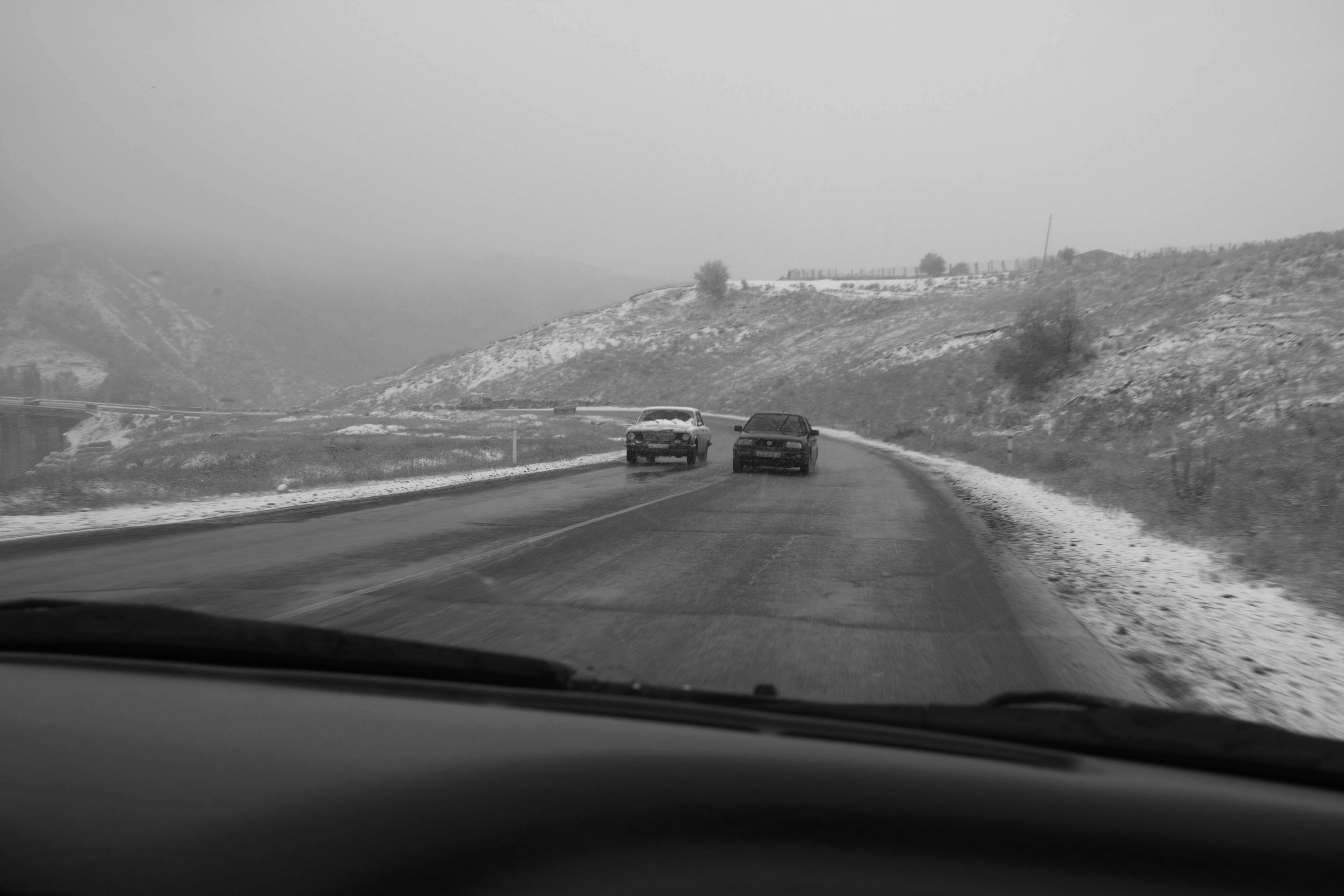
An Engagement Ring
2011A narrative series set in Wrocław in August 2011. Awarded 2nd prize & Silver Glass at the 10th Photographic Open Championship Olsztyn in 2014.
View Series →
Heat Wave
2014A documentary series recording spontaneous events across August and September 2014, capturing the raw energy of a city under the grip of summer.
View Series →